Background
Overview
Teaching: 5 min
Exercises: 0 minQuestions
What is the Ocean Tracking Network?
How does your local telemetry network interact with OTN?
What methods of data analysis will be covered?
Objectives
Intro to OTN
The Ocean Tracking Network (OTN) supports global telemetry research by providing training, equipment, and data infrastructure to our large network of partners.
OTN and affiliated networks provide automated cross-referencing of your detection data with other tags in the system to help resolve “mystery detections” and provide detection data to taggers in other regions. OTN’s Data Managers will also extensively quality-control your submitted metadata for errors to ensure the most accurate records possible are stored in the database. OTN’s database and Data Portal website are excellent places to archive your datasets for future use and sharing with collaborators. We offer pathways to publish your datasets with OBIS, and via open data portals like ERDDAP, GeoServer etc. The data-product format returned by OTN is directly ingestible by analysis packages such as glatos and resonATe for ease of analysis. OTN offers support for the use of these packages and tools.
Learn more about OTN and our partners here https://members.oceantrack.org/. Please contact OTNDC@DAL.CA if you are interested in connecting with your regional network and learning about their affiliation with OTN.
Intended Audience
This set of workshop material is directed at researchers who are ready to begin the work of acoustic telemetry data analysis. There are no introductory R lessons provided, but “intro to R for telemetry” material can be explored here.
If you’d like to refresh your basic R coding skills outside of this workshop curriculum, we recommend Data Analysis and Visualization in R for Ecologists as a good starting point. Much of this content is included in the first two lessons of this workshop.
Getting Started
Please follow the instrucions in the “Setup” tab along the top menu to install all required software, packages and data files. If you have questions or are running into errors please reach out to OTNDC@DAL.CA for support.
Intro to Telemetry Data Analysis
OTN-affiliated telemetry networks all provide researchers with pre-formatted datasets, which are easily ingested into these data analysis tools.
Before diving in to a lot of analysis, it is important to take the time to clean and sort your dataset, taking the pre-formatted files and combining them in different ways, allowing you to analyse the data with different questions in mind.
There are multiple R packages necessary for efficient and thorough telemetry data analysis. General packages that allow for data cleaning and arrangement, dataset manipulation and visualization, pairing with oceanographic data and temporo-spatial locating are used in conjuction with the telemetry analysis tool packages remora, actel and glatos.
There are many more useful packages covered in this workshop, but here are some highlights:
Intro to the glatos Package
glatos is an R package with functions useful to members of the Great Lakes Acoustic Telemetry Observation System (http://glatos.glos.us). Developed by Chris Holbrook of GLATOS, OTN helps to maintain and keep relevant. Functions may be generally useful for processing, analyzing, simulating, and visualizing acoustic telemetry data, but are not strictly limited to acoustic telemetry applications. Tools included in this package facilitate false filtering of detections due to time between pings and disstance between pings. There are tools to summarise and plot, including mapping of animal movement. Learn more here.
Maintainer: Dr. Chris Holbrook, ( cholbrook@usgs.gov )
Intro to the actel Package
This package is designed for studies where animals tagged with acoustic tags are expected to move through receiver arrays. actel combines the advantages of automatic sorting and checking of animal movements with the possibility for user intervention on tags that deviate from expected behaviour. The three analysis functions: explore, migration and residency, allow the users to analyse their data in a systematic way, making it easy to compare results from different studies.
Author: Dr. Hugo Flavio, ( hflavio@wlu.ca )
Intro to the remora Package
This package is designed for the Rapid Extraction of Marine Observations for Roving Animals (remora). This is an R package that enables the integration of animal acoustic telemetry data with oceanographic observations collected by ocean observing programs. It includes functions for:
- Interactively exploring animal movements in space and time from acoustic telemetry data
- Performing robust quality-control of acoustic telemetry data as described in Hoenner et al. 2018
- Identifying available satellite-derived and sub-surface in situ oceanographic datasets coincident and collocated with the animal movement data, based on regional Ocean Observing Systems
- Extracting and appending these environmental data to animal movement data
Whilst the functions in remora were primarily developed to work with acoustic telemetry data, the environmental data extraction and integration functionalities will work with other spatio-temporal ecological datasets (eg. satellite telemetry, species sightings records, fisheries catch records).
Maintainer: Created by a team from IMOS Animal Tracking Facility, adapted to work on OTN-formatted data by Bruce Delo ( bruce.delo@dal.ca )
Intro to the pathroutr Package
The goal of pathroutr is to provide functions for re-routing paths that cross land around barrier polygons. The use-case in mind is movement paths derived from location estimates of marine animals. Due to error associated with these locations it is not uncommon for these tracks to cross land. The pathroutr package aims to provide a pragmatic and fast solution for re-routing these paths around land and along an efficient path. You can learn more here
Author: Dr. Josh M London ( josh.london@noaa.gov )
Key Points
Introduction to glatos Data Processing Package
Overview
Teaching: 30 min
Exercises: 0 minQuestions
How do I load my data into glatos?
How do I filter out false detections?
How can I consolidate my detections into detection events?
How do I summarize my data?
Objectives
The glatos package is a powerful toolkit that provides a wide range of functionality for loading, processing, and visualizing your data. With it, you can gain valuable insights with quick and easy commands that condense high volumes of base R into straightforward functions, with enough versatility to meet a variety of needs.
This package was originally created to meet the needs of the Great Lakes Acoustic Telemetry Observation System (GLATOS) and use their specific data formats. However, over time, the functionality has been expanded to allow operations on OTN-formatted data as well, broadening the range of possible applications for the software. As a point of clarification, “GLATOS” (all caps acronym) refers to the organization, while glatos refers to the package.
Our first step is setting our working directory and importing the relevant libraries.
## Set your working directory ####

setwd("YOUR/PATH/TO/data/act")
library(glatos)
library(tidyverse)
library(lubridate)
If you are following along with the workshop in the workshop repository, there should be a folder in ‘data/’ containing data corresponding to your node (at time of writing, FACT, ACT, GLATOS, or MigraMar). glatos can function with both GLATOS and OTN Node-formatted data, but the functions are different for each. Both, however, provide a marked performance boost over base R, and both ensure that the resulting data set will be compatible with the rest of the glatos framework.
We’ll start by combining our several data files into one master detection file, which glatos will be able to read.
# First we need to create one detections file from all our detection extracts.
library(utils)

format <- cols( # Heres a col spec to use when reading in the files
  .default = col_character(),
  datelastmodified = col_date(format = ""),
  bottom_depth = col_double(),
  receiver_depth = col_double(),
  sensorname = col_character(),
  sensorraw = col_character(),
  sensorvalue = col_character(),
  sensorunit = col_character(),
  datecollected = col_datetime(format = ""),
  longitude = col_double(),
  latitude = col_double(),
  yearcollected = col_double(),
  monthcollected = col_double(),
  daycollected = col_double(),
  julianday = col_double(),
  timeofday = col_double(),
  datereleasedtagger = col_logical(),
  datereleasedpublic = col_logical()
)

detections <- tibble()
for (detfile in list.files('.', full.names = TRUE, pattern = "proj.*\\.zip")) {
  print(detfile)
  tmp_dets <- read_csv(detfile, col_types = format)
  detections <- bind_rows(detections, tmp_dets)
}

write_csv(detections, 'all_dets.csv', append = FALSE)
With our new file in hand, we’ll want to use the read_otn_detections() function to load our data into a dataframe. In this case, our data is formatted in the ACT (OTN) style - if it were GLATOS formatted, we would want to use read_glatos_detections() instead.
Remember: you can always check a function’s documentation by typing a question mark, followed by the name of the function.
## glatos help files are helpful!! ####
?read_otn_detections

# Save our detections file data into a dataframe called detections
detections <- read_otn_detections('all_dets.csv')
Remember that we can use head() to inspect a few lines of our data to ensure it was loaded properly.
# View first 2 rows of output
head(detections, 2)
With our data loaded, we next want to apply a false filtering algorithm to reduce the number of false detections in our dataset. glatos uses the Pincock algorithm
to filter probable false detections based on the time lag between detections - tightly clustered detections are weighted as more likely to be true, while detections spaced out temporally will be marked as false. We can also pass the time-lag threshold as a variable to the false_detections() function. This lets us fine-tune our filtering to allow for greater or lesser temporal space between detections before they’re flagged as false.
## Filtering False Detections ####
## ?glatos::false_detections

#Write the filtered data to a new det_filtered object
#This doesn't delete any rows, it just adds a new column that tells you whether
#or not a detection was filtered out.

detections_filtered <- false_detections(detections, tf=3600, show_plot=TRUE)
head(detections_filtered)
nrow(detections_filtered)
The false_detections function will add a new column to your dataframe, ‘passed_filter’. This contains a boolean value that will tell you whether or not that record passed the false detection filter. That information may be useful on its own merits; for now, we will just use it to filter out the false detections.
# Filter based on the column if you're happy with it.

detections_filtered <- detections_filtered[detections_filtered$passed_filter == 1,]
nrow(detections_filtered) # Smaller than before
With our data properly filtered, we can begin investigating it and developing some insights. glatos provides a range of tools for summarizing our data so that we can better see what our receivers are telling us. We can begin with a summary by animal, which will group our data by the unique animals we’ve detected.
# Summarize Detections ####
#?summarize_detections
#summarize_detections(detections_filtered)

# By animal ====
sum_animal <- summarize_detections(detections_filtered, location_col = 'station', summ_type='animal')

sum_animal
We can also summarize by location, grouping our data by distinct locations.
# By location ====

sum_location <- summarize_detections(detections_filtered, location_col = 'station', summ_type='location')

head(sum_location)
summarize_detections() will return different summaries depending on the summ_type parameter. It can take either “animal”, “location”, or “both”. More information on what these summaries return and how they are structured can be found in the help files (?summarize_detections).
If you had another column that describes the location of a detection, and you would prefer to use that, you can specify it in the function with the location_col parameter. In the example below, we will create a new column and use that as the location.
# You can make your own column and use that as the location_col
# For example we will create a uniq_station column for if you have duplicate station names across projects

detections_filtered_special <- detections_filtered %>%
  mutate(station_uniq = paste(glatos_array, station, sep=':'))

sum_location_special <- summarize_detections(detections_filtered_special, location_col = 'station_uniq', summ_type='location')

head(sum_location_special)
For the next example, we’ll summarise along both animal and location, as outlined above.
# By both dimensions
sum_animal_location <- summarize_detections(det = detections_filtered,
                                            location_col = 'station',
                                            summ_type='both')

head(sum_animal_location)
Summarising by both dimensions will create a row for each station and each animal pair. This can be a bit cluttered, so let’s use a filter to remove every row where the animal was not detected on the corresponding station.
# Filter out stations where the animal was NOT detected.
sum_animal_location <- sum_animal_location %>% filter(num_dets > 0)

sum_animal_location
One other method we can use is to summarize by a subset of our animals as well. If we only want to see summary data for a fixed set of animals, we can pass an array containing the animal_ids that we want to see summarized.
# create a custom vector of Animal IDs to pass to the summary function
# look only for these IDs when doing your summary

tagged_fish <- c('PROJ58-1218508-2015-10-13', 'PROJ58-1218510-2015-10-13')

sum_animal_custom <- summarize_detections(det=detections_filtered,
                                          animals=tagged_fish,  # Supply the vector to the function
                                          location_col = 'station',
                                          summ_type='animal')

sum_animal_custom
Now that we have an overview of how to quickly and elegantly summarize our data, let’s make our dataset more amenable to plotting by reducing it from detections to detection events.
Detection Events differ from detections in that they condense a lot of temporally and spatially clustered detections for a single animal into a single detection event. This is a powerful and useful way to clean up the data, and makes it easier to present and clearer to read. Fortunately,this is easy to do with glatos.
# Reduce Detections to Detection Events ####

# ?glatos::detection_events
# you specify how long an animal must be absent before starting a fresh event

events <- detection_events(detections_filtered,
                           location_col = 'station',
                           time_sep=3600)

head(events)
location_col tells the function what to use as the locations by which to group the data, while time_sep tells it how much time has to elapse between sequential detections before the detection belongs to a new event (in this case, 3600 seconds, or an hour). The threshold for your data may be different depending on the purpose of your project.
We can also keep the full extent of our detections, but add a group column so that we can see how they would have been condensed.
# keep detections, but add a 'group' column for each event group

detections_w_events <- detection_events(detections_filtered,
                                        location_col = 'station',
                                        time_sep=3600, condense=FALSE)
With our filtered data in hand, let’s move on to some visualization.
Key Points
More Features of glatos
Overview
Teaching: 15 min
Exercises: 0 minQuestions
What other features does glatos offer?
Objectives
glatos has more advanced analytic tools that let you manipulate your data further. We’ll cover a few of these features now, to show you how to take your data beyond just filtering and event creation. By combining the glatos package’s powerful built-in functions with its interoperability across scientific R packages, we’ll show you how to derive powerful insights from your data, and format it in a way that lets you demonstrate them.
glatos can be used to get the residence index of your animals at all the different stations. In fact, glatos offers five different methods for calculating Residence Index. For this lesson, we will showcase two of them, but more information on the others can be found in the glatos documentation.
The residence_index() function requires an events object to create a residence index. We will start by creating a subset like we did in the last lesson. This will save us some time, since running the residence index on the full set is prohibitively long for the scope of this workshop.
First we will decide which animals to base our subset on. To help us with this, we can use group_by on the events object to make it easier to identify good candidates.
#Using all the events data will take too long, so we will subset to just use a couple animals

events %>% group_by(animal_id) %>% summarise(count=n()) %>% arrange(desc(count))

#In this case, we have already decided to use these three animal IDs as the basis for our subset.

subset_animals <- c('PROJ59-1191631-2014-07-09', 'PROJ59-1191628-2014-07-07', 'PROJ64-1218527-2016-06-07')
events_subset <- events %>% filter(animal_id %in% subset_animals)

events_subset
Now that we have a subset of our events object, we can apply the residence_index() functions.
# Calc residence index using the Kessel method

rik_data <- residence_index(events_subset,
                            calculation_method = 'kessel')
# "Kessel" method is a special case of "time_interval" where time_interval_size = "1 day"
rik_data

# Calc residence index using the time interval method, interval set to 6 hours
rit_data <- residence_index(events_subset,
                            calculation_method = 'time_interval',
                            time_interval_size = "6 hours")

rit_data
Although the code we’ve written for each method of calculating the residence index is similar, the different parameters and calculation methods mean that these will return different results. It is up to you to investigate which of the methods within glatos best suits your data and its intended application.
We will continue with glatos for one more lesson, in which we will cover some basic, but very versatile visualization functions provided by the package.
Key Points
Basic Visualization and Plotting
Overview
Teaching: 30 min
Exercises: 0 minQuestions
How can I use glatos to plot my data?
What kinds of plots can I make with my data?
Objectives
Now that we’ve cleaned and processed our data, we can use glatos’ built-in plotting tools to make quick and effective visualizations out of it. One of the simplest visualizations is an abacus plot to display animal detections against the appropriate stations. To this end, glatos supplies a built-in, customizable abacus_plot function.
# Visualizing Data - Abacus Plots ####
# ?glatos::abacus_plot
# customizable version of the standard VUE-derived abacus plots


abacus_plot(detections_w_events,
            location_col='station',
            main='ACT Detections by Station') # can use plot() variables here, they get passed thru to plot()
This is good, but you can see that the plot is cluttered. Rather than plotting our entire dataset, let’s try filtering out a single animal ID and only plotting that. We can do this right in our call to abacus_plot with the filtering syntax we’ve previously covered.
# pick a single fish to plot
abacus_plot(detections_filtered[detections_filtered$animal_id== "PROJ58-1218508-2015-10-13",],
            location_col='station',
            main="PROJ58-1218508-2015-10-13 Detections By Station")
Other plots are available in glatos and can show different facets of our data. If we want to see the physical distribution of our stations, for example, a bubble plot will serve us better.
# Bubble Plots for Spatial Distribution of Fish ####
# bubble variable gets the summary data that was created to make the plot
detections_filtered

?detection_bubble_plot

# We'll use raster to get a polygon to plot against
library(raster)
USA <- getData('GADM', country="USA", level=1)
MD <- USA[USA$NAME_1=="Maryland",]

bubble_station <- detection_bubble_plot(detections_filtered,

                                        background_ylim = c(38, 40),
                                        background_xlim = c(-77, -76),
                                        map = MD,
                                        location_col = 'station',
                                        out_file = 'act_bubbles_by_stations.png')
bubble_station

bubble_array <- detection_bubble_plot(detections_filtered,
                                      background_ylim = c(38, 40),
                                      background_xlim = c(-77, -76),
                                      map = MD,
                                      out_file = 'act_bubbles_by_array.png')
bubble_array
These examples provide just a brief introduction to some of the plotting available in glatos.
Glatos Challenge
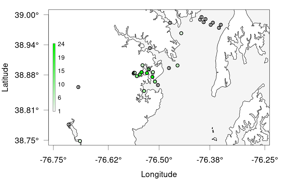
Challenge 1 —- Create a bubble plot of that bay we zoomed in earlier. Set the bounding box using the provided nw + se cordinates, change the colour scale and resize the points to be smaller. As a bonus, add points for the other receivers that don’t have any detections. Hint: ?detection_bubble_plot will help a lot Here’s some code to get you started
nw <- c(38.75, -76.75) # given
se <- c(39, -76.25) # given
Solution
nw <- c(38.75, -76.75) # given
se <- c(39, -76.25) # given

deploys <- read_otn_deployments('matos_FineToShare_stations_receivers_202104091205.csv') # For bonus
bubble_challenge <- detection_bubble_plot(detections_filtered,
                                     background_ylim = c(nw[1], se[1]),
                                     background_xlim = c(nw[2], se[2]),
                                     map = MD,
                                     symbol_radius = 0.75,
                                     location_col = 'station',
                                     col_grad = c('white', 'green'),
                                     receiver_locs = deploys, # For bonus
                                     out_file = 'act_bubbles_challenge.png')
Key Points
Introduction to actel
Overview
Teaching: 45 min
Exercises: 0 minQuestions
What does the actel package do?
When should I consider using Actel to analyze my acoustic telemetry data?
Objectives
actel is designed for studies where animals tagged with acoustic tags are expected to move through receiver arrays. actel combines the advantages of automatic sorting and checking of animal movements with the possibility for user intervention on tags that deviate from expected behaviour. The three analysis functions: explore, migration and residency, allow the users to analyse their data in a systematic way, making it easy to compare results from different studies.
Author: Dr. Hugo Flavio, ( hflavio@wlu.ca )
Supplemental Links and Related Materials:
Actel - a package for the analysis of acoustic telemetry data
The R package actel seeks to be a one-stop package that guides the user through the compilation and cleaning of their telemetry data, the description of their study system, and the production of many reports and analyses that are generally applicable to closed-system telemetry projects. actel tracks receiver deployments, tag releases, and detection data, as well as an additional concept of receiver groups and a network of the interconnectivity between them within our study area, and uses all of this information to raise warnings and potential oddities in the detection data to the user.
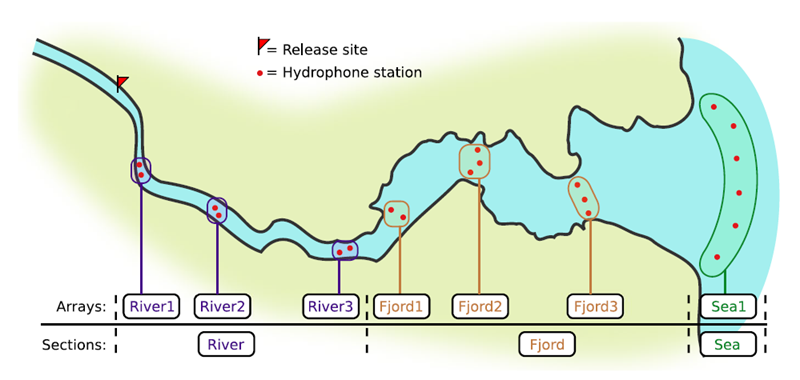

If you’re working in river systems, you’ve probably got a sense of which receivers form arrays. There is a larger-order grouping you can make called ‘sections’, and this will be something we can inter-compare our results with.
Preparing to use actel
With our receiver, tag, and detection data mapped to actel’s formats, and after creating our receiver groups and graphing out how detected animals may move between them, we can leverage actel’s analyses for our own datasets. Thanks to some efforts on the part of Hugo and of the glatos development team, we can move fairly easily with our glatos data into actel.
actel’s standard suite of analyses are grouped into three main functions - explore(), migration(), and residency(). As we will see in this and the next modules, these functions specialize in terms of their outputs but accept the same input data and arguments.
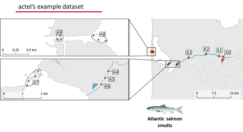
The first thing we will do is use actel’s built-in dataset to ensure we’ve got a working environment, and also to see what sorts of default analysis output Actel can give us.
Exploring
library("actel")

# The first thing you want to do when you try out a package is...
# explore the documentation!

# See the package level documentation:
?actel

# See the manual:
browseVignettes("actel")

# Get the citation for actel, and access the paper:
citation("actel")

# Finally, every function in actel contains detailed documentation
# of the function's purpose and parameters. You can access this
# documentation by typing a question mark before the function name.
# e.g.: ?explore
Working with actel’s example dataset
# Start by checking where your working directory is (it is always good to know this)
getwd()

# We will then deploy actel's example files into a new folder, called "actel_example".
# exampleWorkspace() will provide you with some information about how to run the example analysis.
exampleWorkspace("actel_example")

# Side note: When preparing your own data, you can create the initial template files
# with the function createWorkspace("directory_name")

# Take a minute to explore this folder's contents.

# -----------------------
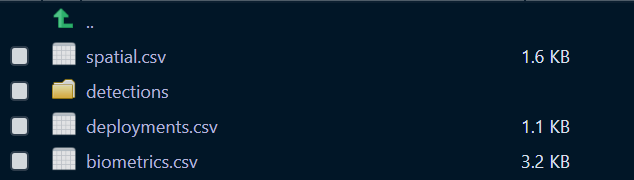
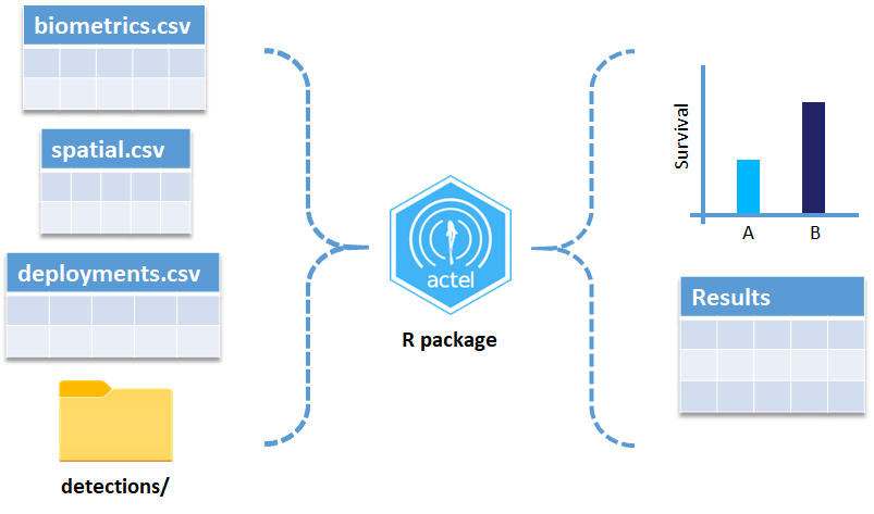
These are the files the Actel package depends on to create its output plots and result summary files.
biometrics.csv contains the detailed information on your tagged animals, where they were released and when, what the tag code is for that animal, and a grouping variable for you to set. Additional columns can be part of biometrics.csv but these are the minimum requirements. The names of our release sites must match up to a place in our spatial.csv file, where you release the animal has a bearing on how it will begin to interact with your study area.
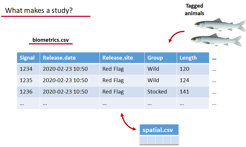
deployments.csv concerns your receiver deployments, when and where each receiver by serial number was deployed. Here again you can have more than the required columns but you have to have a column that corresponds to the station’s ‘name’, which will have a paired entry in the spatial.csv file as well, and a start and end time for the deployment.
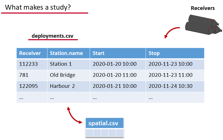
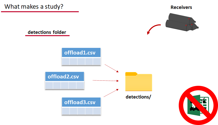
Finally, we have to have some number of detection files. This is helpfully a folder to make it easier on folks who don’t have aggregators like GLATOS and OTN to pull together all the detection information for their tags. While we could drop our detection data in here, when the time comes to use GLATOS data with actel we’ll see how we can create these data structures straight from the glatos data objects. Here also Hugo likes to warn people about opening their detection data files in Excel directly… Excel’s eaten a few date fields on all of us, I’m sure. We don’t have a hate-on for Excel or anything, like our beloved household pet, we’ve just had to learn there are certain places we just can’t bring it with us.
OK, now we have a biometrics file of our tag releases with names for each place we released our tags in spatial.csv, we have a deployments file of all our receiver deployments and the matching names in spatial.csv, and we’ve got our detections. These are the minimum components necessary for actel to go to work.
# move into the newly created folder
setwd('actel_example')

# Run analysis. Note: This will open an analysis report on your web browser.
exp.results <- explore(tz = 'Europe/Copenhagen', report = TRUE)

# Because this is an example dataset, this analysis will run very smoothly.
# Real data is not always this nice to us!

# ----------
# If your analysis failed while compiling the report, you can load
# the saved results back in using the dataToList() function:
exp.results <- dataToList("actel_explore_results.RData")

# If your analysis failed before you had a chance to save the results,
# load the pre-compiled results, so you can keep up with the workshop.
# Remember to change the path so R can find the RData file.
exp.results <- dataToList("pre-compiled_results.RData")
This example dataset is a salmon project working in a river-and-estuary system in northeastern Denmark. There are lots of clear logical separations in the array design and the general geography here that we will want to compare and deal with separately.
Exploring the output of explore()
# What is inside the output?
names(exp.results)

# What is inside the valid movements?
names(exp.results$valid.movements)

# let's have a look at the first one:
exp.results$valid.movements[["R64K-4451"]]

# and here are the respective valid detections:
exp.results$valid.detections[["R64K-4451"]]

# We can use these results to obtain our own plots (We will go into that later)
These files are the minimum requirements for the main analyses, but there are more files we can create that will give us more control over how actel sees our study area.
A good deal of checking occurs when you first run any analysis function against your data files, and actel is designed to step through any problems interactively with you and prompt you for the preferred resolutions. These interactions can be saved as plaintext in your R script if you want to remember your choices, or you can optionally clean up the input files directly and re-run the analysis function.
Checks that actel runs:
Actel will calculate the movement path for each individual animal, and determine whether that animal has met a threshhold for minimum detections and detection events, whether it snuck across arrays that should have detected it but didn’t, whether it reached unlikely speeds or crossed impassable areas
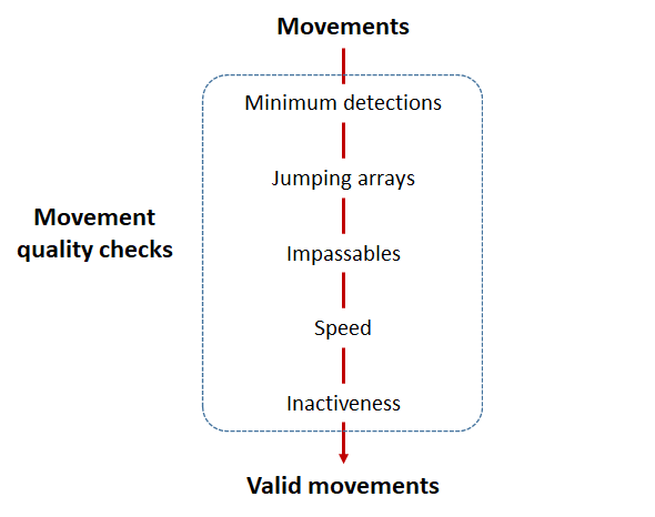
Minimum detections:
Controlled by the minimum.detections and max.interval arguments, if a tag has only 1 movement with less than n detections, discard the tag. Note that animals with movement events > 1 will pass this filter regardless of n.
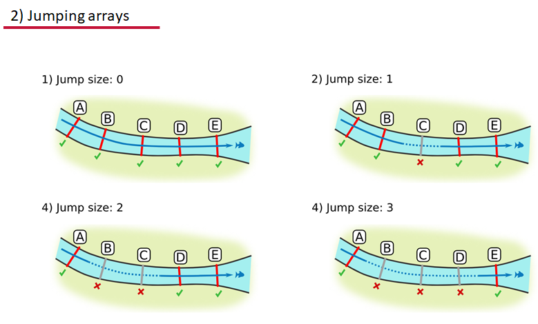
Jumping arrays:
In cases where you have gates of arrays designed to capture all movement up and down a linear system, you may want to verify that your tags have not ‘jumped’ past one or more arrays before being re-detected. You can use the jump.warning and jump.error arguments to explore() to set the number of acceptable jumps across your array system are permissible.
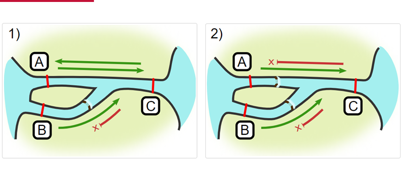
Impassables:
When we define how our areas are connected in the spatial.txt file, it tells actel which movements are -not- permitted explicitly, and can tell us about when those movements occur. This way, we can account for manmade obstacles or make other assumptions about one-way movement and verify our data against them.
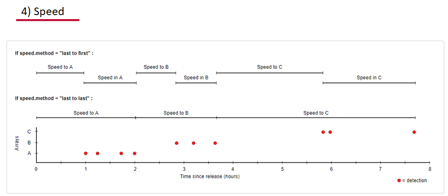
Speed:
actel can calculate the minimum speed of an animal between (and optionally within) detection events using the distances calculated from spatial.csv into a new distance matrix file, distances.csv, and we can supply speed.warning, speed.error, and speed.method to tailor our report to the speed and calculation method we want to submit our data to.
Inactivity:
With the inactive.warning and inactive.error arguments, we can flag entries that have spent a longer time than expected not transiting between locations.
Creating a spatial.txt file
Your study area might be simple and linear, may be complicated and open, completely interconnected. It is more likely a combination of the two! We can use DOT notation (commonly used in graphing applications like GraphViz and Gephi) to create a graph of our areas and how they are allowed to inter-mingle. actel can read this information as DOT notation using readDOT() or you can provide a spatial.txt with the DOT information already inline.
The question you must ask when creating spatial.txt files is: for each location, where could my animal move to and be detected next?
The DOT for the simple system on the left is:
A -- B -- C -- D -- E
And for the more complicated system on the right it’s
A -- B -- C -- D
A -- E -- D
A -- F -- G
B -- E -- F
B -- F
C -- E
Challenge : DOT notation
Using the DOT notation tutorial linked here, discover the notation for a one-way connection and write the DOT notations for the systems shown here:
Solution:
Left-hand diagram:
A -- B
A -- C
B -> C
Right-hand diagram:
A -- B
A -> C
B -> C
Generating an initial distance matrix file
A distance matrix tracks the distance between each pair of spatial data points in a dataframe. In actel, our dataframe is spatial.csv, and we can use this datafile as well as a shapefile describing our body or bodies of water, with the functions loadShape(), transitionLayer() and distancesMatrix() to generate a distance matrix for our study area.
Let’s use actel’s built-in functions to create a distance matrix file. The process generally will be:
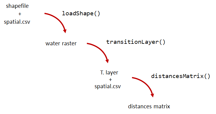
# Let's load the spatial file individually, so we can have a look at it.
spatial <- loadSpatial()
head(spatial)

# When doing the following steps, it is imperative that the coordinate reference
# system (CRS) of the shapefile and of the points in the spatial file are the same.
# In this case, the values in columns "x" and "y" are already in the right CRS.

# loadShape will rasterize the input shape, using the "size" argument as a reference
# for the pixel size. Note: The units of the "size" will be the same as the units
# of the shapefile projection (i.e. metres for metric projections, and degrees for latlong systems)
#
# In this case, we are using a metric system, so we are saying that we want the pixel
# size to be 10 metres.
#
# NOTE: Change the 'path' to the folder where you have the shape file.
# ^^^^^^^^^^^^^^^^^^^^^^^^^^^^^^^^^^^^^^^^^^^^^^^^^^^^^^^^^^^^^^^^^^^^
water <- loadShape(path = "replace/with/path/to/shapefile",
									 shape = "stora_shape_epsg32632.shp", size = 10,
									 coord.x = "x", coord.y = "y")

# The function above can run without the coord.x and coord.y arguments. However, by including them,
# you are allowing actel to load the spatial.csv file on the fly and check if the spatial points
# (i.e. hydrophone stations and release sites) are positioned in water. This is very important,
# as any point position on land will be cut off during distance calculations.

# Now we need to create a transition layer, which R will use to estimate the distances
tl <- transitionLayer(water)

# We are ready to try it out! distancesMatrix will automatically search for a "spatial.csv"
# file in the current directory, so remember to keep that file up to date!
dist.mat <- distancesMatrix(tl, coord.x = "x", coord.y = "y")

# have a look at it:
dist.mat
migration and residency
The migration() function runs the same checks as explore() and can be advantageous in cases where your animals can be assumed to be moving predictably.
The built-in vignettes (remember: browseVignettes("actel") for the interactive vignette) are the most comprehensive description of all that migration() offers over and above explore() but one good way might be to examine its output. For simple datasets and study areas like our example dataset, the arguments and extra spatial.txt and distances.csv aren’t necessary. Our mileage may vary.
# Let's go ahead and try running migration() on this dataset.
mig.results <- migration(tz = 'Europe/Copenhagen', report = TRUE)
the migration() function will ask us to invalidate some flagged data or leave it in the analysis, and then it will ask us to save a copy of the source data once we’ve cleared all the flags. Then we get to see the report. It will show us things like our study locations and their graph relationship:

… a breakdown of the biometrics variables it finds in biometrics.csv
… and a temporal analysis of when animals arrived at each of the array sections of the study area.
To save our choices in actel’s interactives, let’s include them as raw text in our R block. We’ll test this by calling residency() with a few pre-recorded choices, as below:
# Try copy-pasting the next five lines as a block and run it all at once.
res.results <- residency(tz = 'Europe/Copenhagen', report = TRUE)
comment
This is a lovely fish
n
y
# R will know to answer each of the questions that pop up during the analysis
# with the lines you copy-pasted together with your code!

# explore the reports to see what's new!

# Note: There is a known bug in residency() as of actel 1.2.0, which for some datasets
# will cause a crash with the following error message:
#
# Error in tableInteraction(moves = secmoves, tag = tag, trigger = the.warning,  :
#  argument "save.tables.locally" is missing, with no default
#
# This has already been corrected and a fix has been released in actel 1.2.1.
Further exploration of actel: Transforming the results
# Review more available features of Actel in the manual pages!
vignette("f-0_post_functions", "actel")
Key Points
Preparing ACT Data for actel
Overview
Teaching: 30 min
Exercises: 0 minQuestions
How do I take my ACT detection extracts and metadata and format them for use in
actel?Objectives
Preparing our data to use in Actel
So now, as the last piece of stock curriculum for this workshop, let’s quickly look at how we can take the data reports we get from the ACT-MATOS (or any other OTN-compatible data partner, like FACT, or OTN proper) and make it ready for Actel.
# Using ACT-style data in Actel ####

library(actel)
library(stringr)
library(glatos)
library(tidyverse)
library(readxl)
Within actel there is a preload() function for folks who are holding their deployment, tagging, and detection data in R variables already instead of the files and folders we saw in the actel intro. This function expects 4 input objects, plus the ‘spatial’ data object that will help us describe the locations of our receivers and how the animals are allowed to move between them.
To achieve the minimum required data for actel’s ingestion, we’ll want deployment and recovery datetimes, instrument models, etc. We can transform our metadata’s standard format into the standard format and naming schemes expected by actel::preload() with a bit of dplyr magic:
# Load the ACT metadata and detection extracts -------------
# set working directory to the data folder for this workshop
setwd("YOUR/PATH/TO/data/act")

# Our project's detections file - I'll use readr to read everything from proj59 in at once:

proj_dets <- list.files(pattern="proj59_matched_detections*") %>%
  map_df(~readr::read_csv(.))
# note: readr::read_csv will read in csvs inside zip files no problem.

# read in the tag metadata:

tag_metadata <- readxl::read_excel('Tag_Metadata/Proj59_Metadata_bluecatfish.xls',
                                   sheet='Tag Metadata', # use the Tag Metadata sheet from this excel file
                                   skip=4) # skip the first 4 lines as they're 'preamble'


# And we can import first a subset of the deployments in MATOS that were deemed OK to publish
deploy_metadata <- read_csv('act_matos_moorings_receivers_202104130939.csv') %>%
  # Add a very quick and dirty receiver group column.
  mutate(rcvrgroup = ifelse(collectioncode %in% c('PROJ60', 'PROJ61'), # if we're talking PROJ61
                            paste0(collectioncode,station_name), #let my receiver group be the station name
                            collectioncode)) # for other project receivers just make it their whole project code.

# Also tried to figure out if there was a pattern to station naming that we could take advantage of
# but nothing obvious materialized.
# mutate(rcvrgroup = paste(collectioncode, stringr::str_replace_all(station_name, "[:digit:]", ""), sep='_'))

# Let's review the groups quickly to see if we under or over-shot what our receiver groups should be.
# nb. hiding the legend because there are too many categories.

deploy_metadata %>% ggplot(aes(deploy_lat, deploy_long, colour=rcvrgroup)) +
  geom_point() +
  theme(legend.position="none")

# Maybe this is a bit of an overshoot, but it should work out. proj61 has receivers all over the place,
# so our spatial analysis is not going to be very accurate.


# And let's look at what the other projects were that detected us.
proj_dets %>% count(detectedby)

# And how many of our tags are getting detections back:
proj_dets %>% filter(receiver != 'release') %>% count(tagname)

# OK most of those who have more than an isolated detection are in our deploy metadata.
# just one OTN project to add.

# For OTN projects, we would be able to add in any deployments of OTN receivers from the OTN GeoServer:

# if we wanted to grab and add V2LGMXSNAP receivers to our deployment metadata
# using OTN's public station history records on GeoServer:
# otn_geoserver_stations_url = 'https://members.oceantrack.org/geoserver/otn/ows?service=WFS&version=1.0.0&request=GetFeature&typeName=otn:stations_receivers&outputFormat=csv&cql_filter=collectioncode=%27V2LGMXSNAP%27'
## TODO: Actel needs serial numbers for receivers, so OTN
#  will add serial numbers to this layer, and then we can just
#  urlencode the CQL-query for which projects you want,
#  so you can write your list in 'plaintext' and embed it in the url

# For today, we've made an extract for V2LGMXSNAP and included it in the data folder:
otn_deploy_metadata <- readr::read_csv('otn_moorings_receivers_202104130938.csv') %>%
  mutate(rcvrgroup = collectioncode)

# Tack OTN stations to the end of the MATOS extract.
# These are in the exact same format because OTN and MATOS's databases are the
# same format, so we can easily coordinate our output formats.
all_stations <- bind_rows(deploy_metadata, otn_deploy_metadata)

# For ACT/FACT projects - we could use GeoServer to share this information, and could even add
# an authentication layer to let ACT members do this same trick to fetch deploy histories!

# So now this is our animal tagging metadata
# tag_metadata %>% View

# these are our detections:

# proj_dets %>% View

# These are our deployments:

# all_stations %>% View

# Mutate metadata into Actel format ----

# Create a station entry from the projectcode and station number.
# --- add station to receiver metadata ----
full_receiver_meta <- all_stations %>%
  dplyr::mutate(
    station = paste(collectioncode, station_name, sep = '-')
  ) %>%
  filter(is.na(rcvrstatus)|rcvrstatus != 'lost')
We’ve now imported our data, and renamed a few columns from the receiver metadata sheet so that they are in a nicer format. We also create a few helper columns, like a ‘station’ column that is of the form collectioncode + station_name, guaranteed unique for any project across the entire Network.
Formatting - Tagging and Deployment Data
As we saw earlier, tagging metadata is entered into Actel as biometrics, and deployment metadata as deployments. These data structures also require a few specially named columns, and a properly formatted date.
# All dates will be supplied to Actel in this format:
actel_datefmt = '%Y-%m-%d %H:%M:%S'

# biometrics is the tag metadata. If you have a tag metadata sheet, it looks like this:

actel_biometrics <- tag_metadata %>% dplyr::mutate(Release.date = format(UTC_RELEASE_DATE_TIME, actel_datefmt),
                                                   Signal=as.integer(TAG_ID_CODE),
                                                   Release.site = RELEASE_LOCATION,
                                                   # Group=RELEASE_LOCATION  # can supply group to subdivide tagging groups
)


# deployments is based in the receiver deployment metadata sheet

actel_deployments <- full_receiver_meta %>% dplyr::filter(!is.na(recovery_date)) %>%
  mutate(Station.name = station,
         Start = format(deploy_date, actel_datefmt), # no time data for these deployments
         Stop = format(recovery_date, actel_datefmt),  # not uncommon for this region
         Receiver = rcvrserial) %>%
  arrange(Receiver, Start)
Detections
For detections, a few columns need to exist: Transmitter holds the full transmitter ID. Receiver holds the receiver serial number, Timestamp has the detection times, and we use a couple of Actel functions to split CodeSpace and Signal from the full transmitter_id.
# Renaming some columns in the Detection extract files
actel_dets <- proj_dets %>% dplyr::filter(receiver != 'release') %>%
  dplyr::mutate(Transmitter = tagname,
                Receiver = as.integer(receiver),
                Timestamp = format(datecollected, actel_datefmt),
                CodeSpace = extractCodeSpaces(tagname),
                Signal = extractSignals(tagname),
                Sensor.Value = sensorvalue,
                Sensor.Unit = sensorunit)
Note: we don’t have any environmental data in our detection extract here, but Actel will also find and plot temperature or other sensor values if you have those kinds of tags.
Creating the Spatial dataframe
The spatial dataframe must have entries for all release locations and all receiver deployment locations. Basically, it must have an entry for every distinct location we can say we know an animal has been.
# Prepare and style entries for receivers
actel_receivers <- full_receiver_meta %>% dplyr::mutate( Station.name = station,
                                                         Latitude = deploy_lat,
                                                         Longitude = deploy_long,
                                                         Type='Hydrophone') %>%
  dplyr::mutate(Array=rcvrgroup) %>%    # Having too many distinct arrays breaks things.
  dplyr::select(Station.name, Latitude, Longitude, Array, Type) %>%
  distinct(Station.name, Latitude, Longitude, Array, Type)

# Actel Tag Releases ---------------

# Prepare and style entries for tag releases
actel_tag_releases <- tag_metadata %>% mutate(Station.name = RELEASE_LOCATION,
                                              Latitude = RELEASE_LATITUDE,
                                              Longitude = RELEASE_LONGITUDE,
                                              Type='Release') %>%
  # It's helpful to associate release locations with their nearest Array.
  # Could set all release locations to the same Array:
  #  mutate(Array = 'PROJ61JUGNO_2A') %>% # Set this to the closest array to your release locations
  # if this is different for multiple release groups, can do things like this to subset case-by-case:
  # here Station.name is the release location 'station' name, and the value after ~ will be assigned to all.
  mutate(Array = case_when(Station.name %in% c('Red Banks', 'Eldorado', 'Williamsburg') ~ 'PROJ61UTEAST',
                           Station.name == 'Woodrow Wilson Bridge' ~ 'PROJ56',
                           Station.name == 'Adjacent to Lyons Creek' ~ 'PROJ61JUGNO_5',
                           Station.name == 'Merkle Wildlife Sanctuary' ~ 'PROJ61JUGNO_2A',
                           Station.name == 'Nottingham' ~ 'PROJ61NOTTIN',
                           Station.name == 'Sneaking Point' ~ 'PROJ61MAGRUD',
                           Station.name == 'Jug Bay Dock' ~ 'PROJ61JUGDCK')) %>% # This value needs to be the nearest array to the release site
  distinct(Station.name, Latitude, Longitude, Array, Type)

# Combine Releases and Receivers ------

# Bind the releases and the deployments together for the unique set of spatial locations
actel_spatial <- actel_receivers %>% bind_rows(actel_tag_releases)
Now, for longer data series, we may have similar stations that were deployed and redeployed at very slightly different locations. One way to deal with this issue is that for stations that are named the same, we assign an average location in spatial.
Another way we might overcome this issue could be to increment station_names that are repeated and provide their distinct locations.
# group by station name and take the mean lat and lon of each station deployment history.
actel_spatial_sum <- actel_spatial %>% dplyr::group_by(Station.name, Type) %>%
  dplyr::summarize(Latitude = mean(Latitude),
                   Longitude = mean(Longitude),
                   Array =  first(Array))
Creating the Actel data object w/ preload()
Now you have everything you need to call preload().
# Specify the timezone that your timestamps are in.
# OTN provides them in UTC/GMT.
# FACT has both UTC/GMT and Eastern
# GLATOS provides them in UTC/GMT
# If you got the detections from someone else,
#    they will have to tell you what TZ they're in!
#    and you will have to convert them before importing to Actel!

tz <- "GMT0"

# You've collected every piece of data and metadata and formatted it properly.
# Now you can create the Actel project object.

actel_project <- preload(biometrics = actel_biometrics,
                         spatial = actel_spatial_sum,
                         deployments = actel_deployments,
                         detections = actel_dets,
                         tz = tz)
# Alas, we're going to have to discard a bunch of detections here,
# as our subsetted demo data doesn't have deployment metadat for certain
# receivers / time periods and is missing some station deployments

e # discard all detections at unknown receivers - this is almost never
# what you want to do in practice. Ask for missing metadata before
# resorting to this one
There will very likely be some issues with the data that the Actel checkers find and warn us about. Detections outside the deployment time bounds, receivers that aren’t in your metadata. For the purposes of today, we will drop those rows from the final copy of the data, but you can take these prompts as cues to verify your input metadata is accurate and complete. It is up to you in the end to determine whether there is a problem with the data, or an overzealous check that you can safely ignore. Here our demo is using a very deeply subsetted version of one project’s data, and it’s not surprising to be missing some deployments.
Once you have an Actel object, you can run explore() to generate your project’s summary reports:
# actel::explore()

actel_explore_output <- explore(datapack=actel_project,
                                report=TRUE, GUI='never',
                                print.releases=FALSE)

n  # don't render any movements invalid - repeat for each tag, because:
# we haven't told Actel anything about which arrays connect to which
# so it's not able to properly determine which movements are valid/invalid

n  # don't save a copy of the results to a RData object... this time.

# Review the output .html file that has popped up in a browser.
# Our analysis might not make a lot of sense, since...
# actel assumed our study area was linear, we didn't tell it otherwise!
Review the file that Actel pops up in our browser. It presumed our Arrays were arranged linearly and alphabetically, which is of course not correct!
Custom spatial.txt files for Actel
We’ll have to tell Actel how our arrays are inter-connected. To do this, we’ll need to design a spatial.txt file for our detection data.
To help with this, we can go back and visualize our study area interactively, and start to see how the Arrays are connected.
# Designing a spatial.txt file -----

library(mapview)
library(spdplyr)
library(leaflet)
library(leafpop)


## Exploration - Let's use mapview, since we're going to want to move around,
#   drill in and look at our stations


# Get a list of spatial objects to plot from actel_spatial_sum:
our_receivers <- as.data.frame(actel_spatial_sum) %>%
  dplyr::filter(Array %in% (actel_spatial_sum %>%   # only look at the arrays already in our spatial file
                              distinct(Array))$Array)

rcvr_spatial <- our_receivers %>%
  dplyr::select(Longitude, Latitude) %>%           # and get a SpatialPoints object to pass to mapview
  sp::SpatialPoints(CRS('+proj=longlat'))
# and plot it using mapview. The popupTable() function lets us customize our tooltip
mapview(rcvr_spatial, popup = popupTable(our_receivers,
                                         zcol = c("Array",
                                                  "Station.name")))  # and make a tooltip we can explore
Can we design a graph and write it into spatial.txt that fits all these Arrays together? The station value we put in Array for our PROJ61 and PROJ60 projects looks to be a bit too granular for our purposes. Maybe we can combine many arrays that are co-located in open water into a singular ‘zone’, preserving the complexity of the river systems but creating a large basin to which we can connect the furthest downstream of those river arrays.
To do this, we only need to update the arrays in our spatial.csv file or actel_spatial dataframe. We don’t need to edit our source metadata! We will have to define a spatial.txt file and how these newly defined Arrays interconnect. While there won’t be time to do that for this example dataset and its large and very complicated region, this approach is definitely suitable for small river systems and even perhaps for multiple river systems feeding a bay and onward to the open water.
Custom Spatial Networks
Let’s get started designing a spatial.txt file for our detection data!
First we will visualize our study area, with a popup that tells us what project each deployment belongs to.
library(ggplot2)
library(ggmap)
library(plotly)

# Subset our study area so we're not dealing with too much stuff.

# Where were we detected, excluding Canada and the GoM:
actel_dets <- actel_dets %>% filter(!detectedby %in% c('OTN.V2LGMXSNAP', 'OTN.V2LSTANI', 'OTN.V2LSTADC'))

bbox.minlat <- min(actel_dets$latitude) - 0.5
bbox.maxlat <- max(actel_dets$latitude) + 0.5
bbox.minlong <- min(actel_dets$longitude) - 0.5
bbox.maxlong <- max(actel_dets$longitude) + 1.5

actel_deployments <- actel_deployments %>% filter(between(deploy_lat, bbox.minlat, bbox.maxlat) &
                                                    between(deploy_long, bbox.minlong, bbox.maxlong))

actel_receivers <- actel_receivers %>% filter(Station.name %in% actel_deployments$Station.name)

# biometrics? maybe don't have to?

actel_spatial_sum <- actel_spatial_sum %>% filter(Station.name %in% actel_deployments$Station.name)

base <- get_stamenmap(
  bbox = c(left = min(actel_deployments$deploy_long),
           bottom = min(actel_deployments$deploy_lat),
           right = max(actel_deployments$deploy_long),
           top = max(actel_deployments$deploy_lat)),
  maptype = "toner",
  crop = FALSE,
  zoom = 12)


proj59_zoomed_map <- ggmap(base, extent='panel') +
                      ylab("Latitude") +
                      xlab("Longitude") +
                      geom_point(data = actel_spatial_sum,
                        aes(x = Longitude,y = Latitude, colour = Station.name),
                        shape = 19, size = 2)
ggplotly(proj59_zoomed_map)
Now we can see all the arrays in our region, and can begin to imagine how they are all connected. Can we design a spatial.txt file that fits our study area using ‘collectioncode’ as our Array?
Not really, no. Too complicated, too many interconnected arrays! Let’s define most of our projects as “outside”, that is, outside our estuary/river system, not really subject to being interconnected.
# projects in relatively 'open' water:
outside_arrays <- c('PROJ56',
                    'PROJ61CORNHB', 'PROJ61POCOMO',
                    'PROJ61LTEAST', 'PROJ61LTWEST')

# Within the Chesapeake area:
# Piney Point's a gate array
piney_point <-c('PROJ60PINEY POINT A', 'PROJ60PINEY POINT B',
                'PROJ60PINEY POINT C', 'PROJ60PINEY POINT D')

# the RTE 301 receivers are a group.
rte_301 <- c('PROJ60RT 301 A', 'PROJ60RT 301 B')

cedar_point <- c('PROJ60CEDAR POINT A', 'PROJ60CEDAR POINT B',
                 'PROJ60CEDAR POINT C', 'PROJ60CEDAR POINT D',
                 'PROJ60CEDAR POINT E')

ccb_kent <- c('PROJ60CCB1', 'PROJ60CCB2', 'PROJ60CCB3', 'PROJ60CCB4',
              'PROJ60KENT ISLAND A', 'PROJ60KENT ISLAND B',
              'PROJ60KENT ISLAND C', 'PROJ60KENT ISLAND D')

bear_cr <- c('PROJ61BEARCR', 'PROJ61BEARCR2')

# Single receivers inside the Chesapeake:
ches_rcvrs <- c('PROJ61COOKPT','PROJ61NELSON','PROJ61CASHAV',
                'PROJ61TPTSH','PROJ61SAUNDR', 'PROJ61DAVETR')

rhode_r <- c('PROJ61WESTM', 'PROJ61RHODEM', 'PROJ61RMOUTH')
Now we can update actel_spatial_sum to reflect the inter-connectivity of the Chesapeake arrays.
actel_spatial <- actel_receivers %>% bind_rows(actel_tag_releases)
To improve our plots we can summarize and take mean locations for stations
# group by station name and take the mean lat and lon of each station deployment history.
actel_spatial_sum <- actel_spatial %>% dplyr::group_by(Station.name, Type) %>%
  dplyr::summarize(Latitude = mean(Latitude),
                   Longitude = mean(Longitude),
                   Array =  first(Array))

actel_spatial_sum_grouped <- actel_spatial_sum %>%
  dplyr::mutate(Array = if_else(Array %in% outside_arrays, 'Outside', #if any of the above, make it 'Huron'
                                Array)) %>% # else leave it as its current value
#  dplyr::mutate(Array = if_else(Array %in% wilmington, 'Wilmington', Array)) %>%
  dplyr::mutate(Array = if_else(Array %in% ches_rcvrs, 'InnerChesapeake', Array)) %>%
  dplyr::mutate(Array = if_else(Array %in% piney_point, 'PROJ60PineyPoint', Array)) %>%
  dplyr::mutate(Array = if_else(Array %in% rte_301, 'PROJ60RTE301', Array)) %>%
  dplyr::mutate(Array = if_else(Array %in% rhode_r, 'PROJ61RHODER', Array)) %>%
  dplyr::mutate(Array = if_else(Array %in% cedar_point, 'PROJ60CEDARPOINT', Array)) %>%
  dplyr::mutate(Array = if_else(Array %in% ccb_kent, 'CCBKENT', Array)) %>%
  dplyr::mutate(Array = if_else(Array %in% bear_cr, 'PROJ60BEARCR', Array)) %>%
  dplyr::mutate(Array = if_else(Station.name %in% c('PROJ56-UP', 'Woodrow Wilson Bridge'),'PROJ56-UP', Array)) %>% # one tricky receiver?
  dplyr::mutate(Array = if_else(Station.name == 'PROJ56-SN', 'PROJ56-SN', Array)) %>%
  dplyr::mutate(Array = if_else(Station.name == 'PROJ56-GR', 'PROJ56-GR', Array)) %>%
#  dplyr::mutate(Array = if_else(Array == 'PROJ60CD WEST LL 9200', 'PROJ60CDWESTLL9200', Array)) %>%
  dplyr::mutate(Array = if_else(Array == 'PROJ60CBL PIER', 'PROJ60CBLPIER', Array))# two tricky receivers?
# Notice we haven't changed any of our data or metadata, just the spatial table
Now let’s remake our map, see if the connectivity is better denoted.
# Head back into the map, and denote the connectivity between our receiver groups:

proj59_arrays_map <- ggmap(base, extent='panel') +
  ylab("Latitude") +
  xlab("Longitude") +
  geom_point(data = actel_spatial_sum_grouped,
             aes(x = Longitude,y = Latitude, colour = Array),
             shape = 19, size = 2) +
  geom_point(data = actel_tag_releases, aes(x=Longitude, y=Latitude, colour=Station.name),
             shape = 10, size = 5)

ggplotly(proj59_arrays_map)
At this stage you would create and curate your spatial.txt file. This example shows how complicated they can get in large systems where all receivers arrays interact!
spatial_txt_dot = 'act_spatial.txt'

# How many unique spatial Arrays do we still have, now that we've combined
# so many?

actel_spatial_sum_grouped %>% dplyr::group_by(Array) %>% dplyr::select(Array) %>% unique()
For a grand finale, let’s try analyzing this dataset with our reduced spatial complexity compared to previous runs.
# actel::preload() with custom spatial.txt ----

actel_project <- preload(biometrics = actel_biometrics,
                         spatial = actel_spatial_sum_grouped,
                         deployments = actel_deployments,
                         detections = actel_dets,
                         dot = readLines(spatial_txt_dot),
                         tz = tz)


# Now actel understands the connectivity between our arrays better!
# actel::explore() with custom spatial.txt

actel_explore_output_chesapeake <- explore(datapack=actel_project, report=TRUE, print.releases=FALSE)

# We no longer get the error about detections jumping across arrays!
# and we don't need to save the report
n
If you haven’t been able to follow along, this report is included in the data/act/ folder you have cloned from the workshop repository (called actel_explore_report_chesapeake.html) so you can check it out!
Key Points
Basic Animation
Overview
Teaching: 20 min
Exercises: 0 minQuestions
How do I set up my data extract for animation?
How do I animate my animal movements?
Objectives
Static plots are excellent tools and are appropriate a lot of the time, but there are instances where something extra is needed to demonstrate your interesting fish movements: This is where plotting animated tracks can be a useful tool. In this lesson we will explore how to take data from your OTN-style detection extract documents and animate the journey of one fish between stations.
Getting our Packages
If not done already, we will first need to ensure we have all the required packages activated in our R session.
library(glatos)
library(sf)
library(mapview)
library(plotly)
library(gganimate)
library(ggmap)
library(tidyverse)
Preparing our Dataset
Before we can animate, we need to do some preprocessing on our dataset. For this animation we will be using detection events (a format we learned about in the glatos lessons) so we will need to first create that variable. To do this, we will read in our data using the read_otn_detections function from glatos and check for false detections with the false_detections function.
For the purposes of this lesson we will assume that any detection that did not pass the filter is a false detection, and will filter them out using filter(passed_filter != FALSE). It is important to note that for real data you will need to look over these detections to be sure they are truly false.
Finally, we use the detection_events function with station as the location_col argument to get our detection events.
detection_events <- #create detections event variable
  read_otn_detections('proj58_matched_detections_2016.csv') %>% # reading detections
  false_detections(tf = 3600) %>%  #find false detections
  filter(passed_filter != FALSE) %>%
  detection_events(location_col = 'station', time_sep=3600)
There is extra information in detection_events (such as the number of detections per event and the residence time in seconds) that can make some interesting plots, but for our visualization we only need the animal_id, mean_longitude, mean_latitude, and first_detection columns. So we will use the dplyr select function to create a dataframe with just those columns.
plot_data <- detection_events %>%
  dplyr::select(animal_id, mean_longitude,mean_latitude, first_detection)
Additionally, animating many animal tracks can be computationally intensive as well as create a potentially confusing plot, so for this lesson we will only be plotting one fish. We well subset our data by filtering where the animal_id is equal to PROJ58-1218508-2015-10-13.
one_fish <- plot_data[plot_data$animal_id == "PROJ58-1218508-2015-10-13",]
Preparing a Static Plot
Now that we have our data we can begin to create our plot. We will start with creating a static plot and then once happy with that, we will animate it.
The first thing we will do for our plot is download the basemap, this will be the background to our plot. To do this we will use the get_stamenmap function from ggmap. This function gets a Stamen Map based off a bounding box that we provide. To create the bounding box we will pass a vector of four values to the argument bbox ; those four values represent the left, bottom, right, and top boundaries of the map.
To determine which values are needed we will use the min and max function on the mean_longitude and mean_latitude columns of our one_fish variable. min(one_fish$mean_longitude) will be our left-most bound, min(one_fish$mean_latitude) will be our bottom bound, max(one_fish$mean_longitude) will be our right-most bound, and max(one_fish$mean_latitude) will be our top bound. This gives most of what we need for our basemap but we can further customize our plot with maptype which will change what type of map we use, crop which will crop raw map tiles to the specified bounding box, and zoom which will adjust the zoom level of the map.
A note on maptype
The different values you can put for maptype: “terrain”, “terrain-background”, “terrain-labels”, “terrain-lines”, “toner”, “toner-2010”, “toner-2011”, “toner-background”, “toner-hybrid”, “toner-labels”, “toner-lines”, “toner-lite”, “watercolor”
basemap <-
  get_stamenmap(
    bbox = c(left = min(one_fish$mean_longitude),
             bottom = min(one_fish$mean_latitude),
             right = max(one_fish$mean_longitude),
             top = max(one_fish$mean_latitude)),
    maptype = "toner-lite",
    crop = FALSE,
    zoom = 8)

ggmap(basemap)
Now that we have our basemap ready we can create our static plot. We will store our plot in a variable called act.plot so we can access it later on.
To start our plot we will call the ggmap function and pass it our basemap as an argument. To make our detection locations we will then call geom_point, supplying one_fish as the data argument and for the aesthetic will make the x argument equal to mean_longitude and the y argument will be mean_latitude.
We will then call geom_path to connect those detections supplying one_fish as the data argument and for the aesthetic x will again be mean_longitude and y will be mean_latitude.
Lastly, we will use the labs function to add context to our plot such as adding a title, a label for the x axis, and a label for the y axis. We are then ready to view our graph by calling ggplotly with act.plot as the argument!
act.plot <-
  ggmap(base) +
  geom_point(data = one_fish2, aes(x = mean_longitude, y = mean_latitude, group = animal_id, color = animal_id), size = 2) +
  geom_path(data = one_fish2, aes(x = mean_longitude, y = mean_latitude, group = animal_id, color = animal_id)) +
  labs(title = "ACT animation",
       x = "Longitude", y = "Latitude", color = "Tag ID")

ggplotly(act.plot)
Animating our Static Plot
Once we have a static plot we are happy with we are ready for the final step of animating it! We will use the gganimate package for this, since it integrates nicely with ggmap.
To animate our plot we update our act.plot variable by using it as our base, then add a label for the dates to go along with the animation. We then call transition_reveal, which is a function from gganimate that determines how to create the transitions for the animations. There are many transitions you can use for animations with gganimate but transition_reveal will calculate intermediary values between time observations. For our plot we will pass transition_reveal the first_detection information. We will finally use the functions shadow_mark with the arguments of past equal to TRUE and future equal to FALSE. This makes the animation continually show the previous data (a track) but not the future data yet to be seen (allowing it to be revealed as the animation progresses).
Finally, to see our new animation we call the animate function with act.plot as the argument.
act.plot <-
  act.plot +
  labs(subtitle = 'Date: {format(frame_along, "%d %b %Y")}') +
  transition_reveal(first_detection) +
  shadow_mark(past = TRUE, future = FALSE)

animate(act.plot)
Key Points
Animation with pathroutr
Overview
Teaching: 20 min
Exercises: 0 minQuestions
How can I create animal movement plots that avoid land?
Objectives
Basic animations using gganimate are great for many purposes but you will soon run into issues where your fish tracks are moving across land barriers, especially in more complex environments. This is because the geom used in the previous lesson choose the most direct path between two detection points. To avoid this we need to use a specific land avoidance tool. For our next animation we will use the pathroutr package which you can find out more about here.
We will begin in much the same way we did for our basic animation lesson with getting our data ready, but things will differ when we start to use pathroutr since there are specific data formats expected.
Preparing our Data
Just as in the basic animations lesson, we will only look at one fish. We will also filter down the data and only look at 5 detection events as an example subset due to the computational intensity of pathroutr and its calculations.
library(glatos)
library(sf)
library(gganimate)
library(tidyverse)
library(pathroutr)
library(ggspatial)
library(sp)
library(raster)

detection_events <- #create detections event variable
  read_otn_detections('proj58_matched_detections_2016.csv') %>% # reading detections
  false_detections(tf = 3600) %>%  #find false detections
  filter(passed_filter != FALSE) %>%
  detection_events(location_col = 'station', time_sep=3600)

plot_data <- detection_events %>%
  dplyr::select(animal_id, mean_longitude,mean_latitude, first_detection)

one_fish <- plot_data[plot_data$animal_id == "PROJ58-1218518-2015-09-16",]

one_fish <- one_fish %>% filter(mean_latitude < 38.90 & mean_latitude > 38.87) %>%
  slice(155:160)
Getting our Shapefile
The first big difference between our basic animation lesson and this lesson is that we will need a shapefile of the study area, so pathroutr can determine where the landmasses are located. To do this we will use the getData function from the raster library which gets geographic data for anywhere in the world. The first argument we will pass to getData is the name of the dataset we want to use, for our visualization we will use GADM. When you use GADM with getData you need to provide a country argument, which is specified by a country’s 3 letter ISO code. In our case we will pass USA. Last, we pass an argument for level, this is how much we would like the data to be subdivided. Since we are only interested in a portion of the country we will pass level the value of 1 which means that the data will be divided by states. When we run this code we will get back a SpatialPolygonsDataFrame with the shapefiles for the US states.
USA<-getData('GADM', country='USA', level=1)
Since we only need one state we will have to filter out the states we don’t need. We can do this by filtering the data frame using the same filtering methods we have explored in previous lessons.
shape_file <- USA[USA$NAME_1 == 'Maryland',]
This shapefile is a great start, but we need the format to be an sf multipolygon. To do that we will run the st_as_sf function on our shapefile. We also want to change the coordinate reference system (CRS) of the file to a projected coordinate system since we will be mapping this plot flat. To do that we will run st_transform and provide it the value 5070.
md_polygon <- st_as_sf(single_poly) %>% st_transform(5070)
Formatting our Dataset
We will also need to make some changes to our detection data as well, in order to work with pathroutr. To start we will need to turn the path of our fish movements into a SpatialPoints format. To do that we will get the deploy_long and deploy_lat with dplyr::select and add them to a variable called path.
Using the SpatialPoints function we will pass our new path variable and CRS("+proj=longlat +datum=WGS84 +no_defs") for the proj4string argument. Just like for our shapefile we will need to turn our path into an sf object by using the st_as_sf function and change the CRS to a projected coordinate system because we will be mapping it flat.
path <- one_fish %>%  dplyr::select(mean_longitude,mean_latitude)

path <- SpatialPoints(path, proj4string = CRS("+proj=longlat +datum=WGS84 +no_defs"))

path <-  st_as_sf(path)  %>% st_transform(5070)
We can do a quick plot to just check how things look at this stage and see if they are as expected.
ggplot() +
  ggspatial::annotation_spatial(md_polygon, fill = "cornsilk3", size = 0) +
  geom_point(data = path, aes(x=unlist(map(geometry,1)), y=unlist(map(geometry,2)))) +
  geom_path(data = path, aes(x=unlist(map(geometry,1)), y=unlist(map(geometry,2))))  +
  theme_void()
Using pathroutr
Now that we have everything we need we can begin to use pathroutr. First, we will turn our path points into a linestring - this way we can use st_sample to sample points on our path.
plot_path <- path %>% summarise(do_union = FALSE) %>% st_cast('LINESTRING')

track_pts <- st_sample(plot_path, size = 10000, type = "regular")
The first pathroutr function we will use is prt_visgraph. This creates a visibility graph that connects all of the vertices for our shapefile with a Delaunay triangle mesh and removes any edges that cross land. You could think of this part as creating the viable routes an animal could swim through (marking the “water” as viable).
vis_graph <- prt_visgraph(md_polygon, buffer = 150)
To reroute our paths around the landmasses we will call the prt_reroute function. Passing track_pts, md_polygon, and vis_graph as arguments. To have a fully updated path we can run the prt_update_points function, passing our new path track_pts_fix with our old path track_pts.
track_pts_fix <- prt_reroute(track_pts, land_barrier, vis_graph, blend = TRUE)

track_pts_fix <- prt_update_points(track_pts_fix, track_pts)
Now with our newly fixed path we can visualize it and see how it looks. We can also use this plot as the base plot for our animation.
For geom_point and geom_path we will pass in track_pts_fix for the data argument, but we will need to get a little creative for the x and y arguments in the aesthetic. track_pts_fix is a list of points so we will need a way to subset just the x and y values in order to supply them to the aesthetic. We will do this using map(geometry,1) to get a list of the values, and then unlist to turn that into a vector.
pathroutrplot <- ggplot() +
  ggspatial::annotation_spatial(md_polygon, fill = "cornsilk3", size = 0) +
  geom_point(data = track_pts_fix, aes(x=unlist(map(geometry,1)), y=unlist(map(geometry,2)))) +
  geom_path(data = track_pts_fix, aes(x=unlist(map(geometry,1)), y=unlist(map(geometry,2))))  +
  theme_void()

pathroutrplot
Animating our New Path
With our plot in good order we are now able to animate! We will follow what we did in the basic animation lesson with updating our pathroutrplot variable by using it as the basemap, then adding extra information. Using the function transition_reveal and then shadow_mark, we will use the arguments of past equal to TRUE and future equal to FALSE. Then we are good to call the gganimate::animate function and watch our creation!
pathroutrplot.animation <-
  pathroutrplot +
  transition_reveal(fid) +
  shadow_mark(past = TRUE, future = FALSE)

gganimate::animate(pathroutrplot.animation)
Key Points
Quality Control Checks with Remora
Overview
Teaching: 15 min
Exercises: 0 minQuestions
How do I use Remora to quality check my data?
Objectives
remora (Rapid Extraction of Marine Observations for Roving Animals) is a program developed by researchers with IMOS to perform two critical functions. The first is to provide quality control checks for acoustic telemetry detection data. The second is to match detections with environmental
conditions at the time of detection. This lesson will cover the former functionality.
remora’s original design only allowed for data collected by IMOS, in the area surrounding Australia. OTN has taken it on to globalize the code, allowing for detections from any location or institution to be processed. As such, some functions are not available in base remora, and must be taken from the OTN fork and the appropriate branch.
To install the appropriate branch, run the following code:
install.packages('devtools')
library(devtools)

devtools::install_github('ocean-tracking-network/remora@workshop_ready', force=TRUE)
library(remora)
There are other packages that need to be installed and activated but these will have been covered in the workshop setup file.
We also need to download some test data. The data files are too big to store in the repo, so we’ve placed them on the OTN website. Run the following code to download and unzip the file to your working directory.
download.file("https://members.oceantrack.org/data/share/testdataotn.zip/@@download/file/testDataOTN.zip", "./testDataOTN.zip")
unzip("testDataOTN.zip")
The test data folder contains a simplified OTN-format detection file (qc_princess.csv), a tif map of the world, and a selection of shapefiles representing the home ranges of different species of sharks, rays, and chimeras. We will use these latter two files for certain QC tests. In the future, you’ll be able to replace this test data with world maps and animal range shapefiles that better align with your data.
Now that we have some test data, we can start to run remora. First, we’ll do a few things just to show how the code works. The QC functions take as input a list of filepaths. There are four files that must be supplied for the QC code to run properly, in base Remora (we’ll get into some of the newer functionality). These are as follows:
- A file containing detection information.
- A file containing receiver deployment metadata.
- A file containing tag metadata.
- A file containing animal measurement information.
The code below shows what a complete list might look like. We won’t use imos_files for this lesson, but it is illustrative.
imos_files <- list(det = system.file(file.path("test_data","IMOS_detections.csv"), package = "remora"),
                   rmeta = system.file(file.path("test_data","IMOS_receiver_deployment_metadata.csv"),
                                       package = "remora"),
                   tmeta = system.file(file.path("test_data","IMOS_transmitter_deployment_metadata.csv"),
                                       package = "remora"),
                   meas = system.file(file.path("test_data","IMOS_animal_measurements.csv"),
                                      package = "remora"))
Through this lesson we may refer to “IMOS-format” or “OTN-format” data. This may be confusing, since all the files are CSV format. What we’re referring to are the names and presence of certain columns. Remora, having originally been written to handle IMOS’ data, expects to receive a file with certain column names. OTN does not use the same column names, even though the data is often analogous. For example, in IMOS detection data, the column containing the species’ common name is called species_common_name. In OTN detection data, the column is called commonname. The data in the two columns is analogous, but remora expects to see the former and will not accept the latter.
To get around this limitation, we’ve written additional functions that will take OTN-format data and convert it to IMOS-format data so as to make it ingestible by remora. We’ll demonstrate what these functions look like and how to run them, although do note that if you pass OTN-format data to the QC functions directly (as we will later), you do not need to run this function- it will happen as part of the QC process.
To map your data from OTN to IMOS format, we can use the following code. Note that we are only passing in a detection extract dataframe- keep that in mind when we inspect the results of the mapping function.
#Read in the test data as a CSV.
otn_test_data <- read_csv("./testDataOTN/qc_princess.csv") #Put your path to your test file here.

#Return the mapped data
otn_mapped_test <- remora::otn_imos_column_map(otn_test_data)

#If you want to check your work. otn_mapped_test is a list of dataframes, so keep that in mind.
View(otn_mapped_test)
Note that although we only supplied a detection extract to otn_imos_column_map, the returned dataframe contains multiple formatted dataframes. This is because we have built the code to allow for a researcher to supply only their detection extracts. In this event, receiver and tag metadata are derived from information in the detection extract. These are incomplete, but they are enough to run some QC tests on.
This is just illustrative, for now. As stated, this functionality will be run if you pass OTN data directly to the QC functions. Let’s do that now.
First, set up a list of file paths, as we did initially with the IMOS data above.
otn_files <- list(det = "./testDataOTN/qc_princess.csv")
In keeping with the above, we’re just going to supply a detection extract rather than all of the relevant metadata. This will illustrate the functionality we have designed. You are able to supply receiver and tag metadata if you have it, however.
Before we can run the QC checks, we need to set up those shapefiles we downloaded so that remora can use them. First, we’ll set up the shape representing blue shark distribution range.
#Load the shapefile with st_read.
shark_shp <- sf::st_read("./testDataOTN/SHARKS_RAYS_CHIMAERAS/SHARKS_RAYS_CHIMAERAS.shp")

#We're using the binomial name and bounding box that befits our species and area but feel free to sub in your own when you work with other datasets.
blue_shark_shp <- shark_shp[shark_shp$binomial == 'Prionace glauca',]
blue_shark_crop <- st_crop(blue_shark_shp,  xmin=-68.4, ymin=42.82, xmax=-60.53, ymax=45.0)
Now we need to create a transition layer, which is a simple raster that will help QC tests determine which areas represent water and which ones represent land. We can use the glatos library that we’ve already covered to do this.
#Make a transition layer for later...
shark_transition <- glatos::make_transition2(blue_shark_crop)
shark_tr <- shark_transition$transition
We will also need to cast our cropped shapefile to a Spatial polygon so that remora can use it with an awareness of latitude and longitude.
#And also a spatial polygon that we can use later.
blue_shark_spatial <- as_Spatial(blue_shark_crop)
The last element we need to set up is a map of coastlines, which remora will use to tie together the above elements to perform QC tests that involve, for example, calculating shortest distance, or whether or not the fish was detected in its home range (we will outline the available tests below). For this, we will use a mid-resolution .tif file from Natural Earth, which we will then crop using our cropped shapefile, giving us an appropriately sized chunk of coastline data.
#We also need a raster for the ocean. We'll load this from a mid-resolution tif file, for testing purposes.
world_raster <- raster("./testDataOTN/NE2_50M_SR.tif")

#And crop it based on our cropped blue shark extent.
world_raster_sub <- crop(world_raster, blue_shark_crop)
Note that although we have supplied these files as test data, these specific files aren’t the only ones that can be used. If you have data sources that better suit your own data, then when you QC it you should use them. So far this is all about giving you an awareness of what Remora needs to get set up.
Now that we have all of that set up, we can finally run our data through the quality control tests. That looks like this:
#These are the available tests at time of writing. Detection Distribution isn't working yet and so we have commented it out.
tests_vector <-  c("FDA_QC",
                   "Velocity_QC",
                   "Distance_QC",
                   #"DetectionDistribution_QC",
                   "DistanceRelease_QC",
                   "ReleaseDate_QC",
                   "ReleaseLocation_QC",
                   "Detection_QC")

#In a perfect world, when you run this code, you will get output with QC attached.
otn_test_tag_qc <- remora::runQC(otn_files, data_format = "otn", tests_vector = tests_vector, .parallel = FALSE, .progress = TRUE)
otn_test_tag_qc should be a dataframe containing your data, with new columns attached to contain flags representing each of the QC flags and what they returned. The meanings for each test’s QC output can be found in the original Hoenner et al paper that describes Remora’s QC process.
We use the tests_vector variable to decide which tests we want to run on our data. By adding or removing different tests, we can change what gets run on the data and fine-tune our results to only include those tests we’re interested in. The tests listed above are the only ones currently available (note that the OTN fork of remora is in active development and the Detection Distribution test is not fully functional at present).
The call to runQC also includes the parameter ‘data_format’, which can be either ‘imos’ or ‘otn’ (it is ‘imos’ by default). This indicates which format our data is in. If the data is in IMOS format, it will run through the QC normally. If it is in OTN format, the runQC function will run the column mapping function (otn_imos_column_map) on the data before we run it through the QC tests. In either case, we receive in return a single detections dataframe containing columns with the QC flags.
Key Points
Other OTN Telemetry Curriculums
Overview
Teaching: 0 min
Exercises: 0 minQuestions
How can I expand my learning?
Objectives
OTN has hosted other workshops in the past which contain different code sets that may be useful to explore after this workshop.
-
IdeasOTN Telemetry Workshop Series 2020: code available here and videos available on our YouTube here
Many of our Intro to R workshops are based upon this curriculum from The Carpentries.
Key Points