Collaborating with OTN - Advantages and Best Practices
Overview
Teaching: 0 min
Exercises: 0 minQuestions
What is the Ocean Tracking Network?
How do I take my records from fieldnotes to analysis ready data sets?
Where, when, and how do I submit data and metadata to OTN?
Objectives
Learn how OTN quality-controls and aggregates my data
Understand the benefits of sharing data, and how OTN can help
This presentation will describe how you can interact with the Ocean Tracking Network to extend your study across all the compatible telemetry activity globally, and take advantage of quality control methods and standardized formats in use by hundreds of OTN partners around the world.
Key Points
OTN is here to help you quality-control and match your telemetry data with all the other projects across their global network
Base R functions vs. Tidyverse
Overview
Teaching: 30 min
Exercises: 0 minQuestions
What are common operators in R?
What are common data types in R?
How can I introspect, subset, and plot my data using base R?
How do I reformat dates as ‘strings’ into date objects?
What are the Tidyverse functions that will do the same tasks?
Objectives
Learn how to perform basic R data manipulation tasks in base R, and using the Tidyverse
The Tidyverse and its component packages are reimagining how you work with tabular data in R. It includes component libraries and functions for organizing code for readability, cleaning data, and plotting it. While tidyverse is only one of a few competing paradigms for performing these jobs in R, here we will show a few examples of performing tasks in base R and again using Tidy methods.
First, some reminders on how to quickly get help with R functions. We will cover some of these as we go.
Getting help with Functions
# Getting Help with Functions/Packages ####
?barplot
args(lm)
?lm
Intro to R
Learning about R
Operators
3 + 5 #maths! including - , *, /

weight_kg <- 55 #assignment operator! for objects/variables. shortcut: alt + -

weight_lb <- 2.2 * weight_kg #can assign output to an object. can use objects to do calculations
Functions
ten <- sqrt(weight_kg) #contain calculations wrapped into one command to type.
                       #functions take "arguments": you have to tell them what to run their script against

round(3.14159) #don't have to assign

args(round) #the args() function will show you the required arguments of another function

?round #will show you the full help page for a function, so you can see what it does,
       #what argument it takes etc.

round(3.14159, 2) #the round function's second argument is the number of digits you want in the result
round(3.14159, digits = 2) #same as above
round(digits = 2, x = 3.14159) #when reordered you need to specify
Vectors and Data Types
weight_g <- c(21, 34, 39, 54, 55) #use the combine function to join values into a vector object

length(weight_g) #explore vector
class(weight_g) #a vector can only contain one data type
str(weight_g) #find the structure of your object.
              #our vector is numeric.
              #other options include: character (words), logical (TRUE or FALSE), integer etc.

animals <- c("mouse", "rat", "dog") #to create a character vector, use quotes

#R will convert (force) all values in a vector to the same data type.
#for this reason: try to keep one data type in each vector
#a data table / data frame is just multiple vectors (columns)
Subsetting
animals #calling your object will print it out
animals[2] #square brackets = indexing. selects the 2nd value in your vector

weight_g > 50 #conditional indexing: selects based on criteria
weight_g[weight_g <=30 | weight_g == 55] #many new operators here!
                                         #<= less than or equal to, | "or", == equal to
weight_g[weight_g >= 30 & weight_g == 21] #  >=  greater than or equal to, & "and"
                                          # this particular example give 0 results - why?
Missing Data
heights <- c(2, 4, 4, NA, 6)
mean(heights) #some functions cant handle NAs
mean(heights, na.rm = TRUE) #remove the NAs before calculating

#other ways to get a dataset without NAs:
heights[!is.na(heights)] #indexes for values where its NOT NA
                         #! is an operator that reverses the function
na.omit(heights) #omit the NAs
heights[complete.cases(heights)] #select only complete cases
The Tidyverse and Data Frames
Time to explore tabular data and the Tidyverse library! Data and code helpfully provided by Dr. Robert Lennox of NORCE, see his Twitter @FisheriesRobert
Intro - looking at data
# Tidyverse - provides dplyr, ggplot2, and many other packages that simplify data.frame manipulation in R
library(tidyverse)

# Thanks for the data Dr. Lennox!
load("seaTrout.rda")  # load 1.5m sea trout detections from a dataset in the Norwegian fjords.

# Base R way:
str(seaTrout)
# Tidyverse option:
glimpse(seaTrout)

# Base R way:
head(seaTrout)
# alternate way of calling the same head() function using Tidyverse
seaTrout %>% head

# %>% is a "pipe" which allows you to join functions together in sequence.
#it can be read as "and then". shortcut: ctrl + shift + m
Challenge: what are some useful arguments you can pass to the head function? (Hint: try running ?head to explore)
Subsetting
#recall base R indexing
seaTrout[,c(7)] #selects column 7. need an x and y coordinate
seaTrout %>% dplyr::select(7)

# dplyr::select this syntax is to specify that we want the select function from the dplyr package.
#often functions are named the same but do diff things

seaTrout[c(1:5),] #selects rows 1 to 5
seaTrout %>% slice(1:5) #dplyr way

seaTrout_full = seaTrout #make a copy of full dataset
seaTrout <- seaTrout %>% slice(1:100000) #make dataframe smaller, so that it will be easier to work with later
Summarizing data
Useful summaries and other tools
nrow(data.frame(unique(seaTrout$Species))) #number of species, in base R
seaTrout %>% distinct(Species) %>% nrow #number of species in dplyr!

seaTrout[which(seaTrout$Species=="Trout"),] #filtering a subset of data (only species = AB)
seaTrout %>% filter(Species=="Trout") #filtering in dplyr!

tapply(seaTrout$lon, seaTrout$tag.ID, mean) #get the mean value across a column, in base R
seaTrout %>%
  group_by(tag.ID) %>%
  summarise(mean=mean(lon)) #uses pipes and dplyr functions to do this!
Dealing with Dates
While a whole module could be written on this topic, here we’ll show just the difference between formatting dates using base R and using lubridate, a wonderful library for managing date formats. This is also the first place we’ll start to see some minor speed differences in using Tidy vs. base functions.
as.POSIXct(seaTrout$DateTime) #Tells R to treat this column as a date, not numbers

library(lubridate) #can use tidyverse package lubridate to work with dates easier
seaTrout %>% mutate(DateTime=ymd_hms(DateTime)) #ta-da!

#lubridate is amazing if you have a dataset with multiple datetime formats / timezones
#the function parse_date_time() can be used to specify multiple date formats
#the function with_tz() can change timezone. accounting for daylight savings too!
Plotting
We’ll do some more complex stuff with ggplot in a minute, but if you have two axes and want to see them on a plot, here are the base R and ggplot ways of getting there quickly.
plot(seaTrout$lon, seaTrout$lat)  #base R

library(ggplot2) #tidyverse-style plotting, a very customizable plotting package
seaTrout %>%
  ggplot(aes(lon, lat)) + #aes = the aesthetic. x and y etc.
  geom_point() #geom = the type of plot
Questions:
- What arguments does tapply() take? (Hint: try running args(tapply))
- What method of summarizing do you find more readable?
- In base R, what is c()?
FYI, there have been recent updates to dplyr, ggplot2 and R versions!
- see full changes with R version 4.0 here https://cran.r-project.org/doc/manuals/r-devel/NEWS.html
- see the full changes to dplyr 1.0 here https://www.tidyverse.org/blog/2020/06/dplyr-1-0-0/
- see the changes to ggplot2 3.0 here https://www.tidyverse.org/blog/2020/03/ggplot2-3-3-0/
the changes as I recognize them:
- read.csv(), data.frame(), read.table() no longer have
StringsAsFactors = TRUEas default. check data types on import. now functions same as the dplyr read_csv() function - packages need to be re-installed under R version 4.0+
- some packages won’t work (yet) on R 4.0+
Key Points
Many of the tasks you will need to do to analyze your data are made easier or more readable via Tidyverse methods.
Making basic plots using ggplot
Overview
Teaching: 15 min
Exercises: 0 minQuestions
How do I make more sophisticated plots in ggplot?
Objectives
Become familiar with ggplot and dplyr’s methods to summarize and plot data
Explore how ggplot aesthetics and geometry work together
Background
ggplot2 takes advantage of tidyverse pipes and chains of data manipulation as well as separating the aesthetics of the plot (what are we plotting) from the styling of the plot (how should we show it?), in order to produce readable and malleable plotting code.
general formula ggplot(data = <DATA>, mapping = aes(<MAPPINGS>)) + <GEOM_FUNCTION>()
# Assign plot to a variable
seaTroutplot <- ggplot(data = seaTrout,
                       mapping = aes(x = lon, y = lat)) #can assign a base plot to data

#Draw the plot
seaTroutplot +
  geom_point(alpha=0.1,
             color = "blue") #layer whatever geom you want onto your plot template
                             #very easy to explore diff geoms without re-typing
                             #alpha is a transparency argument in case points overlap
Exploratory Plots
Let’s start with a practical example. First we’ll plot the basic shape of this data summary, then we’ll look at applying more style choices to improve our plot’s readability.
# monthly longitudinal distribution of salmon smolts and sea trout

seaTrout %>%
  group_by(m=month(DateTime), tag.ID, Species) %>% #make our groups
  summarise(mean=mean(lon)) %>% #mean lon
  ggplot(aes(m %>% factor, mean, colour=Species, fill=Species))+ #the data is supplied, but no info on how to show it!
  geom_point(size=3, position="jitter")+   # draw data as points, and use jitter to help see all points instead of superimposition
  coord_flip()+   #flip x y
  scale_colour_manual(values=c("grey", "gold"))+  # change the color palette to reflect species a bit better
  scale_fill_manual(values=c("grey", "gold"))+
  geom_boxplot()+ #another layer
  geom_violin(colour="black") #aaaaaand another layer
After we apply all the styling, our grouped time factor’s on the Y axis to highlight the longitudinal change that we’re showing on the X axis, and we’re seeing box plots and violins on top of the ‘raw’ data points to provide additional context. We’ve also made a few style choices to ensure we can tease apart all these overlapping plots a bit better.
There are other ways to present a summary of data like this that we might have chosen. geom_density2d() will give us a KDE for our data points and give us some contours across our chosen plot axes.
seaTrout_full %>% #doesnt work on the subsetted data, back to original dataset for this one
  group_by(m=month(DateTime), tag.ID, Species) %>%
  summarise(mean=mean(lon)) %>%
  ggplot(aes(m, mean, colour=Species, fill=Species))+
  geom_point(size=3, position="jitter")+
  coord_flip()+
  scale_colour_manual(values=c("grey", "gold"))+
  scale_fill_manual(values=c("grey", "gold"))+
  geom_density2d(size=2, lty=1) #this is the only difference from the plot above
Here we start to potentially see why we might like to use multiple plots for each subset, or facets, for our two distinct species, as they’re hard to see on top of one another in this way. Switching to stat_density_2d will fill in my levels (and obliterate my ability to see the underlying data points). I’m also going to use labs() to properly label my axes.
seaTrout %>% #maybe try with full dataset seaTrout1 as well, up to you
  group_by(m=month(DateTime), tag.ID, Species) %>%
  summarise(mean=mean(lon)) %>%
  ggplot(aes(m, mean))+
  stat_density_2d(aes(fill = stat(nlevel)), geom = "polygon")+ #new plot type
  geom_point(size=3, position="jitter")+
  coord_flip()+
  facet_wrap(~Species)+ #faceting our plot by species! we already grouped them
  scale_fill_viridis_c() +
  labs(x="Mean Month", y="Longitude (UTM 33)") #axis labeling
Facets are a great way to highlight differences across your groups, and the most obvious next choice for a grouping is by individual tagged animal. Be aware of how many plots you are going to end up with!
# per-individual density contours - lots of facets!
seaTrout %>%
  ggplot(aes(lon, lat))+
  stat_density_2d(aes(fill = stat(nlevel)), geom = "polygon")+
  facet_wrap(~tag.ID)
So reminder, this is all just exploratory work so far. Using the big individuals plot here, we could identify interesting individuals to subset away for further exploration, or pick out the potential non-survivors and subset them away from the pack. But we’ve worked mostly with summaries of movement data so far, taking advantage of what we know about our domain without actually looking at it yet. Next we’ll do something a bit more spatially-aware.
Key Points
You can feed output from dplyr’s data manipulation functions into ggplot using pipes.
Plotting various summaries and groupings of your data is good practice at the exploratory phase, and dplyr and ggplot make iterating different ideas straightforward.
Loading, formatting, and plotting spatial data objects
Overview
Teaching: 20 min
Exercises: 0 minQuestions
How do I plot my data on a map if my coordinates aren’t in latitude and longitude?
Where can I find environmental data for my study area (like bathymetry)?
Objectives
Learn how to register the spatial component of your dataset, creating a spatial object
Learn how to re-project spatial data objects into different coordinate systems
You may have noticed that our latitude and longitude columns were in a surprising unit. Universal Transverse Mercator (UTM) coordinate systems have some positive aspects that are useful, but some of the things you’re going to want to do with this data, like plotting it alongside lat/lon rasters of bathymetric data, or with any other dataset that has lat/lon as its coordinates, will require conversion to ‘true’ latitude and longitude values.
So let’s first convert our dataset to be a spatially-aware data frame with decimal-degree latitude and longitude as its coordinate system.
# Say that stS is a copy of our seaTrout data
stS<-seaTrout

coordinates(stS)<-~lon+lat # tell stS that it's a spatial data frame with coordinates in lon and lat
proj4string(stS)<-CRS("+proj=utm +zone=33 +ellps=WGS84 +datum=WGS84 +units=m +no_defs") # in reference system UTM 33
We can find from a UTM lookup reference what UTM zone we’re supposed to be in. Northern Norway is UTM33, for example.
We’d like to project this into (long, lat) - but the spTransform() function can take this to any projection / coordinate reference system we might need.
# Project it to a different, strange CRS.

st<-spTransform(stS, CRS("+init=epsg:28992"))   # what is epsg:28992 - https://epsg.io/28992 - netherlands/dutch topographic map in easting/northing
st<-data.frame(st)  # results aren't a data.frame by default though.
View(st)  # It knows the coords should go in lon and lat columns, but they're actually still easting/northing as per the CRS we chose.

# Project it to the CRS we want it to be:
st<-spTransform(stS, CRS("+proj=longlat +datum=WGS84")) # ok let's put it in lat/lon WGS84
st<-data.frame(st)
View(st)
So now we have a spatially-aware data frame, using lat and lon as its coordinates in the appropriate CRS. As we want to see the underlying study area, we can use the min/max values of our latitude and longitude columns to subset a world-scale dataset, or to fetch a terrain/bathymetric map from a public data source. We’ll do this for the NOAA-provided ETOPO1 bathymetric data, using functions provided by a library called marmap.
x=.5 # padding for our data's bounds
st <- st %>% as_tibble(st) # put our data back into tibble form explicitly
bgo <- getNOAA.bathy(lon1 = min(st$lon-x), lon2 = max(st$lon+x),
                     lat1 = min(st$lat-x), lat2 = max(st$lat+x), resolution = 1) # higher resolutions are very big.

# now we have bgo, let's explore it.

class(bgo); # check the data type of bgo
# what's a 'bathy' object?
View(bgo)   # can't View it...
bgo         # yikes!
dim(bgo)    # ok so it's a grid, 125 x 76, with -## values representing depths

plot(bgo)   # it plots!
plot(bgo, col="royalblue")

autoplot(bgo)  # but ggplot2::autoplot() sees its type and knows more about it
               # e.g. understands what its scale ratio ought to be.
As a housekeeping step, we’ll often use fortify to first turn the raster into an x,y,z data.frame and then optionally as_tibble to make it explicitly a tibble. This makes our plotting functions happy, and works for any raster file! Here’s the syntax to turn bgo into a x,y,z dataframe and then into a tibble.
bgo %>% fortify %>% as_tibble
A few helper functions that we’ll use for our bathymetry map can be plussed into the ggplot call.
scale_fill_etopo() will give us a sensible colorbar for our bathy and topographic data. and ggplot provides a few theme_xxxx() functions for pre-setting a bunch of style options.
# Let's really lay on the style with ggplot
bgo %>%
  fortify %>%
  ggplot(aes(x, y, fill=z))+
  geom_raster()   +  # raster-fy - plot to here first, see the values on a blue-scale. This isn't the fjords of Norway....
  scale_fill_etopo() +  # color in the pixels with marmap's scale_fill_etopo to see the positive values more clearly.
  labs(x="Longitude", y="Latitude", fill="Depth")+
  theme_classic()+
  theme(legend.position="top")+
  theme(legend.key.width = unit(5, "cm"))
You can save the output of your ggplot chain to a variable instead of displaying it immediately. We’ll come back to this bathymetric map of our domain later on and lay some more stuff on top of it, so let’s save it to bplot to make that easy on ourselves.
We’re also going to plot our data points on here, just the distinct lat and lon values to avoid overplotting, but now we’ll know where all our listening stations are. A point of order here. Our bathymetry has a z value in its aesthetic, but our sub-plotted receiver points don’t have that! To avoid ggplot chastening us for this ‘missing’ positional data, we tell it we’re being different with the aesthetics using inherit.aes=F in our call to geom_point().
bplot<-bgo %>%  # Save the output of the plot call to a variable instead of showing it.
  fortify %>%  # Turn a raster into a data.frame
  ggplot(aes(x, y, z=z, fill=z))+
  geom_raster()+       # raster-ify
  scale_fill_etopo()+  # color in the pixels
  labs(x="Longitude", y="Latitude", fill="Depth")+
  theme_classic()+
  theme(legend.position="top") + # same plot as before up to here
  geom_point(data=st %>%  # now let's add our station locations to the plot!
               as_tibble() %>%
               distinct(lon, lat), # only plot one point per lat,lon pair, not 1.5m points!
             aes(lon, lat), inherit.aes=F, pch=21, fill="red", size=2)+ # don't inherit aesthetics from the parent,
                                                                        # original map is lat/lon/depth, points without Z vals will fail to plot!
  theme(legend.key.width = unit(5, "cm"))

bplot  # now the plot is saved in bplot, show it by running just the variable name.
Hang onto bplot in your environment for now. We’ll use it later on!
Key Points
More Tidyverse functions useful for telemetry data analysis
Overview
Teaching: 15 min
Exercises: 0 minQuestions
What dplyr functions are useful to analyze my data?
What are some example workflows for analyzing telemetry datasets
Objectives
Learn to create new metrics from the base data using dplyr.
Create and plot our summary statistics, or save them to new columns and use them in further calculations.
Now that we have an idea of what an exploratory workflow might look like with Tidyverse libraries like dplyr and ggplot2, let’s look at how we might implement a common telemetry tidying workflow using these tools.
# Filtering and data processing

st<-as_tibble(st) # make sure st is a tibble again for speed's sake


# One pipe to fix dates,
# filter subsets,
# calculate lead and lag locations,
# summarize multiple consecutive detections at one station into one entry,
# and calculate new derived values, in this case, bearing and distance.

st_summary <- st %>%
  mutate(dt=ymd_hms(DateTime)) %>%
  dplyr::select(-1, -2, -DateTime) %>%  # Don't return DateTime, or column 1 or 2 of the data
 # filter(month(dt)>5 & month(dt)<10) %>%  # filter for just a range of months?
  arrange(dt) %>%
  group_by(tag.ID) %>%
  mutate(llon=lag(lon), llat=lag(lat)) %>%  # lag longitude, lag latitude (previous position)
  filter(lon!=lag(lon)) %>%  # If you didn't change positions, drop this row.
 # rowwise() %>%
  filter(!is.na(llon)) %>%  # Also drop any NA lag longitudes (i.e. the first detection of each)
  mutate(bearing=argosfilter::bearing(llat, lat, llon, lon)) %>% # use mutate and argosfilter to add bearings!
  mutate(dist=argosfilter::distance(llat, lat, llon, lon)) # use mutate and argosfilter to add distances!


View(st)
dim(st_summary) # only 192,000 'animal changed location' entries, down from 1.5m!
So there’s a lot going on here. First, we’re not going to write the result of our pipe right back into the source dataset. That’s sometimes good for saving memory, but bad for rapid reproducability/tinkering with the workflow. If we get it wrong, we have to go back and re-instantiate our dataset before trying again. So you may not want to jump to doing this right away, but in a well-established workflow, maybe it’s ok. I decided I didn’t want to do that here.
So in our pipe chain here, we are doing a lot of the things we saw earlier. We’re fixing up the date object into a new column dt using lubridate. We’re throwing out the first two columns, as well as the old DateTime string column. We’re potentially filtering on dt, picking a range of months to keep. We’re re-indexing the result with arrange(dt) before we start grouping to ensure that everything is in temporal order. We group_by() tag.ID, which is a stand-in for individual in this dataset. Then we use mutate() again within our grouped data along with lag() to produce new variables llat and llon. The lag() function operates on each group, grabbing the previous location (in time) for each animal, and storing it in two new columns. With this position and the previous position, we can calculate a distance and bearing between them. Now, this isn’t a real distance or bearing for the trip between these points, that’s not how acoustic detections work, we’ll never say ‘the animal traveled exactly X metres along this path between detections’ but there might be a pattern to uncover using these measurements.
st_summary %>%
  group_by(tag.ID) %>%
  mutate(cdist=cumsum(dist)) %>%
  ggplot(aes(dt, cdist, colour=tag.ID))+ geom_step()+
  facet_wrap(~Species) +
  guides(colour=F)
Now that we have our distance and bearing data, we can do things like calculate the total distance traveled per animal. Which as we mentioned, is more of a lower bound than a true measure, but especially in well-gated rivers could produce a useful metric.
st_summary %>%
  filter(dist>2) %>%
  ggplot(aes(bearing, fill=Species))+
  # geom_histogram()+  # could do a histogram
  geom_density()+      # and/or a density plot
  facet_wrap(~Species) +  # one facet per species
  coord_polar()
This filter-and-plot by group removes all distances less than 2 (to take away movements within a multi-receiver gate, or multiple detections within the range of two adjacent receivers), and then creates a polar plot showing the dominant bearings for each individual. Because we’re moving longitudinally within a river, we see a dominant east-west trend. And splitting on species shows us there may be differences in how they’re using the river system. To prove a hypothesis like this to ourselves, we’d undergo a lot more filtering and individual-based analysis to see if any detection anomalies or hyper-active individuals are dominating the result.
Key Points
Network analysis using detections of animals at stations
Overview
Teaching: 15 min
Exercises: 0 minQuestions
How do I prepare my data in order to apply network analysis?
Objectives
One of the more popular analysis domains for movement data has been network analysis. Networks are a system of nodes, and the edges that connect them. There are a few ways to think about animal movement data in this context, but perhaps an obvious one, that we’ve set ourselves up to use via our previous data exploration, is considering the receiver locations as nodes, and the animals travel between them as edges. More trips between receivers, larger and more significant edges. More trips to a receiver from the rest of the network, more centrality for that receiver ‘node’.
# 5.1: Networks are just connections between nodes and we can draw a simple one using animals traveling between receivers.

st_summary %>%
  group_by(Species, lon, lat, llon, llat) %>%       # we handily have a pair of locations on each row from last example to group by
  summarise(n=n()) %>%                              # count the number of rows in each group
  ggplot(aes(x=llon, xend=lon, y=llat, yend=lat))+  # xend and yend define your segments
  geom_segment()+geom_curve(colour="purple")+       # and geom_segment() and geom_curve() will connect them
  facet_wrap(~Species)+
  geom_point()                                      # draw the points as well to make them clear.
So ggplot will show us our travel between nodes using xend and yend, and we can choose a couple ways to display those connections using geom_segment() and geom_curve(). Splitting on species can show us the different ways each species uses the network, but the scale of the values of edges and nodes is hard to differentiate. Let’s switch our plot scale for the edges to a log scale.
st_summary %>%
  group_by(Species, lon, lat, llon, llat) %>%
  summarise(n=n()) %>%
  ggplot(aes(x=llon, xend=lon, y=llat, yend=lat, size=n %>% log))+
  geom_point() + # Put this on the bottom of the plot.
  geom_segment()+geom_curve(colour="purple")+
  facet_wrap(~Species)
So we pass n to the log function in our argument to aes(), and that gives us a much clearer context for which edges are dominating. Speaking of adding context, let’s bring back bplot as our backdrop for this and see where our receivers are geospatially.
bplot+ # remember: we saved this bathy plot earlier
  geom_segment(data=st_summary %>%
                 group_by(Species, lon, lat, llon, llat) %>%
                 summarise(n=n()),
               aes(x=llon, xend=lon, y=llat, yend=lat, size=n %>% log, alpha=n %>% log), inherit.aes=F)+ # bplot has Z, nothing else does, so inherit.aes=F to ignore missing parent aesthetic values
  facet_wrap(~Species)  # we also scale alpha because we're going to force a lot of these relationship lines on top of one another with this method.
So to keep the map visible and to see the effect of lines that overlap heavily because we’re forcing it to spatial bounds, we have alpha being set to log(n) as well, alpha is our transparency setting. We also have to leverage inherit.aes=F again, because our network values don’t have a Z axis like our bplot.
You can take things further into the specifics of network analysis with this data and the igraph and ggraph packages (but it’s too big a subject for this tutorial!), but when building the source data for it as we’ve done here, you would want to decide whether you’re intending to see trends in individuals, species, by other variables, whether the regions are your nodes or individuals are your nodes, whether a few highly detected individuals are providing most of the story in a summary like the one we made here, etc.
Key Points
Interactive Exploration of Data / Animating ggplot with gganimate and gifski
Overview
Teaching: 10 min
Exercises: 0 minQuestions
How can I explore my data interactively
How can I avoid ‘overplotting’ my data when performance is a factor?
How do I animate my tracks?
Objectives
Isolate one individual and animate his paths between receivers using gganimate and gifski.
Interactive Data exploration with mapview
with spatial data subsetting via spdplyr!
A couple of quick and exciting packages for exploring and manipulating spatial datasets I wanted to mention quickly so you could explore on your own data. First, mapview, which launches a tiled slippy-map with your data objects projected onto it for you. Here we will hand it the spatial data object we made earlier, stS, and without telling mapview anything about it, we’ll get a map we can interact with in our browser.
# Exploring spatial data interactively

library(mapview)  # generates 'slippy' maps from spatial data frames
library(spdplyr)  # this is a bit of a new package,
                  # this will let us keep our spatial data frame
                  # and still explore the data in the tidyverse way!


# How long would plotting all of this take?
# A long time! And the resulting browser window will be overloaded and
# non-functional. So don't pass -too- many points to mapview!

# don't run this!
# mapview(stS)
But wait, our browser won’t be very happy with us throwing 1.5m points at it. We’d better subset! but how to subset a spatial data object? With a new package called spdplyr, author Michael Sumner is implementing dplyr ‘verbs’ on spatial dataframes. So we’ll use both mapview and spdplyr together for a quick example.
# Instead, how could we look at a single animal?
mapview(stS %>% filter(tag.ID == "A69-1601-30617"))
# 18,000 rows of data
# Quick and snappy.
That isn’t too much data yet. let’s see about all the data points over a given time period, say a month.
# A single month?  # 100,000 rows of data, at the edge of what mapview can do comfortably
# Plotting this one takes a little longer, and the plot may be very slow to interact!
mapview(stS %>% mutate(DateTime = ymd_hms(DateTime)) %>%
                filter(DateTime > as.POSIXct("2012-05-01") & DateTime < as.POSIXct("2012-06-01")))
Q: Since we don’t have the ability to represent time, what are some optimal subsetting strategies for presenting data to mapview()?
Q: How could you confirm how big a subset of your data will be before you pass it to a plotting or analysis function?
Don’t forget: Investigate how big a dataset you’re going to pass to a tool like mapview! Try not to ‘over-plot’ too many data points on top of one another in a static plot!
Animating Plots
You can extend ggplot with gganimate to generate multiple plots, and stitch them together into an animation. In the glatos package, we’ll use ffmpeg to make videos out of these static images, but you can also generate a gif using gifski.
## Animating plots ####

# Let's pick one animal to follow
st1<-st_summary %>% filter(tag.ID=="A69-1601-30617")

an1<-bgo %>%
  fortify %>%
  ggplot(aes(x, y, fill=z))+
  geom_raster()+
  scale_fill_etopo()+
  labs(x="Longitude", y="Latitude", fill="Depth")+
  theme_classic()+
  theme(legend.key.width=unit(5, "cm"), legend.position="top")+
  theme(legend.position="top")+
  geom_point(data=st_summary %>%
               as_tibble() %>%
               distinct(lon, lat),
             aes(lon, lat), inherit.aes=F, pch=21, fill="red", size=2)+
  geom_point(data=st1 %>% filter(tag.ID=="A69-1601-30617"),
             aes(lon, lat), inherit.aes=F, colour="purple", size=5)+ # from here, this plot is not an animation yet. an1
  transition_time(date(st1$dt))+
  labs(title = 'Date: {frame_time}')  # Variables supplied to change with animation.
Now that we have the plots in an1, we can animate them by handing them to gganimate::animate()
# an1 is now a list of plot objects but we haven't plotted them.

?gganimate::animate  # To go deeper into gganimate's animate function and its features.

gganimate::animate(an1)
Notably: our fish is doing a lot of portage! The perils of working in a winding river system, or around land masses is that our straight-line interpolations plain look silly when you animate them this way.
Later we’ll use the glatos package to help us dodge land masses better in our transitions.
Key Points
Introduction to GLATOS Data Processing
Overview
Teaching: 30 min
Exercises: 0 minQuestions
How do I load my data into GLATOS?
How do I filter out false detections?
How can I consolidate my detections into detection events?
How do I summarize my data?
Objectives
GLATOS is a powerful toolkit that provides a wide range of functionality for loading, processing, and visualizing your data. With it, you can gain valuable insights with quick and easy commands that condense high volumes of base R into straightforward functions, with enough versatility to meet a variety of needs.
First, we must set our working directory and import the relevant library.
## Set your working directory ####

setwd("./code/glatos/")
library(glatos)
Your code may not be in the ‘code/glatos’ folder, so use the appropriate file path for your data.
Next, we will create paths to our detections and receiver files. GLATOS can function with both GLATOS and OTN-formatted data, but the functions are different for each. Both, however, provide a marked performance boost over base R, and Both ensure that the resulting data set will be compatible with the rest of the glatos framework.
We will use the NSBS Blue Shark detections that come bundled with GLATOS. Please read the system.file documentation to understand how to load your own data from its location. You may not need to use the system.file command to build the path if the data is stored in the same place you’re running your script from.
# Get file path to example blue shark OTN data
det_file_name <- system.file("extdata", "blue_shark_detections.csv",
                        package = "glatos")

# Receiver Location
rec_file_name <- system.file("extdata", "hfx_deployments.csv",
                               package = "glatos")
Remember: you can always check a function’s documentation by typing a question mark, followed by the name of the function.
## GLATOS help files are helpful!! ####
?read_otn_detections
With our file path in hand, we’ll want to use the read_otn_detections function to load our data into a dataframe. In this case, our data is formatted in the OTN style- if it were GLATOS formatted, we would want to use read_glatos_detections() instead.
# Save our detections file data into a dataframe called detections
detections <- read_otn_detections(det_file=det_file_name)
Remember that we can use head() to inspect a few lines of our data to ensure it was loaded properly.
# View first 2 rows of output
head(detections, 2)
We can do the same for our receivers with the read_otn_deployments function.
?read_otn_deployments
# Save receiver information into receivers dataframe

receivers <- read_otn_deployments(rec_file_name)
head(receivers, 2)
With our data loaded, we next want to apply a false filtering algorithm to reduce the number of false detections in our dataset. GLATOS uses the Pincock algorithm to filter probable false detections based on the time lag between detections- tightly clustered detections are weighted as more likely to be true, while detections spaced out temporally will be marked as false.
## Filtering False Detections ####
## ?glatos::false_detections

# write the filtered data (no rows deleted, just a filter column added)
# to a new det_filtered object
detections_filtered <- false_detections(detections, tf=3600, show_plot=TRUE)
head(detections_filtered)
nrow(detections_filtered)
The false_detections function will add a new column to your dataframe, ‘passed_filter’. This contains a boolean value that will tell you whether or not that record passed the false detection filter. That information may be useful on its own merits; for now, we will just use it to filter out the false detections.
# Filter based on the column if you're happy with it.

detections_filtered <- detections_filtered[detections_filtered$passed_filter == 1,]
nrow(detections_filtered) # Smaller than before
With our data properly filtered, we can begin investigating it and developing some insights. GLATOS provides a range of tools for summarizing our data so that we can better see what our receivers are telling us.
We can begin with a summary by animal, which will group our data by the unique animals we’ve detected.
# Summarize Detections ####

# By animal ====
sum_animal <- summarize_detections(detections_filtered, summ_type='animal')

sum_animal
We can also summarize by location, grouping our data by distinct locations.
# By location ====

sum_location <- summarize_detections(detections_filtered, location_col='glatos_array', summ_type='location')

head(sum_location)
Finally, we can summarize by both dimensions.
# By both dimensions
sum_animal_location <- summarize_detections(det = detections_filtered,
                                            location_col = 'glatos_array',
                                            summ_type='both')

head(sum_animal_location)
One other method- we can summarize by a subset of our animals as well. If we only want to see summary data for a fixed set of animals, we can pass an array containing the animal_ids that we want to see summarized.
# create a custom vector of Animal IDs to pass to the summary function
# look only for these ids when doing your summary
tagged_fish <- c("NSBS-Alison", "NSBS-Brandy", "NSBS-Hey Jude")

sum_animal_custom <- summarize_detections(det=detections_filtered,
                                          animals=tagged_fish,
                                          summ_type='animal')

sum_animal_custom
Alright, we can summarize our data. Let’s move on and see if we can make our dataset more amenable to plotting by reducing it from detections to detection events.
Detection Events differ from detections in that they condense a lot of temporally and spatially clustered detections for a single animal into a single detection event. This is a powerful and useful way to clean up the data, and makes it easier to present and clearer to read. Fortunately, GLATOS lets us to this easily.
# Reduce Detections to Detection Events ####

# ?glatos::detection_events
# arrival and departure time instead of multiple detection rows
# you specify how long an animal must be absent before starting a fresh event

events <- detection_events(detections_filtered,
                           location_col = 'station', # combines events across different receivers in a single array
                           time_sep=432000)

head(events)
We can also keep the full extent of our detections, but add a group column so that we can see how they would have been condensed.
# keep detections, but add a 'group' column for each event group
detections_w_events <- detection_events(detections_filtered,
                                        location_col = 'station', # combines events across different receivers in a single array
                                        time_sep=432000, condense=FALSE)
With our filtered data in hand, let’s move on to some visualization.
Key Points
More Features of GLATOS
Overview
Teaching: 15 min
Exercises: 0 minQuestions
What other features does GLATOS offer?
Objectives
GLATOS has some more advanced analystic tools beyond filtering and creating events.
GLATOS can be used to get the residence index of your animals at all the different stations. GLATOS offers 5 different methods for calculating Residence Index, here we will showcase 2 of those. residence_index requires an events objects to create a residence_index, we will use the one from the last lesson.
# Calc residence index using the Kessel method
rik_data <- glatos::residence_index(events,
                                    calculation_method = 'kessel')
rik_data

# Calc residence index using the time interval method, interval set to 6 hours
rit_data <- glatos::residence_index(events,
                                    calculation_method = 'time_interval',
                                    time_interval_size = "6 hours")
rit_data
Both of these methods are similar and will almost always give different results, you can explore them all to see what method works best for your data.
GLATOS strives to be interoperable with other scientific R packages. Currently, we can crosswalk OTN data over to the package VTrack. Here’s an example:
?convert_otn_to_att

# OTN's tagging metadata sheet
tag_sheet_path <- system.file("extdata", "otn_nsbs_tag_metadata.xls",
                        package = "glatos")
# detections
det_file_name <- system.file("extdata", "blue_shark_detections.csv",
                             package = "glatos")
# Receiver Location
rec_file_name <- system.file("extdata", "hfx_deployments.csv",
                             package = "glatos")

detections <- read_otn_detections(det_file=det_file_name)
receivers <- read_otn_deployments(rec_file_name)
# Load the data from the tagging sheet
# the 5 means start on line 5, and the 2 means use sheet 2
tags <- prepare_tag_sheet(tag_sheet_path, 5, 2)


ATTdata <- convert_otn_to_att(detections, tags, deploymentObj = receivers)
And then you can use your data with the VTrack package.
GLATOS also includes tools for planning receiver arrays, simulating fish moving in an array, and some nice visualizations (which we will cover in the next episode).
Key Points
Basic Visualization and Plotting
Overview
Teaching: 30 min
Exercises: 0 minQuestions
How can I use GLATOS to plot my data?
What kinds of plots can I make with my data?
Objectives
We can use GLATOS to quickly and effectively visualize our data, now that we’ve cleaned it up.
One of the simplest ways is to use an abacus plot to display animal detections against the appropriate stations.
# Visualizing Data - Abacus Plots ####
# ?glatos::abacus_plot
# customizable version of the standard VUE-derived abacus plots

abacus_plot(detections_w_events,
            location_col='station',
            main='NSBS Detections By Station') # can use plot() variables here, they get passed thru to plot()
This is good, but cluttered. We can also filter out a single animal ID and plot only the abacus plot for that.
# pick a single fish to plot
abacus_plot(detections_filtered[detections_filtered$animal_id== "NSBS-Alison",],
            location_col='station',
            main="NSBS-Alison Detections By Station")
Additionally, if we only wanted to plot for a subset of receivers, we could do That as well, using the following code to isolate a particular subset. This is less useful for our Blue Shark dataset, and more applicable to a dataset structured like GLATOS, where the glatos_array column would link multiple receivers together into an array, which we could then select on. In this case, we’re only using our stations, so it’s less important.
# subset of receivers?

receivers

receivers_subset <- receivers[receivers$station %in% c('HFX005', 'HFX031', 'HFX040'),]
receivers_subset

det_first <- min(detections$detection_timestamp_utc)
det_last <- max(detections$detection_timestamp_utc)
receivers_subset <- receivers_subset[
  receivers_subset$deploy_date_time < det_last &
    receivers_subset$recover_date_time > det_first &
    !is.na(receivers_subset$recover_date_time),] #removes deployments without recoveries

locs <- unique(receivers_subset$station)

locs
In keeping with earlier lessons, we could also do the same selection using dplyr’s filter() method.
receivers

receivers_subset <- receivers[receivers$station %in% c('HFX005', 'HFX031', 'HFX040'),]
receivers_subset

det_first <- min(detections$detection_timestamp_utc)
det_last <- max(detections$detection_timestamp_utc)

receivers_subset <- filter(receivers_subset, deploy_date_time < det_last &
                             recover_date_time > det_first &
                             !is.na(receivers_subset$recover_date_time))

receivers_subset
Note that the row indices are different- filter automatically resets them to 1-3, whereas selecting them with base R preserves the original numbering. Use whichever best suits your needs.
We can also plot abacus plots with receiver histories, which can give us a better idea of in which order our tracked fish travelled through our receivers. We just have to pass a few extra parameters to the abacus plot function, including our receivers array so that it builds out the history.
Note that we must add a glatos_array column to receivers before we can plot it in this way- the function still expects GLATOS data. For our purposes, it is enough to use the station column, but different variables may suit your data differently.
# Abacus Plots w/ Receiver History ####
# Using the receiver data frame from the start:
# See the receiver history behind the detections to know what you could see.

receivers$glatos_array = receivers$station

abacus_plot(detections_filtered[detections_filtered$animal_id == 'NSBS-Hooker',],
            pch = 16,
            type='b',
            receiver_history=receivers,
            location_col = 'station')
If we want to see actual physical distribution, a bubble plot will serve us better.
Before we can plot this data properly, we need to download a shapefile of Nova Scotia. This will give us a map on which we can plot our data. We can get a suitable Shapefile for Nova Scotia from GADM, the Global Administrative boundaries reference. The following code will retrieve first the country, then the province:
Canada <- getData('GADM', country="CAN", level=1)
NS <- Canada[Canada$NAME_1=="Nova Scotia",]
With the map generated, we can pass it to the bubble plot and see the results.
# Bubble Plots for Spatial Distribution of Fish ####
# bubble variable gets the summary data that was created to make the plot
detections_filtered
bubble <- detection_bubble_plot(detections_filtered,
                                location_col = 'station',
                                map = NS,
                                col_grad=c('white', 'green'),
                                background_xlim = c(-66, -62),
                                background_ylim = c(42, 46))
There are additional customisations we can perform, which let us tune the output of the bubble plot function to better suit our needs. A few of the parameters are demonstrated below, but we encourage you to investigate the documentation and see what suits Your needs.
# more complex example including zeroes by adding a specific
# receiver locations dataset, in this case the receivers dataset above.

bubble_custom <- detection_bubble_plot(detections_filtered,
                                       location_col='station',
                                       map = NS,
                                       background_xlim = c(-63.75, -63.25),
                                       background_ylim = c(44.25, 44.5),
                                       symbol_radius = 0.7,
                                       receiver_locs = receivers,
                                       col_grad=c('white', 'green'))
Key Points
Basic Animations
Overview
Teaching: 30 min
Exercises: 0 minQuestions
Where and how do I get a shapefile to use in my animation?
How can I use GLATOS functions and a shapefile to animate my data?
Objectives
With just a little extra code, we can go from static visualizations right into animations with the functionality provided by the glatos package.
First, we need to import a couple more libraries that will let us manipulate polygons and raster objects. With those, we’ll be able to build a map for our plot.
library(sp) #for loading greatLakesPoly
library(raster) #for raster manipulation (e.g., crop)
We’ll also re-use our shapefile of the NS coastline from earlier.
Canada <- getData('GADM', country="CAN", level=1)
NS <- Canada[Canada$NAME_1=="Nova Scotia",]
For the purposes of this workshop, we’ll only track one fish. You can select a single fish’s detections in a certain timeframe with the code below, changing the dates and animal IDs as befits your data.
# extract one fish and subset date ####
det <- detections[detections$animal_id == 'NSBS-Hooker' &
             detections$detection_timestamp_utc > as.POSIXct("2014-01-01") &
             detections$detection_timestamp_utc < as.POSIXct("2014-12-31"),]
The polygon we’ve loaded is quite large, so we want to crop it down to a more reasonable area. Otherwise, we run the risk that our code will time out, exhaust RStudio’s memory allocation, or just take too long to be practical. We can use the crop() function, and pass it our polygon, and a lon/lat extent to crop to- in this case, we’ll get an area around Halifax Harbour, where our detections were picked up.
# crop polygon to just outside Halifax Harbour ####
halifax <-  crop(NS, extent(-66, -62, 42, 45))
Now that we have a polygon representing the appropriate area, we can plot it. We also want to put our points representing our fish detections n the plot, which we can do with the points() function.
plot(halifax, col = "grey")
points(deploy_lat ~ deploy_long, data = det, pch = 20, col = "red",
       xlim = c(-66, -62))
That might look OK, but if we’re going to animate it, we need more- since we need to be able to interpolate the paths points to properly make the animation, we need to know if our interpolations make any sense. To do that, we need to know whether our paths cross land at any point. And to do that, we need to know what on our map is water, and what on our map is land. Fortunately, glatos lets us do this with the make_transition() function.
make_transition interpolates the paths between points using a least-cost path. In our case, the only two costs are 0- if the path only goes through water- or infinity, if the path crosses land. This is hypothetically extensible, however, to a broader set of behaviours, if multiple rasters were used and costs were differently weighted.
make_transition generates two objects- a transition layer, and a raster object, both representing the land and water on the map we’re plotting on. However, take note! Since glatos was originally designed to run on data from lakes, it will treat any fully-bounded polygon as a lake. This means that depending on your shapefile, glatos may mistake your land for water, and vice-versa!
Fortunately, we can get around this. make_transition takes a parameter, ‘invert’, that defaults to false. If it is true, then make_transition() will return the inverse of the raster it otherwise would have returned. If it is treating your land masses as water, this should fix the problem.
tran <- make_transition_flipped(halifax, res = c(0.1, 0.1))
Finally, we have our transition layer and our raster. Let’s plot it against our polygon and see how it looks.
plot(tran$rast, xlim = c(-66, -62), ylim = c(42, 45))
plot(halifax, add = TRUE)
That doesn’t look great- the resolution isn’t very high, and the water area (green by default) definitely doesn’t match up with the coastline. We can re-run make_transition with a higher resolution, however, to provide a better match.
# not high enough resolution- bump up resolution
tran1 <- make_transition_flipped(halifax, res = c(0.001, 0.001))
Keep in mind that increasing the resolution will make the function take a longer time to run, and on large polygons, the operation can time out. It’s up to you to find the right balance of speed and detail as appropriate for your dataset.
# plot to check resolution- much better
plot(tran1$rast, xlim = c(-66, -62), ylim = c(42, 45))
plot(halifax, add = TRUE)
Much better!
The next step is to add our points to the map. For this, we’ll break out the unique lat/lon pairs from our data and only plot those. That will cut down on the size of the data set we’re adding and make our rendering speedier.
# add fish detections to make sure they are "on the map"
# plot unique values only for simplicity
foo <- unique(det[, c("deploy_lat", "deploy_long")])
points(foo$deploy_long, foo$deploy_lat, pch = 20, col = "red")
We’re finally ready to interpolate our points, which we can do with the interpolate_path() function. We pass it our detections, our transition layer, and a specification for how it should output its results- in this case, as a data.table. This may not be right for your dataset, so be sure to check.
# call with "transition matrix" (non-linear interpolation), other options ####
# note that it is quite a bit slower due than linear interpolation
pos2 <- interpolate_path(det, trans = tran1$transition, out_class = "data.table")
At last, we can do a quick sanity check, plotting our interpolated data against our map and making sure all our points are in the right place- that is, the water.
plot(halifax, col = "grey")
points(latitude ~ longitude, data = pos2, pch=20, col='red', cex=0.5)
We’re finally ready to generate our animation. Using the make_frames function, we can generate, at once, a series of still frames representing the animation, and the animation itself.
Note that we have to pass some extra parameters to the make_frames() function. Since glatos was written for the Great Lakes, by default it will use those as its background and lat/lon. We can change the former with bg_map, which we set as the ‘halifax’ object we’ve been using, and background_xlim and background_ylim to set the lon/lat properly- otherwise, even if we have the right map, our dots won’t display.
We also have ‘overwrite’ set to TRUE, which just means that if the files already exist, they’ll be overwritten. That’s fine here, but you may want to set yours differently.
# Make frames out of the data points ####
# ?make_frames

# just gimme the animation!
#setwd('~/code/glatos')
frameset <- make_frames(pos2, bg_map=halifax, background_ylim = c(42, 45), background_xlim = c(-66, -62), overwrite=TRUE)
Excellent! A brief but accurate animation of our data points.
You may find glatos’ animation options restrictive, or might not like the output they generate. If that’s the case, you can set the ‘animate’ parameter to FALSE and just get the frames, which you can then take into your own animation software to tweak as you see fit. You can also supply an out_dir to specify where the animations and frames get written to, if you want it to be somewhere other than your working directory.
# can set animate = FALSE to just get the composite frames
# to take into your own program for animation
#

pos1 <- interpolate_path(det)
frameset <- make_frames(pos1, bg_map=halifax, background_ylim = c(42, 45), background_xlim = c(-66, -62), out_dir=paste0(getwd(),'/anim_out'), overwrite=TRUE)
Key Points
Basic Tag and Receiver Simulations using GLATOS
Overview
Teaching: 30 min
Exercises: 0 minQuestions
Objectives
A lession reviewing the simulation capabilities of glatos for evaluating tag programming and multiple tag/receiver interactions is in development and will be coming soon!
In the interim, you may want to review the relevant functions, and the examples in the glatos package vignettes here:
https://gitlab.oceantrack.org/GreatLakes/glatos/tree/master/vignettes
or Joseph Stachelek’s online documentation of the GLATOS package here: https://rdrr.io/github/jsta/glatos/man/calc_collision_prob.html
Key Points
What Analysis Should I Use?
Overview
Teaching: 20 min
Exercises: 0 minQuestions
Objectives
A quick intro to different analytical techniques that can be used for analyzing acoustic telemetry data. We’ll break statistics down into a three-point checklist - the goal, the response variable, and the method - and take a look at how each of these play a role in the statistical analysis of our data. We will have a brief intro into the main classes of statistics that can be used (e.g., GLMMs, network analysis, etc.), and examine how they are used by taking a look at the several examples from the literature
(Speaker: Kim Whoriskey)
Key Points
Is This Software Package Any Good?
Overview
Teaching: 20 min
Exercises: 0 minQuestions
Objectives
How do I find packages to use?
- CRAN? List packages by date
- GitHub? GH for VTrack
- literature reviews? Navigating through the R packages for movement. (Joo et al, 2019)
How do I learn the right way to use them?
- Most importantly, are there Vignettes that are legible and show you how this package fits your intended workflow?
Should I keep this?
Checking the Pulse of a Package
- Open source?
- Regular updates?
- Tickets being submitted, addressed, and resolved?
Can I cite this?
You’ll want to cite the exact version of any complex software package thatr you’re depending on heavily so others can reproduce your work.
- Does it have a version number?
- CRAN will enforce this.
- If it’s not on CRAN, does it tag versions for reference? e.g: https://gitlab.oceantrack.org/GreatLakes/glatos/-/releases
- Does it have an introductory publication / white paper? a vignette that describes the preferred citation method? e.g. adehabitat
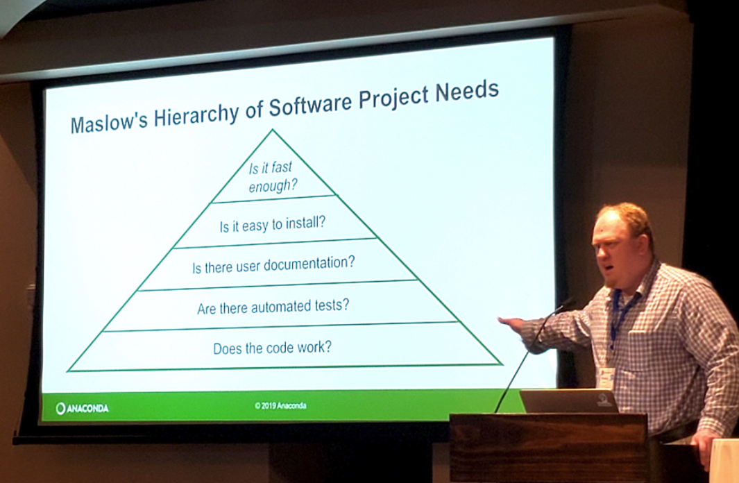
What’s most important to the user?
- Maslow’s Hierarchy of Software Package Needs
- Stanley Siebert of the Anaconda Project updated a very familiar diagram with what is important to software developers adopting new software into their workflows.
- These priorities will also help you and the people who follow after you to implement and carry forward the scripts/code/packages you will one day build.
Key Points
Applying Telemetry Data to Decision-Making
Overview
Teaching: 20 min
Exercises: 0 minQuestions
Objectives
The ultimate goal of telemetry research is to answer questions about animals and their environment. These answers in turn inform decisions that can have significant ecological, social, and economic consequences. Here we’ll learn how the goals of a telemetry project can be factored into preparation, field deployments, and analysis, and review some case studies of telemetry research informing decisions on fishery management, shipping, and other human interactions with the marine environment.
Key Points