Basic Visualization and Plotting
Overview
Teaching: 30 min
Exercises: 0 minQuestions
How can I use glatos to plot my data?
What kinds of plots can I make with my data?
Objectives
We can use glatos to quickly and effectively visualize our data, now that we’ve cleaned it up.
One of the simplest ways is to use an abacus plot to display animal detections against the appropriate stations.
# Visualizing Data - Abacus Plots ####
# ?glatos::abacus_plot
# customizable version of the standard VUE-derived abacus plots


abacus_plot(detections_w_events,
            location_col='station',
            main='ACT Detections by Station') # can use plot() variables here, they get passed thru to plot()
This is good, but cluttered. We can also filter out a single animal ID and plot only the abacus plot for that.
# pick a single fish to plot
abacus_plot(detections_filtered[detections_filtered$animal_id== "PROJ58-1218508-2015-10-13",],
            location_col='station',
            main="PROJ58-1218508-2015-10-13 Detections By Station")
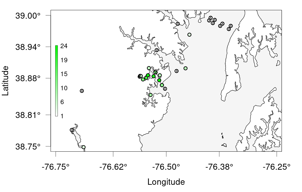
If we want to see actual physical distribution, a bubble plot will serve us better.
We’ll use the Maryland raster MD from last lesson.
# Bubble Plots for Spatial Distribution of Fish ####
# bubble variable gets the summary data that was created to make the plot
detections_filtered

?detection_bubble_plot

bubble_station <- detection_bubble_plot(detections_filtered,

                                        background_ylim = c(38, 40),
                                        background_xlim = c(-77, -76),
                                        map = MD,
                                        location_col = 'station',
                                        out_file = 'act_bubbles_by_stations.png')
bubble_station

bubble_array <- detection_bubble_plot(detections_filtered,
                                      background_ylim = c(38, 40),
                                      background_xlim = c(-77, -76),
                                      map = MD,
                                      out_file = 'act_bubbles_by_array.png')
bubble_array
Glatos Challenge
Challenge 1 —- Create a bubble plot of that bay we zoomed in earlier. Set the bounding box using the provided nw + se cordinates, change the colour scale and resize the points to be smaller. As a bonus, add points for the other receivers that don’t have any detections. Hint: ?detection_bubble_plot will help a lot Here’s some code to get you started
nw <- c(38.75, -76.75) # given
se <- c(39, -76.25) # given
Solution
nw <- c(38.75, -76.75) # given
se <- c(39, -76.25) # given

deploys <- read_otn_deployments('matos_FineToShare_stations_receivers_202104091205.csv') # For bonus
bubble_challenge <- detection_bubble_plot(detections_filtered,
                                     background_ylim = c(nw[1], se[1]),
                                     background_xlim = c(nw[2], se[2]),
                                     map = MD,
                                     symbol_radius = 0.75,
                                     location_col = 'station',
                                     col_grad = c('white', 'green'),
                                     receiver_locs = deploys, # For bonus
                                     out_file = 'act_bubbles_challenge.png')
Key Points