Overview
Teaching: min
Exercises: minQuestions
Objectives
Intro to OTN
The Ocean Tracking Network (OTN) supports global telemetry research by providing training, equipment, and data infrastructure to our large network of partners.
OTN and affiliated networks provide automated cross-referencing of your detection data with other tags in the system to help resolve “mystery detections” and provide detection data to taggers in other regions. OTN’s Data Managers will also extensively quality-control your submitted metadata for errors to ensure the most accurate records possible are stored in the database. OTN’s database and Data Portal website are excellent places to archive your datasets for future use and sharing with collaborators. We offer pathways to publish your datasets with OBIS, and via open data portals like ERDDAP, GeoServer etc. The data-product format returned by OTN is directly ingestible by analysis packages such as glatos and resonATe for ease of analysis. OTN offers support for the use of these packages and tools.
Learn more about OTN and our partners here https://members.oceantrack.org/. Please contact OTNDC@DAL.CA if you are interested in connecting with your regional network and learning about their affiliation with OTN.
Intended Audience
This set of workshop material is directed at researchers who are ready to begin the work of acoustic telemetry data analysis. The first few lessons will begin with introductory R - no previous coding experince required. The workshop material progresses into more advanced techniques as we move along, beginning around lesson 8 “Introduction to Glatos”.
If you’d like to refresh your R coding skills outside of this workshop curriculum, we recommend Data Analysis and Visualization in R for Ecologists as a good starting point. Much of this content is included in the first two lessons of this workshop.
Getting Started
Please follow the instrucions in the “Setup” tab along the top menu to install all required software, packages and data files. If you have questions or are running into errors please reach out to OTNDC@DAL.CA for support.
Intro to Telemetry Data Analysis
OTN-affiliated telemetry networks all provide researchers with pre-formatted datasets, which are easily ingested into these data analysis tools.
Before diving in to a lot of analysis, it is important to take the time to clean and sort your dataset, taking the pre-formatted files and combining them in different ways, allowing you to analyse the data with different questions in mind.
There are multiple R packages necessary for efficient and thorough telemetry data analysis. General packages that allow for data cleaning and arrangement, dataset manipulation and visualization, network analysis and temporo-spatial locating are used in conjuction with the telemetry analysis tool packages VTtrack, actel and glatos.
There are many more useful packages covered in this workshop, but here are some highlights:
Intro to the glatos Package
glatos is an R package with functions useful to members of the Great Lakes Acoustic Telemetry Observation System (http://glatos.glos.us). Developed by Chris Holbrook of GLATOS, OTN helps to maintain and keep relevant. Functions may be generally useful for processing, analyzing, simulating, and visualizing acoustic telemetry data, but are not strictly limited to acoustic telemetry applications. Tools included in this package facilitate false filtering of detections due to time between pings and disstance between pings. There are tools to summarise and plot, including mapping of animal movement. Learn more here.
Maintainer: Dr. Chris Holbrook, ( cholbrook@usgs.gov )
Intro to the VTrack Package
This package was designed to facilitate the assimilation, analysis and synthesis of animal location and movement data collected by the VEMCO suite of acoustic transmitters and receivers. As well as database and geographic information capabilities the principal feature of VTrack is the qualification and identification of ecologically relevant events from the acoustic detection and sensor data. This procedure condenses the acoustic detection database by orders of magnitude, greatly enhancing the synthesis of acoustic detection data. The development version of VTrack now houses a suit of functions called the ‘Animal Tracking Toolbox’ that helps users to follow a workflow to efficiently analyse acoustic telemetry data. You can find more information about the new functions in this vignette. Learn more here.
Maintainer: Dr. Vinay Udyawer ( vinay.udyawer@gmail.com )
Intro to the actel Package
This package is designed for studies where animals tagged with acoustic tags are expected to move through receiver arrays. actel combines the advantages of automatic sorting and checking of animal movements with the possibility for user intervention on tags that deviate from expected behaviour. The three analysis functions: explore, migration and residency, allow the users to analyse their data in a systematic way, making it easy to compare results from different studies.
Author: Dr. Hugo Flavio, ( hflavio@wlu.ca )
Key Points
Intro to R
Overview
Teaching: 30 min
Exercises: 20 minQuestions
What are common operators in R?
What are common data types in R?
What are some base R functions?
How do I deal with missing data?
Objectives
First, lets learn about RStudio.
RStudio is divided into 4 “Panes”: the Source for your scripts and documents (top-left, in the default layout); your Environment/History (top-right) which shows all the objects in your working space (Environment) and your command history (History); your Files/Plots/Packages/Help/Viewer (bottom-right); and the R Console (bottom-left). The placement of these panes and their content can be customized (see menu, Tools -> Global Options -> Pane Layout).
The R Script in the top pane can be saved and edited, while code typed directly into the Console below will disappear after closing the R session.
R can access files on and save outputs to any folder on your computer. R knows where to look for and save files based on the current working directory. This is one of the first things you should set up: a folder you’d like to contain all your data, scripts and outputs. The working directory path will be different for everyone. For the workshop, we’ve included the path one of our instructors uses, but you should use your computer’s file explorer to find the correct path for your data.
Setting up R
# Packages ####
# once you install packages to your computer, you can "check them out" of your packages library each time you need them
# make sure you check the "mask" messages that appear - sometimes packages have functions with the same names!

library(tidyverse)# really neat collection of packages! https://www.tidyverse.org/
library(lubridate)
library(readxl)
library(viridis)
library(plotly)
library(ggmap)


# Working Directory ####


setwd('C:/Users/tress_n/2021-04-13-act-workshop/data') #set folder you're going to work in
getwd() #check working directory

#you can also change it in the RStudio interface by navigating in the file browser where your working directory should be
#(if you can't see the folder you want, choose the three horizonal dots on the right side of the Home bar),
#and clicking on the blue gear icon "More", and select "Set As Working Directory".
Intro to R
Like most programming langauges, we can do basic mathematical operations with R. These, along with variable assignment, form the basis of everything for which we will use R.
Operators
Operators in R include standard mathematical operators (+, -, *, /) as well as an assignment operator, <- (a less-than sign followed by a hyphen). The assignment operator is used to associate a value with a variable name (or, to ‘assign’ the value a name). This lets us refer to that value later, by the name we’ve given to it. This may look unfamiliar, but it fulfils the same function as the ‘=’ operator in most other languages.
3 + 5 #maths! including - , *, /

weight_kg <- 55 #assignment operator! for objects/variables. shortcut: alt + -
weight_kg

weight_lb <- 2.2 * weight_kg #can assign output to an object. can use objects to do calculations
Variables Challenge
If we change the value of weight_kg to be 100, does the value of weight_lb also change? Remember: You can check the contents of an object by typing out its name and running the line in RStudio.
Solution
No! You have to re-assign 2.2*weight_kg to the object weight_lb for it to update.
The order you run your operations is very important, if you change something you may need to re-run everything!
weight_kg <- 100

weight_lb #didnt change!

weight_lb <- 2.2 * weight_kg #now its updated
Functions
While we can write code as we have in the section above - line by line, executed one line at a time - it is often more efficient to run multiple lines of code at once. By using functions, we can even compress complex calculations into just one line!
Functions use a single name to refer to underlying blocks of code that execute a specific calculation. To run a function you need two things: the name of the function, which is usually indicative of the function’s purpose; and the function’s arguments- the variables or values on which the function should execute.
#functions take "arguments": you have to tell them what to run their script against

ten <- sqrt(weight_kg) #contain calculations wrapped into one command to type.
#Output of the function can be assigned directly to a variable...

round(3.14159) #... but doesn't have to be.
Since there are hundreds of functions and often their functionality can be nuanced, we have several ways to get more information on a given function. First, we can use ‘args()’, itself a function that takes the name of another function as an argument, which will tell us the required arguments of the function against which we run it.
Second, we can use the ‘?’ operator. Typing a question mark followed by the name of a function will open a Help window in RStudio’s bottom-right panel. This will contain the most complete documentation available for the function in question.
args(round) #the args() function will show you the required arguments of another function

?round #will show you the full help page for a function, so you can see what it does
Functions Challenge
Can you round the value 3.14159 to two decimal places?
Hint: Using args() on a function can give you a clue.
Solution
round(3.14159, 2) #the round function's second argument is the number of digits you want in the result
round(3.14159, digits = 2) #same as above
round(digits = 2, x = 3.14159) #when reordered you need to specify
Vectors and Data Types
While variables can hold a single value, sometimes we want to store multiple values in the same variable name. For this, we can use an R data structure called a ‘vector.’ Vectors contain one or more variables of the same data type, and can be assigned to a single variable name, as below.
weight_g <- c(21, 34, 39, 54, 55) #use the combine function to join values into a vector object

length(weight_g) #explore vector
class(weight_g) #a vector can only contain one data type
str(weight_g) #find the structure of your object.
Above, we mentioned ‘data type’. This refers to the kind of data represented by a value, or stored by the appropriate variable. Data types include character (words or letters), logical (boolean TRUE or FALSE values), or numeric data. Crucially, vectors can only contain one type of data, and will force all data in the vector to conform to that type (i.e, data in the vector will all be treated as the same data type, regardless of whether or not it was of that type when the vector was created.) We can always check the data type of a variable or vector by using the ‘class()’ function, which takes the variable name as an argument.
#our first vector is numeric.
#other options include: character (words), logical (TRUE or FALSE), integer etc.

animals <- c("mouse", "rat", "dog") #to create a character vector, use quotes

class(weight_g)
class(animals)

# Note:
#R will convert (force) all values in a vector to the same data type.
#for this reason: try to keep one data type in each vector
#a data table / data frame is just multiple vectors (columns)
#this is helpful to remember when setting up your field sheets!
Vectors Challenge
What data type will this vector become?
challenge3 <- c(1, 2, 3, "4")Hint: You can check a vector’s type with the class() function.
Solution
R will force all of these to be characters, since the number 4 has quotes around it! Will always coerce data types following this structure: logical → numeric → character ← logical
class(challenge3)
Indexing and Subsetting
We can use subsetting to select only a portion of a vector. For this, we use square brackets after the name of a vector. If we supply a single numeric value, as below, we will retrieve only the value from that index of the vector. Note: vectors in R are indexed with 1 representing the first index- other languages use 0 for the start of their array, so if you are coming from a language like Python, this can be disorienting.
animals #calling your object will print it out
animals[2] #square brackets = indexing. selects the 2nd value in your vector
We can select a specific value, as above, but we can also select one or more entries based on conditions. By supplying one or more criteria to our indexing syntax, we can retrieve the elements of the array that match that criteria.
weight_g > 50 #conditional indexing: selects based on criteria
weight_g[weight_g <=30 | weight_g == 55] #many new operators here!
                                         #<= less than or equal to; | "or"; == equal to. Also available are >=, greater than or equal to; < and > for less than or greater than (no equals); and & for "and".
weight_g[weight_g >= 30 & weight_g == 21] #  >=  greater than or equal to, & "and"
                                          # this particular example give 0 results - why?
Missing Data
In practical data analysis, our data is often incomplete. It is therefore useful to cover some methods of dealing with NA values. NA is R’s shorthand for a null value; or a value where there is no data. Certain functions cannot process NA data, and therefore provide arguments that allow NA values to be removed before the function execution.
heights <- c(2, 4, 4, NA, 6)
mean(heights) #some functions cant handle NAs
mean(heights, na.rm = TRUE) #remove the NAs before calculating
This can be done within an individual function as above, but for our entire analysis we may want to produce a copy of our dataset without the NA values included. Below, we’ll explore a few ways to do that.
heights[!is.na(heights)] #select for values where its NOT NA
#[] square brackets are the base R way to select a subset of data --> called indexing
#! is an operator that reverses the function

na.omit(heights) #omit the NAs

heights[complete.cases(heights)] #select only complete cases
Missing Data Challenge
Question 1: Using the following vector of heighs in inches, create a new vector, called heights_no_na, with the NAs removed.
heights <- c(63, 69, 60, 65, NA, 68, 61, 70, 61, 59, 64, 69, 63, 63, NA, 72, 65, 64, 70, 63, 65)Solution
heights_no_na <- heights[!is.na(heights)]
# or
heights_no_na <- na.omit(heights)
# or
heights_no_na <- heights[complete.cases(heights)]
Question 2: Use the function median() to calculate the median of the heights vector.
Solution
median(heights, na.rm = TRUE)Bonus question: Use R to figure out how many people in the set are taller than 67 inches.
Solution
heights_above_67 <- heights_no_na[heights_no_na > 67]
length(heights_above_67)
Key Points
Starting with Data Frames
Overview
Teaching: 25 min
Exercises: 10 minQuestions
How do I import tabular data?
How do I explore my data set?
What are some basic data manipulation functions?
Objectives
Note to instructors: please choose the relevant Network below when teaching
ACT Node
###Dataframes and dplyr
In this lesson, we’re going to introduce a package called dplyr. dplyr takes advantage of an operator called a pipe to create chains of data manipulation that produce powerful exploratory summaries. It also provides a suite of further functionality for manipulating dataframes: tabular sets of data that are common in data analysis. If you’ve imported the tidyverse library, as we did during setup and in the last episode, then congratulations: you already have dplyr (along with a host of other useful packages).
You may not be familiar with dataframes by name, but you may recognize the structure. Dataframes are arranged into rows and columns, not unlike tables in typical spreadsheet format (ex: Excel). In R, they are represented as vectors of vectors: that is, a vector wherein each column is itself a vector. If you are familiar with matrices, or two-dimensional arrays in other languages, the structure of a dataframe will be clear to you.
However, dataframes are not merely vectors- they are a specific type of object with their own functionality, which we will cover in this lesson.
We are going to use OTN-style detection extracts for this lesson. If you’re unfamiliar with detection extracts formats from OTN-style database nodes, see the documentation here
###Importing from CSVs
Before we can start analyzing our data, we need to import it into R. Fortunately, we have a function for this. read_csv is a function from the readr package, also included with the tidyverse library. This function can read data from a .csv file into a dataframe. “.csv” is an extension that denotes a Comma-Separated Value file, or a file wherein data is arranged into rows, and entries within rows are delimited by commas. They’re common in data analysis.
For the purposes of this lesson, we will only cover read_csv; however, there is another function, read_excel, which you can use to import excel files. It’s from a different library (readxl) and is outside the scope of this lesson, but worth investigating if you need it.
To import your data from your CSV file, we just need to pass the file path to read_csv, and assign the output to a variable. Note that the file path you give to read_csv will be relative to the working directory you set in the last lesson, so keep that in mind.
#imports file into R. paste the filepath to the unzipped file here!

proj58_matched_2016 <- read_csv("proj58_matched_detections_2016.csv")
We can now refer to the variable proj58_matched_2016 to access, manipulate, and view the data from our CSV. In the next sections, we will explore some of the basic operations you can perform on dataframes.
Exploring Detection Extracts
Let’s start with a practical example. What can we find out about these matched detections? We’ll begin by running the code below, and then give some insight into what each function does. Remember, if you’re ever confused about the purpose of a function, you can use ‘?’ followed by the function name (i.e, ?head, ?View) to get more information.
head(proj58_matched_2016) #first 6 rows
View(proj58_matched_2016) #can also click on object in Environment window
str(proj58_matched_2016) #can see the type of each column (vector)
glimpse(proj58_matched_2016) #similar to str()

#summary() is a base R function that will spit out some quick stats about a vector (column)
#the $ syntax is the way base R selects columns from a data frame

summary(proj58_matched_2016$latitude)
You may now have an idea of what each of those functions does, but we will briefly explain each here.
head takes the dataframe as a parameter and returns the first 6 rows of the dataframe. This is useful if you want to quickly check that a dataframe imported, or that all the columns are there, or see other such at-a-glance information. Its primary utility is that it is much faster to load and review than the entire dataframe, which may be several tens of thousands of rows long. Note that the related function tail will return the last six elements.
If we do want to load the entire dataframe, though, we can use View, which will open the dataframe in its own panel, where we can scroll through it as though it were an Excel file. This is useful for seeking out specific information without having to consult the file itself. Note that for large dataframes, this function can take a long time to execute.
Next are the functions str and glimpse, which do similar but different things. str is short for ‘structure’ and will print out a lot of information about your dataframe, including the number of rows and columns (called ‘observations’ and ‘variables’), the column names, the first four entries of each column, and each column type as well. str can sometimes be a bit overwhelming, so if you want to see a more condensed output, glimpse can be useful. It prints less information, but is cleaner and more compact, which can be desirable.
Finally, we have the summary function, which takes a single column from a dataframe and produces a summary of its basic statistics. You may have noticed the ‘$’ in the summary call- this is how we index a specific column from a dataframe. In this case, we are referring to the latitude column of our dataframe.
Using what you now know about summary functions, try to answer the challenge below.
Detection Extracts Challenge
Question 1: What is the class of the station column in proj58_matched_2016, and how many rows and columns are in the proj58_matched_2016 dataset??
Solution
The column is a character, and there are 7,693 rows with 36 columns
str(proj58_matched_2016)
# or
glimpse(proj58_matched_2016)
Data Manipulation
Now that we’ve learned how to import and summarize our data, we can learn how to use dplyr to manipulate it. The name ‘dplyr’ may seem esoteric- the ‘d’ is short for ‘dataframe’, and ‘plyr’ is meant to evoke pliers, and thereby cutting, twisting, and shaping. This is an elegant summation of the dplyr library’s functionality.
We are going to introduce a new operator in this section, called the “dplyr pipe”. Not to be confused with |, which is also called a pipe in some other languages, the dplyr pipe is rendered as %>%. A pipe takes the output of the function or contents of the variable on the left and passes them to the function on the right. It is often read as “and then.” If you want to quickly add a pipe, the keybord shortcut CTRL + SHIFT + M will do so.
library(dplyr) #can use tidyverse package dplyr to do exploration on dataframes in a nicer way

# %>% is a "pipe" which allows you to join functions together in sequence.

proj58_matched_2016 %>% dplyr::select(6) #selects column 6

# Using the above transliteration: "take proj58_matched_2016 AND THEN select column number 6 from it using the select function in the dplyr library"
You may have noticed another unfamiliar operator above, the double colon (::). This is used to specify the package from which we want to pull a function. Until now, we haven’t needed this, but as your code grows and the number of libraries you’re using increases, it’s likely that multiple functions across several different packages will have the same name (a phenomenon called “overloading”). R has no automatic way of knowing which package contains the function you are referring to, so using double colons lets us specify it explicitly. It’s important to be able to do this, since different functions with the same name often do markedly different things.
Let’s explore a few other examples of how we can use dplyr and pipes to manipulate our dataframe.
proj58_matched_2016 %>% slice(1:5) #selects rows 1 to 5 in the dplyr way
# Take proj58_matched_2016 AND THEN slice rows 1 through 5.

#We can also use multiple pipes.
proj58_matched_2016 %>%
  distinct(detectedby) %>% nrow #number of arrays that detected my fish in dplyr!
# Take proj58_matched_2016 AND THEN select only the unique entries in the detectedby column AND THEN count them with nrow.

#We can do the same as above with other columns too.
proj58_matched_2016 %>%
  distinct(catalognumber) %>%
  nrow #number of animals that were detected
# Take proj58_matched_2016 AND THEN select only the unique entries in the catalognumber column AND THEN count them with nrow.

#We can use filtering to conditionally select rows as well.
proj58_matched_2016 %>% filter(catalognumber=="PROJ58-1191602-2014-07-24")
# Take proj58_matched_2016 AND THEN select only those rows where catalognumber is equal to the above value.

proj58_matched_2016 %>% filter(monthcollected >= 10) #all dets in/after October of 2016
# Take proj58_matched_2016 AND THEN select only those rows where monthcollected is greater than or equal to 10.
These are all ways to extract a specific subset of our data, but dplyr can also be used to manipulate dataframes to give you even greater insights. We’re now going to use two new functions: group_by, which allows us to group our data by the values of a single column, and summarise (not to be confused with summary above!), which can be used to calculate summary statistics across your grouped variables, and produces a new dataframe containing these values as the output. These functions can be difficult to grasp, so don’t forget to use ?group_by and ?summarise if you get lost.
#get the mean value across a column using GroupBy and Summarize

proj58_matched_2016 %>% #Take proj58_matched_2016, AND THEN...
  group_by(catalognumber) %>%  #Group the data by catalognumber- that is, create a group within the dataframe where each group contains all the rows related to a specific catalognumber. AND THEN...
  summarise(MeanLat=mean(latitude)) #use summarise to add a new column containing the mean latitude of each group. We named this new column "MeanLat" but you could name it anything
With just a few lines of code, we’ve created a dataframe that contains each of our catalog numbers and the mean latitude at which those fish were detected. dplyr, its wide array of functions, and the powerful pipe operator can let us build out detailed summaries like this one without writing too much code.
Data Manipulation Challenge
Question 1: Find the max lat and max longitude for animal “PROJ58-1191602-2014-07-24”.
Solution
proj58_matched_2016 %>%
 filter(catalognumber=="PROJ58-1191602-2014-07-24") %>%
 summarise(MaxLat=max(latitude), MaxLong=max(longitude))
Question 2: Find the min lat/long of each animal for detections occurring in/after April.
Solution
proj58_matched_2016 %>%
  filter(monthcollected >= 4 ) %>%
  group_by(catalognumber) %>%
  summarise(MinLat=min(latitude), MinLong=min(longitude))
Joining Detection Extracts
We’re now going to briefly touch on a few useful dataframe use-cases that aren’t directly related to dplyr, but with which dplyr can help us.
One function that we’ll need to know is rbind, a base R function which lets us combine two R objects together. Since detections for animals tagged during a study often appear in multiple years, this functionality will let us merge the dataframes together. We’ll also use distinct, a dplyr function that lets us trim out duplicate release records for each animal, since these are listed in each detection extract.
proj58_matched_2017 <- read_csv("proj58_matched_detections_2017.csv") #First, read in our file.

proj58_matched_full <- rbind(proj58_matched_2016, proj58_matched_2017) #Now join the two dataframes

# release records for animals often appear in >1 year, this will remove the duplicates
proj58_matched_full <- proj58_matched_full %>% distinct() # Use distinct to remove duplicates.

View(proj58_matched_full)
Dealing with Datetimes
Datetime data is in a special format which is neither numeric nor character. It can be tricky to deal with, too, since Excel frequently reformats dates in any file it opens. We also have to concern ourselves with practical matters of time, like time zone and date formatting. Fortunately, the lubridate library gives us a whole host of functionality to manage datetime data.
We’ll also use a dplyr function called mutate, which lets us add new columns or change existing ones, while preserving the existing data in the table. Be careful not to confuse this with its sister function transmute, which adds or manipulates columns while dropping existing data. If you’re ever in doubt as to which is which, remember: ?mutate and ?transmute will bring up the help files.
library(lubridate) #Import our Lubridate library.

proj58_matched_full %>% mutate(datecollected=ymd_hms(datecollected)) #Use the lubridate function ymd_hms to change the format of the date.

#as.POSIXct(proj58_matched_full$datecollected) #this is the base R way - if you ever see this function
{. :language-r}
We’ve just used a single function, ymd_hms, but with it we’ve been able to completely reformat the entire datecollected column. ymd_hms is short for Year, Month, Day, Hours, Minutes, and Seconds. For example, at time of writing, it’s 2021-05-14 14:21:40. Other format functions exist too, like dmy_hms, which specifies the day first and year third (i.e, 14-05-2021 14:21:40). Investigate the documentation to find which is right for you.
There are too many useful lubridate functions to cover in the scope of this lesson. These include parse_date_time, which can be used to read in date data in multiple formats, which is useful if you have a column contianing heterogenous date data; as well as with_tz, which lets you make your data sensitive to timezones (including automatic daylight savings time awareness). Dates are a tricky subject, so be sure to investigate lubridate to make sure you find the functions you need.
FACT Node
###Dataframes and dplyr
In this lesson, we’re going to introduce a package called dplyr. dplyr takes advantage of an operator called a pipe to create chains of data manipulation that produce powerful exploratory summaries. It also provides a suite of further functionality for manipulating dataframes: tabular sets of data that are common in data analysis. If you’ve imported the tidyverse library, as we did during setup and in the last episode, then congratulations: you already have dplyr (along with a host of other useful packages).
You may not be familiar with dataframes by name, but you may recognize the structure. Dataframes are arranged into rows and columns, not unlike tables in typical spreadsheet format (ex: Excel). In R, they are represented as vectors of vectors: that is, a vector wherein each column is itself a vector. If you are familiar with matrices, or two-dimensional arrays in other languages, the structure of a dataframe will be clear to you.
However, dataframes are not merely vectors- they are a specific type of object with their own functionality, which we will cover in this lesson.
We are going to use OTN-style detection extracts for this lesson. If you’re unfamiliar with detection extracts formats from OTN-style database nodes, see the documentation here
###Importing from CSVs
Before we can start analyzing our data, we need to import it into R. Fortunately, we have a function for this. read_csv is a function from the readr package, also included with the tidyverse library. This function can read data from a .csv file into a dataframe. “.csv” is an extension that denotes a Comma-Separated Value file, or a file wherein data is arranged into rows, and entries within rows are delimited by commas. They’re common in data analysis.
For the purposes of this lesson, we will only cover read_csv; however, there is another function, read_excel, which you can use to import excel files. It’s from a different library (readxl) and is outside the scope of this lesson, but worth investigating if you need it.
To import your data from your CSV file, we just need to pass the file path to read_csv, and assign the output to a variable. Note that the file path you give to read_csv will be relative to the working directory you set in the last lesson, so keep that in mind.
#imports file into R. paste the filepath to the unzipped file here!

tqcs_matched_2010 <- read_csv("tqcs_matched_detections_2010.csv", guess_max = 117172) #Import 2010 detections
You may have noticed that our call to read_csv has a second argument: guess_max. This is a useful argument when some of our columns begin with a lot of NULL values. When determining what data type to assign to a column, rather than checking every single entry, R will check the first few and make a guess based on that. If the first few values are null, R will get confused and throw an error when it actually finds data further down in the column. guess_max lets us tell R exactly how many columns to read before trying to make a guess. This way, we know it will read enough entries in each column to actually find data, which it will prioritize over the NULL values when assigning a type to the column. This parameter isn’t always necessary, but it can be vital depending on your dataset.
We can now refer to the variable tqcs_matched_2010 to access, manipulate, and view the data from our CSV. In the next sections, we will explore some of the basic operations you can perform on dataframes.
Exploring Detection Extracts
Let’s start with a practical example. What can we find out about these matched detections? We’ll begin by running the code below, and then give some insight into what each function does. Remember, if you’re ever confused about the purpose of a function, you can use ‘?’ followed by the function name (i.e, ?head, ?View) to get more information.
head(tqcs_matched_2010) #first 6 rows
View(tqcs_matched_2010) #can also click on object in Environment window
str(tqcs_matched_2010) #can see the type of each column (vector)
glimpse(tqcs_matched_2010) #similar to str()

#summary() is a base R function that will spit out some quick stats about a vector (column)
#the $ syntax is the way base R selects columns from a data frame

summary(tqcs_matched_2010$latitude)
You may now have an idea of what each of those functions does, but we will briefly explain each here.
head takes the dataframe as a parameter and returns the first 6 rows of the dataframe. This is useful if you want to quickly check that a dataframe imported, or that all the columns are there, or see other such at-a-glance information. Its primary utility is that it is much faster to load and review than the entire dataframe, which may be several tens of thousands of rows long. Note that the related function tail will return the last six elements.
If we do want to load the entire dataframe, though, we can use View, which will open the dataframe in its own panel, where we can scroll through it as though it were an Excel file. This is useful for seeking out specific information without having to consult the file itself. Note that for large dataframes, this function can take a long time to execute.
Next are the functions str and glimpse, which do similar but different things. str is short for ‘structure’ and will print out a lot of information about your dataframe, including the number of rows and columns (called ‘observations’ and ‘variables’), the column names, the first four entries of each column, and each column type as well. str can sometimes be a bit overwhelming, so if you want to see a more condensed output, glimpse can be useful. It prints less information, but is cleaner and more compact, which can be desirable.
Finally, we have the summary function, which takes a single column from a dataframe and produces a summary of its basic statistics. You may have noticed the ‘$’ in the summary call- this is how we index a specific column from a dataframe. In this case, we are referring to the latitude column of our dataframe.
Using what you now know about summary functions, try to answer the challenge below.
Detection Extracts Challenge
Question 1: What is the class of the station column in tqcs_matched_2010, and how many rows and columns are in the tqcs_matched_2010 dataset??
Solution
The column is a character, and there are 1,737,597 rows with 36 columns
str(tqcs_matched_2010)
# or
glimpse(tqcs_matched_2010)
Data Manipulation
Now that we’ve learned how to import and summarize our data, we can learn how to use dplyr to manipulate it. The name ‘dplyr’ may seem esoteric- the ‘d’ is short for ‘dataframe’, and ‘plyr’ is meant to evoke pliers, and thereby cutting, twisting, and shaping. This is an elegant summation of the dplyr library’s functionality.
We are going to introduce a new operator in this section, called the “dplyr pipe”. Not to be confused with |, which is also called a pipe in some other languages, the dplyr pipe is rendered as %>%. A pipe takes the output of the function or contents of the variable on the left and passes them to the function on the right. It is often read as “and then.” If you want to quickly add a pipe, the keybord shortcut CTRL + SHIFT + M will do so.
library(dplyr) #can use tidyverse package dplyr to do exploration on dataframes in a nicer way

# %>% is a "pipe" which allows you to join functions together in sequence.

tqcs_matched_2010 %>% dplyr::select(6) #selects column 6

# Using the above transliteration: "take tqcs_matched_2010 AND THEN select column number 6 from it using the select function in the dplyr library"
You may have noticed another unfamiliar operator above, the double colon (::). This is used to specify the package from which we want to pull a function. Until now, we haven’t needed this, but as your code grows and the number of libraries you’re using increases, it’s likely that multiple functions across several different packages will have the same name (a phenomenon called “overloading”). R has no automatic way of knowing which package contains the function you are referring to, so using double colons lets us specify it explicitly. It’s important to be able to do this, since different functions with the same name often do markedly different things.
Let’s explore a few other examples of how we can use dplyr and pipes to manipulate our dataframe.
tqcs_matched_2010 %>% slice(1:5) #selects rows 1 to 5 in the dplyr way
# Take tqcs_matched_2010 AND THEN slice rows 1 through 5.

#We can also use multiple pipes.
tqcs_matched_2010 %>%
  distinct(detectedby) %>% nrow #number of arrays that detected my fish in dplyr!
# Take tqcs_matched_2010 AND THEN select only the unique entries in the detectedby column AND THEN count them with nrow.

#We can do the same as above with other columns too.
tqcs_matched_2010 %>%
  distinct(catalognumber) %>%
  nrow #number of animals that were detected
# Take tqcs_matched_2010 AND THEN select only the unique entries in the catalognumber column AND THEN count them with nrow.

#We can use filtering to conditionally select rows as well.
tqcs_matched_2010 %>% filter(catalognumber=="TQCS-1049258-2008-02-14")
# Take tqcs_matched_2010 AND THEN select only those rows where catalognumber is equal to the above value.

tqcs_matched_2010 %>% filter(monthcollected >= 10) #all dets in/after October of 2016
# Take tqcs_matched_2010 AND THEN select only those rows where monthcollected is greater than or equal to 10.
These are all ways to extract a specific subset of our data, but dplyr can also be used to manipulate dataframes to give you even greater insights. We’re now going to use two new functions: group_by, which allows us to group our data by the values of a single column, and summarise (not to be confused with summary above!), which can be used to calculate summary statistics across your grouped variables, and produces a new dataframe containing these values as the output. These functions can be difficult to grasp, so don’t forget to use ?group_by and ?summarise if you get lost.
#get the mean value across a column using GroupBy and Summarize

tqcs_matched_2010 %>% #Take tqcs_matched_2010, AND THEN...
  group_by(catalognumber) %>%  #Group the data by catalognumber- that is, create a group within the dataframe where each group contains all the rows related to a specific catalognumber. AND THEN...
  summarise(MeanLat=mean(latitude)) #use summarise to add a new column containing the mean latitude of each group. We named this new column "MeanLat" but you could name it anything
With just a few lines of code, we’ve created a dataframe that contains each of our catalog numbers and the mean latitude at which those fish were detected. dplyr, its wide array of functions, and the powerful pipe operator can let us build out detailed summaries like this one without writing too much code.
Data Manipulation Challenge
Question 1: Find the max lat and max longitude for animal “TQCS-1049258-2008-02-14”.
Solution
tqcs_matched_2010 %>%
 filter(catalognumber=="TQCS-1049258-2008-02-14") %>%
 summarise(MaxLat=max(latitude), MaxLong=max(longitude))
Question 2: Find the min lat/long of each animal for detections occurring in July.
Solution
tqcs_matched_2010 %>%
  filter(monthcollected == 7) %>%
  group_by(catalognumber) %>%
  summarise(MinLat=min(latitude), MinLong=min(longitude))
Joining Detection Extracts
We’re now going to briefly touch on a few useful dataframe use-cases that aren’t directly related to dplyr, but with which dplyr can help us.
One function that we’ll need to know is rbind, a base R function which lets us combine two R objects together. Since detections for animals tagged during a study often appear in multiple years, this functionality will let us merge the dataframes together. We’ll also use distinct, a dplyr function that lets us trim out duplicate release records for each animal, since these are listed in each detection extract.
tqcs_matched_2011 <- read_csv("tqcs_matched_detections_2011.csv", guess_max = 41880) #Import 2011 detections

tqcs_matched_10_11_full <- rbind(tqcs_matched_2010, tqcs_matched_2011) #Now join the two dataframes

#release records for animals often appear in >1 year, this will remove the duplicates
tqcs_matched_10_11_full <- tqcs_matched_10_11_full %>% distinct() # Use distinct to remove duplicates.

tqcs_matched_10_11 <- tqcs_matched_10_11_full %>% slice(1:100000) # subset our example data to help this workshop run smoother!
Dealing with Datetimes
Datetime data is in a special format which is neither numeric nor character. It can be tricky to deal with, too, since Excel frequently reformats dates in any file it opens. We also have to concern ourselves with practical matters of time, like time zone and date formatting. Fortunately, the lubridate library gives us a whole host of functionality to manage datetime data.
We’ll also use a dplyr function called mutate, which lets us add new columns or change existing ones, while preserving the existing data in the table. Be careful not to confuse this with its sister function transmute, which adds or manipulates columns while dropping existing data. If you’re ever in doubt as to which is which, remember: ?mutate and ?transmute will bring up the help files.
library(lubridate) #Import our Lubridate library.

tqcs_matched_10_11 %>% mutate(datecollected=ymd_hms(datecollected)) #Use the lubridate function ymd_hms to change the format of the date.

#as.POSIXct(tqcs_matched_10_11$datecollected) #this is the base R way - if you ever see this function
{. :language-r}
We’ve just used a single function, ymd_hms, but with it we’ve been able to completely reformat the entire datecollected column. ymd_hms is short for Year, Month, Day, Hours, Minutes, and Seconds. For example, at time of writing, it’s 2021-05-14 14:21:40. Other format functions exist too, like dmy_hms, which specifies the day first and year third (i.e, 14-05-2021 14:21:40). Investigate the documentation to find which is right for you.
There are too many useful lubridate functions to cover in the scope of this lesson. These include parse_date_time, which can be used to read in date data in multiple formats, which is useful if you have a column contianing heterogenous date data; as well as with_tz, which lets you make your data sensitive to timezones (including automatic daylight savings time awareness). Dates are a tricky subject, so be sure to investigate lubridate to make sure you find the functions you need.
GLATOS Network
###Dataframes and dplyr
In this lesson, we’re going to introduce a package called dplyr. dplyr takes advantage of an operator called a pipe to create chains of data manipulation that produce powerful exploratory summaries. It also provides a suite of further functionality for manipulating dataframes: tabular sets of data that are common in data analysis. If you’ve imported the tidyverse library, as we did during setup and in the last episode, then congratulations: you already have dplyr (along with a host of other useful packages).
You may not be familiar with dataframes by name, but you may recognize the structure. Dataframes are arranged into rows and columns, not unlike tables in typical spreadsheet format (ex: Excel). In R, they are represented as vectors of vectors: that is, a vector wherein each column is itself a vector. If you are familiar with matrices, or two-dimensional arrays in other languages, the structure of a dataframe will be clear to you.
However, dataframes are not merely vectors - they are a specific type of object with their own functionality, which we will cover in this lesson.
We are going to use GLATOS-style detection extracts for this lesson.
###Importing from CSVs
Before we can start analyzing our data, we need to import it into R. Fortunately, we have a function for this. read_csv is a function from the readr package, also included with the tidyverse library. This function can read data from a .csv file into a dataframe. “.csv” is an extension that denotes a Comma-Separated Value file, or a file wherein data is arranged into rows, and entries within rows are delimited by commas. They’re common in data analysis.
For the purposes of this lesson, we will only cover read_csv; however, there is another function, read_excel, which you can use to import excel files. It’s from a different library (readxl) and is outside the scope of this lesson, but worth investigating if you need it.
To import your data from your CSV file, we just need to pass the file path to read_csv, and assign the output to a variable. Note that the file path you give to read_csv will be relative to the working directory you set in the last lesson, so keep that in mind.
#imports file into R. paste the filepath to the unzipped file here!

lamprey_dets <- read_csv("inst_extdata_lamprey_detections.csv", guess_max = 3102)
You may have noticed that our call to read_csv has a second argument: guess_max. This is a useful argument when some of our columns begin with a lot of NULL values. When determining what data type to assign to a column, rather than checking every single entry, R will check the first few and make a guess based on that. If the first few values are null, R will get confused and throw an error when it actually finds data further down in the column. guess_max lets us tell R exactly how many columns to read before trying to make a guess. This way, we know it will read enough entries in each column to actually find data, which it will prioritize over the NULL values when assigning a type to the column. This parameter isn’t always necessary, but it can be vital depending on your dataset.
We can now refer to the variable lamprey_dets to access, manipulate, and view the data from our CSV. In the next sections, we will explore some of the basic operations you can perform on dataframes.
Exploring Detection Extracts
Let’s start with a practical example. What can we find out about these matched detections? We’ll begin by running the code below, and then give some insight into what each function does. Remember, if you’re ever confused about the purpose of a function, you can use ‘?’ followed by the function name (i.e, ?head, ?View) to get more information.
head(lamprey_dets) #first 6 rows
View(lamprey_dets) #can also click on object in Environment window
str(lamprey_dets) #can see the type of each column (vector)
glimpse(lamprey_dets) #similar to str()

#summary() is a base R function that will spit out some quick stats about a vector (column)
#the $ syntax is the way base R selects columns from a data frame

summary(lamprey_dets$release_latitude)
You may now have an idea of what each of those functions does, but we will briefly explain each here.
head takes the dataframe as a parameter and returns the first 6 rows of the dataframe. This is useful if you want to quickly check that a dataframe imported, or that all the columns are there, or see other such at-a-glance information. Its primary utility is that it is much faster to load and review than the entire dataframe, which may be several tens of thousands of rows long. Note that the related function tail will return the last six elements.
If we do want to load the entire dataframe, though, we can use View, which will open the dataframe in its own panel, where we can scroll through it as though it were an Excel file. This is useful for seeking out specific information without having to consult the file itself. Note that for large dataframes, this function can take a long time to execute.
Next are the functions str and glimpse, which do similar but different things. str is short for ‘structure’ and will print out a lot of information about your dataframe, including the number of rows and columns (called ‘observations’ and ‘variables’), the column names, the first four entries of each column, and each column type as well. str can sometimes be a bit overwhelming, so if you want to see a more condensed output, glimpse can be useful. It prints less information, but is cleaner and more compact, which can be desirable.
Finally, we have the summary function, which takes a single column from a dataframe and produces a summary of its basic statistics. You may have noticed the ‘$’ in the summary call- this is how we index a specific column from a dataframe. In this case, we are referring to the latitude column of our dataframe.
Using what you now know about summary functions, try to answer the challenge below.
Detection Extracts Challenge
Question 1: What is the class of the station column in lamprey_dets, and how many rows and columns are in the lamprey_dets dataset??
Solution
The column is a character, and there are 5,923 rows with 30 columns
str(lamprey_dets)
# or
glimpse(lamprey_dets)
Data Manipulation
Now that we’ve learned how to import and summarize our data, we can learn how to use dplyr to manipulate it. The name ‘dplyr’ may seem esoteric- the ‘d’ is short for ‘dataframe’, and ‘plyr’ is meant to evoke pliers, and thereby cutting, twisting, and shaping. This is an elegant summation of the dplyr library’s functionality.
We are going to introduce a new operator in this section, called the “dplyr pipe”. Not to be confused with |, which is also called a pipe in some other languages, the dplyr pipe is rendered as %>%. A pipe takes the output of the function or contents of the variable on the left and passes them to the function on the right. It is often read as “and then.” If you want to quickly add a pipe, the keybord shortcut CTRL + SHIFT + M will do so.
library(dplyr) #can use tidyverse package dplyr to do exploration on dataframes in a nicer way

# %>% is a "pipe" which allows you to join functions together in sequence.

lamprey_dets %>% dplyr::select(6) #selects column 6

# Using the above transliteration: "take lamprey_dets AND THEN select column number 6 from it using the select function in the dplyr library"
You may have noticed another unfamiliar operator above, the double colon (::). This is used to specify the package from which we want to pull a function. Until now, we haven’t needed this, but as your code grows and the number of libraries you’re using increases, it’s likely that multiple functions across several different packages will have the same name (a phenomenon called “overloading”). R has no automatic way of knowing which package contains the function you are referring to, so using double colons lets us specify it explicitly. It’s important to be able to do this, since different functions with the same name often do markedly different things.
Let’s explore a few other examples of how we can use dplyr and pipes to manipulate our dataframe.
lamprey_dets %>% slice(1:5) #selects rows 1 to 5 in the dplyr way
# Take lamprey_dets AND THEN slice rows 1 through 5.

#We can also use multiple pipes.
lamprey_dets %>%
  distinct(glatos_array) %>% nrow #number of arrays that detected my fish in dplyr!
# Take lamprey_dets AND THEN select only the unique entries in the glatos_array column AND THEN count them with nrow.

#We can do the same as above with other columns too.
lamprey_dets %>%
  distinct(animal_id) %>%
  nrow #number of animals that were detected
# Take lamprey_dets AND THEN select only the unique entries in the animal_id column AND THEN count them with nrow.

#We can use filtering to conditionally select rows as well.
lamprey_dets %>% filter(animal_id=="A69-1601-1363")
# Take lamprey_dets AND THEN select only those rows where animal_id is equal to the above value.

lamprey_dets %>% filter(detection_timestamp_utc >= '2012-06-01 00:00:00') #all dets in/after October of 2016
# Take lamprey_dets AND THEN select only those rows where monthcollected is greater than or equal to June 1 2012.
These are all ways to extract a specific subset of our data, but dplyr can also be used to manipulate dataframes to give you even greater insights. We’re now going to use two new functions: group_by, which allows us to group our data by the values of a single column, and summarise (not to be confused with summary above!), which can be used to calculate summary statistics across your grouped variables, and produces a new dataframe containing these values as the output. These functions can be difficult to grasp, so don’t forget to use ?group_by and ?summarise if you get lost.
#get the mean value across a column using GroupBy and Summarize

lamprey_dets %>% #Take lamprey_dets, AND THEN...
  group_by(animal_id) %>%  #Group the data by animal_id- that is, create a group within the dataframe where each group contains all the rows related to a specific animal_id. AND THEN...
  summarise(MeanLat=mean(deploy_lat)) #use summarise to add a new column containing the mean latitude of each group. We named this new column "MeanLat" but you could name it anything
With just a few lines of code, we’ve created a dataframe that contains each of our catalog numbers and the mean latitude at which those fish were detected. dplyr, its wide array of functions, and the powerful pipe operator can let us build out detailed summaries like this one without writing too much code.
Data Manipulation Challenge
Question 1: Find the max lat and max longitude for animal “A69-1601-1363”.
Solution
lamprey_dets %>%
 filter(animal_id=="A69-1601-1363") %>%
 summarise(MaxLat=max(deploy_lat), MaxLong=max(deploy_long))
Question 2: Find the min lat/long of each animal for detections occurring in July 2012.
Solution
lamprey_dets %>%
  filter(detection_timestamp_utc >= "2012-07-01 00:00:00" & detection_timestamp_utc < "2012-08-01 00:00:00" ) %>%
  group_by(animal_id) %>%
  summarise(MinLat=min(deploy_lat), MinLong=min(deploy_long))
Joining Detection Extracts
We’re now going to briefly touch on a few useful dataframe use-cases that aren’t directly related to dplyr, but with which dplyr can help us.
One function that we’ll need to know is rbind, a base R function which lets us combine two R objects together. This is particularly useful if you have more than one detection extract provided by GLATOS (perhaps multiple projects).
walleye_dets <- read_csv("inst_extdata_walleye_detections.csv", guess_max = 9595) #Import walleye detections

all_dets <- rbind(lamprey_dets, walleye_dets) #Now join the two dataframes
Dealing with Datetimes
Datetime data is in a special format which is neither numeric nor character. It can be tricky to deal with, too, since Excel frequently reformats dates in any file it opens. We also have to concern ourselves with practical matters of time, like time zone and date formatting. Fortunately, the lubridate library gives us a whole host of functionality to manage datetime data.
We’ll also use a dplyr function called mutate, which lets us add new columns or change existing ones, while preserving the existing data in the table. Be careful not to confuse this with its sister function transmute, which adds or manipulates columns while dropping existing data. If you’re ever in doubt as to which is which, remember: ?mutate and ?transmute will bring up the help files.
library(lubridate)

lamprey_dets %>% mutate(detection_timestamp_utc=ymd_hms(detection_timestamp_utc)) #Tells R to treat this column as a date, not number numbers

#as.POSIXct(lamprey_dets$detection_timestamp_utc) #this is the base R way - if you ever see this function
{. :language-r}
We’ve just used a single function, ymd_hms, but with it we’ve been able to completely reformat the entire detection_timestamp_utc column. ymd_hms is short for Year, Month, Day, Hours, Minutes, and Seconds. For example, at time of writing, it’s 2021-05-14 14:21:40. Other format functions exist too, like dmy_hms, which specifies the day first and year third (i.e, 14-05-2021 14:21:40). Investigate the documentation to find which is right for you.
There are too many useful lubridate functions to cover in the scope of this lesson. These include parse_date_time, which can be used to read in date data in multiple formats, which is useful if you have a column contianing heterogenous date data; as well as with_tz, which lets you make your data sensitive to timezones (including automatic daylight savings time awareness). Dates are a tricky subject, so be sure to investigate lubridate to make sure you find the functions you need.
Key Points
Intro to Plotting
Overview
Teaching: 15 min
Exercises: 10 minQuestions
How do I plot my data?
How can I plot summaries of my data?
Objectives
Learn how to make basic plots with ggplot2
Learn how to combine dplyr summaries with ggplot2 plots
Note to instructors: please choose the relevant Network below when teaching
ACT Node
Background
Now that we have learned how to import, inspect, and manipulate our data, we are next going to learn how to visualize it. R provides a robust plotting suite in the library ggplot2. ggplot2 takes advantage of tidyverse pipes and chains of data manipulation to build plotting code. Additionally, it separates the aesthetics of the plot (what are we plotting) from the styling of the plot (what the plot looks like). What this means is that data aesthetics and styles can be built separately and then combined and recombined to produce modular, reusable plotting code.
While ggplot2 function calls can look daunting at first, they follow a single formula, detailed below.
#Anything within <> braces will be replaced in an actual function call.
ggplot(data = <DATA>, mapping = aes(<MAPPINGS>)) + <GEOM_FUNCTION>
In the above example, there are three important parts: <DATA>, <MAPPINGS>, and <GEOM_FUNCTION>.
<DATA> refers to the data that we’ll be plotting. In general, this will be held in a dataframe like the one we prepared in the previous lessons.
<MAPPINGS> refers to the aesthetic mappings for the data- that is, which columns in the data will be used to determine which attributes of the graph. For example, if you have columns for latitude and longitude, you may want to map these onto the X and Y axes of the graph. We’ll cover how to do exactly that in a moment.
Finally, <GEOM_FUNCTION> refers to the style of the plot: what type of plot are we going to make. GEOM is short for “geometry” and ggplot2 contains many different ‘geom’ functions that you can use. For this lesson, we’ll be using geom_point(), which produces a scatterplot, but in the future you may want to use geom_path(), geom_bar(), geom_boxplot() or any of ggplots other geom functions. Remember, since these are functions, you can use the help syntax (i.e ?geom_point) in the R console to find out more about them and what you need to pass to them.
Now that we’ve introduced ggplot2, let’s build a functional example with our data.
# Begin by importing the ggplot2 library, which you should have installed as part of setup.
library(ggplot2)

# Build the plot and assign it to a variable.
proj58_matched_full_plot <- ggplot(data = proj58_matched_full,
                  mapping = aes(x = longitude, y = latitude)) #can assign a base
With a couple of lines of code, we’ve already mostly completed a simple scatter plot of our data. The ‘data’ parameter takes our dataframe, and the mapping parameter takes the output of the aes() function, which itself takes a mapping of our data onto the axes of the graph. That can be a bit confusing, so let’s briefly break this down. aes() is short for ‘aesthetics’- the function constructs the aesthetic mappings of our data, which describe how variables in the data are mapped to visual properties of the plot. For example, above, we are setting the ‘x’ attribute to ‘longitude’, and the ‘y’ attribute to latitude. This means that the X axis of our plot will represent longitude, and the Y axis will represent latitude. Depending on the type of plot you’re making, you may want different values there, and different types of geom functions can require different aesthetic mappings (colour, for example, is another common one). You can always type ?aes() at the console if you want more information.
We still have one step to add to our plotting code: the geom function. We’ll be making a scatterplot, so we want to use geom_point().
proj58_matched_full_plot +
  geom_point(alpha=0.1,
             colour = "blue")
#This will layer our chosen geom onto our plot template.
#alpha is a transparency argument in case points overlap. Try alpha = 0.02 to see how it works!
With just the above code, we’ve added our geom to our aesthetic and made our plot ready for display. We’ve built only a very simple plot here, but ggplot2 provides many, many options for building more complex, illustrative plots.
Basic plots
As a minor syntactic note, you can build your plots iteratively, without assigning them to a variable in-between. For this, we make use of tidyverse pipes.
proj58_matched_full %>%
  ggplot(aes(longitude, latitude)) +
  geom_point() #geom = the type of plot

proj58_matched_full %>%
  ggplot(aes(longitude, latitude, colour = commonname)) +
  geom_point()


#anything you specify in the aes() is applied to the actual data points/whole plot,
#anything specified in geom() is applied to that layer only (colour, size...). sometimes you have >1 geom layer so this makes more sense!
You can see that all we need to do to make this work is omit the ‘data’ parameter, since that’s being passed in by the pipe. Note also that we’ve added colour = commonname to the second plot’s aesthetic, meaning that the output will be coloured based on the species of the animal (if there is more than one included).
Remembering which of the aes or the geom controls which variable can be difficult, but here’s a handy rule of thumb: anything specified in aes() will apply to the data points themselves, or the whole plot. They are broad statements about how the plot is to be displayed. Anything in the geom_ function will apply only to that geom_ layer. Keep this in mind, since it’s possible for your plot to have more than one geom_!
Plotting and dplyr Challenge
Try combining with
dplyrfunctions in this challenge! Try making a scatterplot showing the lat/long for animal “PROJ58-1218515-2015-10-13”, coloured by detection arraySolution
proj58_matched_full %>%
 filter(catalognumber=="PROJ58-1218515-2015-10-13") %>%
 ggplot(aes(longitude, latitude, colour = detectedby)) +
 geom_point()
What other geoms are there? Try typing
geom_into R to see what it suggests!
FACT Node
Background
Now that we have learned how to import, inspect, and manipulate our data, we are next going to learn how to visualize it. R provides a robust plotting suite in the library ggplot2. ggplot2 takes advantage of tidyverse pipes and chains of data manipulation to build plotting code. Additionally, it separates the aesthetics of the plot (what are we plotting) from the styling of the plot (what the plot looks like). What this means is that data aesthetics and styles can be built separately and then combined and recombined to produce modular, reusable plotting code.
While ggplot2 function calls can look daunting at first, they follow a single formula, detailed below.
#Anything within <> braces will be replaced in an actual function call.
ggplot(data = <DATA>, mapping = aes(<MAPPINGS>)) + <GEOM_FUNCTION>
In the above example, there are three important parts: <DATA>, <MAPPINGS>, and <GEOM_FUNCTION>.
<DATA> refers to the data that we’ll be plotting. In general, this will be held in a dataframe like the one we prepared in the previous lessons.
<MAPPINGS> refers to the aesthetic mappings for the data- that is, which columns in the data will be used to determine which attributes of the graph. For example, if you have columns for latitude and longitude, you may want to map these onto the X and Y axes of the graph. We’ll cover how to do exactly that in a moment.
Finally, <GEOM_FUNCTION> refers to the style of the plot: what type of plot are we going to make. GEOM is short for “geometry” and ggplot2 contains many different ‘geom’ functions that you can use. For this lesson, we’ll be using geom_point(), which produces a scatterplot, but in the future you may want to use geom_path(), geom_bar(), geom_boxplot() or any of ggplots other geom functions. Remember, since these are functions, you can use the help syntax (i.e ?geom_point) in the R console to find out more about them and what you need to pass to them.
Now that we’ve introduced ggplot2, let’s build a functional example with our data.
# Begin by importing the ggplot2 library, which you should have installed as part of setup.
library(ggplot2)

# Build the plot and assign it to a variable.
tqcs_10_11_plot <- ggplot(data = tqcs_matched_10_11,
                          mapping = aes(x = longitude, y = latitude)) #can assign a base
With a couple of lines of code, we’ve already mostly completed a simple scatter plot of our data. The ‘data’ parameter takes our dataframe, and the mapping parameter takes the output of the aes() function, which itself takes a mapping of our data onto the axes of the graph. That can be a bit confusing, so let’s briefly break this down. aes() is short for ‘aesthetics’- the function constructs the aesthetic mappings of our data, which describe how variables in the data are mapped to visual properties of the plot. For example, above, we are setting the ‘x’ attribute to ‘longitude’, and the ‘y’ attribute to latitude. This means that the X axis of our plot will represent longitude, and the Y axis will represent latitude. Depending on the type of plot you’re making, you may want different values there, and different types of geom functions can require different aesthetic mappings (colour, for example, is another common one). You can always type ?aes() at the console if you want more information.
We still have one step to add to our plotting code: the geom function. We’ll be making a scatterplot, so we want to use geom_point().
tqcs_10_11_plot +
  geom_point(alpha=0.1,
             colour = "blue")
#This will layer our chosen geom onto our plot template.
#alpha is a transparency argument in case points overlap. Try alpha = 0.02 to see how it works!
With just the above code, we’ve added our geom to our aesthetic and made our plot ready for display. We’ve built only a very simple plot here, but ggplot2 provides many, many options for building more complex, illustrative plots.
Basic plots
As a minor syntactic note, you can build your plots iteratively, without assigning them to a variable in-between. For this, we make use of tidyverse pipes.
tqcs_matched_10_11 %>%
  ggplot(aes(longitude, latitude)) +
  geom_point() #geom = the type of plot

tqcs_matched_10_11 %>%
  ggplot(aes(longitude, latitude, colour = commonname)) +
  geom_point()


#anything you specify in the aes() is applied to the actual data points/whole plot,
#anything specified in geom() is applied to that layer only (colour, size...). sometimes you have >1 geom layer so this makes more sense!
You can see that all we need to do to make this work is omit the ‘data’ parameter, since that’s being passed in by the pipe. Note also that we’ve added colour = commonname to the second plot’s aesthetic, meaning that the output will be coloured based on the species of the animal (if there is more than one included).
Remembering which of the aes or the geom controls which variable can be difficult, but here’s a handy rule of thumb: anything specified in aes() will apply to the data points themselves, or the whole plot. They are broad statements about how the plot is to be displayed. Anything in the geom_ function will apply only to that geom_ layer. Keep this in mind, since it’s possible for your plot to have more than one geom_!
Plotting and dplyr Challenge
Try combining with
dplyrfunctions in this challenge! Try making a scatterplot showing the lat/long for animal “TQCS-1049258-2008-02-14”, coloured by detection arraySolution
tqcs_matched_10_11  %>%
 filter(catalognumber=="TQCS-1049258-2008-02-14") %>%
 ggplot(aes(longitude, latitude, colour = detectedby)) +
 geom_point()
What other geoms are there? Try typing
geom_into R to see what it suggests!
GLATOS Network
Background
Now that we have learned how to import, inspect, and manipulate our data, we are next going to learn how to visualize it. R provides a robust plotting suite in the library ggplot2. ggplot2 takes advantage of tidyverse pipes and chains of data manipulation to build plotting code. Additionally, it separates the aesthetics of the plot (what are we plotting) from the styling of the plot (what the plot looks like). What this means is that data aesthetics and styles can be built separately and then combined and recombined to produce modular, reusable plotting code.
While ggplot2 function calls can look daunting at first, they follow a single formula, detailed below.
#Anything within <> braces will be replaced in an actual function call.
ggplot(data = <DATA>, mapping = aes(<MAPPINGS>)) + <GEOM_FUNCTION>
In the above example, there are three important parts: <DATA>, <MAPPINGS>, and <GEOM_FUNCTION>.
<DATA> refers to the data that we’ll be plotting. In general, this will be held in a dataframe like the one we prepared in the previous lessons.
<MAPPINGS> refers to the aesthetic mappings for the data- that is, which columns in the data will be used to determine which attributes of the graph. For example, if you have columns for latitude and longitude, you may want to map these onto the X and Y axes of the graph. We’ll cover how to do exactly that in a moment.
Finally, <GEOM_FUNCTION> refers to the style of the plot: what type of plot are we going to make. GEOM is short for “geometry” and ggplot2 contains many different ‘geom’ functions that you can use. For this lesson, we’ll be using geom_point(), which produces a scatterplot, but in the future you may want to use geom_path(), geom_bar(), geom_boxplot() or any of ggplots other geom functions. Remember, since these are functions, you can use the help syntax (i.e ?geom_point) in the R console to find out more about them and what you need to pass to them.
Now that we’ve introduced ggplot2, let’s build a functional example with our data.
# Begin by importing the ggplot2 library, which you should have installed as part of setup.
library(ggplot2)

# Build the plot and assign it to a variable.
lamprey_dets_plot <- ggplot(data = lamprey_dets,
                                   mapping = aes(x = deploy_long, y = deploy_lat)) #can assign a base
With a couple of lines of code, we’ve already mostly completed a simple scatter plot of our data. The ‘data’ parameter takes our dataframe, and the mapping parameter takes the output of the aes() function, which itself takes a mapping of our data onto the axes of the graph. That can be a bit confusing, so let’s briefly break this down. aes() is short for ‘aesthetics’- the function constructs the aesthetic mappings of our data, which describe how variables in the data are mapped to visual properties of the plot. For example, above, we are setting the ‘x’ attribute to ‘deploy_long’, and the ‘y’ attribute to ‘deploy_lat’. This means that the X axis of our plot will represent longitude, and the Y axis will represent latitude. Depending on the type of plot you’re making, you may want different values there, and different types of geom functions can require different aesthetic mappings (colour, for example, is another common one). You can always type ?aes() at the console if you want more information.
We still have one step to add to our plotting code: the geom function. We’ll be making a scatterplot, so we want to use geom_point().
lamprey_dets_plot +
  geom_point(alpha=0.1,
             colour = "blue")
#This will layer our chosen geom onto our plot template.
#alpha is a transparency argument in case points overlap. Try alpha = 0.02 to see how it works!
With just the above code, we’ve added our geom to our aesthetic and made our plot ready for display. We’ve built only a very simple plot here, but ggplot2 provides many, many options for building more complex, illustrative plots.
Basic plots
As a minor syntactic note, you can build your plots iteratively, without assigning them to a variable in-between. For this, we make use of tidyverse pipes.
all_dets %>%
  ggplot(aes(deploy_long, deploy_lat)) +
  geom_point() #geom = the type of plot

all_dets %>%
  ggplot(aes(deploy_long, deploy_lat, colour = common_name_e)) +
  geom_point()


#anything you specify in the aes() is applied to the actual data points/whole plot,
#anything specified in geom() is applied to that layer only (colour, size...). sometimes you have >1 geom layer so this makes more sense!
You can see that all we need to do to make this work is omit the ‘data’ parameter, since that’s being passed in by the pipe. Note also that we’ve added colour = common_name_e to the second plot’s aesthetic, meaning that the output will be coloured based on the species of the animal.
Remembering which of the aes or the geom controls which variable can be difficult, but here’s a handy rule of thumb: anything specified in aes() will apply to the data points themselves, or the whole plot. They are broad statements about how the plot is to be displayed. Anything in the geom_ function will apply only to that geom_ layer. Keep this in mind, since it’s possible for your plot to have more than one geom_!
Plotting and dplyr Challenge
Try combining with
dplyrfunctions in this challenge! Try making a scatterplot showing the lat/long for animal “A69-1601-1363”, coloured by detection arraySolution
all_dets  %>%
 filter(animal_id=="A69-1601-1363") %>%
 ggplot(aes(deploy_long, deploy_lat, colour = glatos_array)) +
 geom_point()
What other geoms are there? Try typing
geom_into R to see what it suggests!
Key Points
You can feed output from dplyr’s data manipulation functions into ggplot using pipes.
Plotting various summaries and groupings of your data is good practice at the exploratory phase, and dplyr and ggplot make iterating different ideas straightforward.
Telemetry Reports - Imports
Overview
Teaching: 10 min
Exercises: 0 minQuestions
What datasets do I need from the Network?
How do I import all the datasets?
Objectives
Importing all the datasets
Now that we have an idea of what an exploratory workflow might look like with Tidyverse libraries like dplyr and ggplot2, let’s look at how we might implement a common telemetry workflow using these tools.
Note to instructors: please choose the relevant Network below when teaching
ACT Node
We are going to use OTN-style detection extracts for this lesson. If you’re unfamiliar with detection extracts formats from OTN-style database nodes, see the documentation here.
For the ACT Network you will receive Detection Extracts which include (1) Matched to Animals YYYY, (2) Detections Mapped to Other Trackers YYYY (also called Qualified) and (3) Unqualified Detections YYYY. In each case, the YYYY in the filename indicates the single year of data contained in the file. The types of detection extracts you receive will differ depending on the type of project you have regitered with the Network. ex: Tag-only projects will not receive Qualified and Unqualified detection extracts.
To illustrate the many meaningful summary reports which can be created use detection extracts, we will import an example of Matched and Qualified extracts.
First, we will comfirm we have our Tag Matches stored in a dataframe.
View(proj58_matched_full) #Check to make sure we already have our tag matches, from a previous episode

# if you do not have the variable created from a previous lesson, you can use the following code to re-create it:

proj58_matched_2016 <- read_csv("proj58_matched_detections_2016.csv") #Import 2016 detections
proj58_matched_2017 <- read_csv("proj58_matched_detections_2017.csv") # Import 2017 detections
proj58_matched_full <- rbind(proj58_matched_2016, proj58_matched_2017) #Now join the two dataframes
# release records for animals often appear in >1 year, this will remove the duplicates
proj58_matched_full <- proj58_matched_full %>% distinct() # Use distinct to remove duplicates.
Next, we will load in and join our Array matches. Ensure you replace the filepath to show the files as they appear in your working directory.
proj61_qual_2016 <- read_csv("proj61_qualified_detections_2016_fixed.csv")
proj61_qual_2017 <- read_csv("proj61_qualified_detections_2017_fixed.csv", guess_max = 25309)
proj61_qual_16_17_full <- rbind(proj61_qual_2016, proj61_qual_2017)


proj61_qual_16_17_full <- proj61_qual_16_17_full %>% slice(1:100000) #subset our example data for ease of analysis!
You may have noticed that our call to read_csv has a second argument this time: guess_max. This is a useful argument when some of our columns begin with a lot of NULL values. When determining what data type to assign to a column, rather than checking every single entry, R will check the first few and make a guess based on that. If the first few values are null, R will get confused and throw an error when it actually finds data further down in the column. guess_max lets us tell R exactly how many columns to read before trying to make a guess. This way, we know it will read enough entries in each column to actually find data, which it will prioritize over the NULL values when assigning a type to the column. This parameter isn’t always necessary, but it can be vital depending on your dataset.
To give meaning to these detections we should import our Instrument Deployment Metadata and Tagging Metadata as well. These are in the standard OTN-style templates which can be found here.
#These are saved as XLS/XLSX files, so we need a different library to read them in.
library(readxl)

# Deployment Metadata
proj61_deploy <- read_excel("Deploy_metadata_2016_2017/deploy_sercarray_proj61_2016_2017.xlsx", sheet = "Deployment", skip=3)
View(proj61_deploy)

# Tag metadata
proj58_tag <- read_excel("Tag_Metadata/Proj58_Metadata_cownoseray.xlsx", sheet = "Tag Metadata", skip=4)
View(proj58_tag)

#remember: we learned how to switch timezone of datetime columns above,
# if that is something you need to do with your dataset!
FACT Node
We are going to use OTN-style detection extracts for this lesson. If you’re unfamiliar with detection extracts formats from OTN-style database nodes, see the documentation here.
For the FACT Network you will receive Detection Extracts which include (1) Matched to Animals YYYY, (2) Detections Mapped to Other Trackers - Extended YYYY (also called Qualified Extended) and (3) Unqualified Detections YYYY. In each case, the YYYY in the filename indicates the single year of data contained in the file and “extended” refers to the extra column provided to FACT Network members: “species detected”. The types of detection extracts you receive will differ depending on the type of project you have regitered with the Network. If you have both an Array project and a Tag project you will likely need both sets of Detection Extracts.
To illustrate the many meaningful summary reports which can be created use detection extracts, we will import an example of Matched and Qualified extracts.
First, we will comfirm we have our Tag Matches stored in a dataframe.
View(tqcs_matched_10_11) #already have our Tag matches, from a previous lesson.

# if you do not have the variable created from a previous lesson, you can use the following code to re-create it:

tqcs_matched_2010 <- read_csv("tqcs_matched_detections_2010.csv", guess_max = 117172) #Import 2010 detections
tqcs_matched_2011 <- read_csv("tqcs_matched_detections_2011.csv", guess_max = 41880) #Import 2011 detections
tqcs_matched_10_11_full <- rbind(tqcs_matched_2010, tqcs_matched_2011) #Now join the two dataframes
# release records for animals often appear in >1 year, this will remove the duplicates
tqcs_matched_10_11_full <- tqcs_matched_10_11_full %>% distinct() # Use distinct to remove duplicates.
tqcs_matched_10_11 <- tqcs_matched_10_11_full %>% slice(1:100000) # subset our example data to help this workshop run smoother!
Next, we will load in and join our Array matches.
teq_qual_2010 <- read_csv("teq_qualified_detections_2010_ish.csv")
teq_qual_2011 <- read_csv("teq_qualified_detections_2011_ish.csv")
teq_qual_10_11_full <- rbind(teq_qual_2010, teq_qual_2011)

teq_qual_10_11 <- teq_qual_10_11_full %>% slice(1:100000) #subset our example data for ease of analysis!
To give meaning to these detections we should import our Instrument Deployment Metadata and Tagging Metadata as well. These are in the standard VEMBU/FACT-style templates which can be found here.
# Array metadata

teq_deploy <- read.csv("TEQ_Deployments_201001_201201.csv")
View(teq_deploy)

# Tag metadata

tqcs_tag <- read.csv("TQCS_metadata_tagging.csv")
View(tqcs_tag)

#remember: we learned how to switch timezone of datetime columns above, if that is something you need to do with your dataset!!
GLATOS Network
For the GLATOS Network you will receive Detection Extracts which include all the Tag matches for your animals. These can be used to create many meaningful summary reports.
First, we will comfirm we have our Tag Matches stored in a dataframe.
View(all_dets) #already have our tag matches

# if you do not have the variable created from a previous lesson, you can use the following code to re-create it:

#lamprey_dets <- read_csv("inst_extdata_lamprey_detections.csv", guess_max = 3102)
#walleye_dets <- read_csv("inst_extdata_walleye_detections.csv", guess_max = 9595)
# lets join these two detection files together!
#all_dets <- rbind(lamprey_dets, walleye_dets)
To give meaning to these detections we should import our GLATOS Workbook. These are in the standard GLATOS-style template which can be found here.
library(readxl)

# Deployment Metadata

walleye_deploy <- read_excel('inst_extdata_walleye_workbook.xlsm', sheet = 'Deployment') #pull in deploy sheet
View(walleye_deploy)

walleye_recovery <- read_excel('inst_extdata_walleye_workbook.xlsm', sheet = 'Recovery') #pull in recovery sheet
View(walleye_recovery)

#join the deploy and recovery sheets together

walleye_recovery <- walleye_recovery %>% rename(INS_SERIAL_NO = INS_SERIAL_NUMBER) #first, rename INS_SERIAL_NUMBER so they match between the two dataframes.

walleye_recievers <- merge(walleye_deploy, walleye_recovery,
                          by.x = c("GLATOS_PROJECT", "GLATOS_ARRAY", "STATION_NO",
                                    "CONSECUTIVE_DEPLOY_NO", "INS_SERIAL_NO"),
                          by.y = c("GLATOS_PROJECT", "GLATOS_ARRAY", "STATION_NO",
                                    "CONSECUTIVE_DEPLOY_NO", "INS_SERIAL_NO"),
                          all.x=TRUE, all.y=TRUE) #keep all the info from each, merged using the above columns

View(walleye_recievers)

# Tagging metadata

walleye_tag <- read_excel('inst_extdata_walleye_workbook.xlsm', sheet = 'Tagging')

View(walleye_tag)

#remember: we learned how to switch timezone of datetime columns above,
# if that is something you need to do with your dataset!!
  #hint: check GLATOS_TIMEZONE column to see if its what you want!
The glatos R package (which will be introduced in future lessons) can import your Workbook in one step! The function will format all datetimes to UTC, check for conflicts, join the deploy/recovery tabs etc. This package is beyond the scope of this lesson, but is incredibly useful for GLATOS Network members. Below is some example code:
# this won't work unless you happen to have this installed - just an teaser today, will be covered tomorrow
library(glatos)
data <- read_glatos_workbook('inst_extdata_walleye_workbook.xlsm')
receivers <- data$receivers
animals <-  data$animals
Finally, we can import the station locations for the entire GLATOS Network, to help give context to our detections which may have occured on parter arrays.
glatos_receivers <- read_csv("inst_extdata_sample_receivers.csv")
View(glatos_receivers)
Key Points
Telemetry Reports for Array Operators
Overview
Teaching: 30 min
Exercises: 0 minQuestions
How do I summarize and plot my deployments?
How do I summarize and plot my detections?
Objectives
Note to instructors: please choose the relevant Network below when teaching
ACT Node
Mapping Receiver Stations - Static map
This section will use a set of receiver metadata from the ACT Network, showing stations which may not be included in our Array. We will make a static map of all the receiver stations in three steps, using the package ggmap.
First, we set a basemap using the aesthetics and bounding box we desire. Then, we will filter our stations dataset for those which we would like to plot on the map. Next, we add the stations onto the basemap and look at our creation! If we are happy with the product, we can export the map as a .tiff file using the ggsave function, to use outside of R. Other possible export formats include: .png, .jpeg, .pdf and more.
library(ggmap)


#We'll use the CSV below to tell where our stations and receivers are.
full_receivers <- read.csv('matos_FineToShare_stations_receivers_202104091205.csv')
full_receivers

#what are our columns called?
names(full_receivers)


#make a basemap for all of the stations, using the min/max deploy lat and longs as bounding box


base <- get_stamenmap(
  bbox = c(left = min(full_receivers$stn_long),
           bottom = min(full_receivers$stn_lat),
           right = max(full_receivers$stn_long),
           top = max(full_receivers$stn_lat)),
  maptype = "terrain-background",
  crop = FALSE,
  zoom = 4)

#filter for stations you want to plot - this is very customizable

full_receivers_plot <- full_receivers %>%
  mutate(deploy_date=ymd(deploy_date)) %>% #make a datetime
  mutate(recovery_date=ymd(recovery_date)) %>% #make a datetime
  filter(!is.na(deploy_date)) %>% #no null deploys
  filter(deploy_date > '2011-07-03' & recovery_date < '2018-12-11') %>% #only looking at certain deployments, can add start/end dates here
  group_by(station_name) %>%
  summarise(MeanLat=mean(stn_lat), MeanLong=mean(stn_long)) #get the mean location per station, in case there is >1 deployment

# you could choose to plot stations which are within a certain bounding box!
# to do this you would add another filter to the above data, before passing to the map
# ex: add this line after the mutate() clauses:
# filter(latitude <= 0.5 & latitude >= 24.5 & longitude <= 0.6 & longitude >= 34.9)


#add your stations onto your basemap

full_receivers_map <-
  ggmap(base, extent='panel') +
  ylab("Latitude") +
  xlab("Longitude") +
  geom_point(data = full_receivers_plot, #filtering for recent deployments
             aes(x = MeanLong, y = MeanLat), #specify the data
             shape = 19, size = 2) #lots of aesthetic options here!

#view your receiver map!
full_receivers_map

#save your receiver map into your working directory

ggsave(plot = full_receivers_map, filename = "full_receivers_map.tiff", units="in", width=15, height=8)
#can specify file location, file type and dimensions
Mapping our stations - Static map
We can do the same exact thing with the deployment metadata from OUR project only!
names(proj61_deploy)


base <- get_stamenmap(
  bbox = c(left = min(proj61_deploy$DEPLOY_LONG),
           bottom = min(proj61_deploy$DEPLOY_LAT),
           right = max(proj61_deploy$DEPLOY_LONG),
           top = max(proj61_deploy$DEPLOY_LAT)),
  maptype = "terrain-background",
  crop = FALSE,
  zoom = 5)

#filter for stations you want to plot - this is very customizable

proj61_deploy_plot <- proj61_deploy %>%
  mutate(deploy_date=ymd_hms(`DEPLOY_DATE_TIME   (yyyy-mm-ddThh:mm:ss)`)) %>% #make a datetime
  mutate(recover_date=ymd_hms(`RECOVER_DATE_TIME (yyyy-mm-ddThh:mm:ss)`)) %>% #make a datetime
  filter(!is.na(deploy_date)) %>% #no null deploys
  filter(deploy_date > '2011-07-03' & recover_date < '2018-12-11') %>% #only looking at certain deployments, can add start/end dates here
  group_by(STATION_NO) %>%
  summarise(MeanLat=mean(DEPLOY_LAT), MeanLong=mean(DEPLOY_LONG)) #get the mean location per station, in case there is >1 deployment


#add your stations onto your basemap

proj61_map <-
  ggmap(base, extent='panel') +
  ylab("Latitude") +
  xlab("Longitude") +
  geom_point(data = proj61_deploy_plot, #filtering for recent deployments
             aes(x = MeanLong,y = MeanLat, colour = STATION_NO), #specify the data
             shape = 19, size = 2) #lots of aesthetic options here!

#view your receiver map!
proj61_map

#save your receiver map into your working directory

ggsave(plot = proj61_map, filename = "proj61_map.tiff", units="in", width=15, height=8)

#can specify location, file type and dimensions
Mapping my stations - Interactive map
An interactive map can contain more information than a static map. Here we will explore the package plotly to create interactive “slippy” maps. These allow you to explore your map in different ways by clicking and scrolling through the output.
First, we will set our basemap’s aesthetics and bounding box and assign this information (as a list) to a geo_styling variable.
library(plotly)

#set your basemap

geo_styling <- list(
  scope = 'usa',
  fitbounds = "locations", visible = TRUE, #fits the bounds to your data!
  showland = TRUE,
  showlakes = TRUE,
  lakecolor = toRGB("blue", alpha = 0.2), #make it transparent
  showcountries = TRUE,
  landcolor = toRGB("gray95"),
  countrycolor = toRGB("gray85")
)
Then, we choose which Deployment Metadata dataset we wish to use and identify the columns containing Latitude and Longitude, using the plot_geo function.
#decide what data you're going to use. Let's use proj61_deploy_plot, which we created above for our static map.

proj61_map_plotly <- plot_geo(proj61_deploy_plot, lat = ~MeanLat, lon = ~MeanLong)
Next, we use the add_markers function to write out what information we would like to have displayed when we hover our mouse over a station in our interactive map. In this case, we chose to use paste to join together the Station Name and its lat/long.
#add your markers for the interactive map

proj61_map_plotly <- proj61_map_plotly %>% add_markers(
  text = ~paste(STATION_NO, MeanLat, MeanLong, sep = "<br />"),
  symbol = I("square"), size = I(8), hoverinfo = "text"
)
Finally, we add all this information together, along with a title, using the layout function, and now we can explore our interactive map!
#Add layout (title + geo stying)

proj61_map_plotly <- proj61_map_plotly %>% layout(
  title = 'Project 61 Deployments<br />(> 2011-07-03)', geo = geo_styling
)

#View map

proj61_map_plotly
To save this interactive map as an .html file, you can explore the function htmlwidgets::saveWidget(), which is beyond the scope of this lesson.
Summary of Animals Detected
Let’s find out more about the animals detected by our array! These summary statistics, created using dplyr functions, could be used to help determine the how successful each of your stations has been at detecting tagged animals. We will also learn how to export our results using write_csv.
# How many of each animal did we detect from each collaborator, by species, per station

proj61_qual_summary <- proj61_qual_16_17_full %>%
  filter(datecollected > '2016-06-01') %>% #select timeframe, stations etc.
  group_by(trackercode, station, tag_contact_pi, tag_contact_poc) %>%
  summarize(count = n()) %>%
  select(trackercode, tag_contact_pi, tag_contact_poc, station, count)

#view our summary table

proj61_qual_summary #remember, this is just the first 10,000 rows!

#export our summary table

write_csv(proj61_qual_summary, "data/proj61_summary.csv", col_names = TRUE)
Summary of Detections
These dplyr summaries can suggest array performance, hotspot stations, and be used as a metric for funders.
# number of detections per month/year per station

proj61_det_summary  <- proj61_qual_16_17_full  %>%
  mutate(datecollected=ymd_hms(datecollected))  %>%
  group_by(station, year = year(datecollected), month = month(datecollected)) %>%
  summarize(count =n())

proj61_det_summary #remember: this is a subset!

# Create a new data product, det_days, that give you the unique dates that an animal was seen by a station
stationsum <- proj61_qual_16_17_full %>%
  group_by(station) %>%
  summarise(num_detections = length(datecollected),
            start = min(datecollected),
            end = max(datecollected),
            uniqueIDs = length(unique(fieldnumber)),
            det_days=length(unique(as.Date(datecollected))))
View(stationsum)
Plot of Detections
Lets make an informative plot using ggplot showing the number of matched detections, per year and month. Remember: we can combine dplyr data manipulation and plotting into one step, using pipes!
proj61_qual_16_17_full %>%  #remember: this is a subset!
  mutate(datecollected=ymd_hms(datecollected)) %>% #make datetime
  mutate(year_month = floor_date(datecollected, "months")) %>% #round to month
  group_by(year_month) %>% #can group by station, species etc.
  summarize(count =n()) %>% #how many dets per year_month
  ggplot(aes(x = (month(year_month) %>% as.factor()),
             y = count,
             fill = (year(year_month) %>% as.factor())
  )
  )+
  geom_bar(stat = "identity", position = "dodge2")+
  xlab("Month")+
  ylab("Total Detection Count")+
  ggtitle('Proj61 Animal Detections by Month')+ #title
  labs(fill = "Year") #legend title
FACT Node
Mapping my stations - Static map
Since we have already imported and joined our datasets, we can jump in. This section will use the Deployment metadata for your array. We will make a static map of all the receiver stations in three steps, using the package ggmap.
First, we set a basemap using the aesthetics and bounding box we desire. Then, we will filter our stations dataset for those which we would like to plot on the map. Next, we add the stations onto the basemap and look at our creation! If we are happy with the product, we can export the map as a .tiff file using the ggsave function, to use outside of R. Other possible export formats include: .png, .jpeg, .pdf and more.
library(ggmap)


#first, what are our columns called?
names(teq_deploy)


#make a basemap for your stations, using the min/max deploy lat and longs as bounding box

base <- get_stamenmap(
  bbox = c(left = min(teq_deploy$DEPLOY_LONG),
           bottom = min(teq_deploy$DEPLOY_LAT),
           right = max(teq_deploy$DEPLOY_LONG),
           top = max(teq_deploy$DEPLOY_LAT)),
  maptype = "terrain-background",
  crop = FALSE,
  zoom = 8)

#filter for stations you want to plot

teq_deploy_plot <- teq_deploy %>%
  mutate(deploy_date=ymd_hms(DEPLOY_DATE_TIME....yyyy.mm.ddThh.mm.ss.)) %>% #make a datetime
  mutate(recover_date=ymd_hms(RECOVER_DATE_TIME..yyyy.mm.ddThh.mm.ss.)) %>% #make a datetime
  filter(!is.na(deploy_date)) %>% #no null deploys
  filter(deploy_date > 2010-07-03) %>% #only looking at certain deployments!
  group_by(STATION_NO) %>%
  summarise(MeanLat=mean(DEPLOY_LAT), MeanLong=mean(DEPLOY_LONG)) #get the mean location per station

# you could choose to plot stations which are within a certain bounding box!
# to do this you would add another filter to the above data, before passing to the map
# ex: add this line after the mutate() clauses:
	# filter(latitude >= 0.5 & latitude <= 24.5 & longitude >= 0.6 & longitude <= 34.9)


#add your stations onto your basemap

teq_map <-
  ggmap(base, extent='panel') +
  ylab("Latitude") +
  xlab("Longitude") +
  geom_point(data = teq_deploy_plot, #filtering for recent deployments
             aes(x = MeanLong,y = MeanLat), #specify the data
             colour = 'blue', shape = 19, size = 2) #lots of aesthetic options here!

#view your receiver map!

teq_map

#save your receiver map into your working directory

ggsave(plot = teq_map, file = "code/day1/teq_map.tiff", units="in", width=15, height=8)
Mapping my stations - Interactive map
An interactive map can contain more information than a static map. Here we will explore the package plotly to create interactive “slippy” maps. These allow you to explore your map in different ways by clicking and scrolling through the output.
First, we will set our basemap’s aesthetics and bounding box and assign this information (as a list) to a geo_styling variable.
library(plotly)

#set your basemap

geo_styling <- list(
  scope = 'usa',
  fitbounds = "locations", visible = TRUE, #fits the bounds to your data!
  showland = TRUE,
  showlakes = TRUE,
  lakecolor = toRGB("blue", alpha = 0.2), #make it transparent
  showcountries = TRUE,
  landcolor = toRGB("gray95"),
  countrycolor = toRGB("gray85")
)
Then, we choose which Deployment Metadata dataset we wish to use and identify the columns containing Latitude and Longitude, using the plot_geo function.
#decide what data you're going to use. Let's use teq_deploy_plot, which we created above for our static map.

teq_map_plotly <- plot_geo(teq_deploy_plot, lat = ~MeanLat, lon = ~MeanLong)
Next, we use the add_markers function to write out what information we would like to have displayed when we hover our mouse over a station in our interactive map. In this case, we chose to use paste to join together the Station Name and its lat/long.
#add your markers for the interactive map

teq_map_plotly <- teq_map_plotly %>% add_markers(
  text = ~paste(STATION_NO, MeanLat, MeanLong, sep = "<br />"),
  symbol = I("square"), size = I(8), hoverinfo = "text"
)
Finally, we add all this information together, along with a title, using the layout function, and now we can explore our interactive map!
#Add layout (title + geo stying)

teq_map_plotly <- teq_map_plotly %>% layout(
  title = 'TEQ Deployments<br />(> 2010-07-03)', geo = geo_styling
)

#View map

teq_map_plotly
To save this interactive map as an .html file, you can explore the function htmlwidgets::saveWidget(), which is beyond the scope of this lesson.
Summary of Animals Detected
Let’s find out more about the animals detected by our array! These summary statistics, created using dplyr functions, could be used to help determine the how successful each of your stations has been at detecting tagged animals. We will also learn how to export our results using write_csv.
# How many of each animal did we detect from each collaborator, by species

teq_qual_summary <- teq_qual_10_11 %>%
  filter(datecollected > '2010-06-01') %>% #select timeframe, stations etc.
  group_by(trackercode, scientificname, tag_contact_pi, tag_contact_poc) %>%
  summarize(count = n()) %>%
  select(trackercode, tag_contact_pi, tag_contact_poc, scientificname, count)

#view our summary table

teq_qual_summary #remember, this is just the first 10,000 rows! We subsetted the dataset upon import!

#export our summary table

write_csv(teq_qual_summary, "code/day1/teq_detection_summary_June2010_to_Dec2011.csv", col_names = TRUE)
You may notice in your summary table above that some rows have a value of NA for ‘scientificname’. This is because this example dataset has detections of animals tagged by researchers who are not a part of the FACT Network, and therefore have not agreed to share their species information with array-operators automatically. To obtain this information you would have to reach out to the researcher directly. For more information on the FACT Data Policy and how it differs from other collaborating OTN Networks, please reach out to Data@theFACTnetwork.org.
Summary of Detections
These dplyr summaries can suggest array performance, hotspot stations, and be used as a metric for funders.
# number of detections per month/year per station

teq_det_summary  <- teq_qual_10_11  %>%
  mutate(datecollected=ymd_hms(datecollected))  %>%
  group_by(station, year = year(datecollected), month = month(datecollected)) %>%
  summarize(count =n())

teq_det_summary #remember: this is a subset!

# number of detections per month/year per station & species

teq_anim_summary  <- teq_qual_10_11  %>%
  mutate(datecollected=ymd_hms(datecollected))  %>%
  group_by(station, year = year(datecollected), month = month(datecollected), scientificname) %>%
  summarize(count =n())

teq_anim_summary # remember: this is a subset!

# Create a new data product, det_days, that give you the unique dates that an animal was seen by a station
stationsum <- teq_qual_10_11 %>%
  group_by(station) %>%
  summarise(num_detections = length(datecollected),
            start = min(datecollected),
            end = max(datecollected),
            species = length(unique(scientificname)),
            uniqueIDs = length(unique(fieldnumber)),
            det_days=length(unique(as.Date(datecollected))))
View(stationsum)
Plot of Detections
Lets make an informative plot using ggplot showing the number of matched detections, per year and month. Remember: we can combine dplyr data manipulation and plotting into one step, using pipes!
#try with teq_qual_10_11_full if you're feeling bold! takes about 1 min to run on a fast machine

teq_qual_10_11 %>%
  mutate(datecollected=ymd_hms(datecollected)) %>% #make datetime
  mutate(year_month = floor_date(datecollected, "months")) %>% #round to month
  group_by(year_month) %>% #can group by station, species etc.
  summarize(count =n()) %>% #how many dets per year_month
  ggplot(aes(x = (month(year_month) %>% as.factor()),
             y = count,
             fill = (year(year_month) %>% as.factor())
             )
         )+
  geom_bar(stat = "identity", position = "dodge2")+
  xlab("Month")+
  ylab("Total Detection Count")+
  ggtitle('TEQ Animal Detections by Month')+ #title
  labs(fill = "Year") #legend title
GLATOS Network
Mapping GLATOS stations - Static map
This section will use a set of receiver metadata from the GLATOS Network, showing stations which may not be included in our Project. We will make a static map of all the receiver stations in three steps, using the package ggmap.
First, we set a basemap using the aesthetics and bounding box we desire. Then, we will filter our stations dataset for those which we would like to plot on the map. Next, we add the stations onto the basemap and look at our creation! If we are happy with the product, we can export the map as a .tiff file using the ggsave function, to use outside of R. Other possible export formats include: .png, .jpeg, .pdf and more.
library(ggmap)


#first, what are our columns called?
names(glatos_receivers)


#make a basemap for all of the stations, using the min/max deploy lat and longs as bounding box

base <- get_stamenmap(
  bbox = c(left = min(glatos_receivers$deploy_long),
           bottom = min(glatos_receivers$deploy_lat),
           right = max(glatos_receivers$deploy_long),
           top = max(glatos_receivers$deploy_lat)),
  maptype = "terrain-background",
  crop = FALSE,
  zoom = 8)

#filter for stations you want to plot - this is very customizable

glatos_deploy_plot <- glatos_receivers %>%
  mutate(deploy_date=ymd_hms(deploy_date_time)) %>% #make a datetime
  mutate(recover_date=ymd_hms(recover_date_time)) %>% #make a datetime
  filter(!is.na(deploy_date)) %>% #no null deploys
  filter(deploy_date > '2011-07-03' & recover_date < '2018-12-11') %>% #only looking at certain deployments, can add start/end dates here
  group_by(station, glatos_array) %>%
  summarise(MeanLat=mean(deploy_lat), MeanLong=mean(deploy_long)) #get the mean location per station, in case there is >1 deployment

# you could choose to plot stations which are within a certain bounding box!
#to do this you would add another filter to the above data, before passing to the map
# ex: add this line after the mutate() clauses:
# filter(latitude <= 0.5 & latitude >= 24.5 & longitude <= 0.6 & longitude >= 34.9)


#add your stations onto your basemap

glatos_map <-
  ggmap(base, extent='panel') +
  ylab("Latitude") +
  xlab("Longitude") +
  geom_point(data = glatos_deploy_plot, #filtering for recent deployments
             aes(x = MeanLong,y = MeanLat, colour = glatos_array), #specify the data
             shape = 19, size = 2) #lots of aesthetic options here!

#view your receiver map!

glatos_map

#save your receiver map into your working directory

ggsave(plot = glatos_map, filename = "glatos_map.tiff", units="in", width=15, height=8)
#can specify location, file type and dimensions
Mapping our stations - Static map
We can do the same exact thing with the deployment metadata from OUR project only! This will use metadata imported from our Workbook.
base <- get_stamenmap(
  bbox = c(left = min(walleye_recievers$DEPLOY_LONG),
           bottom = min(walleye_recievers$DEPLOY_LAT),
           right = max(walleye_recievers$DEPLOY_LONG),
           top = max(walleye_recievers$DEPLOY_LAT)),
  maptype = "terrain-background",
  crop = FALSE,
  zoom = 8)

#filter for stations you want to plot - this is very customizable

walleye_deploy_plot <- walleye_recievers %>%
  mutate(deploy_date=ymd_hms(GLATOS_DEPLOY_DATE_TIME)) %>% #make a datetime
  mutate(recover_date=ymd_hms(GLATOS_RECOVER_DATE_TIME)) %>% #make a datetime
  filter(!is.na(deploy_date)) %>% #no null deploys
  filter(deploy_date > '2011-07-03' & is.na(recover_date)) %>% #only looking at certain deployments, can add start/end dates here
  group_by(STATION_NO, GLATOS_ARRAY) %>%
  summarise(MeanLat=mean(DEPLOY_LAT), MeanLong=mean(DEPLOY_LONG)) #get the mean location per station, in case there is >1 deployment

#add your stations onto your basemap

walleye_deploy_map <-
  ggmap(base, extent='panel') +
  ylab("Latitude") +
  xlab("Longitude") +
  geom_point(data = walleye_deploy_plot, #filtering for recent deployments
             aes(x = MeanLong,y = MeanLat, colour = GLATOS_ARRAY), #specify the data
             shape = 19, size = 2) #lots of aesthetic options here!


#view your receiver map!

walleye_deploy_map

#save your receiver map into your working directory

ggsave(plot = walleye_deploy_map, filename = "walleye_deploy_map.tiff", units="in", width=15, height=8)
#can specify location, file type and dimensions
Mapping all GLATOS Stations - Interactive map
An interactive map can contain more information than a static map. Here we will explore the package plotly to create interactive “slippy” maps. These allow you to explore your map in different ways by clicking and scrolling through the output.
First, we will set our basemap’s aesthetics and bounding box and assign this information (as a list) to a geo_styling variable.
library(plotly)

#set your basemap

geo_styling <- list(
  fitbounds = "locations", visible = TRUE, #fits the bounds to your data!
  showland = TRUE,
  showlakes = TRUE,
  lakecolor = toRGB("blue", alpha = 0.2), #make it transparent
  showcountries = TRUE,
  landcolor = toRGB("gray95"),
  countrycolor = toRGB("gray85")
)
Then, we choose which Deployment Metadata dataset we wish to use and identify the columns containing Latitude and Longitude, using the plot_geo function.
#decide what data you're going to use. We have chosen glatos_deploy_plot which we created earlier.

glatos_map_plotly <- plot_geo(glatos_deploy_plot, lat = ~MeanLat, lon = ~MeanLong)
Next, we use the add_markers function to write out what information we would like to have displayed when we hover our mouse over a station in our interactive map. In this case, we chose to use paste to join together the Station Name and its lat/long.
#add your markers for the interactive map

glatos_map_plotly <- glatos_map_plotly %>% add_markers(
  text = ~paste(station, MeanLat, MeanLong, sep = "<br />"),
  symbol = I("square"), size = I(8), hoverinfo = "text"
)
Finally, we add all this information together, along with a title, using the layout function, and now we can explore our interactive map!
#Add layout (title + geo stying)

glatos_map_plotly <- glatos_map_plotly %>% layout(
  title = 'GLATOS Deployments<br />(> 2011-07-03)', geo = geo_styling
)

#View map

glatos_map_plotly
To save this interactive map as an .html file, you can explore the function htmlwidgets::saveWidget(), which is beyond the scope of this lesson.
How are my stations performing?
Let’s find out more about the animals detected by our array! These summary statistics, created using dplyr functions, could be used to help determine the how successful each of your stations has been at detecting your tagged animals. We will also learn how to export our results using write_csv.
#How many detections of my tags does each station have?

det_summary  <- all_dets  %>%
  filter(glatos_project_receiver == 'HECST') %>%  #choose to summarize by array, project etc!
  mutate(detection_timestamp_utc=ymd_hms(detection_timestamp_utc))  %>%
  group_by(station, year = year(detection_timestamp_utc), month = month(detection_timestamp_utc)) %>%
  summarize(count =n())

det_summary #number of dets per month/year per station


#How many detections of my tags does each station have? Per species

anim_summary  <- all_dets  %>%
  filter(glatos_project_receiver == 'HECST') %>%  #choose to summarize by array, project etc!
  mutate(detection_timestamp_utc=ymd_hms(detection_timestamp_utc))  %>%
  group_by(station, year = year(detection_timestamp_utc), month = month(detection_timestamp_utc), common_name_e) %>%
  summarize(count =n())

anim_summary #number of dets per month/year per station & species

# Create a new data product, det_days, that give you the unique dates that an animal was seen by a station
stationsum <- all_dets %>%
  group_by(station) %>%
  summarise(num_detections = length(animal_id),
            start = min(detection_timestamp_utc),
            end = max(detection_timestamp_utc),
            uniqueIDs = length(unique(animal_id)),
            det_days=length(unique(as.Date(detection_timestamp_utc))))
View(stationsum)
Key Points
Telemetry Reports for Tag Owners
Overview
Teaching: 30 min
Exercises: 0 minQuestions
How do I summarize and plot my detections?
How do I summarize and plot my tag metadata?
Objectives
Note to instructors: please choose the relevant Network below when teaching
ACT Node
New dataframes
To aid in the creating of useful Matched Detection summaries, we should create a new dataframe where we filter out release records from the detection extracts. This will leave only “true” detections.
#optional dataset to use: detections with releases filtered out!

proj58_matched_full_no_release <- proj58_matched_full  %>%
  filter(receiver != "release")
Mapping my Detections and Releases - static map
Where were my fish observed? We will make a static map of all the receiver stations where my fish was detected in two steps, using the package ggmap.
First, we set a basemap using the aesthetics and bounding box we desire. Next, we add the detection locations onto the basemap and look at our creation!
base <- get_stamenmap(
  bbox = c(left = min(proj58_matched_full_no_release$longitude),
           bottom = min(proj58_matched_full_no_release$latitude),
           right = max(proj58_matched_full_no_release$longitude),
           top = max(proj58_matched_full_no_release$latitude)),
  maptype = "terrain-background",
  crop = FALSE,
  zoom = 5)


#add your releases and detections onto your basemap

proj58_map <-
  ggmap(base, extent='panel') +
  ylab("Latitude") +
  xlab("Longitude") +
  geom_point(data = proj58_matched_full_no_release,
             aes(x = longitude,y = latitude), #specify the data
             colour = 'blue', shape = 19, size = 2) #lots of aesthetic options here!

#view your tagging map!

proj58_map
Mapping my Detections and Releases - interactive map
An interactive map can contain more information than a static map. Here we will explore the package plotly to create interactive “slippy” maps. These allow you to explore your map in different ways by clicking and scrolling through the output.
First, we will set our basemap’s aesthetics and bounding box and assign this information (as a list) to a geo_styling variable. Then, we choose which detections we wish to use and identify the columns containing Latitude and Longitude, using the plot_geo function. Next, we use the add_markers function to write out what information we would like to have displayed when we hover our mouse over a station in our interactive map. In this case, we chose to use paste to join together the Station Name and its lat/long. Finally, we add all this information together, along with a title, using the layout function, and now we can explore our interactive map!
#set your basemap

geo_styling <- list(
  fitbounds = "locations", visible = TRUE, #fits the bounds to your data!
  showland = TRUE,
  showlakes = TRUE,
  lakecolor = toRGB("blue", alpha = 0.2), #make it transparent
  showcountries = TRUE,
  landcolor = toRGB("gray95"),
  countrycolor = toRGB("gray85")
)

#decide what data you're going to use

detections_map_plotly <- plot_geo(proj58_matched_full_no_release, lat = ~latitude, lon = ~longitude)

#add your markers for the interactive map
detections_map_plotly <- detections_map_plotly %>% add_markers(
  text = ~paste(catalognumber, commonname, paste("Date detected:", datecollected),
                paste("Latitude:", latitude), paste("Longitude",longitude),
                paste("Detected by:", detectedby), paste("Station:", station),
                paste("Project:",collectioncode), sep = "<br />"),
  symbol = I("square"), size = I(8), hoverinfo = "text"
)

#Add layout (title + geo stying)

detections_map_plotly <- detections_map_plotly %>% layout(
  title = 'Project 58 Detections', geo = geo_styling
)

#View map
detections_map_plotly
Summary of tagged animals
This section will use your Tagging Metadata to create dplyr summaries of your tagged animals.
# summary of animals you've tagged

proj58_tag_summary <- proj58_tag %>%
  mutate(UTC_RELEASE_DATE_TIME = ymd_hms(UTC_RELEASE_DATE_TIME)) %>%
  #filter(UTC_RELEASE_DATE_TIME > '2016-06-01') %>% #select timeframe, specific animals etc.
  group_by(year = year(UTC_RELEASE_DATE_TIME), COMMON_NAME_E) %>%
  summarize(count = n(),
            Meanlength = mean(`LENGTH (m)`, na.rm=TRUE),
            minlength= min(`LENGTH (m)`, na.rm=TRUE),
            maxlength = max(`LENGTH (m)`, na.rm=TRUE),
            MeanWeight = mean(`WEIGHT (kg)`, na.rm = TRUE))

#view our summary table

proj58_tag_summary
Detection Attributes
Lets add some biological context to our summaries! To do this we can join our Tag Metadata with our Matched Detections. To learn more about the different types of dataframe joins and how they function, see here.
# Average location of each animal, without release records

proj58_matched_full_no_release %>%
  group_by(catalognumber) %>%
  summarize(NumberOfStations = n_distinct(station),
            AvgLat = mean(latitude),
            AvgLong =mean(longitude))
Now lets try to join our metadata and detection extracts.
#First we need to make a tagname column in the tag metadata (to match the Detection Extract), and figure out the enddate of the tag battery.

proj58_tag <- proj58_tag %>%
  mutate(enddatetime = (ymd_hms(UTC_RELEASE_DATE_TIME) + days(EST_TAG_LIFE))) %>% #adding enddate
  mutate(tagname = paste(TAG_CODE_SPACE,TAG_ID_CODE, sep = '-')) #adding tagname column

#Now we join by tagname, to the detection dataset (without the release information)

tag_joined_dets <- left_join(x = proj58_matched_full_no_release, y = proj58_tag, by = "tagname") #join!

#make sure any redeployed tags have matched within their deployment period only

tag_joined_dets <- tag_joined_dets %>%
  filter(datecollected >= UTC_RELEASE_DATE_TIME & datecollected <= enddatetime)

View(tag_joined_dets)
Lets use this new joined dataframe to make summaries!
#Avg length per location

proj58_tag_det_summary <- tag_joined_dets %>%
  group_by(detectedby, station, latitude, longitude)  %>%
  summarise(AvgSize = mean(`LENGTH (m)`, na.rm=TRUE))

proj58_tag_det_summary

#export our summary table as CSV
write_csv(proj58_tag_det_summary, "detections_summary.csv", col_names = TRUE)

# count detections per transmitter, per array

proj58_matched_full_no_release %>%
  group_by(catalognumber, station, detectedby, commonname) %>%
  summarize(count = n()) %>%
  select(catalognumber, commonname, detectedby, station, count)

# list all receivers each fish was seen on, and a number_of_receivers column too

receivers <- proj58_matched_full_no_release %>%
  group_by(catalognumber) %>%
  mutate(stations = (list(unique(station)))) %>% #create a column with a list of the stations
  dplyr::select(catalognumber, stations)  %>% #remove excess columns
  distinct_all() %>% #keep only one record of each
  mutate(number_of_stations = sapply(stations, length)) %>% #sapply: applies a function across a List - in this case we are applying length()
  as.data.frame()

View(receivers)

animal_id_summary <- proj58_matched_full_no_release %>%
  group_by(catalognumber) %>%
  summarise(dets = length(catalognumber),
            stations = length(unique(station)),
            min = min(datecollected),
            max = max(datecollected),
            tracklength = max(datecollected)-min(datecollected))

View(animal_id_summary)
Summary of Detection Counts
Lets make an informative plot showing number of matched detections, per year and month.
proj58_matched_full_no_release  %>%
  mutate(datecollected=ymd_hms(datecollected)) %>% #make datetime
  mutate(year_month = floor_date(datecollected, "months")) %>% #round to month
  group_by(year_month) %>% #can group by station, species etc.
  summarize(count =n()) %>% #how many dets per year_month
  ggplot(aes(x = (month(year_month) %>% as.factor()),
             y = count,
             fill = (year(year_month) %>% as.factor())
  )
  )+
  geom_bar(stat = "identity", position = "dodge2")+
  xlab("Month")+
  ylab("Total Detection Count")+
  ggtitle('Project 58 Detections by Month (2016-2017)')+ #title
  labs(fill = "Year") #legend title
Other Example Plots
Some examples of complex plotting options. The most useful of these may include abacus plotting (an example with ‘animal’ and ‘station’ on the y-axis) as well as an example using ggmap and geom_path to create an example map showing animal movement.
#Use the color scales in this package to make plots that are pretty,
#better represent your data, easier to read by those with colorblindness, and print well in grey scale.
library(viridis)

proj58_matched_full %>%
  group_by(m=month(datecollected), catalognumber, scientificname) %>% #make our groups
  summarise(mean=mean(latitude)) %>% #mean lat
  ggplot(aes(m %>% factor, mean, colour=scientificname, fill=scientificname))+ #the data is supplied, but no info on how to show it!
  geom_point(size=3, position="jitter")+   # draw data as points, and use jitter to help see all points instead of superimposition
  #coord_flip()+   #flip x y, not needed here
  scale_colour_manual(values = "blue")+ #change the colour to represent the species better!
  scale_fill_manual(values = "grey")+
  geom_boxplot()+ #another layer
  geom_violin(colour="black") #and one more layer


#There are other ways to present a summary of data like this that we might have chosen.
#geom_density2d() will give us a KDE for our data points and give us some contours across our chosen plot axes.

proj58_matched_full %>%
  group_by(month=month(datecollected), catalognumber, scientificname) %>%
  summarise(meanlat=mean(latitude)) %>%
  ggplot(aes(month, meanlat, colour=scientificname, fill=scientificname))+
  geom_point(size=3, position="jitter")+
  scale_colour_manual(values = "blue")+
  scale_fill_manual(values = "grey")+
  geom_density2d(size=7, lty=1) #this is the only difference from the plot above

#anything you specify in the aes() is applied to the actual data points/whole plot,
#anything specified in geom() is applied to that layer only (colour, size...)

# per-individual density contours - lots of plots: called facets!

proj58_matched_full %>%
  ggplot(aes(longitude, latitude))+
  facet_wrap(~catalognumber)+ #make one plot per individual
  geom_violin()
#Warnings going on above.

# an easy abacus plot!

abacus_animals <-
  ggplot(data = proj58_matched_full, aes(x = datecollected, y = catalognumber, col = detectedby)) +
  geom_point() +
  ggtitle("Detections by animal") +
  theme(plot.title = element_text(face = "bold", hjust = 0.5)) +
  scale_color_viridis(discrete = TRUE)

abacus_animals

abacus_stations <-
  ggplot(data = proj58_matched_full,  aes(x = datecollected, y = detectedby, col = catalognumber)) +
  geom_point() +
  ggtitle("Detections by Array") +
  theme(plot.title = element_text(face = "bold", hjust = 0.5)) +
  scale_color_viridis(discrete = TRUE)

abacus_stations #might be better with just a subset, huh??

# track movement using geom_path!!

proj58_subset <- proj58_matched_full %>%
  dplyr::filter(catalognumber %in% c('PROJ58-1191602-2014-07-24', 'PROJ58-1191606-2014-07-24',
                               'PROJ58-1191612-2014-08-21', 'PROJ58-1218518-2015-09-16'))

View(proj58_subset)

movMap <-
  ggmap(base, extent = 'panel') + #use the BASE we set up before
  ylab("Latitude") +
  xlab("Longitude") +
  geom_path(data = proj58_subset, aes(x = longitude, y = latitude, col = commonname)) + #connect the dots with lines
  geom_point(data = proj58_subset, aes(x = longitude, y = latitude, col = commonname)) + #layer the stations back on
  scale_colour_manual(values = c("red", "blue"), name = "Species")+ #
  facet_wrap(~catalognumber, nrow=2, ncol=2)+
  ggtitle("Inferred Animal Paths")

#to size the dots by number of detections you could do something like: size = (log(length(animal)id))?

movMap
FACT Node
New data frames
To aid in the creating of useful Matched Detection summaries, we should create a new dataframe where we filter out release records from the detection extracts. This will leave only “true” detections.
#optional subsetted dataset to use: detections with releases filtered out!

tqcs_matched_10_11_no_release <- tqcs_matched_10_11 %>%
  filter(receiver != "release")

#optional full dataset to use: detections with releases filtered out!

tqcs_matched_10_11_full_no_release <- tqcs_matched_10_11_full %>%
  filter(receiver != "release")
Mapping my Detections and Releases - static map
Where were my fish observed? We will make a static map of all the receiver stations where my fish was detected in two steps, using the package ggmap.
First, we set a basemap using the aesthetics and bounding box we desire. Next, we add the detection locations onto the basemap and look at our creation!
base <- get_stamenmap(
  bbox = c(left = min(tqcs_matched_10_11$longitude),
           bottom = min(tqcs_matched_10_11$latitude),
           right = max(tqcs_matched_10_11$longitude),
           top = max(tqcs_matched_10_11$latitude)),
  maptype = "terrain-background",
  crop = FALSE,
  zoom = 8)


#add your releases and detections onto your basemap

tqcs_map <-
  ggmap(base, extent='panel') +
  ylab("Latitude") +
  xlab("Longitude") +
  geom_point(data = tqcs_matched_10_11,
             aes(x = longitude,y = latitude), #specify the data
             colour = 'blue', shape = 19, size = 2) #lots of aesthetic options here!

#view your tagging map!

tqcs_map
Mapping my Detections and Releases - interactive map
An interactive map can contain more information than a static map. Here we will explore the package plotly to create interactive “slippy” maps. These allow you to explore your map in different ways by clicking and scrolling through the output.
First, we will set our basemap’s aesthetics and bounding box and assign this information (as a list) to a geo_styling variable. Then, we choose which detections we wish to use and identify the columns containing Latitude and Longitude, using the plot_geo function. Next, we use the add_markers function to write out what information we would like to have displayed when we hover our mouse over a station in our interactive map. In this case, we chose to use paste to join together the Station Name and its lat/long. Finally, we add all this information together, along with a title, using the layout function, and now we can explore our interactive map!
#set your basemap

geo_styling <- list(
  fitbounds = "locations", visible = TRUE, #fits the bounds to your data!
  showland = TRUE,
  landcolor = toRGB("gray95"),
  subunitcolor = toRGB("gray85"),
  countrycolor = toRGB("gray85")
)

#decide what data you're going to use

tqcs_map_plotly <- plot_geo(tqcs_matched_10_11, lat = ~latitude, lon = ~longitude)

#add your markers for the interactive map

tqcs_map_plotly <- tqcs_map_plotly %>% add_markers(
  text = ~paste(catalognumber, scientificname, paste("Date detected:", datecollected),
                paste("Latitude:", latitude), paste("Longitude",longitude),
                paste("Detected by:", detectedby), paste("Station:", station),
                paste("Contact:", contact_poc, contact_pi), sep = "<br />"),
  symbol = I("square"), size = I(8), hoverinfo = "text"
)

#Add layout (title + geo stying)

tqcs_map_plotly <- tqcs_map_plotly %>% layout(
  title = 'TQCS Detections<br />(2010-2011)', geo = geo_styling
)

#View map

tqcs_map_plotly
Summary of tagged animals
This section will use your Tagging Metadata to create dplyr summaries of your tagged animals.
# summary of animals you've tagged

tqcs_tag_summary <- tqcs_tag %>%
  mutate(UTC_RELEASE_DATE_TIME = ymd_hms(UTC_RELEASE_DATE_TIME)) %>%
  #filter(UTC_RELEASE_DATE_TIME > '2019-06-01') %>% #select timeframe, specific animals etc.
  group_by(year = year(UTC_RELEASE_DATE_TIME), COMMON_NAME_E) %>%
 summarize(count = n(),
            Meanlength = mean(LENGTH..m., na.rm=TRUE),
            minlength= min(LENGTH..m., na.rm=TRUE),
            maxlength = max(LENGTH..m., na.rm=TRUE),
            MeanWeight = mean(WEIGHT..kg., na.rm = TRUE))

#view our summary table

tqcs_tag_summary
Detection Attributes
Lets add some biological context to our summaries! To do this we can join our Tag Metadata with our Matched Detections. To learn more about the different types of dataframe joins and how they function, see here.
#Average location of each animal, without release records

tqcs_matched_10_11_no_release %>%
  group_by(catalognumber) %>%
  summarize(NumberOfStations = n_distinct(station),
            AvgLat = mean(latitude),
            AvgLong =mean(longitude))
Now lets try to join our metadata and detection extracts.
#First we need to make a tagname column in the tag metadata (to match the Detection Extract), and figure out the enddate of the tag battery.

tqcs_tag <- tqcs_tag %>%
  mutate(enddatetime = (ymd_hms(UTC_RELEASE_DATE_TIME) + days(EST_TAG_LIFE))) %>% #adding enddate
  mutate(tagname = paste(TAG_CODE_SPACE,TAG_ID_CODE, sep = '-')) #adding tagname column

#Now we join by tagname, to the detections without the release information

tag_joined_dets <-  left_join(x = tqcs_matched_10_11_no_release, y = tqcs_tag, by = "tagname")

#make sure the redeployed tags have matched within their deployment period only

tag_joined_dets <- tag_joined_dets %>%
  filter(datecollected >= UTC_RELEASE_DATE_TIME & datecollected <= enddatetime)

View(tag_joined_dets)
Lets use this new joined dataframe to make summaries!
# Avg length per location

tqcs_tag_det_summary <- tag_joined_dets %>%
  group_by(detectedby, station, latitude, longitude)  %>%
  summarise(AvgSize = mean(LENGTH..m., na.rm=TRUE))

tqcs_tag_det_summary

# count detections per transmitter, per array

tqcs_matched_10_11_no_release %>%
  group_by(catalognumber, detectedby, commonname) %>%
  summarize(count = n()) %>%
  select(catalognumber, commonname, detectedby, count)

# list all receivers each fish was seen on, and a number_of_receivers column too

receivers <- tqcs_matched_10_11_no_release %>%
  group_by(catalognumber) %>%
  mutate(stations = (list(unique(station)))) %>% #create a column with a list of the stations
  dplyr::select(catalognumber, stations)  %>% #remove excess columns
  distinct_all() %>% #keep only one record of each
  mutate(number_of_stations = sapply(stations, length)) %>% #sapply: applies a function across a List - in this case we are applying length()
  as.data.frame()

View(receivers)

animal_id_summary <- tqcs_matched_10_11_no_release %>%
  group_by(catalognumber) %>%
  summarise(dets = length(catalognumber),
            stations = length(unique(station)),
            min = min(datecollected),
            max = max(datecollected),
            tracklength = max(datecollected)-min(datecollected))

View(animal_id_summary)
Summary of Detection Counts
Lets make an informative plot showing number of matched detections, per year and month.
#try with tqcs_matched_10_11_full_no_release if you're feeling bold! takes ~30 secs

tqcs_matched_10_11_no_release  %>%
  mutate(datecollected=ymd_hms(datecollected)) %>% #make datetime
  mutate(year_month = floor_date(datecollected, "months")) %>% #round to month
  group_by(year_month) %>% #can group by station, species etc.
  summarize(count =n()) %>% #how many dets per year_month
  ggplot(aes(x = (month(year_month) %>% as.factor()),
             y = count,
             fill = (year(year_month) %>% as.factor())
  )
  )+
  geom_bar(stat = "identity", position = "dodge2")+
  xlab("Month")+
  ylab("Total Detection Count")+
  ggtitle('TQCS Detections by Month (2010-2011)')+ #title
  labs(fill = "Year") #legend title
Other Example Plots
Some examples of complex plotting options. The most useful of these may include abacus plotting (an example with ‘animal’ and ‘station’ on the y-axis) as well as an example using ggmap and geom_path to create an example map showing animal movement.
#Use the color scales in this package to make plots that are pretty,
#better represent your data, easier to read by those with colorblindness, and print well in grey scale.
library(viridis)

# monthly latitudinal distribution of your animals (works best w >1 species)

tqcs_matched_10_11 %>%
  group_by(m=month(datecollected), catalognumber, scientificname) %>% #make our groups
  summarise(mean=mean(latitude)) %>% #mean lat
  ggplot(aes(m %>% factor, mean, colour=scientificname, fill=scientificname))+ #the data is supplied, but no info on how to show it!
  geom_point(size=3, position="jitter")+   # draw data as points, and use jitter to help see all points instead of superimposition
  #coord_flip()+   #flip x y, not needed here
  scale_colour_manual(values = "blue")+ #change the colour to represent the species better!
  scale_fill_manual(values = "grey")+
  geom_boxplot()+ #another layer
  geom_violin(colour="black") #and one more layer


#There are other ways to present a summary of data like this that we might have chosen.
#geom_density2d() will give us a KDE for our data points and give us some contours across our chosen plot axes.

tqcs_matched_10_11 %>% #doesnt work on the subsetted data, back to original dataset for this one
  group_by(month=month(datecollected), catalognumber, scientificname) %>%
  summarise(meanlat=mean(latitude)) %>%
  ggplot(aes(month, meanlat, colour=scientificname, fill=scientificname))+
  geom_point(size=3, position="jitter")+
  scale_colour_manual(values = "blue")+
  scale_fill_manual(values = "grey")+
  geom_density2d(size=7, lty=1) #this is the only difference from the plot above

#anything you specify in the aes() is applied to the actual data points/whole plot,
#anything specified in geom() is applied to that layer only (colour, size...)

# per-individual density contours - lots of plots: called facets!
tqcs_matched_10_11 %>%
  ggplot(aes(longitude, latitude))+
  facet_wrap(~catalognumber)+ #make one plot per individual
  geom_violin()

# an easy abacus plot!

abacus_animals <-
  ggplot(data = tqcs_matched_10_11_no_release, aes(x = datecollected, y = catalognumber, col = detectedby)) +
  geom_point() +
  ggtitle("Detections by animal") +
  theme(plot.title = element_text(face = "bold", hjust = 0.5)) +
  scale_color_viridis(discrete = TRUE)

abacus_animals

abacus_stations <-
  ggplot(data = tqcs_matched_10_11_no_release,  aes(x = datecollected, y = station, col = catalognumber)) +
  geom_point() +
  ggtitle("Detections by station") +
  theme(plot.title = element_text(face = "bold", hjust = 0.5)) +
  scale_color_viridis(discrete = TRUE)

abacus_stations

# track movement using geom_path!!

tqcs_subset <- tqcs_matched_10_11_no_release %>%
  dplyr::filter(catalognumber %in%
                  c('TQCS-1049282-2008-02-28', 'TQCS-1049281-2008-02-28'))

View(tqcs_subset)

movMap <-
  ggmap(base, extent = 'panel') + #use the BASE we set up before
  ylab("Latitude") +
  xlab("Longitude") +
  geom_path(data = tqcs_subset, aes(x = longitude, y = latitude, col = commonname)) + #connect the dots with lines
  geom_point(data = tqcs_subset, aes(x = longitude, y = latitude, col = commonname)) + #layer the stations back on
  scale_colour_manual(values = c("red", "blue"), name = "Species")+ #
  facet_wrap(~catalognumber)+
  ggtitle("Inferred Animal Paths")

#to size the dots by number of detections you could do something like: size = (log(length(animal)id))?

movMap
GLATOS Network
Mapping my Detections and Releases - static map
Where were my fish observed? We will make a static map of all the receiver stations where my fish was detected in two steps, using the package ggmap.
First, we set a basemap using the aesthetics and bounding box we desire. Next, we add the detection locations onto the basemap and look at our creation!
base <- get_stamenmap(
  bbox = c(left = min(all_dets$deploy_long),
           bottom = min(all_dets$deploy_lat),
           right = max(all_dets$deploy_long),
           top = max(all_dets$deploy_lat)),
  maptype = "terrain-background",
  crop = FALSE,
  zoom = 8)


#add your detections onto your basemap
detections_map <-
  ggmap(base, extent='panel') +
  ylab("Latitude") +
  xlab("Longitude") +
  geom_point(data = all_dets,
             aes(x = deploy_long,y = deploy_lat, colour = common_name_e), #specify the data
             shape = 19, size = 2) #lots of aesthetic options here!

#view your detections map!
detections_map
Mapping my Detections and Releases - interactive map
An interactive map can contain more information than a static map. Here we will explore the package plotly to create interactive “slippy” maps. These allow you to explore your map in different ways by clicking and scrolling through the output.
First, we will set our basemap’s aesthetics and bounding box and assign this information (as a list) to a geo_styling variable. Then, we choose which detections we wish to use and identify the columns containing Latitude and Longitude, using the plot_geo function. Next, we use the add_markers function to write out what information we would like to have displayed when we hover our mouse over a station in our interactive map. In this case, we chose to use paste to join together the Station Name and its lat/long. Finally, we add all this information together, along with a title, using the layout function, and now we can explore our interactive map!
#set your basemap

geo_styling <- list(
  fitbounds = "locations", visible = TRUE, #fits the bounds to your data!
  showland = TRUE,
  showlakes = TRUE,
  lakecolor = toRGB("blue", alpha = 0.2), #make it transparent
  showcountries = TRUE,
  landcolor = toRGB("gray95"),
  countrycolor = toRGB("gray85")
)

#decide what data you're going to use

detections_map_plotly <- plot_geo(all_dets, lat = ~deploy_lat, lon = ~deploy_long)

#add your markers for the interactive map

detections_map_plotly <- detections_map_plotly %>% add_markers(
  text = ~paste(animal_id, common_name_e, paste("Date detected:", detection_timestamp_utc),
                paste("Latitude:", deploy_lat), paste("Longitude",deploy_long),
                paste("Detected by:", glatos_array), paste("Station:", station),
                paste("Project:",glatos_project_receiver), sep = "<br />"),
  symbol = I("square"), size = I(8), hoverinfo = "text"
)
#Add layout (title + geo stying)

detections_map_plotly <- detections_map_plotly %>% layout(
  title = 'Lamprey and Walleye Detections<br />(2012-2013)', geo = geo_styling
)

#View map

detections_map_plotly
Summary of tagged animals
This section will use your Tagging Metadata to create dplyr summaries of your tagged animals.
# summary of animals you've tagged
walleye_tag_summary <- walleye_tag %>%
  mutate(GLATOS_RELEASE_DATE_TIME = ymd_hms(GLATOS_RELEASE_DATE_TIME)) %>%
  #filter(GLATOS_RELEASE_DATE_TIME > '2012-06-01') %>% #select timeframe, specific animals etc.
  group_by(year = year(GLATOS_RELEASE_DATE_TIME), COMMON_NAME_E) %>%
  summarize(count = n(),
            Meanlength = mean(LENGTH, na.rm=TRUE),
            minlength= min(LENGTH, na.rm=TRUE),
            maxlength = max(LENGTH, na.rm=TRUE),
            MeanWeight = mean(WEIGHT, na.rm = TRUE))


#view our summary table
walleye_tag_summary
Detection Attributes
Lets add some biological context to our summaries!
#Average location of each animal!

all_dets %>%
  group_by(animal_id) %>%
  summarize(NumberOfStations = n_distinct(station),
            AvgLat = mean(deploy_lat),
            AvgLong =mean(deploy_long))


# Avg length per location

all_dets_summary <- all_dets %>%
  mutate(detection_timestamp_utc = ymd_hms(detection_timestamp_utc)) %>%
  group_by(glatos_array, station, deploy_lat, deploy_long, common_name_e)  %>%
  summarise(AvgSize = mean(length, na.rm=TRUE))

all_dets_summary

#export our summary table as CSV
write_csv(all_dets_summary, "detections_summary.csv", col_names = TRUE)

# count detections per transmitter, per array

all_dets %>%
  group_by(animal_id, glatos_array, common_name_e) %>%
  summarize(count = n()) %>%
  select(animal_id, common_name_e, glatos_array, count)

# list all GLATOS arrays each fish was seen on, and a number_of_arrays column too

arrays <- all_dets %>%
  group_by(animal_id) %>%
  mutate(arrays =  (list(unique(glatos_array)))) %>% #create a column with a list of the arrays
  dplyr::select(animal_id, arrays)  %>% #remove excess columns
  distinct_all() %>% #keep only one record of each
  mutate(number_of_arrays = sapply(arrays,length)) %>% #sapply: applies a function across a List - in this case we are applying length()
  as.data.frame()

View(arrays)

#Full summary of each animal's track
animal_id_summary <- all_dets %>%
  group_by(animal_id) %>%
  summarise(dets = length(animal_id),
            stations = length(unique(station)),
            min = min(detection_timestamp_utc),
            max = max(detection_timestamp_utc),
            tracklength = max(detection_timestamp_utc)-min(detection_timestamp_utc))

View(animal_id_summary)
Summary of Detection Counts
Lets make an informative plot showing number of matched detections, per year and month.
all_dets  %>%
  mutate(detection_timestamp_utc=ymd_hms(detection_timestamp_utc)) %>% #make datetime
  mutate(year_month = floor_date(detection_timestamp_utc, "months")) %>% #round to month
 filter(common_name_e == 'walleye') %>% #can filter for specific stations, dates etc. doesn't have to be species!
  group_by(year_month) %>% #can group by station, species et - doesn't have to be by date
  summarize(count =n()) %>% #how many dets per year_month
  ggplot(aes(x = (month(year_month) %>% as.factor()),
             y = count,
             fill = (year(year_month) %>% as.factor())
  )
  )+
  geom_bar(stat = "identity", position = "dodge2")+
  xlab("Month")+
  ylab("Total Detection Count")+
  ggtitle('Walleye Detections by Month (2012-2013)')+ #title
  labs(fill = "Year") #legend title
Other Example Plots
Some examples of complex plotting options. The most useful of these may include abacus plotting (an example with ‘animal’ and ‘station’ on the y-axis) as well as an example using ggmap and geom_path to create an example map showing animal movement.
# an easy abacus plot!

#Use the color scales in this package to make plots that are pretty,
#better represent your data, easier to read by those with colorblindness, and print well in grey scale.
library(viridis)

abacus_animals <-
  ggplot(data = all_dets, aes(x = detection_timestamp_utc, y = animal_id, col = glatos_array)) +
  geom_point() +
  ggtitle("Detections by animal") +
  theme(plot.title = element_text(face = "bold", hjust = 0.5)) +
  scale_color_viridis(discrete = TRUE)

abacus_animals

#another way to vizualize

abacus_stations <-
  ggplot(data = all_dets,  aes(x = detection_timestamp_utc, y = station, col = animal_id)) +
  geom_point() +
  ggtitle("Detections by station") +
  theme(plot.title = element_text(face = "bold", hjust = 0.5)) +
  scale_color_viridis(discrete = TRUE)

abacus_stations

#track movement using geom_path!

movMap <-
  ggmap(base, extent = 'panel') + #use the BASE we set up before
  ylab("Latitude") +
  xlab("Longitude") +
  geom_path(data = all_dets, aes(x = deploy_long, y = deploy_lat, col = common_name_e)) + #connect the dots with lines
  geom_point(data = all_dets, aes(x = deploy_long, y = deploy_lat, col = common_name_e)) + #layer the stations back on
  scale_colour_manual(values = c("red", "blue"), name = "Species")+ #
  facet_wrap(~animal_id, ncol = 6, nrow=1)+
  ggtitle("Inferred Animal Paths")


movMap


# monthly latitudinal distribution of your animals (works best w >1 species)

all_dets %>%
  group_by(month=month(detection_timestamp_utc), animal_id, common_name_e) %>% #make our groups
  summarise(meanlat=mean(deploy_lat)) %>% #mean lat
  ggplot(aes(month %>% factor, meanlat, colour=common_name_e, fill=common_name_e))+ #the data is supplied, but no info on how to show it!
  geom_point(size=3, position="jitter")+   # draw data as points, and use jitter to help see all points instead of superimposition
  #coord_flip()+   #flip x y, not needed here
  scale_colour_manual(values = c("brown", "green"))+ #change the colour to represent the species better!
  scale_fill_manual(values = c("brown", "green"))+  #colour of the boxplot
  geom_boxplot()+ #another layer
  geom_violin(colour="black") #and one more layer


# per-individual contours - lots of plots: called facets!
all_dets %>%
  ggplot(aes(deploy_long, deploy_lat))+
  facet_wrap(~animal_id)+ #make one plot per individual
  geom_violin()
Key Points
Introduction to glatos Data Processing Package
Overview
Teaching: 30 min
Exercises: 0 minQuestions
How do I load my data into glatos?
How do I filter out false detections?
How can I consolidate my detections into detection events?
How do I summarize my data?
Objectives
The glatos package is a powerful toolkit that provides a wide range of functionality for loading,
processing, and visualizing your data. With it, you can gain valuable insights
with quick and easy commands that condense high volumes of base R into straightforward
functions, with enough versatility to meet a variety of needs.
This package was originally created to meet the needs of the Great Lakes Acoustic Telemetry Observation System (GLATOS) and use their specific data formats. However, over time, the functionality has been expanded to allow operations on OTN-formatted data as well, broadening the range of possible applications for the software. As a point of clarification, “GLATOS” (all caps acronym) refers to the organization, while glatos refers to the package.
Our first step is setting our working directory and importing the relevant libraries.
## Set your working directory ####

setwd("./data/glatos")
library(glatos)
library(tidyverse)
library(VTrack)
library(utils)
library(lubridate)
If you are following along with the workshop in the workshop repository, there should be a folder in ‘data/’ containing data corresponding to your node (at time of writing, FACT, ACT, or GLATOS). glatos can function with both GLATOS and OTN Node-formatted data, but the functions are different for each. Both, however, provide a marked performance boost over base R, and both ensure that the resulting data set will be compatible with the rest of the glatos framework.
We’ll start by combining our several data files into one master detection file, which glatos will be able to read.
format <- cols( # Heres a col spec to use when reading in the files
  .default = col_character(),
  datelastmodified = col_date(format = ""),
  bottom_depth = col_double(),
  receiver_depth = col_double(),
  sensorname = col_character(),
  sensorraw = col_character(),
  sensorvalue = col_character(),
  sensorunit = col_character(),
  datecollected = col_datetime(format = ""),
  longitude = col_double(),
  latitude = col_double(),
  yearcollected = col_double(),
  monthcollected = col_double(),
  daycollected = col_double(),
  julianday = col_double(),
  timeofday = col_double(),
  datereleasedtagger = col_logical(),
  datereleasedpublic = col_logical()
)

detections <- tibble()
for (detfile in list.files('.', full.names = TRUE, pattern = "proj.*\\.zip")) {
  print(detfile)
  tmp_dets <- read_csv(detfile, col_types = format)
  detections <- bind_rows(detections, tmp_dets)
}

write_csv(detections, 'all_dets.csv', append = FALSE)
With our new file in hand, we’ll want to use the read_otn_detections function to load our data into a dataframe. In this case, our data is formatted in the ACT (OTN) style- if it were GLATOS formatted, we would want to use read_glatos_detections() instead.
Remember: you can always check a function’s documentation by typing a question mark, followed by the name of the function.
## glatos help files are helpful!! ####
?read_otn_detections

# Save our detections file data into a dataframe called detections
detections <- read_otn_detections(det_file='all_dets.csv')
Remember that we can use head() to inspect a few lines of our data to ensure it was loaded properly.
# View first 2 rows of output
head(detections, 2)
With our data loaded, we next want to apply a false filtering algorithm to reduce the number of false detections in our dataset. glatos uses the Pincock algorithm to filter probable false detections based on the time lag between detections- tightly clustered detections are weighted as more likely to be true, while detections spaced out temporally will be marked as false. We can also pass the time-lag threshold as a variable to the false_detections function. This lets us fine-tune our filtering to allow for greater or lesser temporal space between detections before they’re flagged as false.
## Filtering False Detections ####
## ?glatos::false_detections

# write the filtered data to a new det_filtered object
#This doesn't delete any rows, it just adds a new column that tells you whether #or not a detection was filtered out.
detections_filtered <- false_detections(detections, tf=3600, show_plot=TRUE)
head(detections_filtered)
nrow(detections_filtered)
The false_detections function will add a new column to your dataframe, ‘passed_filter’. This contains a boolean value that will tell you whether or not that record passed the false detection filter. That information may be useful on its own merits; for now, we will just use it to filter out the false detections.
# Filter based on the column if you're happy with it.

detections_filtered <- detections_filtered[detections_filtered$passed_filter == 1,]
nrow(detections_filtered) # Smaller than before
With our data properly filtered, we can begin investigating it and developing some insights. glatos provides a range of tools for summarizing our data so that we can better see what our receivers are telling us.
We can begin with a summary by animal, which will group our data by the unique animals we’ve detected.
# Summarize Detections ####
#?summarize_detections
#summarize_detections(detections_filtered)

# By animal ====
sum_animal <- summarize_detections(detections_filtered, location_col = 'station', summ_type='animal')

sum_animal
We can also summarize by location, grouping our data by distinct locations.
# By location ====

sum_location <- summarize_detections(detections_filtered, location_col = 'station', summ_type='location')

head(sum_location)
summarize_detections will return different summaries depending on the summ_type parameter. It can take either “animal”, “location”, or “both”. More information on what these summaries return and how they are structured can be found in the help files (?summarize_detections).
If you had another column that describes the location of a detection, and you would prefer to use that, you can specify it in the function with the location_col parameter. In the example below, we will create a new column and use that as the location.
# You can make your own column and use that as the location_col
# For example we will create a uniq_station column for if you have duplicate station names across projects
detections_filtered_special <- detections_filtered %>%
  mutate(station_uniq = paste(glatos_array, station, sep=':'))

sum_location_special <- summarize_detections(detections_filtered_special, location_col = 'station_uniq', summ_type='location')

head(sum_location_special)
For the next example, we’ll summarise along both animal and location, as outlined above.
# By both dimensions
sum_animal_location <- summarize_detections(det = detections_filtered,
                                            location_col = 'station',
                                            summ_type='both')

head(sum_animal_location)
Summarising by both dimensions will create a row for each station and each animal pair. This can be a bit cluttered, so let’s use a filter to remove every row where the animal was not detected on the corresponding station.
# Filter out stations where the animal was NOT detected.
sum_animal_location <- sum_animal_location %>% filter(num_dets > 0)

sum_animal_location
One other method we can use is to summarize by a subset of our animals as well. If we only want to see summary data for a fixed set of animals, we can pass an array containing the animal_ids that we want to see summarized.
# create a custom vector of Animal IDs to pass to the summary function
# look only for these ids when doing your summary
tagged_fish <- c('PROJ58-1218508-2015-10-13', 'PROJ58-1218510-2015-10-13')

sum_animal_custom <- summarize_detections(det=detections_filtered,
                                          animals=tagged_fish,  # Supply the vector to the function
                                          location_col = 'station',
                                          summ_type='animal')

sum_animal_custom
Now that we have an overview of how to quickly and elegantly summarize our data, let’s make our dataset more amenable to plotting by reducing it from detections to detection events.
Detection Events differ from detections in that they condense a lot of temporally and
spatially clustered detections for a single animal into a single detection event. This is
a powerful and useful way to clean up the data, and makes it easier to present and
clearer to read. Fortunately,this is easy to do with glatos.
# Reduce Detections to Detection Events ####

# ?glatos::detection_events
# you specify how long an animal must be absent before starting a fresh event

events <- detection_events(detections_filtered,
                           location_col = 'station',
                           time_sep=3600)

head(events)
location_col tells the function what to use as the locations by which to group the data, while time_sep tells it how much time has to elapse between sequential detections before the detection belongs to a new event (in this case, 3600 seconds, or an hour). The threshold for your data may be different depending on the purpose of your project.
We can also keep the full extent of our detections, but add a group column so that we can see how they would have been condensed.
# keep detections, but add a 'group' column for each event group
detections_w_events <- detection_events(detections_filtered,
                                        location_col = 'station',
                                        time_sep=3600, condense=FALSE)
With our filtered data in hand, let’s move on to some visualization.
Key Points
More Features of glatos
Overview
Teaching: 15 min
Exercises: 0 minQuestions
What other features does glatos offer?
Objectives
glatos has some more advanced analytic tools beyond filtering and creating events.
glatos can be used to get the residence index of your animals at all the different stations. glatos offers 5 different methods for calculating Residence Index, here we will showcase 2 of those. residence_index requires an events objects to create a residence_index, we will use a subset the one
from the last lesson.
First we will figure out which animals to subset. We will use group_by on the events object to find some good candidates.
#Using all the events data will take too long, we will subset to just use a couple animals
events %>% group_by(animal_id) %>% summarise(count=n()) %>% arrange(desc(count))

subset_animals <- c('PROJ59-1191631-2014-07-09', 'PROJ59-1191628-2014-07-07', 'PROJ64-1218527-2016-06-07')
events_subset <- events %>% filter(animal_id %in% subset_animals)

events_subset
Now with the subsetted events objects, lets look at the functions.
# Calc residence index using the Kessel method

rik_data <- residence_index(events_subset,
                            calculation_method = 'kessel')
rik_data

# Calc residence index using the time interval method, interval set to 6 hours
# "Kessel" method is a special case of "time_interval" where time_interval_size = "1 day"
rit_data <- residence_index(events_subset,
                            calculation_method = 'time_interval',
                            time_interval_size = "6 hours")

rit_data
Both of these methods are similar and will almost always give different results, you can explore them all to see what method works best for your data.
glatos strives to be interoperable with other scientific R packages. Currently, we can crosswalk glatos data over to the package VTrack. We’ll use the same dataset as before, but we’ll also pull in some other metadata and filter out all non-proj58 detections.
First, lets get the tagging metadata. Some of the release timestamps are formated wrong so we will fix that just like in the earlier lessons
tags <- prepare_tag_sheet('Tag_Metadata/Proj58_Metadata_cownoseray.xls',sheet = 2, start = 5)


#To fix the datetimes, we will use the code Bruce showed yesterday
normDate <- Vectorize(function(x) {
  if (!is.na(suppressWarnings(as.numeric(x))))  # Win excel
    as.Date(as.numeric(x), origin="1899-12-30")
  else
    as.Date(x, format="%y/%m/%d")
})

res <- as.Date(normDate(tags$time[0:52]), origin="1970-01-01")

full_dates = c(ymd_hms(res, truncated = 3), ymd_hms(tags$time[53:89]))
View(full_dates)

tags <- tags %>%
  mutate(time = full_dates)
We’ll filter out all the detections that aren’t part of proj58 and pull in the stations metadata file.
# Filter our dets so we only have proj58 ones
proj58_detections <- detections_filtered %>%  filter(collectioncode == 'PROJ58')

?read_otn_deployments
deploys <- read_otn_deployments('matos_FineToShare_stations_receivers_202104091205.csv')
Now that we have all the pieces, we can run the conversion function.
?convert_otn_to_att

ATTdata <- convert_otn_to_att(proj58_detections, tags, deploymentObj = deploys)

# ATT is split into 3 objects, we can view them like this
ATTdata$Tag.Detections
ATTdata$Tag.Metadata
ATTdata$Station.Information
And then you can use your data with the VTrack package. You’ll notice that not all the detections made it into the ATT object. That’s because the conversion function only keeps detections that it has station metadata for. Tags with no detections will also be thrown out by the function. This is to prevent issues with VTrack.
You can call its abacusPlot function to generate an abacus plot:
# Now that we have an ATT dataframe, we can use it in VTrack functions:

# Abacus plot:
VTrack::abacusPlot(ATTdata)
To use the spacial features of VTrack, we have to give the ATT object a coordinate system to use.
# If you're going to do spatial things in ATT:
library(rgdal)
# Tell the ATT dataframe its coordinates are in decimal lat/lon
proj <- CRS("+init=epsg:4326")
attr(ATTdata, "CRS") <-proj
Here’s an example of the Centers of Activity function from VTrack.
?COA
coa <- VTrack::COA(ATTdata)
coa
Let’s take a look at a plot of the COAs from VTrack. We’ll use animal ‘PROJ58-1218518-2015-09-16 for this.
# Plot a COA
coa_single <- coa %>% filter(Tag.ID == 'PROJ58-1218518-2015-09-16')

# We'll use raster to get the polygon
library(raster)
USA <- getData('GADM', country="USA", level=1)
MD <- USA[USA$NAME_1=="Maryland",]

# plot the object and zoom in to lake Huron. Set colour of ground to green Add labels to the axises
plot(MD, xlim=c(-77, -76), ylim=c(38, 40), col='green', xlab="Longitude", ylab="Latitude")

# For much more zoomed in plot
# plot(MD, xlim=c(-76.75, -76.25), ylim=c(38.75, 39), col='green', xlab="Longitude", ylab="Latitude")

# Create a palette
color <- c(colorRampPalette(c('pink', 'red'))(max(coa_single$Number.of.Detections)))

#add the points

points(coa_single$Longitude.coa, coa_single$Latitude.coa, pch=19, col=color[coa_single$Number.of.Detections],
    cex=log(coa_single$Number.of.Stations) + 0.5) # cex is for point size. natural log is for scaling purposes


# add axises and title
axis(1)
axis(2)
title("Centers of Activities for PROJ58-1218518-2015-09-16")
Here’s an example of a VTrack function for getting metrics of dispersal.
# Dispersal information
# ?dispersalSummary
dispSum<-dispersalSummary(ATTdata)

View(dispSum)

# Get only the detections when the animal just arrives at a station
dispSum %>% filter(Consecutive.Dispersal > 0) %>%  View
VTrack has some more analysis functions like creating activity space models.
glatos also includes tools for planning receiver arrays, simulating fish moving in an array, and some nice visualizations (which we will cover in the next episode).
Key Points
Basic Visualization and Plotting
Overview
Teaching: 30 min
Exercises: 0 minQuestions
How can I use glatos to plot my data?
What kinds of plots can I make with my data?
Objectives
We can use glatos to quickly and effectively visualize our data, now that we’ve cleaned it up.
One of the simplest ways is to use an abacus plot to display animal detections against the appropriate stations.
# Visualizing Data - Abacus Plots ####
# ?glatos::abacus_plot
# customizable version of the standard VUE-derived abacus plots


abacus_plot(detections_w_events,
            location_col='station',
            main='ACT Detections by Station') # can use plot() variables here, they get passed thru to plot()
This is good, but cluttered. We can also filter out a single animal ID and plot only the abacus plot for that.
# pick a single fish to plot
abacus_plot(detections_filtered[detections_filtered$animal_id== "PROJ58-1218508-2015-10-13",],
            location_col='station',
            main="PROJ58-1218508-2015-10-13 Detections By Station")
If we want to see actual physical distribution, a bubble plot will serve us better.
We’ll use the Maryland raster MD from last lesson.
# Bubble Plots for Spatial Distribution of Fish ####
# bubble variable gets the summary data that was created to make the plot
detections_filtered

?detection_bubble_plot

bubble_station <- detection_bubble_plot(detections_filtered,

                                        background_ylim = c(38, 40),
                                        background_xlim = c(-77, -76),
                                        map = MD,
                                        location_col = 'station',
                                        out_file = 'act_bubbles_by_stations.png')
bubble_station

bubble_array <- detection_bubble_plot(detections_filtered,
                                      background_ylim = c(38, 40),
                                      background_xlim = c(-77, -76),
                                      map = MD,
                                      out_file = 'act_bubbles_by_array.png')
bubble_array
Glatos Challenge
Challenge 1 —- Create a bubble plot of that bay we zoomed in earlier. Set the bounding box using the provided nw + se cordinates, change the colour scale and resize the points to be smaller. As a bonus, add points for the other receivers that don’t have any detections. Hint: ?detection_bubble_plot will help a lot Here’s some code to get you started
nw <- c(38.75, -76.75) # given
se <- c(39, -76.25) # given
Solution
nw <- c(38.75, -76.75) # given
se <- c(39, -76.25) # given

deploys <- read_otn_deployments('matos_FineToShare_stations_receivers_202104091205.csv') # For bonus
bubble_challenge <- detection_bubble_plot(detections_filtered,
                                     background_ylim = c(nw[1], se[1]),
                                     background_xlim = c(nw[2], se[2]),
                                     map = MD,
                                     symbol_radius = 0.75,
                                     location_col = 'station',
                                     col_grad = c('white', 'green'),
                                     receiver_locs = deploys, # For bonus
                                     out_file = 'act_bubbles_challenge.png')
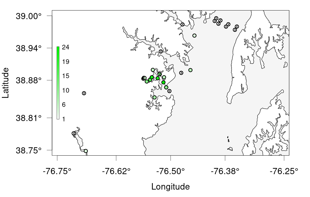
Key Points
Introduction to actel
Overview
Teaching: 45 min
Exercises: 0 minQuestions
What does the actel package do?
When should I consider using Actel to analyze my acoustic telemetry data?
Objectives
actel is designed for studies where animals tagged with acoustic tags are expected to move through receiver arrays. actel combines the advantages of automatic sorting and checking of animal movements with the possibility for user intervention on tags that deviate from expected behaviour. The three analysis functions: explore, migration and residency, allow the users to analyse their data in a systematic way, making it easy to compare results from different studies.
Author: Dr. Hugo Flavio, ( hflavio@wlu.ca )
Supplemental Links and Related Materials:
Actel - a package for the analysis of acoustic telemetry data
The R package actel seeks to be a one-stop package that guides the user through the compilation and cleaning of their telemetry data, the description of their study system, and the production of many reports and analyses that are generally applicable to closed-system telemetry projects. actel tracks receiver deployments, tag releases, and detection data, as well as an additional concept of receiver groups and a network of the interconnectivity between them within our study area, and uses all of this information to raise warnings and potential oddities in the detection data to the user.
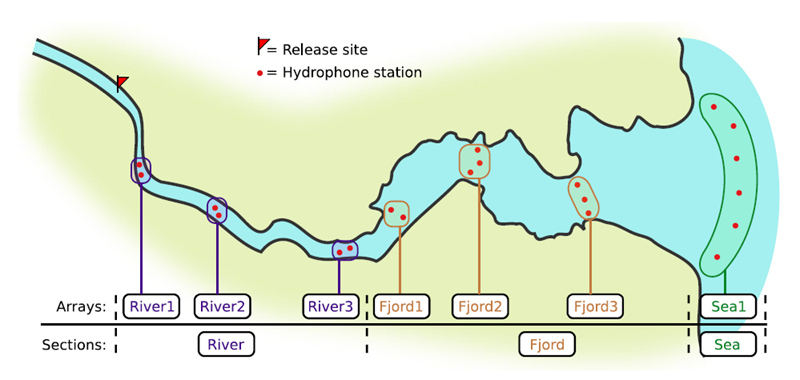

If you’re working in river systems, you’ve probably got a sense of which receivers form arrays. There is a larger-order grouping you can make called ‘sections’, and this will be something we can inter-compare our results with.
Preparing to use actel
With our receiver, tag, and detection data mapped to actel’s formats, and after creating our receiver groups and graphing out how detected animals may move between them, we can leverage actel’s analyses for our own datasets. Thanks to some efforts on the part of Hugo and of the glatos development team, we can move fairly easily with our glatos data into actel.
actel’s standard suite of analyses are grouped into three main functions - explore(), migration(), and residency(). As we will see in this and the next modules, these functions specialize in terms of their outputs but accept the same input data and arguments.
The first thing we will do is use actel’s built-in dataset to ensure we’ve got a working environment, and also to see what sorts of default analysis output Actel can give us.
Exploring
library("actel")

# The first thing you want to do when you try out a package is...
# explore the documentation!

# See the package level documentation:
?actel

# See the manual:
browseVignettes("actel")

# Get the citation for actel, and access the paper:
citation("actel")

# Finally, every function in actel contains detailed documentation
# of the function's purpose and parameters. You can access this
# documentation by typing a question mark before the function name.
# e.g.: ?explore
Working with actel’s example dataset
# Start by checking where your working directory is (it is always good to know this)
getwd()

# We will then deploy actel's example files into a new folder, called "actel_example".
# exampleWorkspace() will provide you with some information about how to run the example analysis.
exampleWorkspace("actel_example")

# Side note: When preparing your own data, you can create the initial template files
# with the function createWorkspace("directory_name")

# Take a minute to explore this folder's contents.

# -----------------------
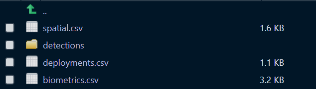
These are the files the Actel package depends on to create its output plots and result summary files.
biometrics.csv contains the detailed information on your tagged animals, where they were released and when, what the tag code is for that animal, and a grouping variable for you to set. Additional columns can be part of biometrics.csv but these are the minimum requirements. The names of our release sites must match up to a place in our spatial.csv file, where you release the animal has a bearing on how it will begin to interact with your study area.
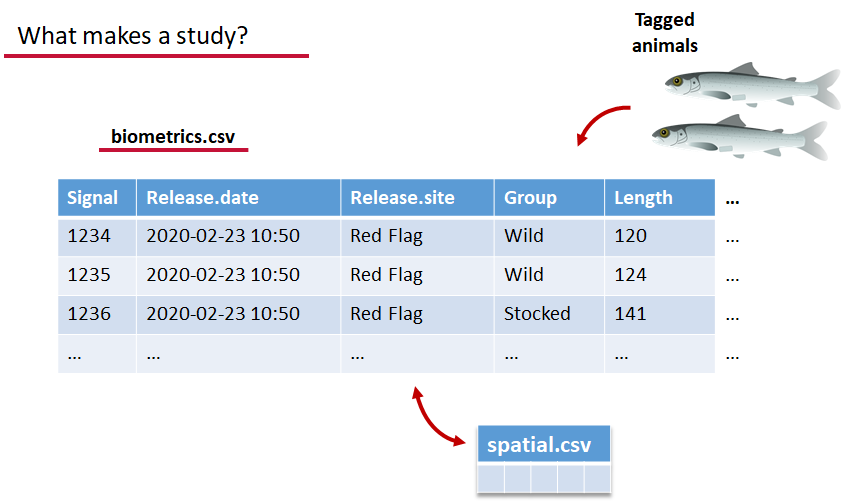
deployments.csv concerns your receiver deployments, when and where each receiver by serial number was deployed. Here again you can have more than the required columns but you have to have a column that corresponds to the station’s ‘name’, which will have a paired entry in the spatial.csv file as well, and a start and end time for the deployment.
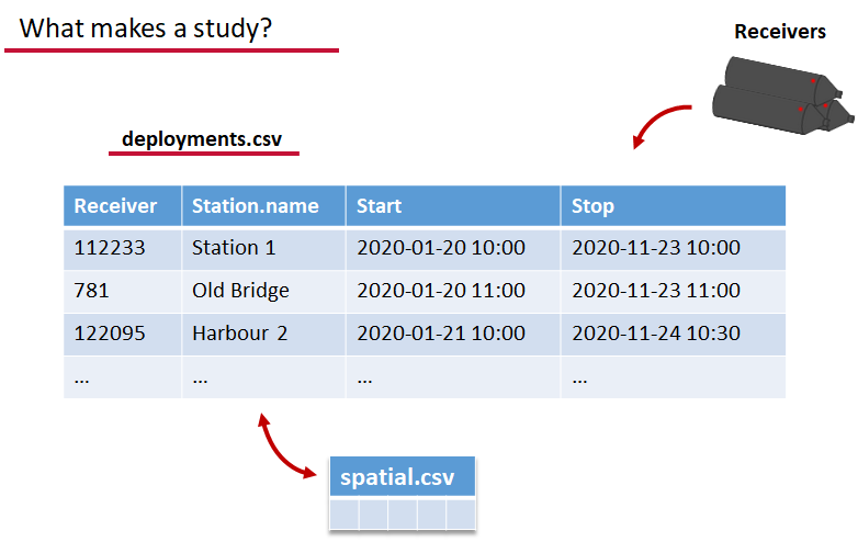
Finally, we have to have some number of detection files. This is helpfully a folder to make it easier on folks who don’t have aggregators like GLATOS and OTN to pull together all the detection information for their tags. While we could drop our detection data in here, when the time comes to use GLATOS data with actel we’ll see how we can create these data structures straight from the glatos data objects. Here also Hugo likes to warn people about opening their detection data files in Excel directly… Excel’s eaten a few date fields on all of us, I’m sure. We don’t have a hate-on for Excel or anything, like our beloved household pet, we’ve just had to learn there are certain places we just can’t bring it with us.
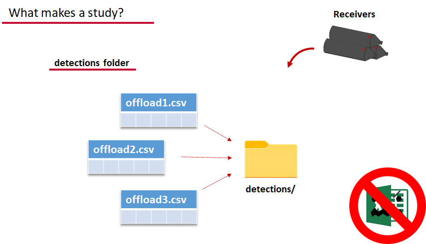
OK, now we have a biometrics file of our tag releases with names for each place we released our tags in spatial.csv, we have a deployments file of all our receiver deployments and the matching names in spatial.csv, and we’ve got our detections. These are the minimum components necessary for actel to go to work.
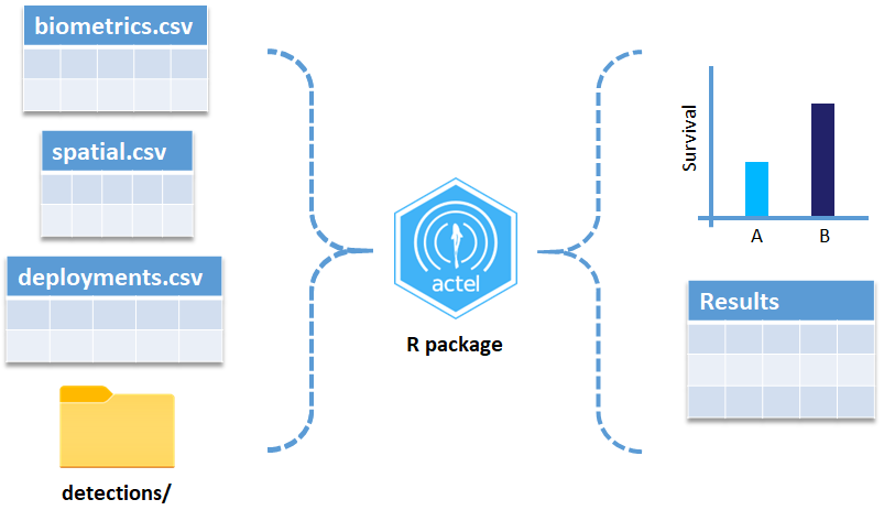
# move into the newly created folder
setwd('actel_example')

# Run analysis. Note: This will open an analysis report on your web browser.
exp.results <- explore(tz = 'US/Central', report = TRUE)

# Because this is an example dataset, this analysis will run very smoothly.
# Real data is not always this nice to us!

# ----------
# If your analysis failed while compiling the report, you can load
# the saved results back in using the dataToList() function:
exp.results <- dataToList("actel_explore_results.RData")

# If your analysis failed before you had a chance to save the results,
# load the pre-compiled results, so you can keep up with the workshop.
# Remember to change the path so R can find the RData file.
exp.results <- dataToList("pre-compiled_results.RData")
This example dataset is a salmon project working in a river-and-estuary system in northeastern Denmark. There are lots of clear logical separations in the array design and the general geography here that we will want to compare and deal with separately.
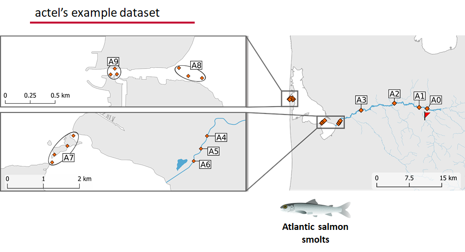
Exploring the output of explore()
# What is inside the output?
names(exp.results)

# What is inside the valid movements?
names(exp.results$valid.movements)

# let's have a look at the first one:
exp.results$valid.movements[["R64K-4451"]]

# and here are the respective valid detections:
exp.results$valid.detections[["R64K-4451"]]

# We can use these results to obtain our own plots (We will go into that later)
These files are the minimum requirements for the main analyses, but there are more files we can create that will give us more control over how actel sees our study area.
A good deal of checking occurs when you first run any analysis function against your data files, and actel is designed to step through any problems interactively with you and prompt you for the preferred resolutions. These interactions can be saved as plaintext in your R script if you want to remember your choices, or you can optionally clean up the input files directly and re-run the analysis function.
Checks that actel runs:
Actel will calculate the movement path for each individual animal, and determine whether that animal has met a threshhold for minimum detections and detection events, whether it snuck across arrays that should have detected it but didn’t, whether it reached unlikely speeds or crossed impassable areas
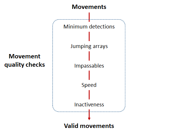
Minimum detections:
Controlled by the minimum.detections and max.interval arguments, if a tag has only 1 movement with less than n detections, discard the tag. Note that animals with movement events > 1 will pass this filter regardless of n.
Jumping arrays:
In cases where you have gates of arrays designed to capture all movement up and down a linear system, you may want to verify that your tags have not ‘jumped’ past one or more arrays before being re-detected. You can use the jump.warning and jump.error arguments to explore() to set the number of acceptable jumps across your array system are permissible.
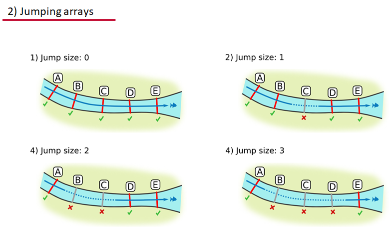
Impassables:
When we define how our areas are connected in the spatial.txt file, it tells actel which movements are -not- permitted explicitly, and can tell us about when those movements occur. This way, we can account for manmade obstacles or make other assumptions about one-way movement and verify our data against them.
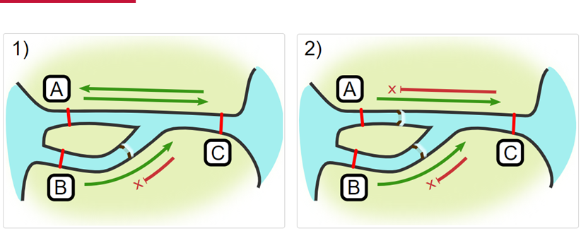
Speed:
actel can calculate the minimum speed of an animal between (and optionally within) detection events using the distances calculated from spatial.csv into a new distance matrix file, distances.csv, and we can supply speed.warning, speed.error, and speed.method to tailor our report to the speed and calculation method we want to submit our data to.
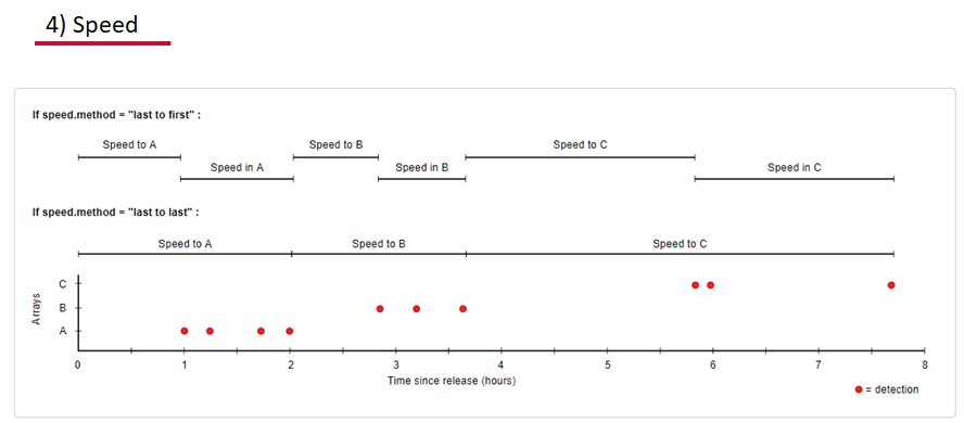
Inactivity:
With the inactive.warning and inactive.error arguments, we can flag entries that have spent a longer time than expected not transiting between locations.
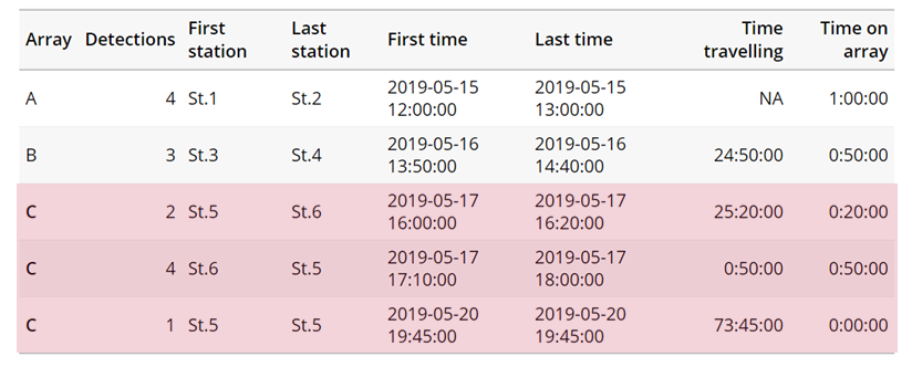
Creating a spatial.txt file
Your study area might be simple and linear, may be complicated and open, completely interconnected. It is more likely a combination of the two! We can use DOT notation (commonly used in graphing applications like GraphViz and Gephi) to create a graph of our areas and how they are allowed to inter-mingle. actel can read this information as DOT notation using readDOT() or you can provide a spatial.txt with the DOT information already inline.
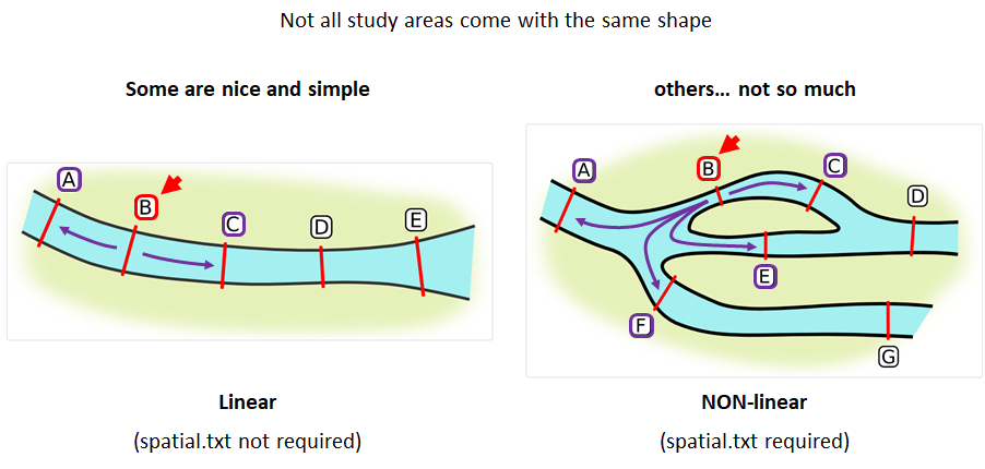
The question you must ask when creating spatial.txt files is: for each location, where could my animal move to and be detected next?
The DOT for the simple system on the left is:
A -- B -- C -- D -- E
And for the more complicated system on the right it’s
A -- B -- C -- D
A -- E -- D
A -- F -- G
B -- E -- F
B -- F
C -- E
Challenge : DOT notation
Using the DOT notation tutorial linked here, discover the notation for a one-way connection and write the DOT notations for the systems shown here:
Solution:
Left-hand diagram:
A -- B
A -- C
B -> C
Right-hand diagram:
A -- B
A -> C
B -> C
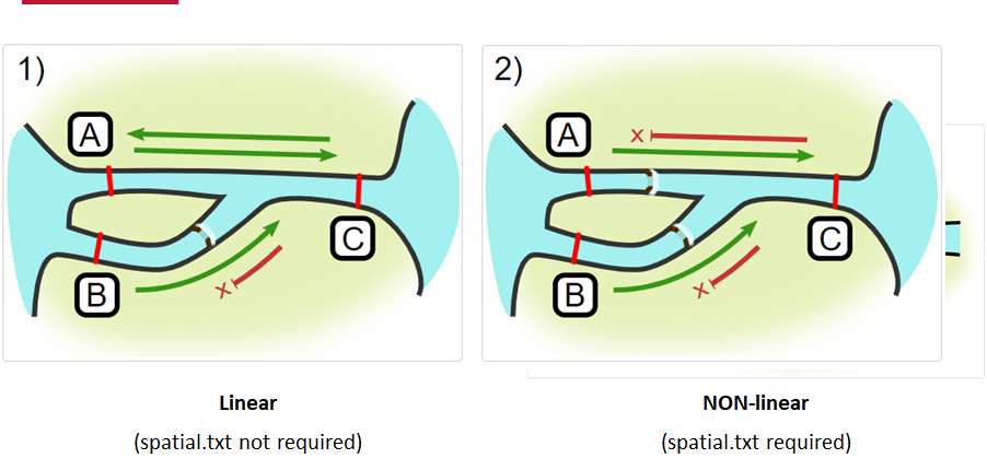
Generating an initial distance matrix file
A distance matrix tracks the distance between each pair of spatial data points in a dataframe. In actel, our dataframe is spatial.csv, and we can use this datafile as well as a shapefile describing our body or bodies of water, with the functions loadShape(), transitionLayer() and distancesMatrix() to generate a distance matrix for our study area.
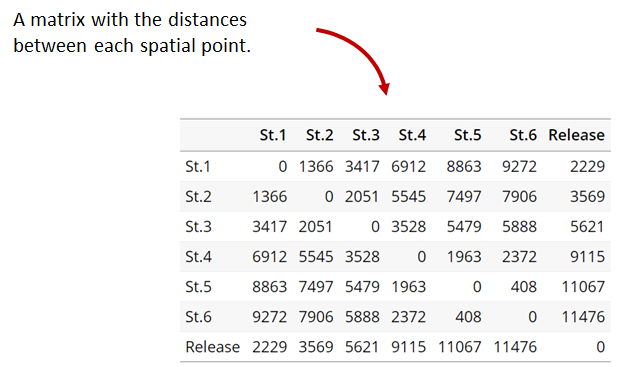
Let’s use actel’s built-in functions to create a distance matrix file. The process generally will be:
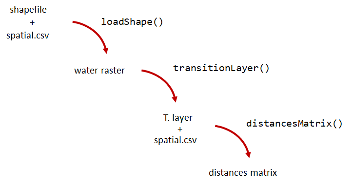
# Let's load the spatial file individually, so we can have a look at it.
spatial <- loadSpatial()
head(spatial)

# When doing the following steps, it is imperative that the coordinate reference
# system (CRS) of the shapefile and of the points in the spatial file are the same.
# In this case, the values in columns "x" and "y" are already in the right CRS.

# loadShape will rasterize the input shape, using the "size" argument as a reference
# for the pixel size. Note: The units of the "size" will be the same as the units
# of the shapefile projection (i.e. metres for metric projections, and degrees for latlong systems)
#
# In this case, we are using a metric system, so we are saying that we want the pixel
# size to be 10 metres.
#
# NOTE: Change the 'path' to the folder where you have the shape file.
# ^^^^^^^^^^^^^^^^^^^^^^^^^^^^^^^^^^^^^^^^^^^^^^^^^^^^^^^^^^^^^^^^^^^^
water <- loadShape(path = "replace/with/path/to/shapefile",
									 shape = "stora_shape_epsg32632.shp", size = 10,
									 coord.x = "x", coord.y = "y")

# The function above can run without the coord.x and coord.y arguments. However, by including them,
# you are allowing actel to load the spatial.csv file on the fly and check if the spatial points
# (i.e. hydrophone stations and release sites) are positioned in water. This is very important,
# as any point position on land will be cut off during distance calculations.

# Now we need to create a transition layer, which R will use to estimate the distances
tl <- transitionLayer(water)

# We are ready to try it out! distancesMatrix will automatically search for a "spatial.csv"
# file in the current directory, so remember to keep that file up to date!
dist.mat <- distancesMatrix(tl, coord.x = "x", coord.y = "y")

# have a look at it:
dist.mat
migration and residency
The migration() function runs the same checks as explore() and can be advantageous in cases where your animals can be assumed to be moving predictably.
The built-in vignettes (remember: browseVignettes("actel") for the interactive vignette) are the most comprehensive description of all that migration() offers over and above explore() but one good way might be to examine its output. For simple datasets and study areas like our example dataset, the arguments and extra spatial.txt and distances.csv aren’t necessary. Our mileage may vary.
# Let's go ahead and try running migration() on this dataset.
mig.results <- migration(tz = 'Europe/Copenhagen', report = TRUE)
the migration() function will ask us to invalidate some flagged data or leave it in the analysis, and then it will ask us to save a copy of the source data once we’ve cleared all the flags. Then we get to see the report. It will show us things like our study locations and their graph relationship:

… a breakdown of the biometrics variables it finds in biometrics.csv
… and a temporal analysis of when animals arrived at each of the array sections of the study area.
To save our choices in actel’s interactives, let’s include them as raw text in our R block. We’ll test this by calling residency() with a few pre-recorded choices, as below:
# Try copy-pasting the next five lines as a block and run it all at once.
res.results <- residency(tz = 'Europe/Copenhagen', report = TRUE)
comment
This is a lovely fish
n
y
# R will know to answer each of the questions that pop up during the analysis
# with the lines you copy-pasted together with your code!

# explore the reports to see what's new!

# Note: There is a known bug in residency() as of actel 1.2.0, which for some datasets
# will cause a crash with the following error message:
#
# Error in tableInteraction(moves = secmoves, tag = tag, trigger = the.warning,  :
#  argument "save.tables.locally" is missing, with no default
#
# This has already been corrected and a fix has been released in actel 1.2.1.
Further exploration of actel: Transforming the results
# Review more available features of Actel in the manual pages!
vignette("f-0_post_functions", "actel")
Key Points
Preparing ACT/OTN/GLATOS Data for actel
Overview
Teaching: 30 min
Exercises: 0 minQuestions
How do I take my ACT detection extracts and metadata and format them for use in
actel?Objectives
Preparing our data to use in Actel
So now, as the last piece of stock curriculum for this workshop, let’s quickly look at how we can take the data reports we get from the ACT-MATOS (or any other OTN-compatible data partner, like FACT, or OTN proper) and make it ready for Actel.
# Using ACT-style data in Actel ####

# install.packages('actel')  # CRAN Version 1.2.1

# Or the development version:
# remotes::install_github("hugomflavio/actel", build_opts = c("--no-resave-data", "--no-manual"), build_vignettes = TRUE)

library(actel)
library(stringr)
library(glatos)
library(tidyverse)
library(readxl)
Within actel there is a preload() function for folks who are holding their deployment, tagging, and detection data in R variables already instead of the files and folders we saw in the actel intro. This function expects 4 input objects, plus the ‘spatial’ data object that will help us describe the locations of our receivers and how the animals are allowed to move between them.
To achieve the minimum required data for actel’s ingestion, we’ll want deployment and recovery datetimes, instrument models, etc. We can transform our metadata’s standard format into the standard format and naming schemes expected by actel::preload() with a bit of dplyr magic:
# Load the ACT metadata and detection extracts -------------
# set working directory to the data folder for this workshop

# Our project's detections file - I'll use readr to read everything from proj59 in at once:

proj_dets <- list.files(pattern="proj59_matched_detections*") %>%
            map_df(~readr::read_csv(.))
# note: readr::read_csv will read in csvs inside zip files no problem.


# read in the tag metadata:

tag_metadata <- readxl::read_excel('Tag_Metadata/Proj59_Metadata_bluecatfish.xls',
                                   sheet='Tag Metadata', # use the Tag Metadata sheet from this excel file
                                   skip=4) # skip the first 4 lines as they're 'preamble'


# And we can import first a subset of the deployments in MATOS that were deemed OK to publish
deploy_metadata <- read_csv('act_matos_moorings_receivers_202104130939.csv') %>%
                      # Add a very quick and dirty receiver group column.
                      mutate(rcvrgroup = ifelse(collectioncode %in% c('PROJ60', 'PROJ61'), # if we're talking PROJ61
                                                paste0(collectioncode,station_name), #let my receiver group be the station name
                                                collectioncode)) # for other project receivers just make it their whole project code.

                      # Also tried to figure out if there was a pattern to station naming that we could take advantage of
                      # but nothing obvious materialized.
                      # mutate(rcvrgroup = paste(collectioncode, stringr::str_replace_all(station_name, "[:digit:]", ""), sep='_'))

# Let's review the groups quickly to see if we under or over-shot what our receiver groups should be.

# TODO: map of the deploy_metadata by group


deploy_metadata %>% ggplot(aes(deploy_lat, deploy_long, colour=rcvrgroup)) + geom_point()


# And let's look at what the other projects were that detected us.
proj_dets %>% count(detectedby)

# And how many of our tags are getting detections back:
proj_dets %>% filter(receiver != 'release') %>% count(tagname)

# OK most of those who have more than an isolated detection are in our deploy metadata.
# just one OTN project to add.

# For OTN projects, we would be able to add in any deployments of OTN receivers from the OTN GeoServer:

# if we wanted to grab and add V2LGMXSNAP receivers to our deployment metadata
# using OTN's public station history records on GeoServer:
# otn_geoserver_stations_url = 'https://members.oceantrack.org/geoserver/otn/ows?service=WFS&version=1.0.0&request=GetFeature&typeName=otn:stations_receivers&outputFormat=csv&cql_filter=collectioncode=%27V2LGMXSNAP%27'
## TODO: Actel needs serial numbers for receivers, so OTN
#  will add serial numbers to this layer, and then we can just
#  urlencode the CQL-query for which projects you want,
#  so you can write your list in 'plaintext' and embed it in the url

# For today, we've made an extract for V2LGMXSNAP and included it in the data folder:
otn_deploy_metadata <- readr::read_csv('otn_moorings_receivers_202104130938.csv') %>%
                                  mutate(rcvrgroup = collectioncode)

# Tack OTN stations to the end of the MATOS extract.
# These are in the exact same format because OTN and MATOS's databases are the
# same format, so we can easily coordinate our output formats.
all_stations <- bind_rows(deploy_metadata, otn_deploy_metadata)

# For ACT/FACT projects - we could use GeoServer to share this information, and could even add
# an authentication layer to let ACT members do this same trick to fetch deploy histories!

# So now this is our animal tagging metadata
# tag_metadata %>% View

# these are our detections:

# proj_dets %>% View

# These are our deployments:

# all_stations %>% View

# Mutate metadata into Actel format ----

# Create a station entry from the projectcode and station number.
# --- add station to receiver metadata ----
full_receiver_meta <- all_stations %>%
  dplyr::mutate(
    station = paste(collectioncode, station_name, sep = '-')
  ) %>%
  filter(is.na(rcvrstatus)|rcvrstatus != 'lost')
We’ve now imported our data, and renamed a few columns from the receiver metadata sheet so that they are in a nicer format. We also create a few helper columns, like a ‘station’ column that is of the form collectioncode + station_name, guaranteed unique for any project across the entire Network.
Formatting - Tagging and Deployment Data
As we saw earlier, tagging metadata is entered into Actel as biometrics, and deployment metadata as deployments. These data structures also require a few specially named columns, and a properly formatted date.
# All dates will be supplied to Actel in this format:
actel_datefmt = '%Y-%m-%d %H:%M:%S'

# biometrics is the tag metadata. If you have a tag metadata sheet, it looks like this:
actel_biometrics <- tag_metadata %>% dplyr::mutate(Release.date = format(UTC_RELEASE_DATE_TIME, actel_datefmt),
                                    Signal=as.integer(TAG_ID_CODE),
                                    Release.site = RELEASE_LOCATION,
                                    # Group=RELEASE_LOCATION  # can supply group to subdivide tagging groups
                                    )
# Actel Deployments ----
# deployments is based in the receiver deployment metadata sheet
actel_deployments <- full_receiver_meta %>% dplyr::filter(!is.na(recovery_date)) %>%
  mutate(Station.name = station,
         Start = format(deploy_date, actel_datefmt), # no time data for these deployments
         Stop = format(recovery_date, actel_datefmt),  # not uncommon for this region
         Receiver = rcvrserial) %>%
  arrange(Receiver, Start)
Detections
For detections, a few columns need to exist: Transmitter holds the full transmitter ID. Receiver holds the receiver serial number, Timestamp has the detection times, and we use a couple of Actel functions to split CodeSpace and Signal from the full transmitter_id.
# Renaming some columns in the Detection extract files
actel_dets <- proj_dets %>% dplyr::mutate(Transmitter = tagname,
                                    Receiver = as.integer(receiver),
                                    Timestamp = format(datecollected, actel_datefmt),
                                    CodeSpace = extractCodeSpaces(tagname),
                                    Signal = extractSignals(tagname))  %>%
                            dplyr::filter(Receiver != 'Release')
Creating the Spatial dataframe
The spatial dataframe must have entries for all release locations and all receiver deployment locations. Basically, it must have an entry for every distinct location we can say we know an animal has been.
# Prepare and style entries for receivers
actel_receivers <- full_receiver_meta %>% dplyr::mutate( Station.name = station,
                                                  Latitude = deploy_lat,
                                                  Longitude = deploy_long,
                                                  Type='Hydrophone') %>%
  dplyr::mutate(Array=rcvrgroup) %>%    # Having too many distinct arrays breaks things.
  dplyr::select(Station.name, Latitude, Longitude, Array, Type) %>%
  distinct(Station.name, Latitude, Longitude, Array, Type)

# Actel Tag Releases ---------------

# Prepare and style entries for tag releases
actel_tag_releases <- tag_metadata %>% mutate(Station.name = RELEASE_LOCATION,
                                      Latitude = RELEASE_LATITUDE,
                                      Longitude = RELEASE_LONGITUDE,
                                      Type='Release') %>%
# TODO: get a sense of which array is closest to the animal releases and auto-assign them
  mutate(Array = 'PROJ61JUGNO_2A') %>% # Set this to the closest array to your release locations
# if this is different for multiple release groups, can do things like this to subset case-by-case:
  # here Station.name is the release location 'station' name, and the value after ~ will be assigned to all.
#  mutate(Array = case_when(Station.name == 'Maumee' ~ 'SIC',
#                           Station.name == 'Tittabawassee' ~ 'TTB',
#                           Station.name == 'AuGres' ~ 'AGR')) %>% # This value needs to be the nearest array to the release site
  distinct(Station.name, Latitude, Longitude, Array, Type)

# Combine Releases and Receivers ------

# Bind the releases and the deployments together for the unique set of spatial locations
actel_spatial <- actel_receivers %>% bind_rows(actel_tag_releases)
Now, for longer data series, we may have similar stations that were deployed and redeployed at very slightly different locations. One way to deal with this issue is that for stations that are named the same, we assign an average location in spatial.
Another way we might overcome this issue could be to increment station_names that are repeated and provide their distinct locations.
# group by station name and take the mean lat and lon of each station deployment history.
actel_spatial_sum <- actel_spatial %>% dplyr::group_by(Station.name, Type) %>%
                                      dplyr::summarize(Latitude = mean(Latitude),
                                                        Longitude = mean(Longitude),
                                                        Array =  first(Array))
Creating the Actel data object w/ preload()
Now you have everything you need to call preload().
# Specify the timezone that your timestamps are in.
# OTN provides them in UTC/GMT.
# FACT has both UTC/GMT and Eastern
# ACT provides them in UTC/GMT and Eastern
# If you got the detections from someone else,
#    they will have to tell you what TZ they're in!
#    and you will have to convert them before importing to Actel!

tz <- "GMT0"

# You've collected every piece of data and metadata and formatted it properly.
# Now you can create the Actel project object.

actel_project <- preload(biometrics = actel_biometrics,
                         spatial = actel_spatial_sum,
                         deployments = actel_deployments,
                         detections = actel_dets,
                         tz = tz)
There will very likely be some issues with the data that the Actel checkers find and warn us about. Detections outside the deployment time bounds, receivers that aren’t in your metadata. For the purposes of today, we will drop those rows from the final copy of the data, but you can take these prompts as cues to verify your input metadata is accurate and complete. It is up to you in the end to determine whether there is a problem with the data, or an overzealous check that you can safely ignore. Here our demo is using a very deeply subsetted version of one project’s data, and it’s not surprising to be missing some deployments.
Once you have an Actel object, you can run explore() to generate your project’s summary reports:
# Get summary reports from our dataset:
actel_explore_output <- explore(datapack=actel_project,
                                report=TRUE,
                                print.releases=FALSE)
Review the file that Actel pops up in our browser. It presumed our Arrays were arranged linearly and alphabetically, which is of course not correct!
Custom spatial.txt files for Actel
We’ll have to tell Actel how our arrays are inter-connected. To do this, we’ll need to design a spatial.txt file for our detection data.
To help with this, we can go back and visualize our study area interactively, and start to see how the Arrays are connected.
# Designing a spatial.txt file -----

library(mapview)
library(spdplyr)
library(leaflet)
library(leafpop)


## Exploration - Let's use mapview, since we're going to want to move around,
#   drill in and look at our stations


# Get a list of spatial objects to plot from actel_spatial_sum:
our_receivers <- as.data.frame(actel_spatial_sum) %>%
  dplyr::filter(Array %in% (actel_spatial_sum %>%   # only look at the arrays already in our spatial file
                              distinct(Array))$Array)

rcvr_spatial <- our_receivers %>%
  dplyr::select(Longitude, Latitude) %>%           # and get a SpatialPoints object to pass to mapview
  sp::SpatialPoints(CRS('+proj=longlat'))
# and plot it using mapview. The popupTable() function lets us customize our tooltip
mapview(rcvr_spatial, popup = popupTable(our_receivers,
                                         zcol = c("Array",
                                                  "Station.name")))  # and make a tooltip we can explore
Can we design a graph and write it into spatial.txt that fits all these Arrays together? The station value we put in Array for our PROJ61 and PROJ60 projects looks to be a bit too granular for our purposes. Maybe we can combine many arrays that are co-located in open water into a singular ‘zone’, preserving the complexity of the river systems but creating a large basin to which we can connect the furthest downstream of those river arrays.
To do this, we only need to update the arrays in our spatial.csv file or actel_spatial dataframe. We don’t need to edit our source metadata! We will have to define a spatial.txt file and how these newly defined Arrays interconnect. While there won’t be time to do that for this example dataset and its large and very complicated region, this approach is definitely suitable for small river systems and even perhaps for multiple river systems feeding a bay and onward to the open water. If you’d like to apply Actel to your data and want to define a custom spatial.txt file, there are some code examples included in code/day2/5_actel_custom_spatial.R that might be helpful to get you started.
Key Points
Introduction to Boosted Regression Trees
Overview
Teaching: 45 min
Exercises: 0 minQuestions
How is boosted regression tree modeling used in telemetry analysis?
What are the advantages of boosted regression trees when working with telemetry data?
Objectives
Briefly review how boosted regression trees work.
Demonstrate how to set up a boosted regression tree analysis with acoustic telemetry data.
Introduce the gbm.auto package and demonstrate its use with a case study on dusky sharks off the US Mid-Atlantic region.
Overview
- BRT Basics
- Using BRTs with Acoustic Telemetry Data
- BRT Analysis in R using
gbm.auto - Case Study (and Shameless Paper Promotion): NW Atlantic Dusky Sharks
(Speaker: Dr. Charles Bangley, Charles.Bangley@dal.ca)
Key Points
Other OTN Telemetry Curriculums
Overview
Teaching: 0 min
Exercises: 0 minQuestions
How can I expand my learning?
Objectives
OTN has hosted other workshops in the past which contain different code sets that may be useful to explore after this workshop.
-
IdeasOTN Telemetry Workshop Series 2020: code available here and videos available on our YouTube here
Many of our Intro to R workshops are based upon this curriculum from The Carpentries.
Key Points