Basic Visualization and Plotting
Overview
Teaching: 30 min
Exercises: 0 minQuestions
How can I use GLATOS to plot my data?
What kinds of plots can I make with my data?
Objectives
We can use GLATOS to quickly and effectively visualize our data, now that we’ve cleaned it up.
One of the simplest ways is to use an abacus plot to display animal detections against the appropriate stations.
# Visualizing Data - Abacus Plots ####
# ?glatos::abacus_plot
# customizable version of the standard VUE-derived abacus plots

abacus_plot(detections_w_events,
            location_col='station',
            main='Walleye Detection by Station') # can use plot() variables here, they get passed thru to plot()

abacus_plot(detections_w_events,
            location_col='glatos_array',
            main='Walleye Detection by Array')
This is good, but cluttered. We can also filter out a single animal ID and plot only the abacus plot for that.
# pick a single fish to plot
# pick a single fish to plot
abacus_plot(detections_filtered[detections_filtered$animal_id== "22",],
            location_col='station',
            main="Animal 22 Detections By Station")
If we want to see actual physical distribution, a bubble plot will serve us better.
The glatos package provides a raster of the Great Lakes to the bubble plot, we will just use that.
# Bubble Plots for Spatial Distribution of Fish ####
# bubble variable gets the summary data that was created to make the plot
detections_filtered

?detection_bubble_plot

bubble_station <- detection_bubble_plot(detections_filtered,
                                location_col = 'station',
                                out_file = 'walleye_bubbles_by_stations.png')
bubble_station

bubble_array <- detection_bubble_plot(detections_filtered,
                                      out_file = 'walleye_bubbles_by_array.png')
bubble_array
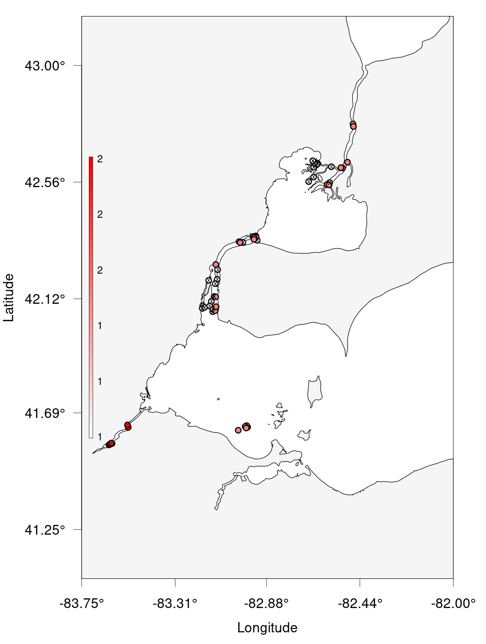
Glatos Challenge
Create a bubble plot of the station in Lake Erie only. Set the bounding box using the provided nw + se cordinates and resize the points. As a bonus, add points for the other receivers in Lake Erie. Hint:
?detection_bubble_plotwill help a lot. Here’s some code to get you started:erie_arrays <-c("DRF", "DRL", "DRU", "MAU", "RAR", "SCL", "SCM", "TSR") nw <- c(43, -83.75) se <- c(41.25, -82)Solution
erie_arrays <-c("DRF", "DRL", "DRU", "MAU", "RAR", "SCL", "SCM", "TSR") # Given
nw <- c(43, -83.75) # Given
se <- c(41.25, -82) # Given
erie_detections <- detections_filtered %>% filter(glatos_array %in% erie_arrays)
erie_rcvrs <- receivers %>% filter(glatos_array %in% erie_arrays) # For bonus

erie_bubble <- detection_bubble_plot(erie_detections,
                                     receiver_locs = erie_rcvrs, # For bonus
                                     location_col = 'station',
                                     background_ylim = c(se[1], nw[1]),
                                     background_xlim = c(nw[2], se[2]),
                                     symbol_radius = 0.75,
                                     out_file = 'erie_bubbles_by_stations.png')
Key Points