Background
Overview
Teaching: 5 min
Exercises: 0 minQuestions
What is the Ocean Tracking Network?
How does your local telemetry network interact with OTN?
What methods of data analysis will be covered?
Objectives
Intro to OTN
The Ocean Tracking Network (OTN) supports global telemetry research by providing training, equipment, and data infrastructure to our large network of partners.
OTN and affiliated networks provide automated cross-referencing of your detection data with other tags in the system to help resolve “mystery detections” and provide detection data to taggers in other regions. OTN’s Data Managers will also extensively quality-control your submitted metadata for errors to ensure the most accurate records possible are stored in the database. OTN’s database and Data Portal website are excellent places to archive your datasets for future use and sharing with collaborators. We offer pathways to publish your datasets with OBIS, and via open data portals like ERDDAP, GeoServer etc. The data-product format returned by OTN is directly ingestible by analysis packages such as glatos and resonATe for ease of analysis. OTN offers support for the use of these packages and tools.
Learn more about OTN and our partners here https://members.oceantrack.org/. Please contact OTNDC@DAL.CA if you are interested in connecting with your regional network and learning about their affiliation with OTN.
Intended Audience
This set of workshop material is directed at researchers who are ready to begin the work of acoustic telemetry data analysis. The first few lessons will begin with introductory R - no previous coding experince required. The workshop material progresses into more advanced techniques as we move along, beginning around lesson 8 “Introduction to Glatos”.
If you’d like to refresh your R coding skills outside of this workshop curriculum, we recommend Data Analysis and Visualization in R for Ecologists as a good starting point. Much of this content is included in the first two lessons of this workshop.
Getting Started
Please follow the instrucions in the “Setup” tab along the top menu to install all required software, packages and data files. If you have questions or are running into errors please reach out to OTNDC@DAL.CA for support.
NOTE: this workshop has been update to align with OTN’s 2025 Detection Extract Format. For older detection extracts, please see the this lesson: Archived OTN Workshop.
Intro to Telemetry Data Analysis
OTN-affiliated telemetry networks all provide researchers with pre-formatted datasets, which are easily ingested into these data analysis tools.
Before diving in to a lot of analysis, it is important to take the time to clean and sort your dataset, taking the pre-formatted files and combining them in different ways, allowing you to analyse the data with different questions in mind.
There are multiple R packages necessary for efficient and thorough telemetry data analysis. General packages that allow for data cleaning and arrangement, dataset manipulation and visualization, pairing with oceanographic data and temporo-spatial locating are used in conjuction with the telemetry analysis tool packages remora, actel and glatos.
There are many more useful packages covered in this workshop, but here are some highlights:
Intro to the glatos Package
glatos is an R package with functions useful to members of the Great Lakes Acoustic Telemetry Observation System (http://glatos.glos.us). Developed by Chris Holbrook of GLATOS, OTN helps to maintain and keep relevant. Functions may be generally useful for processing, analyzing, simulating, and visualizing acoustic telemetry data, but are not strictly limited to acoustic telemetry applications. Tools included in this package facilitate false filtering of detections due to time between pings and disstance between pings. There are tools to summarise and plot, including mapping of animal movement. Learn more here.
Maintainer: Dr. Chris Holbrook, ( cholbrook@usgs.gov )
Intro to the actel Package
This package is designed for studies where animals tagged with acoustic tags are expected to move through receiver arrays. actel combines the advantages of automatic sorting and checking of animal movements with the possibility for user intervention on tags that deviate from expected behaviour. The three analysis functions: explore, migration and residency, allow the users to analyse their data in a systematic way, making it easy to compare results from different studies.
Author: Dr. Hugo Flavio, ( hflavio@wlu.ca )
Intro to the remora Package
This package is designed for the Rapid Extraction of Marine Observations for Roving Animals (remora). This is an R package that enables the integration of animal acoustic telemetry data with oceanographic observations collected by ocean observing programs. It includes functions for:
- Interactively exploring animal movements in space and time from acoustic telemetry data
- Performing robust quality-control of acoustic telemetry data as described in Hoenner et al. 2018
- Identifying available satellite-derived and sub-surface in situ oceanographic datasets coincident and collocated with the animal movement data, based on regional Ocean Observing Systems
- Extracting and appending these environmental data to animal movement data
Whilst the functions in remora were primarily developed to work with acoustic telemetry data, the environmental data extraction and integration functionalities will work with other spatio-temporal ecological datasets (eg. satellite telemetry, species sightings records, fisheries catch records).
Maintainer: Created by a team from IMOS Animal Tracking Facility, adapted to work on OTN-formatted data by Bruce Delo ( bruce.delo@dal.ca )
Intro to the pathroutr Package
The goal of pathroutr is to provide functions for re-routing paths that cross land around barrier polygons. The use-case in mind is movement paths derived from location estimates of marine animals. Due to error associated with these locations it is not uncommon for these tracks to cross land. The pathroutr package aims to provide a pragmatic and fast solution for re-routing these paths around land and along an efficient path. You can learn more here
Author: Dr. Josh M London ( josh.london@noaa.gov )
Key Points
Intro to R
Overview
Teaching: 30 min
Exercises: 20 minQuestions
What are common operators in R?
What are common data types in R?
What are some base R functions?
How do I deal with missing data?
Objectives
First, lets learn about RStudio.
RStudio is divided into 4 “Panes”: the Source for your scripts and documents (top-left, in the default layout); your Environment/History (top-right) which shows all the objects in your working space (Environment) and your command history (History); your Files/Plots/Packages/Help/Viewer (bottom-right); and the R Console (bottom-left). The placement of these panes and their content can be customized (see menu, Tools -> Global Options -> Pane Layout).
The R Script in the top pane can be saved and edited, while code typed directly into the Console below will disappear after closing the R session.
R can access files on and save outputs to any folder on your computer. R knows where to look for and save files based on the current working directory. This is one of the first things you should set up: a folder you’d like to contain all your data, scripts and outputs. The working directory path will be different for everyone. For the workshop, we’ve included the path one of our instructors uses, but you should use your computer’s file explorer to find the correct path for your data.
Setting up R
# Packages ####
# once you install packages to your computer, you can "check them out" of your packages library each time you need them
# make sure you check the "mask" messages that appear - sometimes packages have functions with the same names!

library(tidyverse)# really neat collection of packages! https://www.tidyverse.org/
library(lubridate)
library(readxl)
library(viridis)
library(plotly)
library(ggmap)


# Working Directory ####

#Instructors!! since this lesson is mostly base R we're not going to make four copies of it as with the other nodes.
#Change this one line as befits your audience.
setwd('YOUR/PATH/TO/data/NODE') #set folder you're going to work in
getwd() #check working directory

#you can also change it in the RStudio interface by navigating in the file browser where your working directory should be
#(if you can't see the folder you want, choose the three horizonal dots on the right side of the Home bar),
#and clicking on the blue gear icon "More", and select "Set As Working Directory".
Before we begin the lesson proper, a note on finding additional help. R Libraries, like those included above, are broad and contain many functions. Though most include documentation that can help if you know what to look for, sometimes more general help is necessary. To that end, RStudio maintains cheatsheets for several of the most popular libraries, which can be found here: https://www.rstudio.com/resources/cheatsheets/. As a start, the page includes an RStudio IDE cheatsheet that you may find useful while learning to navigate your workspace. With that in mind, let’s start learning R.
Intro to R
Like most programming langauges, we can do basic mathematical operations with R. These, along with variable assignment, form the basis of everything for which we will use R.
Operators
Operators in R include standard mathematical operators (+, -, *, /) as well as an assignment operator, <- (a less-than sign followed by a hyphen). The assignment operator is used to associate a value with a variable name (or, to ‘assign’ the value a name). This lets us refer to that value later, by the name we’ve given to it. This may look unfamiliar, but it fulfils the same function as the ‘=’ operator in most other languages.
3 + 5 #maths! including - , *, /

weight_kg <- 55 #assignment operator! for objects/variables. shortcut: alt + -
weight_kg

weight_lb <- 2.2 * weight_kg #can assign output to an object. can use objects to do calculations
Variables Challenge
If we change the value of weight_kg to be 100, does the value of weight_lb also change? Remember: You can check the contents of an object by typing out its name and running the line in RStudio.
Solution
No! You have to re-assign 2.2*weight_kg to the object weight_lb for it to update.
The order you run your operations is very important, if you change something you may need to re-run everything!
weight_kg <- 100

weight_lb #didnt change!

weight_lb <- 2.2 * weight_kg #now its updated
Functions
While we can write code as we have in the section above - line by line, executed one line at a time - it is often more efficient to run multiple lines of code at once. By using functions, we can even compress complex calculations into just one line!
Functions use a single name to refer to underlying blocks of code that execute a specific calculation. To run a function you need two things: the name of the function, which is usually indicative of the function’s purpose; and the function’s arguments- the variables or values on which the function should execute.
#functions take "arguments": you have to tell them what to run their script against

ten <- sqrt(weight_kg) #contain calculations wrapped into one command to type.
#Output of the function can be assigned directly to a variable...

round(3.14159) #... but doesn't have to be.
Since there are hundreds of functions and often their functionality can be nuanced, we have several ways to get more information on a given function. First, we can use ‘args()’, itself a function that takes the name of another function as an argument, which will tell us the required arguments of the function against which we run it.
Second, we can use the ‘?’ operator. Typing a question mark followed by the name of a function will open a Help window in RStudio’s bottom-right panel. This will contain the most complete documentation available for the function in question.
args(round) #the args() function will show you the required arguments of another function

?round #will show you the full help page for a function, so you can see what it does
Functions Challenge
Can you round the value 3.14159 to two decimal places?
Hint: Using args() on a function can give you a clue.
Solution
round(3.14159, 2) #the round function's second argument is the number of digits you want in the result
round(3.14159, digits = 2) #same as above
round(digits = 2, x = 3.14159) #when reordered you need to specify
Vectors and Data Types
While variables can hold a single value, sometimes we want to store multiple values in the same variable name. For this, we can use an R data structure called a ‘vector.’ Vectors contain one or more variables of the same data type, and can be assigned to a single variable name, as below.
weight_g <- c(21, 34, 39, 54, 55) #use the combine function to join values into a vector object

length(weight_g) #explore vector
class(weight_g) #a vector can only contain one data type
str(weight_g) #find the structure of your object.
Above, we mentioned ‘data type’. This refers to the kind of data represented by a value, or stored by the appropriate variable. Data types include character (words or letters), logical (boolean TRUE or FALSE values), or numeric data. Crucially, vectors can only contain one type of data, and will force all data in the vector to conform to that type (i.e, data in the vector will all be treated as the same data type, regardless of whether or not it was of that type when the vector was created.) We can always check the data type of a variable or vector by using the ‘class()’ function, which takes the variable name as an argument.
#our first vector is numeric.
#other options include: character (words), logical (TRUE or FALSE), integer etc.

animals <- c("mouse", "rat", "dog") #to create a character vector, use quotes

class(weight_g)
class(animals)

# Note:
#R will convert (force) all values in a vector to the same data type.
#for this reason: try to keep one data type in each vector
#a data table / data frame is just multiple vectors (columns)
#this is helpful to remember when setting up your field sheets!
Vectors Challenge
What data type will this vector become?
challenge3 <- c(1, 2, 3, "4")Hint: You can check a vector’s type with the class() function.
Solution
R will force all of these to be characters, since the number 4 has quotes around it! Will always coerce data types following this structure: logical → numeric → character ← logical
class(challenge3)
Indexing and Subsetting
We can use subsetting to select only a portion of a vector. For this, we use square brackets after the name of a vector. If we supply a single numeric value, as below, we will retrieve only the value from that index of the vector. Note: vectors in R are indexed with 1 representing the first index- other languages use 0 for the start of their array, so if you are coming from a language like Python, this can be disorienting.
animals #calling your object will print it out
animals[2] #square brackets = indexing. selects the 2nd value in your vector
We can select a specific value, as above, but we can also select one or more entries based on conditions. By supplying one or more criteria to our indexing syntax, we can retrieve the elements of the array that match that criteria.
weight_g > 50 #conditional indexing: selects based on criteria
weight_g[weight_g <=30 | weight_g == 55] #many new operators here!
                                         #<= less than or equal to; | "or"; == equal to. Also available are >=, greater than or equal to; < and > for less than or greater than (no equals); and & for "and".
weight_g[weight_g >= 30 & weight_g == 21] #  >=  greater than or equal to, & "and"
                                          # this particular example give 0 results - why?
Missing Data
In practical data analysis, our data is often incomplete. It is therefore useful to cover some methods of dealing with NA values. NA is R’s shorthand for a null value; or a value where there is no data. Certain functions cannot process NA data, and therefore provide arguments that allow NA values to be removed before the function execution.
heights <- c(2, 4, 4, NA, 6)
mean(heights) #some functions cant handle NAs
mean(heights, na.rm = TRUE) #remove the NAs before calculating
This can be done within an individual function as above, but for our entire analysis we may want to produce a copy of our dataset without the NA values included. Below, we’ll explore a few ways to do that.
heights[!is.na(heights)] #select for values where its NOT NA
#[] square brackets are the base R way to select a subset of data --> called indexing
#! is an operator that reverses the function

na.omit(heights) #omit the NAs

heights[complete.cases(heights)] #select only complete cases
Missing Data Challenge
Question 1: Using the following vector of heighs in inches, create a new vector, called heights_no_na, with the NAs removed.
heights <- c(63, 69, 60, 65, NA, 68, 61, 70, 61, 59, 64, 69, 63, 63, NA, 72, 65, 64, 70, 63, 65)Solution
heights_no_na <- heights[!is.na(heights)]
# or
heights_no_na <- na.omit(heights)
# or
heights_no_na <- heights[complete.cases(heights)]
Question 2: Use the function median() to calculate the median of the heights vector.
Solution
median(heights, na.rm = TRUE)Bonus question: Use R to figure out how many people in the set are taller than 67 inches.
Solution
heights_above_67 <- heights_no_na[heights_no_na > 67]
length(heights_above_67)
Key Points
Starting with Data Frames
Overview
Teaching: 25 min
Exercises: 10 minQuestions
How do I import tabular data?
How do I explore my data set?
What are some basic data manipulation functions?
Objectives
NOTE: this workshop has been update to align with OTN’s 2025 Detection Extract Format. For older detection extracts, please see the this lesson: Archived OTN Workshop.
Note to instructors: please choose the relevant Network below when teaching
ACT Node
Dataframes and dplyr
In this lesson, we’re going to introduce a package called dplyr. dplyr takes advantage of an operator called a pipe to create chains of data manipulation that produce powerful exploratory summaries. It also provides a suite of further functionality for manipulating dataframes: tabular sets of data that are common in data analysis. If you’ve imported the tidyverse library, as we did during setup and in the last episode, then congratulations: you already have dplyr (along with a host of other useful packages). As an aside, the cheat sheets for dplyr and readr may be useful when reviewing this lesson.
You may not be familiar with dataframes by name, but you may recognize the structure. Dataframes are arranged into rows and columns, not unlike tables in typical spreadsheet format (ex: Excel). In R, they are represented as vectors of vectors: that is, a vector wherein each column is itself a vector. If you are familiar with matrices, or two-dimensional arrays in other languages, the structure of a dataframe will be clear to you.
However, dataframes are not merely vectors- they are a specific type of object with their own functionality, which we will cover in this lesson.
We are going to use OTN-style detection extracts for this lesson. If you’re unfamiliar with detection extracts formats from OTN-style database nodes, see the documentation here
Importing from CSVs
Before we can start analyzing our data, we need to import it into R. Fortunately, we have a function for this. read_csv is a function from the readr package, also included with the tidyverse library. This function can read data from a .csv file into a dataframe. “.csv” is an extension that denotes a Comma-Separated Value file, or a file wherein data is arranged into rows, and entries within rows are delimited by commas. They’re common in data analysis.
For the purposes of this lesson, we will only cover read_csv; however, there is another function, read_excel, which you can use to import excel files. It’s from a different library (readxl) and is outside the scope of this lesson, but worth investigating if you need it.
To import your data from your CSV file, we just need to pass the file path to read_csv, and assign the output to a variable. Note that the file path you give to read_csv will be relative to the working directory you set in the last lesson, so keep that in mind.
#imports file into R. paste the filepath to the file here!
#read_csv can take both csv and zip files, as long as the zip file contains a csv.

cbcnr_matched_2016 <- read_csv("cbcnr_matched_detections_2016.zip")
Regarding Parquet Files
OTN now sends out detection extracts in
.parquetformat rather than only.csv. Full documentation on the parquet file format can be found here, but in brief, it is an alternative to other tabular data formats that is designed for more efficient data storage and retrieval. If you have a parquet file, you will need to import it usingread_parquetfrom thenanoparquetpackage rather thanread_csv, like so:cbcnr_matched_2016 <- read_parquet("cbcnr_matched_detections_2016.parquet")Replace the filename with the appropriate path to your own parquet file. Everything hereafter will work the same:
read_parquetimports the data as a dataframe, and the column names and data types are identical across the CSV and Parquet versions of the detection extract. That means once the data is imported into R, the rest of the code in the workshop will work identically on it.
We can now refer to the variable cbcnr_matched_2016 to access, manipulate, and view the data from our CSV. In the next sections, we will explore some of the basic operations you can perform on dataframes.
Exploring Detection Extracts
Let’s start with a practical example. What can we find out about these matched detections? We’ll begin by running the code below, and then give some insight into what each function does. Remember, if you’re ever confused about the purpose of a function, you can use ‘?’ followed by the function name (i.e, ?head, ?View) to get more information.
head(cbcnr_matched_2016) #first 6 rows
View(cbcnr_matched_2016) #can also click on object in Environment window
str(cbcnr_matched_2016) #can see the type of each column (vector)
glimpse(cbcnr_matched_2016) #similar to str()

#summary() is a base R function that will spit out some quick stats about a vector (column)
#the $ syntax is the way base R selects columns from a data frame

summary(cbcnr_matched_2016$decimalLatitude)
You may now have an idea of what each of those functions does, but we will briefly explain each here.
head takes the dataframe as a parameter and returns the first 6 rows of the dataframe. This is useful if you want to quickly check that a dataframe imported, or that all the columns are there, or see other such at-a-glance information. Its primary utility is that it is much faster to load and review than the entire dataframe, which may be several tens of thousands of rows long. Note that the related function tail will return the last six elements.
If we do want to load the entire dataframe, though, we can use View, which will open the dataframe in its own panel, where we can scroll through it as though it were an Excel file. This is useful for seeking out specific information without having to consult the file itself. Note that for large dataframes, this function can take a long time to execute.
Next are the functions str and glimpse, which do similar but different things. str is short for ‘structure’ and will print out a lot of information about your dataframe, including the number of rows and columns (called ‘observations’ and ‘variables’), the column names, the first four entries of each column, and each column type as well. str can sometimes be a bit overwhelming, so if you want to see a more condensed output, glimpse can be useful. It prints less information, but is cleaner and more compact, which can be desirable.
Finally, we have the summary function, which takes a single column from a dataframe and produces a summary of its basic statistics. You may have noticed the ‘$’ in the summary call- this is how we index a specific column from a dataframe. In this case, we are referring to the latitude column of our dataframe.
Using what you now know about summary functions, try to answer the challenge below.
Detection Extracts Challenge
Question 1: What is the class of the station column in cbcnr_matched_2016, and how many rows and columns are in the cbcnr_matched_2016 dataset??
Solution
The column is a character, and there are 7,693 rows with 36 columns
str(cbcnr_matched_2016)
# or
glimpse(cbcnr_matched_2016)
Data Manipulation
Now that we’ve learned how to import and summarize our data, we can learn how to use dplyr to manipulate it. The name ‘dplyr’ may seem esoteric- the ‘d’ is short for ‘dataframe’, and ‘plyr’ is meant to evoke pliers, and thereby cutting, twisting, and shaping. This is an elegant summation of the dplyr library’s functionality.
We are going to introduce a new operator in this section, called the “dplyr pipe”. Not to be confused with |, which is also called a pipe in some other languages, the dplyr pipe is rendered as %>%. A pipe takes the output of the function or contents of the variable on the left and passes them to the function on the right. It is often read as “and then.” If you want to quickly add a pipe, the keybord shortcut CTRL + SHIFT + M will do so.
library(dplyr) #can use tidyverse package dplyr to do exploration on dataframes in a nicer way

# %>% is a "pipe" which allows you to join functions together in sequence.

cbcnr_matched_2016 %>% dplyr::select(6) #selects column 6

# Using the above transliteration: "take cbcnr_matched_2016 AND THEN select column number 6 from it using the select function in the dplyr library"
You may have noticed another unfamiliar operator above, the double colon (::). This is used to specify the package from which we want to pull a function. Until now, we haven’t needed this, but as your code grows and the number of libraries you’re using increases, it’s likely that multiple functions across several different packages will have the same name (a phenomenon called “overloading”). R has no automatic way of knowing which package contains the function you are referring to, so using double colons lets us specify it explicitly. It’s important to be able to do this, since different functions with the same name often do markedly different things.
Let’s explore a few other examples of how we can use dplyr and pipes to manipulate our dataframe.
cbcnr_matched_2016 %>% slice(1:5) #selects rows 1 to 5 in the dplyr way
# Take cbcnr_matched_2016 AND THEN slice rows 1 through 5.

#We can also use multiple pipes.
cbcnr_matched_2016 %>%
  distinct(detectedBy) %>%
  nrow #number of arrays that detected my fish in dplyr!
# Take cbcnr_matched_2016 AND THEN select only the unique entries in the detectedBy column AND THEN count them with nrow.

#We can do the same as above with other columns too.
cbcnr_matched_2016 %>%
  distinct(catalogNumber) %>%
  nrow #number of animals that were detected
# Take cbcnr_matched_2016 AND THEN select only the unique entries in the catalogNumber column AND THEN count them with nrow.

#We can use filtering to conditionally select rows as well.
cbcnr_matched_2016 %>% filter(catalogNumber=="CBCNR-1191602-2014-07-24")
# Take cbcnr_matched_2016 AND THEN select only those rows where catalogNumber is equal to the above value.

cbcnr_matched_2016 %>% filter(decimalLatitude >= 38)  #all dets in/after October of 2016
# Take cbcnr_matched_2016 AND THEN select only those rows where latitude is greater than or equal to 38.
These are all ways to extract a specific subset of our data, but dplyr can also be used to manipulate dataframes to give you even greater insights. We’re now going to use two new functions: group_by, which allows us to group our data by the values of a single column, and summarise (not to be confused with summary above!), which can be used to calculate summary statistics across your grouped variables, and produces a new dataframe containing these values as the output. These functions can be difficult to grasp, so don’t forget to use ?group_by and ?summarise if you get lost.
#get the mean value across a column using GroupBy and Summarize

cbcnr_matched_2016 %>% #Take cbcnr_matched_2016, AND THEN...
  group_by(catalogNumber) %>%  #Group the data by catalogNumber- that is, create a group within the dataframe where each group contains all the rows related to a specific catalogNumber. AND THEN...
  summarise(MeanLat=mean(decimalLatitude)) #use summarise to add a new column containing the mean decimalLatitude of each group. We named this new column "MeanLat" but you could name it anything
With just a few lines of code, we’ve created a dataframe that contains each of our catalog numbers and the mean latitude at which those fish were detected. dplyr, its wide array of functions, and the powerful pipe operator can let us build out detailed summaries like this one without writing too much code.
Data Manipulation Challenge
Question 1: Find the max lat and max longitude for animal “CBCNR-1191602-2014-07-24”.
Solution
cbcnr_matched_2016 %>%
 filter(catalogNumber=="CBCNR-1191602-2014-07-24") %>%
 summarise(MaxLat=max(decimalLatitude), MaxLong=max(decimalLongitude))
Question 2: Find the min lat/long of each animal for detections occurring in June.
Solution
cbcnr_matched_2016 %>%
  filter(month(dateCollectedUTC) == 6) %>%
  group_by(catalogNumber) %>%
  summarise(MinLat=min(decimalLatitude), MinLong=min(decimalLongitude))
Joining Detection Extracts
We’re now going to briefly touch on a few useful dataframe use-cases that aren’t directly related to dplyr, but with which dplyr can help us.
One function that we’ll need to know is rbind, a base R function which lets us combine two R objects together. Since detections for animals tagged during a study often appear in multiple years, this functionality will let us merge the dataframes together. We’ll also use distinct, a dplyr function that lets us trim out duplicate release records for each animal, since these are listed in each detection extract.
cbcnr_matched_2017 <- read_csv("cbcnr_matched_detections_2017.zip") #First, read in our file.

cbcnr_matched_full <- rbind(cbcnr_matched_2016, cbcnr_matched_2017) #Now join the two dataframes

# release records for animals often appear in >1 year, this will remove the duplicates
cbcnr_matched_full <- cbcnr_matched_full %>% distinct() # Use distinct to remove duplicates.

View(cbcnr_matched_full)
Dealing with Datetimes
Datetime data is in a special format which is neither numeric nor character. It can be tricky to deal with, too, since Excel frequently reformats dates in any file it opens. We also have to concern ourselves with practical matters of time, like time zone and date formatting. Fortunately, the lubridate library gives us a whole host of functionality to manage datetime data. For additional help, the cheat sheet for lubridate may prove a useful resource.
We’ll also use a dplyr function called mutate, which lets us add new columns or change existing ones, while preserving the existing data in the table. Be careful not to confuse this with its sister function transmute, which adds or manipulates columns while dropping existing data. If you’re ever in doubt as to which is which, remember: ?mutate and ?transmute will bring up the help files.
library(lubridate) #Import our Lubridate library.

cbcnr_matched_full %>% mutate(dateCollectedUTC=ymd_hms(dateCollectedUTC)) #Use the lubridate function ymd_hms to change the format of the date.

#as.POSIXct(cbcnr_matched_full$dateCollectedUTC) #this is the base R way - if you ever see this function
We’ve just used a single function, ymd_hms, but with it we’ve been able to completely reformat the entire datecollectedUTC column. ymd_hms is short for Year, Month, Day, Hours, Minutes, and Seconds. For example, at time of writing, it’s 2021-05-14 14:21:40. Other format functions exist too, like dmy_hms, which specifies the day first and year third (i.e, 14-05-2021 14:21:40). Investigate the documentation to find which is right for you.
There are too many useful lubridate functions to cover in the scope of this lesson. These include parse_date_time, which can be used to read in date data in multiple formats, which is useful if you have a column contianing heterogenous date data; as well as with_tz, which lets you make your data sensitive to timezones (including automatic daylight savings time awareness). Dates are a tricky subject, so be sure to investigate lubridate to make sure you find the functions you need.
FACT Node
Dataframes and dplyr
In this lesson, we’re going to introduce a package called dplyr. dplyr takes advantage of an operator called a pipe to create chains of data manipulation that produce powerful exploratory summaries. It also provides a suite of further functionality for manipulating dataframes: tabular sets of data that are common in data analysis. If you’ve imported the tidyverse library, as we did during setup and in the last episode, then congratulations: you already have dplyr (along with a host of other useful packages). As an aside, the cheat sheets for dplyr and readr may be useful when reviewing this lesson.
You may not be familiar with dataframes by name, but you may recognize the structure. Dataframes are arranged into rows and columns, not unlike tables in typical spreadsheet format (ex: Excel). In R, they are represented as vectors of vectors: that is, a vector wherein each column is itself a vector. If you are familiar with matrices, or two-dimensional arrays in other languages, the structure of a dataframe will be clear to you.
However, dataframes are not merely vectors- they are a specific type of object with their own functionality, which we will cover in this lesson.
We are going to use OTN-style detection extracts for this lesson. If you’re unfamiliar with detection extracts formats from OTN-style database nodes, see the documentation here
Importing from CSVs
Before we can start analyzing our data, we need to import it into R. Fortunately, we have a function for this. read_csv is a function from the readr package, also included with the tidyverse library. This function can read data from a .csv file into a dataframe. “.csv” is an extension that denotes a Comma-Separated Value file, or a file wherein data is arranged into rows, and entries within rows are delimited by commas. They’re common in data analysis.
For the purposes of this lesson, we will only cover read_csv; however, there is another function, read_excel, which you can use to import excel files. It’s from a different library (readxl) and is outside the scope of this lesson, but worth investigating if you need it.
To import your data from your CSV file, we just need to pass the file path to read_csv, and assign the output to a variable. Note that the file path you give to read_csv will be relative to the working directory you set in the last lesson, so keep that in mind.
#imports file into R. paste the filepath to the unzipped file here!
#read_csv can take both csv and zip files, as long as the zip file contains a csv.

tqcs_matched_2010 <- read_csv("tqcs_matched_detections_2010.zip", guess_max = 117172) #Import 2010 detections
Regarding Parquet Files
OTN now sends out detection extracts in
.parquetformat rather than only.csv. Full documentation on the parquet file format can be found here, but in brief, it is an alternative to other tabular data formats that is designed for more efficient data storage and retrieval. If you have a parquet file, you will need to import it usingread_parquetfrom thenanoparquetpackage rather thanread_csv, like so:tqcs_matched_2010 <- read_parquet("tqcs_matched_detections_2010.parquet")Replace the filename with the appropriate path to your own parquet file. Everything hereafter will work the same:
read_parquetimports the data as a dataframe, and the column names and data types are identical across the CSV and Parquet versions of the detection extract. That means once the data is imported into R, the rest of the code in the workshop will work identically on it.
You may have noticed that our call to read_csv has a second argument: guess_max. This is a useful argument when some of our columns begin with a lot of NULL values. When determining what data type to assign to a column, rather than checking every single entry, R will check the first few and make a guess based on that. If the first few values are null, R will get confused and throw an error when it actually finds data further down in the column. guess_max lets us tell R exactly how many columns to read before trying to make a guess. This way, we know it will read enough entries in each column to actually find data, which it will prioritize over the NULL values when assigning a type to the column. This parameter isn’t always necessary, but it can be vital depending on your dataset.
We can now refer to the variable tqcs_matched_2010 to access, manipulate, and view the data from our CSV. In the next sections, we will explore some of the basic operations you can perform on dataframes.
Exploring Detection Extracts
Let’s start with a practical example. What can we find out about these matched detections? We’ll begin by running the code below, and then give some insight into what each function does. Remember, if you’re ever confused about the purpose of a function, you can use ‘?’ followed by the function name (i.e, ?head, ?View) to get more information.
head(tqcs_matched_2010) #first 6 rows
View(tqcs_matched_2010) #can also click on object in Environment window
str(tqcs_matched_2010) #can see the type of each column (vector)
glimpse(tqcs_matched_2010) #similar to str()

#summary() is a base R function that will spit out some quick stats about a vector (column)
#the $ syntax is the way base R selects columns from a data frame

summary(tqcs_matched_2010$decimalLatitude)
You may now have an idea of what each of those functions does, but we will briefly explain each here.
head takes the dataframe as a parameter and returns the first 6 rows of the dataframe. This is useful if you want to quickly check that a dataframe imported, or that all the columns are there, or see other such at-a-glance information. Its primary utility is that it is much faster to load and review than the entire dataframe, which may be several tens of thousands of rows long. Note that the related function tail will return the last six elements.
If we do want to load the entire dataframe, though, we can use View, which will open the dataframe in its own panel, where we can scroll through it as though it were an Excel file. This is useful for seeking out specific information without having to consult the file itself. Note that for large dataframes, this function can take a long time to execute.
Next are the functions str and glimpse, which do similar but different things. str is short for ‘structure’ and will print out a lot of information about your dataframe, including the number of rows and columns (called ‘observations’ and ‘variables’), the column names, the first four entries of each column, and each column type as well. str can sometimes be a bit overwhelming, so if you want to see a more condensed output, glimpse can be useful. It prints less information, but is cleaner and more compact, which can be desirable.
Finally, we have the summary function, which takes a single column from a dataframe and produces a summary of its basic statistics. You may have noticed the ‘$’ in the summary call- this is how we index a specific column from a dataframe. In this case, we are referring to the latitude column of our dataframe.
Using what you now know about summary functions, try to answer the challenge below.
Detection Extracts Challenge
Question 1: What is the class of the station column in tqcs_matched_2010, and how many rows and columns are in the tqcs_matched_2010 dataset??
Solution
The column is a character, and there are 1,737,597 rows with 36 columns
str(tqcs_matched_2010)
# or
glimpse(tqcs_matched_2010)
Data Manipulation
Now that we’ve learned how to import and summarize our data, we can learn how to use dplyr to manipulate it. The name ‘dplyr’ may seem esoteric- the ‘d’ is short for ‘dataframe’, and ‘plyr’ is meant to evoke pliers, and thereby cutting, twisting, and shaping. This is an elegant summation of the dplyr library’s functionality.
We are going to introduce a new operator in this section, called the “dplyr pipe”. Not to be confused with |, which is also called a pipe in some other languages, the dplyr pipe is rendered as %>%. A pipe takes the output of the function or contents of the variable on the left and passes them to the function on the right. It is often read as “and then.” If you want to quickly add a pipe, the keybord shortcut CTRL + SHIFT + M will do so.
library(dplyr) #can use tidyverse package dplyr to do exploration on dataframes in a nicer way

# %>% is a "pipe" which allows you to join functions together in sequence.

tqcs_matched_2010 %>% dplyr::select(6) #selects column 6

# Using the above transliteration: "take tqcs_matched_2010 AND THEN select column number 6 from it using the select function in the dplyr library"
You may have noticed another unfamiliar operator above, the double colon (::). This is used to specify the package from which we want to pull a function. Until now, we haven’t needed this, but as your code grows and the number of libraries you’re using increases, it’s likely that multiple functions across several different packages will have the same name (a phenomenon called “overloading”). R has no automatic way of knowing which package contains the function you are referring to, so using double colons lets us specify it explicitly. It’s important to be able to do this, since different functions with the same name often do markedly different things.
Let’s explore a few other examples of how we can use dplyr and pipes to manipulate our dataframe.
tqcs_matched_2010 %>% slice(1:5) #selects rows 1 to 5 in the dplyr way
# Take tqcs_matched_2010 AND THEN slice rows 1 through 5.

#We can also use multiple pipes.
tqcs_matched_2010 %>%
  distinct(detectedBy) %>% nrow #number of arrays that detected my fish in dplyr!
# Take tqcs_matched_2010 AND THEN select only the unique entries in the detectedBy column AND THEN count them with nrow.

#We can do the same as above with other columns too.
tqcs_matched_2010 %>%
  distinct(catalogNumber) %>%
  nrow #number of animals that were detected
# Take tqcs_matched_2010 AND THEN select only the unique entries in the catalogNumber column AND THEN count them with nrow.

#We can use filtering to conditionally select rows as well.
tqcs_matched_2010 %>% filter(catalogNumber=="TQCS-1049258-2008-02-14")
# Take tqcs_matched_2010 AND THEN select only those rows where catalogNumber is equal to the above value.

tqcs_matched_2010 %>% filter(decimalLatitude >= 27.20)
# Take tqcs_matched_2010 AND THEN select only those rows where latitude is greater than or equal to 27.20.
These are all ways to extract a specific subset of our data, but dplyr can also be used to manipulate dataframes to give you even greater insights. We’re now going to use two new functions: group_by, which allows us to group our data by the values of a single column, and summarise (not to be confused with summary above!), which can be used to calculate summary statistics across your grouped variables, and produces a new dataframe containing these values as the output. These functions can be difficult to grasp, so don’t forget to use ?group_by and ?summarise if you get lost.
#get the mean value across a column using GroupBy and Summarize

tqcs_matched_2010 %>% #Take tqcs_matched_2010, AND THEN...
  group_by(catalogNumber) %>%  #Group the data by catalogNumber- that is, create a group within the dataframe where each group contains all the rows related to a specific catalogNumber. AND THEN...
  summarise(MeanLat=mean(decimalLatitude)) #use summarise to add a new column containing the mean decimalLatitude of each group. We named this new column "MeanLat" but you could name it anything
With just a few lines of code, we’ve created a dataframe that contains each of our catalog numbers and the mean latitude at which those fish were detected. dplyr, its wide array of functions, and the powerful pipe operator can let us build out detailed summaries like this one without writing too much code.
Data Manipulation Challenge
Question 1: Find the max lat and max longitude for animal “TQCS-1049258-2008-02-14”.
Solution
tqcs_matched_2010 %>%
 filter(catalogNumber=="TQCS-1049258-2008-02-14") %>%
 summarise(MaxLat=max(decimalLatitude), MaxLong=max(decimalLongitude))
Question 2: Find the min lat/long of each animal for detections occurring in July.
Solution
tqcs_matched_2010 %>%
  filter(month(dateCollectedUTC) == 7)
  group_by(catalogNumber) %>%
  summarise(MinLat=min(latdecimalLatitudeitude), MinLong=min(decimalLongitude))
Joining Detection Extracts
We’re now going to briefly touch on a few useful dataframe use-cases that aren’t directly related to dplyr, but with which dplyr can help us.
One function that we’ll need to know is rbind, a base R function which lets us combine two R objects together. Since detections for animals tagged during a study often appear in multiple years, this functionality will let us merge the dataframes together. We’ll also use distinct, a dplyr function that lets us trim out duplicate release records for each animal, since these are listed in each detection extract.
tqcs_matched_2011 <- read_csv("tqcs_matched_detections_2011.zip", guess_max = 41881) #Import 2011 detections

tqcs_matched_10_11_full <- rbind(tqcs_matched_2010, tqcs_matched_2011) #Now join the two dataframes

#release records for animals often appear in >1 year, this will remove the duplicates
tqcs_matched_10_11_full <- tqcs_matched_10_11_full %>% distinct() # Use distinct to remove duplicates.

tqcs_matched_10_11 <- tqcs_matched_10_11_full %>% slice(1:110000) # subset our example data to help this workshop run smoother!
tqcs_matched_10_11 <- tqcs_matched_10_11 %>% filter(detectedBy != 'PIRAT.PFRL') #removing erroneous detection in Hawaii
Dealing with Datetimes
Datetime data is in a special format which is neither numeric nor character. It can be tricky to deal with, too, since Excel frequently reformats dates in any file it opens. We also have to concern ourselves with practical matters of time, like time zone and date formatting. Fortunately, the lubridate library gives us a whole host of functionality to manage datetime data. For additional help, the cheat sheet for lubridate may prove a useful resource.
We’ll also use a dplyr function called mutate, which lets us add new columns or change existing ones, while preserving the existing data in the table. Be careful not to confuse this with its sister function transmute, which adds or manipulates columns while dropping existing data. If you’re ever in doubt as to which is which, remember: ?mutate and ?transmute will bring up the help files.
library(lubridate) #Import our Lubridate library.

tqcs_matched_10_11 %>% mutate(dateCollectedUTC=ymd_hms(dateCollectedUTC)) #Use the lubridate function ymd_hms to change the format of the date.

#as.POSIXct(tqcs_matched_10_11$dateCollectedUTC) #this is the base R way - if you ever see this function
We’ve just used a single function, ymd_hms, but with it we’ve been able to completely reformat the entire datecollectedUTC column. ymd_hms is short for Year, Month, Day, Hours, Minutes, and Seconds. For example, at time of writing, it’s 2021-05-14 14:21:40. Other format functions exist too, like dmy_hms, which specifies the day first and year third (i.e, 14-05-2021 14:21:40). Investigate the documentation to find which is right for you.
There are too many useful lubridate functions to cover in the scope of this lesson. These include parse_date_time, which can be used to read in date data in multiple formats, which is useful if you have a column contianing heterogenous date data; as well as with_tz, which lets you make your data sensitive to timezones (including automatic daylight savings time awareness). Dates are a tricky subject, so be sure to investigate lubridate to make sure you find the functions you need.
GLATOS Network
Dataframes and dplyr
In this lesson, we’re going to introduce a package called dplyr. dplyr takes advantage of an operator called a pipe to create chains of data manipulation that produce powerful exploratory summaries. It also provides a suite of further functionality for manipulating dataframes: tabular sets of data that are common in data analysis. If you’ve imported the tidyverse library, as we did during setup and in the last episode, then congratulations: you already have dplyr (along with a host of other useful packages). As an aside, the cheat sheets for dplyr and readr may be useful when reviewing this lesson.
You may not be familiar with dataframes by name, but you may recognize the structure. Dataframes are arranged into rows and columns, not unlike tables in typical spreadsheet format (ex: Excel). In R, they are represented as vectors of vectors: that is, a vector wherein each column is itself a vector. If you are familiar with matrices, or two-dimensional arrays in other languages, the structure of a dataframe will be clear to you.
However, dataframes are not merely vectors - they are a specific type of object with their own functionality, which we will cover in this lesson.
We are going to use GLATOS-style detection extracts for this lesson.
Importing from CSVs
Before we can start analyzing our data, we need to import it into R. Fortunately, we have a function for this. read_csv is a function from the readr package, also included with the tidyverse library. This function can read data from a .csv file into a dataframe. “.csv” is an extension that denotes a Comma-Separated Value file, or a file wherein data is arranged into rows, and entries within rows are delimited by commas. They’re common in data analysis.
For the purposes of this lesson, we will only cover read_csv; however, there is another function, read_excel, which you can use to import excel files. It’s from a different library (readxl) and is outside the scope of this lesson, but worth investigating if you need it.
To import your data from your CSV file, we just need to pass the file path to read_csv, and assign the output to a variable. Note that the file path you give to read_csv will be relative to the working directory you set in the last lesson, so keep that in mind.
#imports file into R. paste the filepath to the unzipped file here!

lamprey_dets <- read_csv("inst_extdata_lamprey_detections.csv", guess_max = 3103)
You may have noticed that our call to read_csv has a second argument: guess_max. This is a useful argument when some of our columns begin with a lot of NULL values. When determining what data type to assign to a column, rather than checking every single entry, R will check the first few and make a guess based on that. If the first few values are null, R will get confused and throw an error when it actually finds data further down in the column. guess_max lets us tell R exactly how many columns to read before trying to make a guess. This way, we know it will read enough entries in each column to actually find data, which it will prioritize over the NULL values when assigning a type to the column. This parameter isn’t always necessary, but it can be vital depending on your dataset.
We can now refer to the variable lamprey_dets to access, manipulate, and view the data from our CSV. In the next sections, we will explore some of the basic operations you can perform on dataframes.
Exploring Detection Extracts
Let’s start with a practical example. What can we find out about these matched detections? We’ll begin by running the code below, and then give some insight into what each function does. Remember, if you’re ever confused about the purpose of a function, you can use ‘?’ followed by the function name (i.e, ?head, ?View) to get more information.
head(lamprey_dets) #first 6 rows
View(lamprey_dets) #can also click on object in Environment window
str(lamprey_dets) #can see the type of each column (vector)
glimpse(lamprey_dets) #similar to str()

#summary() is a base R function that will spit out some quick stats about a vector (column)
#the $ syntax is the way base R selects columns from a data frame

summary(lamprey_dets$release_latitude)
You may now have an idea of what each of those functions does, but we will briefly explain each here.
head takes the dataframe as a parameter and returns the first 6 rows of the dataframe. This is useful if you want to quickly check that a dataframe imported, or that all the columns are there, or see other such at-a-glance information. Its primary utility is that it is much faster to load and review than the entire dataframe, which may be several tens of thousands of rows long. Note that the related function tail will return the last six elements.
If we do want to load the entire dataframe, though, we can use View, which will open the dataframe in its own panel, where we can scroll through it as though it were an Excel file. This is useful for seeking out specific information without having to consult the file itself. Note that for large dataframes, this function can take a long time to execute.
Next are the functions str and glimpse, which do similar but different things. str is short for ‘structure’ and will print out a lot of information about your dataframe, including the number of rows and columns (called ‘observations’ and ‘variables’), the column names, the first four entries of each column, and each column type as well. str can sometimes be a bit overwhelming, so if you want to see a more condensed output, glimpse can be useful. It prints less information, but is cleaner and more compact, which can be desirable.
Finally, we have the summary function, which takes a single column from a dataframe and produces a summary of its basic statistics. You may have noticed the ‘$’ in the summary call- this is how we index a specific column from a dataframe. In this case, we are referring to the latitude column of our dataframe.
Using what you now know about summary functions, try to answer the challenge below.
Detection Extracts Challenge
Question 1: What is the class of the station column in lamprey_dets, and how many rows and columns are in the lamprey_dets dataset??
Solution
The column is a character, and there are 5,923 rows with 30 columns
str(lamprey_dets)
# or
glimpse(lamprey_dets)
Data Manipulation
Now that we’ve learned how to import and summarize our data, we can learn how to use dplyr to manipulate it. The name ‘dplyr’ may seem esoteric- the ‘d’ is short for ‘dataframe’, and ‘plyr’ is meant to evoke pliers, and thereby cutting, twisting, and shaping. This is an elegant summation of the dplyr library’s functionality.
We are going to introduce a new operator in this section, called the “dplyr pipe”. Not to be confused with |, which is also called a pipe in some other languages, the dplyr pipe is rendered as %>%. A pipe takes the output of the function or contents of the variable on the left and passes them to the function on the right. It is often read as “and then.” If you want to quickly add a pipe, the keybord shortcut CTRL + SHIFT + M will do so.
library(dplyr) #can use tidyverse package dplyr to do exploration on dataframes in a nicer way

# %>% is a "pipe" which allows you to join functions together in sequence.

lamprey_dets %>% dplyr::select(6) #selects column 6

# Using the above transliteration: "take lamprey_dets AND THEN select column number 6 from it using the select function in the dplyr library"
You may have noticed another unfamiliar operator above, the double colon (::). This is used to specify the package from which we want to pull a function. Until now, we haven’t needed this, but as your code grows and the number of libraries you’re using increases, it’s likely that multiple functions across several different packages will have the same name (a phenomenon called “overloading”). R has no automatic way of knowing which package contains the function you are referring to, so using double colons lets us specify it explicitly. It’s important to be able to do this, since different functions with the same name often do markedly different things.
Let’s explore a few other examples of how we can use dplyr and pipes to manipulate our dataframe.
lamprey_dets %>% slice(1:5) #selects rows 1 to 5 in the dplyr way
# Take lamprey_dets AND THEN slice rows 1 through 5.

#We can also use multiple pipes.
lamprey_dets %>%
  distinct(glatos_array) %>% nrow #number of arrays that detected my fish in dplyr!
# Take lamprey_dets AND THEN select only the unique entries in the glatos_array column AND THEN count them with nrow.

#We can do the same as above with other columns too.
lamprey_dets %>%
  distinct(animal_id) %>%
  nrow #number of animals that were detected
# Take lamprey_dets AND THEN select only the unique entries in the animal_id column AND THEN count them with nrow.

#We can use filtering to conditionally select rows as well.
lamprey_dets %>% filter(animal_id=="A69-1601-1363")
# Take lamprey_dets AND THEN select only those rows where animal_id is equal to the above value.

lamprey_dets %>% filter(detection_timestamp_utc >= '2012-06-01 00:00:00') #all dets in/after October of 2016
# Take lamprey_dets AND THEN select only those rows where monthcollected is greater than or equal to June 1 2012.
These are all ways to extract a specific subset of our data, but dplyr can also be used to manipulate dataframes to give you even greater insights. We’re now going to use two new functions: group_by, which allows us to group our data by the values of a single column, and summarise (not to be confused with summary above!), which can be used to calculate summary statistics across your grouped variables, and produces a new dataframe containing these values as the output. These functions can be difficult to grasp, so don’t forget to use ?group_by and ?summarise if you get lost.
#get the mean value across a column using GroupBy and Summarize

lamprey_dets %>% #Take lamprey_dets, AND THEN...
  group_by(animal_id) %>%  #Group the data by animal_id- that is, create a group within the dataframe where each group contains all the rows related to a specific animal_id. AND THEN...
  summarise(MeanLat=mean(deploy_lat)) #use summarise to add a new column containing the mean latitude of each group. We named this new column "MeanLat" but you could name it anything
With just a few lines of code, we’ve created a dataframe that contains each of our catalog numbers and the mean latitude at which those fish were detected. dplyr, its wide array of functions, and the powerful pipe operator can let us build out detailed summaries like this one without writing too much code.
Data Manipulation Challenge
Question 1: Find the max lat and max longitude for animal “A69-1601-1363”.
Solution
lamprey_dets %>%
 filter(animal_id=="A69-1601-1363") %>%
 summarise(MaxLat=max(deploy_lat), MaxLong=max(deploy_long))
Question 2: Find the min lat/long of each animal for detections occurring in July 2012.
Solution
lamprey_dets %>%
  filter(detection_timestamp_utc >= "2012-07-01 00:00:00" & detection_timestamp_utc < "2012-08-01 00:00:00" ) %>%
  group_by(animal_id) %>%
  summarise(MinLat=min(deploy_lat), MinLong=min(deploy_long))
Joining Detection Extracts
We’re now going to briefly touch on a few useful dataframe use-cases that aren’t directly related to dplyr, but with which dplyr can help us.
One function that we’ll need to know is rbind, a base R function which lets us combine two R objects together. This is particularly useful if you have more than one detection extract provided by GLATOS (perhaps multiple projects).
walleye_dets <- read_csv("inst_extdata_walleye_detections.csv", guess_max = 9595) #Import walleye detections

all_dets <- rbind(lamprey_dets, walleye_dets) #Now join the two dataframes
Dealing with Datetimes
Datetime data is in a special format which is neither numeric nor character. It can be tricky to deal with, too, since Excel frequently reformats dates in any file it opens. We also have to concern ourselves with practical matters of time, like time zone and date formatting. Fortunately, the lubridate library gives us a whole host of functionality to manage datetime data. For additional help, the cheat sheet for lubridate may prove a useful resource.
We’ll also use a dplyr function called mutate, which lets us add new columns or change existing ones, while preserving the existing data in the table. Be careful not to confuse this with its sister function transmute, which adds or manipulates columns while dropping existing data. If you’re ever in doubt as to which is which, remember: ?mutate and ?transmute will bring up the help files.
library(lubridate)

lamprey_dets %>% mutate(detection_timestamp_utc=ymd_hms(detection_timestamp_utc)) #Tells R to treat this column as a date, not number numbers

#as.POSIXct(lamprey_dets$detection_timestamp_utc) #this is the base R way - if you ever see this function
We’ve just used a single function, ymd_hms, but with it we’ve been able to completely reformat the entire detection_timestamp_utc column. ymd_hms is short for Year, Month, Day, Hours, Minutes, and Seconds. For example, at time of writing, it’s 2021-05-14 14:21:40. Other format functions exist too, like dmy_hms, which specifies the day first and year third (i.e, 14-05-2021 14:21:40). Investigate the documentation to find which is right for you.
There are too many useful lubridate functions to cover in the scope of this lesson. These include parse_date_time, which can be used to read in date data in multiple formats, which is useful if you have a column contianing heterogenous date data; as well as with_tz, which lets you make your data sensitive to timezones (including automatic daylight savings time awareness). Dates are a tricky subject, so be sure to investigate lubridate to make sure you find the functions you need.
MigraMar Node
Dataframes and dplyr
In this lesson, we’re going to introduce a package called dplyr. dplyr takes advantage of an operator called a pipe to create chains of data manipulation that produce powerful exploratory summaries. It also provides a suite of further functionality for manipulating dataframes: tabular sets of data that are common in data analysis. If you’ve imported the tidyverse library, as we did during setup and in the last episode, then congratulations: you already have dplyr (along with a host of other useful packages). As an aside, the cheat sheets for dplyr and readr may be useful when reviewing this lesson.
You may not be familiar with dataframes by name, but you may recognize the structure. Dataframes are arranged into rows and columns, not unlike tables in typical spreadsheet format (ex: Excel). In R, they are represented as vectors of vectors: that is, a vector wherein each column is itself a vector. If you are familiar with matrices, or two-dimensional arrays in other languages, the structure of a dataframe will be clear to you.
However, dataframes are not merely vectors- they are a specific type of object with their own functionality, which we will cover in this lesson.
We are going to use OTN-style detection extracts for this lesson. If you’re unfamiliar with detection extracts formats from OTN-style database nodes, see the documentation here
Importing from CSVs
Before we can start analyzing our data, we need to import it into R. Fortunately, we have a function for this. read_csv is a function from the readr package, also included with the tidyverse library. This function can read data from a .csv file into a dataframe. “.csv” is an extension that denotes a Comma-Separated Value file, or a file wherein data is arranged into rows, and entries within rows are delimited by commas. They’re common in data analysis.
For the purposes of this lesson, we will only cover read_csv; however, there is another function, read_excel, which you can use to import excel files. It’s from a different library (readxl) and is outside the scope of this lesson, but worth investigating if you need it.
To import your data from your CSV file, we just need to pass the file path to read_csv, and assign the output to a variable. Note that the file path you give to read_csv will be relative to the working directory you set in the last lesson, so keep that in mind.
#imports file into R. paste the filepath to the unzipped file here!

gmr_matched_2018 <- read_csv("gmr_matched_detections_2018.csv")
Regarding Parquet Files
OTN now sends out detection extracts in
.parquetformat rather than only.csv. Full documentation on the parquet file format can be found here, but in brief, it is an alternative to other tabular data formats that is designed for more efficient data storage and retrieval. If you have a parquet file, you will need to import it usingread_parquetfrom thenanoparquetpackage rather thanread_csv, like so:gmr_matched_2018 <- read_parquet("gmr_matched_2018.parquet")Replace the filename with the appropriate path to your own parquet file. Everything hereafter will work the same:
read_parquetimports the data as a dataframe, and the column names and data types are identical across the CSV and Parquet versions of the detection extract. That means once the data is imported into R, the rest of the code in the workshop will work identically on it.
We can now refer to the variable gmr_matched_2018 to access, manipulate, and view the data from our CSV. In the next sections, we will explore some of the basic operations you can perform on dataframes.
Exploring Detection Extracts
Let’s start with a practical example. What can we find out about these matched detections? We’ll begin by running the code below, and then give some insight into what each function does. Remember, if you’re ever confused about the purpose of a function, you can use ‘?’ followed by the function name (i.e, ?head, ?View) to get more information.
head(gmr_matched_2018) #first 6 rows
view(gmr_matched_2018) #can also click on object in Environment window
str(gmr_matched_2018) #can see the type of each column (vector)
glimpse(gmr_matched_2018) #similar to str()

#summary() is a base R function that will spit out some quick stats about a vector (column)
#the $ syntax is the way base R selects columns from a data frame

summary(gmr_matched_2018$decimalLatitude)
You may now have an idea of what each of those functions does, but we will briefly explain each here.
head takes the dataframe as a parameter and returns the first 6 rows of the dataframe. This is useful if you want to quickly check that a dataframe imported, or that all the columns are there, or see other such at-a-glance information. Its primary utility is that it is much faster to load and review than the entire dataframe, which may be several tens of thousands of rows long. Note that the related function tail will return the last six elements.
If we do want to load the entire dataframe, though, we can use View, which will open the dataframe in its own panel, where we can scroll through it as though it were an Excel file. This is useful for seeking out specific information without having to consult the file itself. Note that for large dataframes, this function can take a long time to execute.
Next are the functions str and glimpse, which do similar but different things. str is short for ‘structure’ and will print out a lot of information about your dataframe, including the number of rows and columns (called ‘observations’ and ‘variables’), the column names, the first four entries of each column, and each column type as well. str can sometimes be a bit overwhelming, so if you want to see a more condensed output, glimpse can be useful. It prints less information, but is cleaner and more compact, which can be desirable.
Finally, we have the summary function, which takes a single column from a dataframe and produces a summary of its basic statistics. You may have noticed the ‘$’ in the summary call- this is how we index a specific column from a dataframe. In this case, we are referring to the latitude column of our dataframe.
Using what you now know about summary functions, try to answer the challenge below.
Detection Extracts Challenge
Question 1: What is the class of the station column in gmr_matched_2018, and how many rows and columns are in the gmr_matched_2018 dataset??
Solution
The column is a character, and there are 2,305 rows with 36 columns
str(gmr_matched_2018)
# or
glimpse(gmr_matched_2018)
Data Manipulation
Now that we’ve learned how to import and summarize our data, we can learn how to use dplyr to manipulate it. The name ‘dplyr’ may seem esoteric- the ‘d’ is short for ‘dataframe’, and ‘plyr’ is meant to evoke pliers, and thereby cutting, twisting, and shaping. This is an elegant summation of the dplyr library’s functionality.
We are going to introduce a new operator in this section, called the “dplyr pipe”. Not to be confused with |, which is also called a pipe in some other languages, the dplyr pipe is rendered as %>%. A pipe takes the output of the function or contents of the variable on the left and passes them to the function on the right. It is often read as “and then.” If you want to quickly add a pipe, the keybord shortcut CTRL + SHIFT + M will do so.
library(dplyr) #can use tidyverse package dplyr to do exploration on dataframes in a nicer way

# %>% is a "pipe" which allows you to join functions together in sequence.

gmr_matched_2018 %>% dplyr::select(6) #selects column 6

# Using the above transliteration: "take gmr_matched_2018 AND THEN select column number 6 from it using the select function in the dplyr library"
You may have noticed another unfamiliar operator above, the double colon (::). This is used to specify the package from which we want to pull a function. Until now, we haven’t needed this, but as your code grows and the number of libraries you’re using increases, it’s likely that multiple functions across several different packages will have the same name (a phenomenon called “overloading”). R has no automatic way of knowing which package contains the function you are referring to, so using double colons lets us specify it explicitly. It’s important to be able to do this, since different functions with the same name often do markedly different things.
Let’s explore a few other examples of how we can use dplyr and pipes to manipulate our dataframe.
gmr_matched_2018 %>% slice(1:5) #selects rows 1 to 5 in the dplyr way
# Take gmr_matched_2018 AND THEN slice rows 1 through 5.


#We can also use multiple pipes.
gmr_matched_2018 %>%
  distinct(detectedBy) %>%
  nrow #number of arrays that detected my fish in dplyr!
# Take gmr_matched_2018 AND THEN select only the unique entries in the detectedBy column AND THEN count them with nrow.

#We can do the same as above with other columns too.
gmr_matched_2018 %>%
  distinct(catalogNumber) %>%
  nrow #number of animals that were detected
# Take gmr_matched_2018 AND THEN select only the unique entries in the catalogNumber column AND THEN count them with nrow.

#We can use filtering to conditionally select rows as well.
gmr_matched_2018 %>% dplyr::filter(catalogNumber=="GMR-25718-2014-01-17")
# Take gmr_matched_2018 AND THEN select only those rows where catalogNumber is equal to the above value.

gmr_matched_2018 %>% dplyr::filter(decimalLatitude >= 0)
# Take gmr_matched_2018 AND THEN select only those rows where latitude is greater than or equal to 0.
These are all ways to extract a specific subset of our data, but dplyr can also be used to manipulate dataframes to give you even greater insights. We’re now going to use two new functions: group_by, which allows us to group our data by the values of a single column, and summarise (not to be confused with summary above!), which can be used to calculate summary statistics across your grouped variables, and produces a new dataframe containing these values as the output. These functions can be difficult to grasp, so don’t forget to use ?group_by and ?summarise if you get lost.
#get the mean value across a column using GroupBy and Summarize

gmr_matched_2018 %>% #Take gmr_matched_2018, AND THEN...
  group_by(catalogNumber) %>%  #Group the data by catalogNumber- that is, create a group within the dataframe where each group contains all the rows related to a specific catalogNumber. AND THEN...
  summarise(MeanLat=mean(decimalLatitude)) #use summarise to add a new column containing the mean decimalLatitude of each group. We named this new column "MeanLat" but you could name it anything
With just a few lines of code, we’ve created a dataframe that contains each of our catalog numbers and the mean latitude at which those fish were detected. dplyr, its wide array of functions, and the powerful pipe operator can let us build out detailed summaries like this one without writing too much code.
Data Manipulation Challenge
Question 1: Find the max lat and max longitude for animal “GMR-25720-2014-01-18”.
Solution
gmr_matched_2018 %>%
 dplyr::filter(catalogNumber=="GMR-25720-2014-01-18") %>%
 summarise(MaxLat=max(decimalLatitude), MaxLong=max(decimalLongitude)
Question 2: Find the min lat/long of each animal for detections occurring in/after April.
Solution
gmr_matched_2018 %>%
  filter(monthcollected >= 4 ) %>%
  group_by(catalogNumber) %>%
  summarise(MinLat=min(decimalLatitude), MinLong=min(longitdecimalLongitudeude))
Joining Detection Extracts
We’re now going to briefly touch on a few useful dataframe use-cases that aren’t directly related to dplyr, but with which dplyr can help us.
One function that we’ll need to know is rbind, a base R function which lets us combine two R objects together. Since detections for animals tagged during a study often appear in multiple years, this functionality will let us merge the dataframes together. We’ll also use distinct, a dplyr function that lets us trim out duplicate release records for each animal, since these are listed in each detection extract.
gmr_matched_2019 <- read_csv("gmr_matched_detections_2019.csv") #First, read in our file.

gmr_matched_18_19 <- rbind(gmr_matched_2018, gmr_matched_2019) #Now join the two dataframes

# release records for animals often appear in >1 year, this will remove the duplicates
gmr_matched_18_19 <- gmr_matched_18_19 %>% distinct() # Use distinct to remove duplicates.

view(gmr_matched_18_19)
Dealing with Datetimes
Datetime data is in a special format which is neither numeric nor character. It can be tricky to deal with, too, since Excel frequently reformats dates in any file it opens. We also have to concern ourselves with practical matters of time, like time zone and date formatting. Fortunately, the lubridate library gives us a whole host of functionality to manage datetime data. For additional help, the cheat sheet for lubridate may prove a useful resource.
We’ll also use a dplyr function called mutate, which lets us add new columns or change existing ones, while preserving the existing data in the table. Be careful not to confuse this with its sister function transmute, which adds or manipulates columns while dropping existing data. If you’re ever in doubt as to which is which, remember: ?mutate and ?transmute will bring up the help files.
library(lubridate) #Import our Lubridate library.

gmr_matched_18_19 %>% mutate(dateCollectedUTC=ymd_hms(dateCollectedUTC)) #Use the lubridate function ymd_hms to change the format of the date.

#as.POSIXct(gmr_matched_18_19$dateCollectedUTC) #this is the base R way - if you ever see this function
We’ve just used a single function, ymd_hms, but with it we’ve been able to completely reformat the entire datecollectedUTC column. ymd_hms is short for Year, Month, Day, Hours, Minutes, and Seconds. For example, at time of writing, it’s 2021-05-14 14:21:40. Other format functions exist too, like dmy_hms, which specifies the day first and year third (i.e, 14-05-2021 14:21:40). Investigate the documentation to find which is right for you.
There are too many useful lubridate functions to cover in the scope of this lesson. These include parse_date_time, which can be used to read in date data in multiple formats, which is useful if you have a column contianing heterogenous date data; as well as with_tz, which lets you make your data sensitive to timezones (including automatic daylight savings time awareness). Dates are a tricky subject, so be sure to investigate lubridate to make sure you find the functions you need.
OTN Node
Dataframes and dplyr
In this lesson, we’re going to introduce a package called dplyr. dplyr takes advantage of an operator called a pipe to create chains of data manipulation that produce powerful exploratory summaries. It also provides a suite of further functionality for manipulating dataframes: tabular sets of data that are common in data analysis. If you’ve imported the tidyverse library, as we did during setup and in the last episode, then congratulations: you already have dplyr (along with a host of other useful packages). As an aside, the cheat sheets for dplyr and readr may be useful when reviewing this lesson.
You may not be familiar with dataframes by name, but you may recognize the structure. Dataframes are arranged into rows and columns, not unlike tables in typical spreadsheet format (ex: Excel). In R, they are represented as vectors of vectors: that is, a vector wherein each column is itself a vector. If you are familiar with matrices, or two-dimensional arrays in other languages, the structure of a dataframe will be clear to you.
However, dataframes are not merely vectors- they are a specific type of object with their own functionality, which we will cover in this lesson.
We are going to use OTN-style detection extracts for this lesson. If you’re unfamiliar with detection extracts formats from OTN-style database nodes, see the documentation here
Importing from CSVs
Before we can start analyzing our data, we need to import it into R. Fortunately, we have a function for this. read_csv is a function from the readr package, also included with the tidyverse library. This function can read data from a .csv file into a dataframe. “.csv” is an extension that denotes a Comma-Separated Value file, or a file wherein data is arranged into rows, and entries within rows are delimited by commas. They’re common in data analysis.
For the purposes of this lesson, we will only cover read_csv; however, there is another function, read_excel, which you can use to import excel files. It’s from a different library (readxl) and is outside the scope of this lesson, but worth investigating if you need it.
To import your data from your CSV file, we just need to pass the file path to read_csv, and assign the output to a variable. Note that the file path you give to read_csv will be relative to the working directory you set in the last lesson, so keep that in mind.
#imports file into R. paste the filepath to the file here!
#read_csv can take both csv and zip files, as long as the zip file contains a csv.

nsbs_matched_2021 <- read_csv("nsbs_matched_detections_2021.zip")
Regarding Parquet Files
OTN now sends out detection extracts in
.parquetformat rather than only.csv. Full documentation on the parquet file format can be found here, but in brief, it is an alternative to other tabular data formats that is designed for more efficient data storage and retrieval. If you have a parquet file, you will need to import it usingread_parquetfrom thenanoparquetpackage rather thanread_csv, like so:nsbs_matched_2021 <- read_parquet("nsbs_matched_detections_2021.parquet")Replace the filename with the appropriate path to your own parquet file. Everything hereafter will work the same:
read_parquetimports the data as a dataframe, and the column names and data types are identical across the CSV and Parquet versions of the detection extract. That means once the data is imported into R, the rest of the code in the workshop will work identically on it.
We can now refer to the variable nsbs_matched_2021 to access, manipulate, and view the data from our CSV. In the next sections, we will explore some of the basic operations you can perform on dataframes.
Exploring Detection Extracts
Let’s start with a practical example. What can we find out about these matched detections? We’ll begin by running the code below, and then give some insight into what each function does. Remember, if you’re ever confused about the purpose of a function, you can use ‘?’ followed by the function name (i.e, ?head, ?View) to get more information.
head(nsbs_matched_2021) #first 6 rows
View(nsbs_matched_2021) #can also click on object in Environment window
str(nsbs_matched_2021) #can see the type of each column (vector)
glimpse(nsbs_matched_2021) #similar to str()

#summary() is a base R function that will spit out some quick stats about a vector (column)
#the $ syntax is the way base R selects columns from a data frame

summary(nsbs_matched_2021$decimalLatitude)
You may now have an idea of what each of those functions does, but we will briefly explain each here.
head takes the dataframe as a parameter and returns the first 6 rows of the dataframe. This is useful if you want to quickly check that a dataframe imported, or that all the columns are there, or see other such at-a-glance information. Its primary utility is that it is much faster to load and review than the entire dataframe, which may be several tens of thousands of rows long. Note that the related function tail will return the last six elements.
If we do want to load the entire dataframe, though, we can use View, which will open the dataframe in its own panel, where we can scroll through it as though it were an Excel file. This is useful for seeking out specific information without having to consult the file itself. Note that for large dataframes, this function can take a long time to execute.
Next are the functions str and glimpse, which do similar but different things. str is short for ‘structure’ and will print out a lot of information about your dataframe, including the number of rows and columns (called ‘observations’ and ‘variables’), the column names, the first four entries of each column, and each column type as well. str can sometimes be a bit overwhelming, so if you want to see a more condensed output, glimpse can be useful. It prints less information, but is cleaner and more compact, which can be desirable.
Finally, we have the summary function, which takes a single column from a dataframe and produces a summary of its basic statistics. You may have noticed the ‘$’ in the summary call- this is how we index a specific column from a dataframe. In this case, we are referring to the latitude column of our dataframe.
Using what you now know about summary functions, try to answer the challenge below.
Detection Extracts Challenge
Question 1: What is the class of the station column in nsbs_matched_2021, and how many rows and columns are in the nsbs_matched_2021 dataset??
Solution
The column is a character, and there are 7,693 rows with 36 columns
str(nsbs_matched_2021)
# or
glimpse(nsbs_matched_2021)
Data Manipulation
Now that we’ve learned how to import and summarize our data, we can learn how to use dplyr to manipulate it. The name ‘dplyr’ may seem esoteric- the ‘d’ is short for ‘dataframe’, and ‘plyr’ is meant to evoke pliers, and thereby cutting, twisting, and shaping. This is an elegant summation of the dplyr library’s functionality.
We are going to introduce a new operator in this section, called the “dplyr pipe”. Not to be confused with |, which is also called a pipe in some other languages, the dplyr pipe is rendered as %>%. A pipe takes the output of the function or contents of the variable on the left and passes them to the function on the right. It is often read as “and then.” If you want to quickly add a pipe, the keybord shortcut CTRL + SHIFT + M will do so.
library(dplyr) #can use tidyverse package dplyr to do exploration on dataframes in a nicer way

# %>% is a "pipe" which allows you to join functions together in sequence.

nsbs_matched_2021 %>% dplyr::select(6) #selects column 6

# Using the above transliteration: "take nsbs_matched_2021 AND THEN select column number 6 from it using the select function in the dplyr library"
You may have noticed another unfamiliar operator above, the double colon (::). This is used to specify the package from which we want to pull a function. Until now, we haven’t needed this, but as your code grows and the number of libraries you’re using increases, it’s likely that multiple functions across several different packages will have the same name (a phenomenon called “overloading”). R has no automatic way of knowing which package contains the function you are referring to, so using double colons lets us specify it explicitly. It’s important to be able to do this, since different functions with the same name often do markedly different things.
Let’s explore a few other examples of how we can use dplyr and pipes to manipulate our dataframe.
nsbs_matched_2021 %>% slice(1:5) #selects rows 1 to 5 in the dplyr way
# Take nsbs_matched_2021 AND THEN slice rows 1 through 5.

#We can also use multiple pipes.
nsbs_matched_2021 %>%
  distinct(detectedBy) %>% nrow #number of arrays that detected my fish in dplyr!
# Take nsbs_matched_2021 AND THEN select only the unique entries in the detectedby column AND THEN count them with nrow.

#We can do the same as above with other columns too.
nsbs_matched_2021 %>%
  distinct(catalogNumber) %>%
  nrow #number of animals that were detected
# Take nsbs_matched_2021 AND THEN select only the unique entries in the catalognumber column AND THEN count them with nrow.

#We can use filtering to conditionally select rows as well.
nsbs_matched_2021 %>% filter(catalogNumber=="NSBS-1393332-2021-08-05")
# Take nsbs_matched_2021 AND THEN select only those rows where catalognumber is equal to the above value.

nsbs_matched_2021 %>% filter(decimalLatitude >= 44.00)
# Take nsbs_matched_2021 AND THEN select only those rows where latitude is greater than or equal to 44.
These are all ways to extract a specific subset of our data, but dplyr can also be used to manipulate dataframes to give you even greater insights. We’re now going to use two new functions: group_by, which allows us to group our data by the values of a single column, and summarise (not to be confused with summary above!), which can be used to calculate summary statistics across your grouped variables, and produces a new dataframe containing these values as the output. These functions can be difficult to grasp, so don’t forget to use ?group_by and ?summarise if you get lost.
#get the mean value across a column using GroupBy and Summarize

nsbs_matched_2021 %>% #Take nsbs_matched_2021, AND THEN...
  group_by(catalogNumber) %>%  #Group the data by catalogNumber- that is, create a group within the dataframe where each group contains all the rows related to a specific catalogNumber. AND THEN...
  summarise(MeanLat=mean(decimalLatitude)) #use summarise to add a new column containing the mean decimalLatitude of each group. We named this new column "MeanLat" but you could name it anything
With just a few lines of code, we’ve created a dataframe that contains each of our catalog numbers and the mean latitude at which those fish were detected. dplyr, its wide array of functions, and the powerful pipe operator can let us build out detailed summaries like this one without writing too much code.
Data Manipulation Challenge
Question 1: Find the max lat and max longitude for animal “NSBS-1393332-2021-08-05”.
Solution
nsbs_matched_2021 %>%
 filter(catalogNumber=="NSBS-1393332-2021-08-05") %>%
 summarise(MaxLat=max(latidecimalLatitudetude), MaxLong=max(decimalLongitude))
Question 2: Find the min lat/long of each animal for detections occurring in/after April.
Solution
nsbs_matched_2021 %>%
  filter(monthcollected >= 4 ) %>%
  group_by(catalogNumber) %>%
  summarise(MinLat=min(decimalLatitude), MinLong=min(decimalLongitude))
Joining Detection Extracts
We’re now going to briefly touch on a few useful dataframe use-cases that aren’t directly related to dplyr, but with which dplyr can help us.
One function that we’ll need to know is rbind, a base R function which lets us combine two R objects together. Since detections for animals tagged during a study often appear in multiple years, this functionality will let us merge the dataframes together. We’ll also use distinct, a dplyr function that lets us trim out duplicate release records for each animal, since these are listed in each detection extract.
nsbs_matched_2022 <- read_csv("nsbs_matched_detections_2022.zip") #First, read in our file.

nsbs_matched_full <- rbind(nsbs_matched_2021, nsbs_matched_2022) #Now join the two dataframes

# release records for animals often appear in >1 year, this will remove the duplicates
nsbs_matched_full <- nsbs_matched_full %>% distinct() # Use distinct to remove duplicates.

View(nsbs_matched_full)
Dealing with Datetimes
Datetime data is in a special format which is neither numeric nor character. It can be tricky to deal with, too, since Excel frequently reformats dates in any file it opens. We also have to concern ourselves with practical matters of time, like time zone and date formatting. Fortunately, the lubridate library gives us a whole host of functionality to manage datetime data. For additional help, the cheat sheet for lubridate may prove a useful resource.
We’ll also use a dplyr function called mutate, which lets us add new columns or change existing ones, while preserving the existing data in the table. Be careful not to confuse this with its sister function transmute, which adds or manipulates columns while dropping existing data. If you’re ever in doubt as to which is which, remember: ?mutate and ?transmute will bring up the help files.
library(lubridate) #Import our Lubridate library.

nsbs_matched_full %>% mutate(dateCollectedUTC=ymd_hms(dateCollectedUTC)) #Use the lubridate function ymd_hms to change the format of the date.

#as.POSIXct(nsbs_matched_full$dateCollectedUTC) #this is the base R way - if you ever see this function
We’ve just used a single function, ymd_hms, but with it we’ve been able to completely reformat the entire datecollectedUTC column. ymd_hms is short for Year, Month, Day, Hours, Minutes, and Seconds. For example, at time of writing, it’s 2021-05-14 14:21:40. Other format functions exist too, like dmy_hms, which specifies the day first and year third (i.e, 14-05-2021 14:21:40). Investigate the documentation to find which is right for you.
There are too many useful lubridate functions to cover in the scope of this lesson. These include parse_date_time, which can be used to read in date data in multiple formats, which is useful if you have a column contianing heterogenous date data; as well as with_tz, which lets you make your data sensitive to timezones (including automatic daylight savings time awareness). Dates are a tricky subject, so be sure to investigate lubridate to make sure you find the functions you need.
Key Points
Intro to Plotting
Overview
Teaching: 15 min
Exercises: 10 minQuestions
How do I plot my data?
How can I plot summaries of my data?
Objectives
Learn how to make basic plots with ggplot2
Learn how to combine dplyr summaries with ggplot2 plots
NOTE: this workshop has been update to align with OTN’s 2025 Detection Extract Format. For older detection extracts, please see the this lesson: Archived OTN Workshop.
Note to instructors: please choose the relevant Network below when teaching
ACT Node
Background
Now that we have learned how to import, inspect, and manipulate our data, we are next going to learn how to visualize it. R provides a robust plotting suite in the library ggplot2. ggplot2 takes advantage of tidyverse pipes and chains of data manipulation to build plotting code. Additionally, it separates the aesthetics of the plot (what are we plotting) from the styling of the plot (what the plot looks like). What this means is that data aesthetics and styles can be built separately and then combined and recombined to produce modular, reusable plotting code. If ggplot seems daunting, the cheat sheet may prove useful.
While ggplot2 function calls can look daunting at first, they follow a single formula, detailed below.
#Anything within <> braces will be replaced in an actual function call.
ggplot(data = <DATA>, mapping = aes(<MAPPINGS>)) + <GEOM_FUNCTION>
In the above example, there are three important parts: <DATA>, <MAPPINGS>, and <GEOM_FUNCTION>.
<DATA> refers to the data that we’ll be plotting. In general, this will be held in a dataframe like the one we prepared in the previous lessons.
<MAPPINGS> refers to the aesthetic mappings for the data- that is, which columns in the data will be used to determine which attributes of the graph. For example, if you have columns for latitude and longitude, you may want to map these onto the X and Y axes of the graph. We’ll cover how to do exactly that in a moment.
Finally, <GEOM_FUNCTION> refers to the style of the plot: what type of plot are we going to make. GEOM is short for “geometry” and ggplot2 contains many different ‘geom’ functions that you can use. For this lesson, we’ll be using geom_point(), which produces a scatterplot, but in the future you may want to use geom_path(), geom_bar(), geom_boxplot() or any of ggplots other geom functions. Remember, since these are functions, you can use the help syntax (i.e ?geom_point) in the R console to find out more about them and what you need to pass to them.
Now that we’ve introduced ggplot2, let’s build a functional example with our data.
# Begin by importing the ggplot2 library, which you should have installed as part of setup.
library(ggplot2)

# Build the plot and assign it to a variable.
cbcnr_matched_full_plot <- ggplot(data = cbcnr_matched_full,
                                   mapping = aes(x = decimalLongitude, y = decimalLatitude)) #can assign a base
With a couple of lines of code, we’ve already mostly completed a simple scatter plot of our data. The ‘data’ parameter takes our dataframe, and the mapping parameter takes the output of the aes() function, which itself takes a mapping of our data onto the axes of the graph. That can be a bit confusing, so let’s briefly break this down. aes() is short for ‘aesthetics’- the function constructs the aesthetic mappings of our data, which describe how variables in the data are mapped to visual properties of the plot. For example, above, we are setting the ‘x’ attribute to ‘longitude’, and the ‘y’ attribute to latitude. This means that the X axis of our plot will represent longitude, and the Y axis will represent latitude. Depending on the type of plot you’re making, you may want different values there, and different types of geom functions can require different aesthetic mappings (colour, for example, is another common one). You can always type ?aes() at the console if you want more information.
We still have one step to add to our plotting code: the geom function. We’ll be making a scatterplot, so we want to use geom_point().
cbcnr_matched_full_plot +
  geom_point(alpha=0.1,
             colour = "blue")
#This will layer our chosen geom onto our plot template.
#alpha is a transparency argument in case points overlap. Try alpha = 0.02 to see how it works!
With just the above code, we’ve added our geom to our aesthetic and made our plot ready for display. We’ve built only a very simple plot here, but ggplot2 provides many, many options for building more complex, illustrative plots.
Basic plots
As a minor syntactic note, you can build your plots iteratively, without assigning them to a variable in-between. For this, we make use of tidyverse pipes.
cbcnr_matched_full %>%
  ggplot(aes(decimalLongitude, decimalLatitude)) +
  geom_point() #geom = the type of plot

cbcnr_matched_full %>%
  ggplot(aes(decimalLongitude, decimalLatitude, colour = commonName)) +
  geom_point()

#anything you specify in the aes() is applied to the actual data points/whole plot,
#anything specified in geom() is applied to that layer only (colour, size...). sometimes you have >1 geom layer so this makes more sense!
You can see that all we need to do to make this work is omit the ‘data’ parameter, since that’s being passed in by the pipe. Note also that we’ve added colour = commonName to the second plot’s aesthetic, meaning that the output will be coloured based on the species of the animal (if there is more than one included).
Remembering which of the aes or the geom controls which variable can be difficult, but here’s a handy rule of thumb: anything specified in aes() will apply to the data points themselves, or the whole plot. They are broad statements about how the plot is to be displayed. Anything in the geom_ function will apply only to that geom_ layer. Keep this in mind, since it’s possible for your plot to have more than one geom_!
Plotting and dplyr Challenge
Try combining with
dplyrfunctions in this challenge! Try making a scatterplot showing the lat/long for animal “CBCNR-1218515-2015-10-13”, coloured by detection arraySolution
cbcnr_matched_full %>%
 filter(catalogNumber=="CBCNR-1218515-2015-10-13") %>%
 ggplot(aes(decimalLongitude, decimalLatitude, colour = detectedBy)) +
 geom_point()
What other geoms are there? Try typing
geom_into R to see what it suggests!
FACT Node
Background
Now that we have learned how to import, inspect, and manipulate our data, we are next going to learn how to visualize it. R provides a robust plotting suite in the library ggplot2. ggplot2 takes advantage of tidyverse pipes and chains of data manipulation to build plotting code. Additionally, it separates the aesthetics of the plot (what are we plotting) from the styling of the plot (what the plot looks like). What this means is that data aesthetics and styles can be built separately and then combined and recombined to produce modular, reusable plotting code. If ggplot seems daunting, the cheat sheet may prove useful.
While ggplot2 function calls can look daunting at first, they follow a single formula, detailed below.
#Anything within <> braces will be replaced in an actual function call.
ggplot(data = <DATA>, mapping = aes(<MAPPINGS>)) + <GEOM_FUNCTION>
In the above example, there are three important parts: <DATA>, <MAPPINGS>, and <GEOM_FUNCTION>.
<DATA> refers to the data that we’ll be plotting. In general, this will be held in a dataframe like the one we prepared in the previous lessons.
<MAPPINGS> refers to the aesthetic mappings for the data- that is, which columns in the data will be used to determine which attributes of the graph. For example, if you have columns for latitude and longitude, you may want to map these onto the X and Y axes of the graph. We’ll cover how to do exactly that in a moment.
Finally, <GEOM_FUNCTION> refers to the style of the plot: what type of plot are we going to make. GEOM is short for “geometry” and ggplot2 contains many different ‘geom’ functions that you can use. For this lesson, we’ll be using geom_point(), which produces a scatterplot, but in the future you may want to use geom_path(), geom_bar(), geom_boxplot() or any of ggplots other geom functions. Remember, since these are functions, you can use the help syntax (i.e ?geom_point) in the R console to find out more about them and what you need to pass to them.
Now that we’ve introduced ggplot2, let’s build a functional example with our data.
# Begin by importing the ggplot2 library, which you should have installed as part of setup.
library(ggplot2)

tqcs_10_11_plot <- ggplot(data = tqcs_matched_10_11,
                          mapping = aes(x = decimalLongitude, y = decimalLatitude)) #can assign a base
With a couple of lines of code, we’ve already mostly completed a simple scatter plot of our data. The ‘data’ parameter takes our dataframe, and the mapping parameter takes the output of the aes() function, which itself takes a mapping of our data onto the axes of the graph. That can be a bit confusing, so let’s briefly break this down. aes() is short for ‘aesthetics’- the function constructs the aesthetic mappings of our data, which describe how variables in the data are mapped to visual properties of the plot. For example, above, we are setting the ‘x’ attribute to ‘longitude’, and the ‘y’ attribute to latitude. This means that the X axis of our plot will represent longitude, and the Y axis will represent latitude. Depending on the type of plot you’re making, you may want different values there, and different types of geom functions can require different aesthetic mappings (colour, for example, is another common one). You can always type ?aes() at the console if you want more information.
We still have one step to add to our plotting code: the geom function. We’ll be making a scatterplot, so we want to use geom_point().
tqcs_10_11_plot +
  geom_point(alpha=0.1,
             colour = "blue")
#This will layer our chosen geom onto our plot template.
#alpha is a transparency argument in case points overlap. Try alpha = 0.02 to see how it works!
With just the above code, we’ve added our geom to our aesthetic and made our plot ready for display. We’ve built only a very simple plot here, but ggplot2 provides many, many options for building more complex, illustrative plots.
Basic plots
As a minor syntactic note, you can build your plots iteratively, without assigning them to a variable in-between. For this, we make use of tidyverse pipes.
tqcs_matched_10_11 %>%
  ggplot(aes(decimalLongitude, decimalLatitude)) +
  geom_point() #geom = the type of plot

tqcs_matched_10_11 %>%
  ggplot(aes(decimalLongitude, decimalLatitude, colour = commonName)) +
  geom_point()

#anything you specify in the aes() is applied to the actual data points/whole plot,
#anything specified in geom() is applied to that layer only (colour, size...). sometimes you have >1 geom layer so this makes more sense!
You can see that all we need to do to make this work is omit the ‘data’ parameter, since that’s being passed in by the pipe. Note also that we’ve added colour = commonName to the second plot’s aesthetic, meaning that the output will be coloured based on the species of the animal (if there is more than one included).
Remembering which of the aes or the geom controls which variable can be difficult, but here’s a handy rule of thumb: anything specified in aes() will apply to the data points themselves, or the whole plot. They are broad statements about how the plot is to be displayed. Anything in the geom_ function will apply only to that geom_ layer. Keep this in mind, since it’s possible for your plot to have more than one geom_!
Plotting and dplyr Challenge
Try combining with
dplyrfunctions in this challenge! Try making a scatterplot showing the lat/long for animal “TQCS-1049258-2008-02-14”, coloured by detection arraySolution
tqcs_matched_10_11  %>%
 filter(catalogNumber=="TQCS-1049258-2008-02-14") %>%
 ggplot(aes(decimalLongitude, decimalLatitude, colour = detectedBy)) +
 geom_point()
What other geoms are there? Try typing
geom_into R to see what it suggests!
GLATOS Network
Background
Now that we have learned how to import, inspect, and manipulate our data, we are next going to learn how to visualize it. R provides a robust plotting suite in the library ggplot2. ggplot2 takes advantage of tidyverse pipes and chains of data manipulation to build plotting code. Additionally, it separates the aesthetics of the plot (what are we plotting) from the styling of the plot (what the plot looks like). What this means is that data aesthetics and styles can be built separately and then combined and recombined to produce modular, reusable plotting code. If ggplot seems daunting, the cheat sheet may prove useful.
While ggplot2 function calls can look daunting at first, they follow a single formula, detailed below.
#Anything within <> braces will be replaced in an actual function call.
ggplot(data = <DATA>, mapping = aes(<MAPPINGS>)) + <GEOM_FUNCTION>
In the above example, there are three important parts: <DATA>, <MAPPINGS>, and <GEOM_FUNCTION>.
<DATA> refers to the data that we’ll be plotting. In general, this will be held in a dataframe like the one we prepared in the previous lessons.
<MAPPINGS>refers to the aesthetic mappings for the data- that is, which columns in the data will be used to determine which attributes of the graph. For example, if you have columns for latitude and longitude, you may want to map these onto the X and Y axes of the graph. We’ll cover how to do exactly that in a moment.
Finally, <GEOM_FUNCTION> refers to the style of the plot: what type of plot are we going to make. GEOM is short for “geometry” and ggplot2 contains many different ‘geom’ functions that you can use. For this lesson, we’ll be using geom_point(), which produces a scatterplot, but in the future you may want to use geom_path(), geom_bar(), geom_boxplot() or any of ggplots other geom functions. Remember, since these are functions, you can use the help syntax (i.e ?geom_point) in the R console to find out more about them and what you need to pass to them.
Now that we’ve introduced ggplot2, let’s build a functional example with our data.
# Begin by importing the ggplot2 library, which you should have installed as part of setup.
library(ggplot2)

# Build the plot and assign it to a variable.
lamprey_dets_plot <- ggplot(data = lamprey_dets,
                                   mapping = aes(x = deploy_long, y = deploy_lat)) #can assign a base
With a couple of lines of code, we’ve already mostly completed a simple scatter plot of our data. The ‘data’ parameter takes our dataframe, and the mapping parameter takes the output of the aes() function, which itself takes a mapping of our data onto the axes of the graph. That can be a bit confusing, so let’s briefly break this down. aes() is short for ‘aesthetics’- the function constructs the aesthetic mappings of our data, which describe how variables in the data are mapped to visual properties of the plot. For example, above, we are setting the ‘x’ attribute to ‘deploy_long’, and the ‘y’ attribute to ‘deploy_lat’. This means that the X axis of our plot will represent longitude, and the Y axis will represent latitude. Depending on the type of plot you’re making, you may want different values there, and different types of geom functions can require different aesthetic mappings (colour, for example, is another common one). You can always type ?aes() at the console if you want more information.
We still have one step to add to our plotting code: the geom function. We’ll be making a scatterplot, so we want to use geom_point().
lamprey_dets_plot +
  geom_point(alpha=0.1,
             colour = "blue")
#This will layer our chosen geom onto our plot template.
#alpha is a transparency argument in case points overlap. Try alpha = 0.02 to see how it works!
With just the above code, we’ve added our geom to our aesthetic and made our plot ready for display. We’ve built only a very simple plot here, but ggplot2 provides many, many options for building more complex, illustrative plots.
Basic plots
As a minor syntactic note, you can build your plots iteratively, without assigning them to a variable in-between. For this, we make use of tidyverse pipes.
all_dets %>%
  ggplot(aes(deploy_long, deploy_lat)) +
  geom_point() #geom = the type of plot

all_dets %>%
  ggplot(aes(deploy_long, deploy_lat, colour = common_name_e)) +
  geom_point()


#anything you specify in the aes() is applied to the actual data points/whole plot,
#anything specified in geom() is applied to that layer only (colour, size...). sometimes you have >1 geom layer so this makes more sense!
You can see that all we need to do to make this work is omit the ‘data’ parameter, since that’s being passed in by the pipe. Note also that we’ve added colour = common_name_e to the second plot’s aesthetic, meaning that the output will be coloured based on the species of the animal.
Remembering which of the aes or the geom controls which variable can be difficult, but here’s a handy rule of thumb: anything specified in aes() will apply to the data points themselves, or the whole plot. They are broad statements about how the plot is to be displayed. Anything in the geom_ function will apply only to that geom_ layer. Keep this in mind, since it’s possible for your plot to have more than one geom_!
Plotting and dplyr Challenge
Try combining with
dplyrfunctions in this challenge! Try making a scatterplot showing the lat/long for animal “A69-1601-1363”, coloured by detection arraySolution
all_dets  %>%
 filter(animal_id=="A69-1601-1363") %>%
 ggplot(aes(deploy_long, deploy_lat, colour = glatos_array)) +
 geom_point()
What other geoms are there? Try typing
geom_into R to see what it suggests!
MigraMar Node
Background
Now that we have learned how to import, inspect, and manipulate our data, we are next going to learn how to visualize it. R provides a robust plotting suite in the library ggplot2. ggplot2 takes advantage of tidyverse pipes and chains of data manipulation to build plotting code. Additionally, it separates the aesthetics of the plot (what are we plotting) from the styling of the plot (what the plot looks like). What this means is that data aesthetics and styles can be built separately and then combined and recombined to produce modular, reusable plotting code. If ggplot seems daunting, the cheat sheet may prove useful.
While ggplot2 function calls can look daunting at first, they follow a single formula, detailed below.
#Anything within <> braces will be replaced in an actual function call.
ggplot(data = <DATA>, mapping = aes(<MAPPINGS>)) + <GEOM_FUNCTION>
In the above example, there are three important parts: <DATA>, <MAPPINGS>, and <GEOM_FUNCTION>.
<DATA> refers to the data that we’ll be plotting. In general, this will be held in a dataframe like the one we prepared in the previous lessons.
<MAPPINGS> refers to the aesthetic mappings for the data- that is, which columns in the data will be used to determine which attributes of the graph. For example, if you have columns for latitude and longitude, you may want to map these onto the X and Y axes of the graph. We’ll cover how to do exactly that in a moment.
Finally, <GEOM_FUNCTION> refers to the style of the plot: what type of plot are we going to make. GEOM is short for “geometry” and ggplot2 contains many different ‘geom’ functions that you can use. For this lesson, we’ll be using geom_point(), which produces a scatterplot, but in the future you may want to use geom_path(), geom_bar(), geom_boxplot() or any of ggplots other geom functions. Remember, since these are functions, you can use the help syntax (i.e ?geom_point) in the R console to find out more about them and what you need to pass to them.
Now that we’ve introduced ggplot2, let’s build a functional example with our data.
# Begin by importing the ggplot2 library, which you should have installed as part of setup.
library(ggplot2)

# Build the plot and assign it to a variable.
gmr_matched_18_19_plot <- ggplot(data = gmr_matched_18_19,
                                   mapping = aes(x = decimalLongitude, y = decimalLatitude)) #can assign a base
With a couple of lines of code, we’ve already mostly completed a simple scatter plot of our data. The ‘data’ parameter takes our dataframe, and the mapping parameter takes the output of the aes() function, which itself takes a mapping of our data onto the axes of the graph. That can be a bit confusing, so let’s briefly break this down. aes() is short for ‘aesthetics’- the function constructs the aesthetic mappings of our data, which describe how variables in the data are mapped to visual properties of the plot. For example, above, we are setting the ‘x’ attribute to ‘longitude’, and the ‘y’ attribute to latitude. This means that the X axis of our plot will represent longitude, and the Y axis will represent latitude. Depending on the type of plot you’re making, you may want different values there, and different types of geom functions can require different aesthetic mappings (colour, for example, is another common one). You can always type ?aes() at the console if you want more information.
We still have one step to add to our plotting code: the geom function. We’ll be making a scatterplot, so we want to use geom_point().
gmr_matched_18_19_plot +
  geom_point(alpha=0.1,
             colour = "blue")
#This will layer our chosen geom onto our plot template.
#alpha is a transparency argument in case points overlap. Try alpha = 0.02 to see how it works!
With just the above code, we’ve added our geom to our aesthetic and made our plot ready for display. We’ve built only a very simple plot here, but ggplot2 provides many, many options for building more complex, illustrative plots.
Basic plots
As a minor syntactic note, you can build your plots iteratively, without assigning them to a variable in-between. For this, we make use of tidyverse pipes.
gmr_matched_18_19 %>%
  ggplot(aes(decimalLongitude, decimalLatitude)) +
  geom_point() #geom = the type of plot


gmr_matched_18_19 %>%
  ggplot(aes(decimalLongitude, decimalLatitude, colour = commonName)) +
  geom_point()

#anything you specify in the aes() is applied to the actual data points/whole plot,
#anything specified in geom() is applied to that layer only (colour, size...). sometimes you have >1 geom layer so this makes more sense!
You can see that all we need to do to make this work is omit the ‘data’ parameter, since that’s being passed in by the pipe. Note also that we’ve added colour = commonname to the second plot’s aesthetic, meaning that the output will be coloured based on the species of the animal (if there is more than one included).
Remembering which of the aes or the geom controls which variable can be difficult, but here’s a handy rule of thumb: anything specified in aes() will apply to the data points themselves, or the whole plot. They are broad statements about how the plot is to be displayed. Anything in the geom_ function will apply only to that geom_ layer. Keep this in mind, since it’s possible for your plot to have more than one geom_!
Plotting and dplyr Challenge
Try combining with
dplyrfunctions in this challenge! Try making a scatterplot showing the lat/long for animal “GMR-25720-2014-01-18”, coloured by detection stationSolution
gmr_matched_18_19 %>%
 filter(catalogNumber=="GMR-25720-2014-01-18") %>%
 ggplot(aes(decimalLongitude, decimalLatitude, colour = station)) +
 geom_point()
What other geoms are there? Try typing
geom_into R to see what it suggests!
OTN Node
Background
Now that we have learned how to import, inspect, and manipulate our data, we are next going to learn how to visualize it. R provides a robust plotting suite in the library ggplot2. ggplot2 takes advantage of tidyverse pipes and chains of data manipulation to build plotting code. Additionally, it separates the aesthetics of the plot (what are we plotting) from the styling of the plot (what the plot looks like). What this means is that data aesthetics and styles can be built separately and then combined and recombined to produce modular, reusable plotting code. If ggplot seems daunting, the cheat sheet may prove useful.
While ggplot2 function calls can look daunting at first, they follow a single formula, detailed below.
#Anything within <> braces will be replaced in an actual function call.
ggplot(data = <DATA>, mapping = aes(<MAPPINGS>)) + <GEOM_FUNCTION>
In the above example, there are three important parts: <DATA>, <MAPPINGS>, and <GEOM_FUNCTION>.
<DATA> refers to the data that we’ll be plotting. In general, this will be held in a dataframe like the one we prepared in the previous lessons.
<MAPPINGS> refers to the aesthetic mappings for the data- that is, which columns in the data will be used to determine which attributes of the graph. For example, if you have columns for latitude and longitude, you may want to map these onto the X and Y axes of the graph. We’ll cover how to do exactly that in a moment.
Finally, <GEOM_FUNCTION> refers to the style of the plot: what type of plot are we going to make. GEOM is short for “geometry” and ggplot2 contains many different ‘geom’ functions that you can use. For this lesson, we’ll be using geom_point(), which produces a scatterplot, but in the future you may want to use geom_path(), geom_bar(), geom_boxplot() or any of ggplots other geom functions. Remember, since these are functions, you can use the help syntax (i.e ?geom_point) in the R console to find out more about them and what you need to pass to them.
Now that we’ve introduced ggplot2, let’s build a functional example with our data.
# Begin by importing the ggplot2 library, which you should have installed as part of setup.
library(ggplot2)

# Build the plot and assign it to a variable.
nsbs_matched_full_plot <- ggplot(data = nsbs_matched_full,
                                 mapping = aes(x = decimalLongitude, y = decimalLatitude)) #can assign a base
With a couple of lines of code, we’ve already mostly completed a simple scatter plot of our data. The ‘data’ parameter takes our dataframe, and the mapping parameter takes the output of the aes() function, which itself takes a mapping of our data onto the axes of the graph. That can be a bit confusing, so let’s briefly break this down. aes() is short for ‘aesthetics’- the function constructs the aesthetic mappings of our data, which describe how variables in the data are mapped to visual properties of the plot. For example, above, we are setting the ‘x’ attribute to ‘longitude’, and the ‘y’ attribute to latitude. This means that the X axis of our plot will represent longitude, and the Y axis will represent latitude. Depending on the type of plot you’re making, you may want different values there, and different types of geom functions can require different aesthetic mappings (colour, for example, is another common one). You can always type ?aes() at the console if you want more information.
We still have one step to add to our plotting code: the geom function. We’ll be making a scatterplot, so we want to use geom_point().
nsbs_matched_full_plot +
  geom_point(alpha=0.1,
             colour = "blue")
#This will layer our chosen geom onto our plot template.
#alpha is a transparency argument in case points overlap. Try alpha = 0.02 to see how it works!
With just the above code, we’ve added our geom to our aesthetic and made our plot ready for display. We’ve built only a very simple plot here, but ggplot2 provides many, many options for building more complex, illustrative plots.
Basic plots
As a minor syntactic note, you can build your plots iteratively, without assigning them to a variable in-between. For this, we make use of tidyverse pipes.
nsbs_matched_full %>%
  ggplot(aes(decimalLongitude, decimalLatitude)) +
  geom_point() #geom = the type of plot

nsbs_matched_full %>%
  ggplot(aes(decimalLongitude, decimalLatitude, colour = commonName)) +
  geom_point()

#anything you specify in the aes() is applied to the actual data points/whole plot,
#anything specified in geom() is applied to that layer only (colour, size...). sometimes you have >1 geom layer so this makes more sense!
You can see that all we need to do to make this work is omit the ‘data’ parameter, since that’s being passed in by the pipe. Note also that we’ve added colour = commonName to the second plot’s aesthetic, meaning that the output will be coloured based on the species of the animal (if there is more than one included).
Remembering which of the aes or the geom controls which variable can be difficult, but here’s a handy rule of thumb: anything specified in aes() will apply to the data points themselves, or the whole plot. They are broad statements about how the plot is to be displayed. Anything in the geom_ function will apply only to that geom_ layer. Keep this in mind, since it’s possible for your plot to have more than one geom_!
Plotting and dplyr Challenge
Try combining with
dplyrfunctions in this challenge! Try making a scatterplot showing the lat/long for animal “NSBS-1393332-2021-08-05”, coloured by detection arraySolution
nsbs_matched_full %>%
 filter(catalogNumber=="NSBS-1393332-2021-08-05") %>%
 ggplot(aes(decimalLongitude, decimalLatitude, colour = detectedBy)) +
 geom_point()
What other geoms are there? Try typing
geom_into R to see what it suggests!
Key Points
You can feed output from dplyr’s data manipulation functions into ggplot using pipes.
Plotting various summaries and groupings of your data is good practice at the exploratory phase, and dplyr and ggplot make iterating different ideas straightforward.
Telemetry Reports - Imports
Overview
Teaching: 10 min
Exercises: 0 minQuestions
What datasets do I need from the Network?
How do I import all the datasets?
Objectives
NOTE: this workshop has been update to align with OTN’s 2025 Detection Extract Format. For older detection extracts, please see the this lesson: Archived OTN Workshop.
Note to instructors: please choose the relevant Network below when teaching
ACT Node
Importing all the datasets
Now that we have an idea of what an exploratory workflow might look like with Tidyverse libraries like dplyr and ggplot2, let’s look at how we might implement a common telemetry workflow using these tools.
We are going to use OTN-style detection extracts for this lesson. If you’re unfamiliar with detection extracts formats from OTN-style database nodes, see the documentation here.
Regarding Raw Data
Although this lesson assumes you are working with detection extracts from your node (processed data containing matches between animals and receivers), it is likely that you also have raw data directly from your instruments. If you are using Innovasea equipment, the file format for this raw data is ‘.vdat.’ While reading and manipulating this raw data is beyond the scope of this workshop, there are tools available to help you with this. The rvdat package provides a lightweight R interface for inspecting .vdat file metadata and converting the data to .csv format. Additionally, .csv files created in this way can be read and manipulated with the glatos package, covered later in this workshop. In short, although the purpose of this workshop is to teach you to work with detection extracts, there exist related, robust options for managing your raw data as well.
For the ACT Network you will receive Detection Extracts which include (1) Matched to Animals YYYY, (2) Detections Mapped to Other Trackers YYYY (also called Qualified) and (3) Unqualified Detections YYYY. In each case, the YYYY in the filename indicates the single year of data contained in the file. The types of detection extracts you receive will differ depending on the type of project you have regitered with the Network. ex: Tag-only projects will not receive Qualified and Unqualified detection extracts.
To illustrate the many meaningful summary reports which can be created use detection extracts, we will import an example of Matched and Qualified extracts.
First, we will comfirm we have our Tag Matches stored in a dataframe.
View(cbcnr_matched_full) #Check to make sure we already have our tag matches, from a previous episode

# if you do not have the variable created from a previous lesson, you can use the following code to re-create it:

#cbcnr_matched_2016 <- read_csv("cbcnr_matched_detections_2016.zip") #Import 2016 detections
#cbcnr_matched_2017 <- read_csv("cbcnr_matched_detections_2017.zip") # Import 2017 detections
#cbcnr_matched_full <- rbind(cbcnr_matched_2016, cbcnr_matched_2017) #Now join the two dataframes
# release records for animals often appear in >1 year, this will remove the duplicates
#cbcnr_matched_full <- cbcnr_matched_full %>% distinct() # Use distinct to remove duplicates.
Next, we will load in and join our Array matches. Ensure you replace the filepath to show the files as they appear in your working directory.
serc1_qual_2016 <- read_csv("serc1_qualified_detections_2016.zip")
serc1_qual_2017 <- read_csv("serc1_qualified_detections_2017.zip", guess_max = 25309)
serc1_qual_16_17_full <- rbind(serc1_qual_2016, serc1_qual_2017)
You may have noticed that our call to read_csv has a second argument this time: guess_max. This is a useful argument when some of our columns begin with a lot of NULL values. When determining what data type to assign to a column, rather than checking every single entry, R will check the first few and make a guess based on that. If the first few values are null, R will get confused and throw an error when it actually finds data further down in the column. guess_max lets us tell R exactly how many columns to read before trying to make a guess. This way, we know it will read enough entries in each column to actually find data, which it will prioritize over the NULL values when assigning a type to the column. This parameter isn’t always necessary, but it can be vital depending on your dataset.
To give meaning to these detections we should import our Instrument Deployment Metadata and Tagging Metadata as well. These are in the standard OTN-style templates which can be found here.
#These are saved as XLS/XLSX files, so we need a different library to read them in.
library(readxl)

# Deployment Metadata
serc1_deploy <- read_excel("Deploy_metadata_2016_2017/deploy_sercarray_serc1_2016_2017.xlsx", sheet = "Deployment", skip=3)
View(serc1_deploy)

# Tag metadata
cbcnr_tag <- read_excel("Tag_Metadata/cbcnr_Metadata_cownoseray.xlsx", sheet = "Tag Metadata", skip=4)
View(cbcnr_tag)

#remember: we learned how to switch timezone of datetime columns above,
# if that is something you need to do with your dataset!
FACT Node
Importing all the datasets
Now that we have an idea of what an exploratory workflow might look like with Tidyverse libraries like dplyr and ggplot2, let’s look at how we might implement a common telemetry workflow using these tools.
We are going to use OTN-style detection extracts for this lesson. If you’re unfamiliar with detection extracts formats from OTN-style database nodes, see the documentation here.
For the FACT Network you will receive Detection Extracts which include (1) Matched to Animals YYYY, (2) Detections Mapped to Other Trackers - Extended YYYY (also called Qualified Extended) and (3) Unqualified Detections YYYY. In each case, the YYYY in the filename indicates the single year of data contained in the file and “extended” refers to the extra column provided to FACT Network members: “species detected”. The types of detection extracts you receive will differ depending on the type of project you have regitered with the Network. If you have both an Array project and a Tag project you will likely need both sets of Detection Extracts.
Regarding Raw Data
Although this lesson assumes you are working with detection extracts from your node (processed data containing matches between animals and receivers), it is likely that you also have raw data directly from your instruments. If you are using Innovasea equipment, the file format for this raw data is ‘.vdat.’ While reading and manipulating this raw data is beyond the scope of this workshop, there are tools available to help you with this. The rvdat package provides a lightweight R interface for inspecting .vdat file metadata and converting the data to .csv format. Additionally, .csv files created in this way can be read and manipulated with the glatos package, covered later in this workshop. In short, although the purpose of this workshop is to teach you to work with detection extracts, there exist related, robust options for managing your raw data as well.
To illustrate the many meaningful summary reports which can be created use detection extracts, we will import an example of Matched and Qualified extracts.
First, we will comfirm we have our Tag Matches stored in a dataframe.
View(tqcs_matched_10_11) #already have our Tag matches, from a previous lesson.

# if you do not have the variable created from a previous lesson, you can use the following code to re-create it:

#tqcs_matched_2010 <- read_csv("tqcs_matched_detections_2010.csv", guess_max = 117172) #Import 2010 detections
#tqcs_matched_2011 <- read_csv("tqcs_matched_detections_2011.csv", guess_max = 41881) #Import 2011 detections
#tqcs_matched_10_11_full <- rbind(tqcs_matched_2010, tqcs_matched_2011) #Now join the two dataframes
# release records for animals often appear in >1 year, this will remove the duplicates
#tqcs_matched_10_11_full <- tqcs_matched_10_11_full %>% distinct() # Use distinct to remove duplicates.
#tqcs_matched_10_11 <- tqcs_matched_10_11_full %>% slice(1:100000) # subset our example data to help this workshop run smoother!
tqcs_matched_10_11 <- tqcs_matched_10_11 %>% filter(detectedBy != 'PIRAT.PFRL') #removing erroneous detection in Hawaii
Next, we will load in and join our Array matches.
teq_qual_2010 <- read_csv("teq_qualified_detections_2010_ish.csv")
teq_qual_2011 <- read_csv("teq_qualified_detections_2011_ish.csv")
teq_qual_10_11_full <- rbind(teq_qual_2010, teq_qual_2011)

teq_qual_10_11 <- teq_qual_10_11_full %>% slice(1:100000) #subset our example data for ease of analysis!
To give meaning to these detections we should import our Instrument Deployment Metadata and Tagging Metadata as well. These are in the standard VEMBU/FACT-style templates which can be found here.
# Array metadata

teq_deploy <- read.csv("TEQ_Deployments_201001_201201.csv")
View(teq_deploy)

# Tag metadata

tqcs_tag <- read.csv("TQCS_metadata_tagging.csv")
View(tqcs_tag)

#remember: we learned how to switch timezone of datetime columns above, if that is something you need to do with your dataset!!
GLATOS Network
Importing all the datasets
Now that we have an idea of what an exploratory workflow might look like with Tidyverse libraries like dplyr and ggplot2, let’s look at how we might implement a common telemetry workflow using these tools.
For the GLATOS Network you will receive Detection Extracts which include all the Tag matches for your animals. These can be used to create many meaningful summary reports.
Regarding Raw Data
Although this lesson assumes you are working with detection extracts from your node (processed data containing matches between animals and receivers), it is likely that you also have raw data directly from your instruments. If you are using Innovasea equipment, the file format for this raw data is ‘.vdat.’ While reading and manipulating this raw data is beyond the scope of this workshop, there are tools available to help you with this. The rvdat package provides a lightweight R interface for inspecting .vdat file metadata and converting the data to .csv format. Additionally, .csv files created in this way can be read and manipulated with the glatos package, covered later in this workshop. In short, although the purpose of this workshop is to teach you to work with detection extracts, there exist related, robust options for managing your raw data as well.
First, we will comfirm we have our Tag Matches stored in a dataframe.
View(all_dets) #already have our tag matches

# if you do not have the variable created from a previous lesson, you can use the following code to re-create it:

#lamprey_dets <- read_csv("inst_extdata_lamprey_detections.csv", guess_max = 3103)
#walleye_dets <- read_csv("inst_extdata_walleye_detections.csv", guess_max = 9595)
# lets join these two detection files together!
#all_dets <- rbind(lamprey_dets, walleye_dets)
To give meaning to these detections we should import our GLATOS Workbook. These are in the standard GLATOS-style template which can be found here.
library(readxl)

# Deployment Metadata

walleye_deploy <- read_excel('inst_extdata_walleye_workbook.xlsm', sheet = 'Deployment') #pull in deploy sheet
View(walleye_deploy)

walleye_recovery <- read_excel('inst_extdata_walleye_workbook.xlsm', sheet = 'Recovery') #pull in recovery sheet
View(walleye_recovery)

#join the deploy and recovery sheets together

walleye_recovery <- walleye_recovery %>% rename(INS_SERIAL_NO = INS_SERIAL_NUMBER) #first, rename INS_SERIAL_NUMBER so they match between the two dataframes.

walleye_recievers <- merge(walleye_deploy, walleye_recovery,
                          by.x = c("GLATOS_PROJECT", "GLATOS_ARRAY", "STATION_NO",
                                    "CONSECUTIVE_DEPLOY_NO", "INS_SERIAL_NO"),
                          by.y = c("GLATOS_PROJECT", "GLATOS_ARRAY", "STATION_NO",
                                    "CONSECUTIVE_DEPLOY_NO", "INS_SERIAL_NO"),
                          all.x=TRUE, all.y=TRUE) #keep all the info from each, merged using the above columns

View(walleye_recievers)

# Tagging metadata

walleye_tag <- read_excel('inst_extdata_walleye_workbook.xlsm', sheet = 'Tagging')

View(walleye_tag)

#remember: we learned how to switch timezone of datetime columns above,
# if that is something you need to do with your dataset!!
  #hint: check GLATOS_TIMEZONE column to see if its what you want!
The glatos R package (which will be introduced in future lessons) can import your Workbook in one step! The function will format all datetimes to UTC, check for conflicts, join the deploy/recovery tabs etc. This package is beyond the scope of this lesson, but is incredibly useful for GLATOS Network members. Below is some example code:
# this won't work unless you happen to have this installed - just an teaser today, will be covered tomorrow
library(glatos)
data <- read_glatos_workbook('inst_extdata_walleye_workbook.xlsm')
receivers <- data$receivers
animals <-  data$animals
Finally, we can import the station locations for the entire GLATOS Network, to help give context to our detections which may have occured on parter arrays.
glatos_receivers <- read_csv("inst_extdata_sample_receivers.csv")
View(glatos_receivers)
MigraMar Node
Importing all the datasets
Now that we have an idea of what an exploratory workflow might look like with Tidyverse libraries like dplyr and ggplot2, let’s look at how we might implement a common telemetry workflow using these tools.
We are going to use OTN-style detection extracts for this lesson. If you’re unfamiliar with detection extracts formats from OTN-style database nodes, see the documentation here.
For MigraMar you will receive Detection Extracts which include (1) Matched to Animals YYYY, (2) Detections Mapped to Other Trackers YYYY (also called Qualified) and (3) Unqualified Detections YYYY. In each case, the YYYY in the filename indicates the single year of data contained in the file. The types of detection extracts you receive will differ depending on the type of project you have regitered with the Network. ex: Tag-only projects will not receive Qualified and Unqualified detection extracts.
Regarding Raw Data
Although this lesson assumes you are working with detection extracts from your node (processed data containing matches between animals and receivers), it is likely that you also have raw data directly from your instruments. If you are using Innovasea equipment, the file format for this raw data is ‘.vdat.’ While reading and manipulating this raw data is beyond the scope of this workshop, there are tools available to help you with this. The rvdat package provides a lightweight R interface for inspecting .vdat file metadata and converting the data to .csv format. Additionally, .csv files created in this way can be read and manipulated with the glatos package, covered later in this workshop. In short, although the purpose of this workshop is to teach you to work with detection extracts, there exist related, robust options for managing your raw data as well.
To illustrate the many meaningful summary reports which can be created use detection extracts, we will import an example of Matched and Qualified extracts.
First, we will comfirm we have our Tag Matches stored in a dataframe.
view(gmr_matched_18_19) #Check to make sure we already have our tag matches, from a previous episode

# if you do not have the variable created from a previous lesson, you can use the following code to re-create it:

#gmr_matched_2018 <- read_csv("data/migramar/gmr_matched_detections_2018.csv") #Import 2018 detections
#gmr_matched_2019 <- read_csv("data/migramar/gmr_matched_detections_2019.csv") # Import 2019 detections
#gmr_matched_18_19 <- rbind(gmr_matched_2018, gmr_matched_2019) #Now join the two dataframes
# release records for animals often appear in >1 year, this will remove the duplicates
#gmr_matched_18_19 <- gmr_matched_18_19 %>% distinct() # Use distinct to remove duplicates.
Next, we will load in and join our Array matches. Ensure you replace the filepath to show the files as they appear in your working directory.
gmr_qual_2018 <- read_csv("gmr_qualified_detections_2018.csv")
gmr_qual_2019 <- read_csv("gmr_qualified_detections_2019.csv")
gmr_qual_18_19 <- rbind(gmr_qual_2018, gmr_qual_2019)
To give meaning to these detections we should import our Instrument Deployment Metadata and Tagging Metadata as well. These are in the standard OTN-style templates which can be found here.
#These are saved as XLS/XLSX files, so we need a different library to read them in.
library(readxl)

# Deployment Metadata
gmr_deploy <- read_excel("gmr-deployment-short-form.xls", sheet = "Deployment")
view(gmr_deploy)

# Tag metadata
gmr_tag <- read_excel("gmr_tagging_metadata.xls", sheet = "Tag Metadata") #you may need the "skip = 4" argument here
view(gmr_tag)

#remember: we learned how to switch timezone of datetime columns above,
# if that is something you need to do with your dataset!
OTN Node
Importing all the datasets
Let’s look at how we might implement a common telemetry workflow using Tidyverse libraries like dplyr and ggplot2.
We are going to use OTN-style detection extracts for this lesson. If you’re unfamiliar with detection extracts formats from OTN-style database nodes, see the documentation here.
For OTN you will receive Detection Extracts which include (1) Matched to Animals YYYY, (2) Detections Mapped to Other Trackers YYYY (also called Qualified) and (3) Unqualified Detections YYYY. In each case, the YYYY in the filename indicates the single year of data contained in the file. The types of detection extracts you receive will differ depending on the type of project you have regitered with the Network. ex: Tag-only projects will not receive Qualified and Unqualified detection extracts.
Regarding Raw Data
Although this lesson assumes you are working with detection extracts from your node (processed data containing matches between animals and receivers), it is likely that you also have raw data directly from your instruments. If you are using Innovasea equipment, the file format for this raw data is ‘.vdat.’ While reading and manipulating this raw data is beyond the scope of this workshop, there are tools available to help you with this. The rvdat package provides a lightweight R interface for inspecting .vdat file metadata and converting the data to .csv format. Additionally, .csv files created in this way can be read and manipulated with the glatos package, covered later in this workshop. In short, although the purpose of this workshop is to teach you to work with detection extracts, there exist related, robust options for managing your raw data as well.
To illustrate the many meaningful summary reports which can be created use detection extracts, we will import an example of Matched and Qualified extracts.
First, we will comfirm we have our Tag Matches stored in a dataframe.
view(nsbs_matched_full) #Check to make sure we already have our tag matches, from a previous episode

# if you do not have the variable created from a previous lesson, you can use the following code to re-create it:

#nsbs_matched_2021 <- read_csv("nsbs_matched_detections_2021.zip") #Import 2021 detections
#nsbs_matched_2022 <- read_csv("nsbs_matched_detections_2022.zip") # Import 2022 detections
#nsbs_matched_full <- rbind(nsbs_matched_2021, nsbs_matched_2022) #Now join the two dataframes
# release records for animals often appear in >1 year, this will remove the duplicates
#nsbs_matched_full <- nsbs_matched_full %>% distinct() # Use distinct to remove duplicates.
Next, we will load in and join our Array matches. Ensure you replace the filepath to show the files as they appear in your working directory, if needed.
hfx_qual_2021 <- read_csv("hfx_qualified_detections_2021.csv")
hfx_qual_2022 <- read_csv("hfx_qualified_detections_2022.csv")
hfx_qual_21_22_full <- rbind(hfx_qual_2021, hfx_qual_2022)
To give meaning to these detections we should import our Instrument Deployment Metadata and Tagging Metadata as well. These are in the standard OTN-style templates which can be found here.
#These are saved as XLS/XLSX files, so we need a different library to read them in.

# Deployment Metadata
hfx_deploy <- read_excel("hfx_sample_deploy_metadata_export.xlsx", skip=3) #can also do argument "sheet = XXX" if needed
View(hfx_deploy)

# Tag metadata
nsbs_tag <- read_excel("nsbs_sample_tag_metadata_export.xlsx")
View(nsbs_tag)

#keep in mind the timezone of the columns
Key Points
Telemetry Reports for Array Operators
Overview
Teaching: 30 min
Exercises: 0 minQuestions
How do I summarize and plot my deployments?
How do I summarize and plot my detections?
Objectives
NOTE: this workshop has been update to align with OTN’s 2025 Detection Extract Format. For older detection extracts, please see the this lesson: Archived OTN Workshop.
Note to instructors: please choose the relevant Network below when teaching
ACT Node
Mapping Receiver Stations - Static map
This section will use a set of receiver metadata from the ACT Network, showing stations which may not be included in our Array. We will make a static map of all the receiver stations in three steps, using the package ggmap.
First, we set a basemap using the aesthetics and bounding box we desire. Then, we will filter our stations dataset for those which we would like to plot on the map. Next, we add the stations onto the basemap and look at our creation! If we are happy with the product, we can export the map as a .tiff file using the ggsave function, to use outside of R. Other possible export formats include: .png, .jpeg, .pdf and more.
library(ggmap)


#We'll use the CSV below to tell where our stations and receivers are.
full_receivers <- read.csv('matos_FineToShare_stations_receivers_202104091205.csv')
full_receivers

#what are our columns called?
names(full_receivers)


#make a basemap for all of the stations, using the min/max deploy lat and longs as bounding box


base <- get_stadiamap(
  bbox = c(left = min(full_receivers$stn_long),
           bottom = min(full_receivers$stn_lat),
           right = max(full_receivers$stn_long),
           top = max(full_receivers$stn_lat)),
  maptype = "stamen_terrain_background",
  crop = FALSE,
  zoom = 6)

#filter for stations you want to plot - this is very customizable

full_receivers_plot <- full_receivers %>%
  mutate(deploy_date=ymd(deploy_date)) %>% #make a datetime
  mutate(recovery_date=ymd(recovery_date)) %>% #make a datetime
  filter(!is.na(deploy_date)) %>% #no null deploys
  filter(deploy_date > '2011-07-03' & recovery_date < '2018-12-11') %>% #only looking at certain deployments, can add start/end dates here
  group_by(station_name) %>%
  summarise(MeanLat=mean(stn_lat), MeanLong=mean(stn_long)) #get the mean location per station, in case there is >1 deployment

# you could choose to plot stations which are within a certain bounding box!
# to do this you would add another filter to the above data, before passing to the map
# ex: add this line after the mutate() clauses:
# filter(decimalLatitude <= 0.5 & decimalLatitude >= 24.5 & decimalLongitude <= 0.6 & decimalLongitude >= 34.9)


#add your stations onto your basemap

full_receivers_map <-
  ggmap(base, extent='panel') +
  ylab("Latitude") +
  xlab("Longitude") +
  geom_point(data = full_receivers_plot, #filtering for recent deployments
             aes(x = MeanLong, y = MeanLat), #specify the data
             shape = 19, size = 2) #lots of aesthetic options here!

#view your receiver map!
full_receivers_map

#save your receiver map into your working directory

ggsave(plot = full_receivers_map, filename = "full_receivers_map.tiff", units="in", width=15, height=8)
#can specify file location, file type and dimensions
Mapping our stations - Static map
We can do the same exact thing with the deployment metadata from OUR project only!
names(serc1_deploy)


base <- get_stadiamap(
  bbox = c(left = min(serc1_deploy$DEPLOY_LONG),
           bottom = min(serc1_deploy$DEPLOY_LAT),
           right = max(serc1_deploy$DEPLOY_LONG),
           top = max(serc1_deploy$DEPLOY_LAT)),
  maptype = "stamen_terrain_background",
  crop = FALSE,
  zoom = 5)

#filter for stations you want to plot - this is very customizable

serc1_deploy_plot <- serc1_deploy %>%
  mutate(deploy_date=ymd_hms(`DEPLOY_DATE_TIME   (yyyy-mm-ddThh:mm:ss)`)) %>% #make a datetime
  mutate(recover_date=ymd_hms(`RECOVER_DATE_TIME (yyyy-mm-ddThh:mm:ss)`)) %>% #make a datetime
  filter(!is.na(deploy_date)) %>% #no null deploys
  filter(deploy_date > '2011-07-03' & recover_date < '2018-12-11') %>% #only looking at certain deployments, can add start/end dates here
  group_by(STATION_NO) %>%
  summarise(MeanLat=mean(DEPLOY_LAT), MeanLong=mean(DEPLOY_LONG)) #get the mean location per station, in case there is >1 deployment


#add your stations onto your basemap

serc1_map <-
  ggmap(base, extent='panel') +
  ylab("Latitude") +
  xlab("Longitude") +
  geom_point(data = serc1_deploy_plot, #filtering for recent deployments
             aes(x = MeanLong,y = MeanLat, colour = STATION_NO), #specify the data
             shape = 19, size = 2) #lots of aesthetic options here!

#view your receiver map!
serc1_map

#save your receiver map into your working directory

ggsave(plot = serc1_map, filename = "serc1_map.tiff", units="in", width=15, height=8)

#can specify location, file type and dimensions
Mapping my stations - Interactive map
An interactive map can contain more information than a static map. Here we will explore the package plotly to create interactive “slippy” maps. These allow you to explore your map in different ways by clicking and scrolling through the output.
First, we will set our basemap’s aesthetics and bounding box and assign this information (as a list) to a geo_styling variable.
library(plotly)

#set your basemap

geo_styling <- list(
  scope = 'usa',
  fitbounds = "locations", visible = TRUE, #fits the bounds to your data!
  showland = TRUE,
  showlakes = TRUE,
  lakecolor = toRGB("blue", alpha = 0.2), #make it transparent
  showcountries = TRUE,
  landcolor = toRGB("gray95"),
  countrycolor = toRGB("gray85")
)
Then, we choose which Deployment Metadata dataset we wish to use and identify the columns containing Latitude and Longitude, using the plot_geo function.
#decide what data you're going to use. Let's use serc1_deploy_plot, which we created above for our static map.

serc1_map_plotly <- plot_geo(serc1_deploy_plot, lat = ~MeanLat, lon = ~MeanLong)
Next, we use the add_markers function to write out what information we would like to have displayed when we hover our mouse over a station in our interactive map. In this case, we chose to use paste to join together the Station Name and its lat/long.
#add your markers for the interactive map

serc1_map_plotly <- serc1_map_plotly %>% add_markers(
  text = ~paste(STATION_NO, MeanLat, MeanLong, sep = "<br />"),
  symbol = I("square"), size = I(8), hoverinfo = "text"
)
Finally, we add all this information together, along with a title, using the layout function, and now we can explore our interactive map!
#Add layout (title + geo stying)

serc1_map_plotly <- serc1_map_plotly %>% layout(
  title = 'SERC 1 Deployments<br />(> 2011-07-03)', geo = geo_styling
)

#View map

serc1_map_plotly
To save this interactive map as an .html file, you can explore the function htmlwidgets::saveWidget(), which is beyond the scope of this lesson.
Summary of Animals Detected
Let’s find out more about the animals detected by our array! These summary statistics, created using dplyr functions, could be used to help determine the how successful each of your stations has been at detecting tagged animals. We will also learn how to export our results using write_csv.
# How many of each animal did we detect from each collaborator, per station
library(dplyr)

serc1_qual_summary <- serc1_qual_16_17_full %>%
  filter(dateCollectedUTC > '2016-06-01') %>% #select timeframe, stations etc.
  group_by(trackerCode, station, contactPI, contactPOC) %>%
  summarize(count = n()) %>%
  select(trackerCode, contactPI, contactPOC, station, count)

#view our summary table

serc1_qual_summary

#export our summary table

write_csv(serc1_qual_summary, "serc1_summary.csv", col_names = TRUE)
Summary of Detections
These dplyr summaries can suggest array performance, hotspot stations, and be used as a metric for funders.
# number of detections per month/year per station

serc1_det_summary  <- serc1_qual_16_17_full  %>%
  mutate(dateCollectedUTC=ymd_hms(dateCollectedUTC))  %>%
  group_by(station, year = year(dateCollectedUTC), month = month(dateCollectedUTC)) %>%
  summarize(count =n())

serc1_det_summary

# Create a new data product, det_days, that give you the unique dates that an animal was seen by a station

stationsum <- serc1_qual_16_17_full %>%
  group_by(station) %>%
  summarise(num_detections = length(dateCollectedUTC),
            start = min(dateCollectedUTC),
            end = max(dateCollectedUTC),
            uniqueIDs = length(unique(tagName)),
            det_days=length(unique(as.Date(dateCollectedUTC))))

View(stationsum)
Plot of Detections
Lets make an informative plot using ggplot showing the number of matched detections, per year and month. Remember: we can combine dplyr data manipulation and plotting into one step, using pipes!
serc1_qual_16_17_full %>%
  mutate(dateCollectedUTC=ymd_hms(dateCollectedUTC)) %>% #make datetime
  mutate(year_month = floor_date(dateCollectedUTC, "months")) %>% #round to month
  group_by(year_month) %>% #can group by station, species etc.
  summarize(count =n()) %>% #how many dets per year_month
  ggplot(aes(x = (month(year_month) %>% as.factor()),
             y = count,
             fill = (year(year_month) %>% as.factor())
  )
  )+
  geom_bar(stat = "identity", position = "dodge2")+
  xlab("Month")+
  ylab("Total Detection Count")+
  ggtitle('SERC1 Animal Detections by Month')+ #title
  labs(fill = "Year") #legend title
FACT Node
Mapping my stations - Static map
Since we have already imported and joined our datasets, we can jump in. This section will use the Deployment metadata for your array. We will make a static map of all the receiver stations in three steps, using the package ggmap.
First, we set a basemap using the aesthetics and bounding box we desire. Then, we will filter our stations dataset for those which we would like to plot on the map. Next, we add the stations onto the basemap and look at our creation! If we are happy with the product, we can export the map as a .tiff file using the ggsave function, to use outside of R. Other possible export formats include: .png, .jpeg, .pdf and more.
library(ggmap)


#first, what are our columns called?
names(teq_deploy)


#make a basemap for your stations, using the min/max deploy lat and longs as bounding box

base <- get_stadiamap(
  bbox = c(left = min(teq_deploy$DEPLOY_LONG),
           bottom = min(teq_deploy$DEPLOY_LAT),
           right = max(teq_deploy$DEPLOY_LONG),
           top = max(teq_deploy$DEPLOY_LAT)),
  maptype = "stamen_terrain_background",
  crop = FALSE,
  zoom = 8)

#filter for stations you want to plot

teq_deploy_plot <- teq_deploy %>%
  dplyr::mutate(deploy_date=ymd_hms(DEPLOY_DATE_TIME....yyyy.mm.ddThh.mm.ss.)) %>% #make a datetime
  dplyr::mutate(recover_date=ymd_hms(RECOVER_DATE_TIME..yyyy.mm.ddThh.mm.ss.)) %>% #make a datetime
  dplyr::filter(!is.na(deploy_date)) %>% #no null deploys
  dplyr::filter(deploy_date > '2010-07-03') %>% #only looking at certain deployments!
  dplyr::group_by(STATION_NO) %>%
  dplyr::summarise(MeanLat=mean(DEPLOY_LAT), MeanLong=mean(DEPLOY_LONG)) #get the mean location per station

# you could choose to plot stations which are within a certain bounding box!
# to do this you would add another filter to the above data, before passing to the map
# ex: add this line after the mutate() clauses:
	# filter(decimalLatitude >= 0.5 & decimalLatitude <= 24.5 & decimalLongitude >= 0.6 & decimalLongitude <= 34.9)


#add your stations onto your basemap

teq_map <-
  ggmap(base, extent='panel') +
  ylab("Latitude") +
  xlab("Longitude") +
  geom_point(data = teq_deploy_plot, #filtering for recent deployments
             aes(x = MeanLong,y = MeanLat), #specify the data
             colour = 'blue', shape = 19, size = 2) #lots of aesthetic options here!

#view your receiver map!

teq_map

#save your receiver map into your working directory

ggsave(plot = teq_map, file = "code/day1/teq_map.tiff", units="in", width=15, height=8)
Mapping my stations - Interactive map
An interactive map can contain more information than a static map. Here we will explore the package plotly to create interactive “slippy” maps. These allow you to explore your map in different ways by clicking and scrolling through the output.
First, we will set our basemap’s aesthetics and bounding box and assign this information (as a list) to a geo_styling variable.
library(plotly)

#set your basemap

geo_styling <- list(
  scope = 'usa',
  fitbounds = "locations", visible = TRUE, #fits the bounds to your data!
  showland = TRUE,
  showlakes = TRUE,
  lakecolor = toRGB("blue", alpha = 0.2), #make it transparent
  showcountries = TRUE,
  landcolor = toRGB("gray95"),
  countrycolor = toRGB("gray85")
)
Then, we choose which Deployment Metadata dataset we wish to use and identify the columns containing Latitude and Longitude, using the plot_geo function.
#decide what data you're going to use. Let's use teq_deploy_plot, which we created above for our static map.

teq_map_plotly <- plot_geo(teq_deploy_plot, lat = ~MeanLat, lon = ~MeanLong)
Next, we use the add_markers function to write out what information we would like to have displayed when we hover our mouse over a station in our interactive map. In this case, we chose to use paste to join together the Station Name and its lat/long.
#add your markers for the interactive map

teq_map_plotly <- teq_map_plotly %>% add_markers(
  text = ~paste(STATION_NO, MeanLat, MeanLong, sep = "<br />"),
  symbol = I("square"), size = I(8), hoverinfo = "text"
)
Finally, we add all this information together, along with a title, using the layout function, and now we can explore our interactive map!
#Add layout (title + geo stying)

teq_map_plotly <- teq_map_plotly %>% layout(
  title = 'TEQ Deployments<br />(> 2010-07-03)', geo = geo_styling
)

#View map

teq_map_plotly
To save this interactive map as an .html file, you can explore the function htmlwidgets::saveWidget(), which is beyond the scope of this lesson.
Summary of Animals Detected
Let’s find out more about the animals detected by our array! These summary statistics, created using dplyr functions, could be used to help determine the how successful each of your stations has been at detecting tagged animals. We will also learn how to export our results using write_csv.
# How many of each animal did we detect from each collaborator, by species

library(dplyr)

teq_qual_summary <- teq_qual_10_11 %>%
  filter(dateCollectedUTC > '2010-06-01') %>% #select timeframe, stations etc.
  group_by(trackerCode, scientificName, contactPI, contactPOC) %>%
  summarize(count = n()) %>%
  select(trackerCode, contactPI, contactPOC, scientificName, count)

#view our summary table

teq_qual_summary #remember, this is just the first 100,000 rows! We subsetted the dataset upon import!

#export our summary table

write_csv(teq_qual_summary, "teq_detection_summary_June2010_to_Dec2011.csv", col_names = TRUE)
You may notice in your summary table above that some rows have a value of NA for ‘scientificname’. This is because this example dataset has detections of animals tagged by researchers who are not a part of the FACT Network, and therefore have not agreed to share their species information with array-operators automatically. To obtain this information you would have to reach out to the researcher directly. For more information on the FACT Data Policy and how it differs from other collaborating OTN Networks, please reach out to Data@theFACTnetwork.org.
Summary of Detections
These dplyr summaries can suggest array performance, hotspot stations, and be used as a metric for funders.
# number of detections per month/year per station

teq_det_summary  <- teq_qual_10_11  %>%
  group_by(station, year = year(dateCollectedUTC), month = month(dateCollectedUTC)) %>%
  summarize(count =n())

teq_det_summary #remember: this is a subset!

# number of detections per month/year per station & species

teq_anim_summary  <- teq_qual_10_11  %>%
  group_by(station, year = year(dateCollectedUTC), month = month(dateCollectedUTC), scientificName) %>%
  summarize(count =n())

teq_anim_summary # remember: this is a subset!

# Create a new data product, det_days, that give you the unique dates that an animal was seen by a station
stationsum <- teq_qual_10_11 %>%
  group_by(station) %>%
  summarise(num_detections = length(dateCollectedUTC),
            start = min(dateCollectedUTC),
            end = max(dateCollectedUTC),
            species = length(unique(scientificName)),
            uniqueIDs = length(unique(tagName)),
            det_days=length(unique(as.Date(dateCollectedUTC))))
View(stationsum)
Plot of Detections
Lets make an informative plot using ggplot showing the number of matched detections, per year and month. Remember: we can combine dplyr data manipulation and plotting into one step, using pipes!
#try with teq_qual_10_11_full if you're feeling bold! takes about 1 min to run on a fast machine

teq_qual_10_11 %>%
  mutate(dateCollectedUTC=as.POSIXct(dateCollectedUTC)) %>% #make datetime
  mutate(year_month = floor_date(dateCollectedUTC, "months")) %>% #round to month
  group_by(year_month) %>% #can group by station, species etc.
  summarize(count =n()) %>% #how many dets per year_month
  ggplot(aes(x = (month(year_month) %>% as.factor()),
             y = count,
             fill = (year(year_month) %>% as.factor())
  )
  )+
  geom_bar(stat = "identity", position = "dodge2")+
  xlab("Month")+
  ylab("Total Detection Count")+
  ggtitle('TEQ Animal Detections by Month')+ #title
  labs(fill = "Year") #legend title
GLATOS Network
Mapping GLATOS stations - Static map
This section will use a set of receiver metadata from the GLATOS Network, showing stations which may not be included in our Project. We will make a static map of all the receiver stations in three steps, using the package ggmap.
First, we set a basemap using the aesthetics and bounding box we desire. Then, we will filter our stations dataset for those which we would like to plot on the map. Next, we add the stations onto the basemap and look at our creation! If we are happy with the product, we can export the map as a .tiff file using the ggsave function, to use outside of R. Other possible export formats include: .png, .jpeg, .pdf and more.
library(ggmap)


#first, what are our columns called?
names(glatos_receivers)


#make a basemap for all of the stations, using the min/max deploy lat and longs as bounding box

base <- get_stadiamap(
  bbox = c(left = min(glatos_receivers$deploy_long),
           bottom = min(glatos_receivers$deploy_lat),
           right = max(glatos_receivers$deploy_long),
           top = max(glatos_receivers$deploy_lat)),
  maptype = "stamen_terrain_background",
  crop = FALSE,
  zoom = 8)

#filter for stations you want to plot - this is very customizable

glatos_deploy_plot <- glatos_receivers %>%
  dplyr::mutate(deploy_date=ymd_hms(deploy_date_time)) %>% #make a datetime
  dplyr::mutate(recover_date=ymd_hms(recover_date_time)) %>% #make a datetime
  dplyr::filter(!is.na(deploy_date)) %>% #no null deploys
  dplyr::filter(deploy_date > '2011-07-03' & recover_date < '2018-12-11') %>% #only looking at certain deployments, can add start/end dates here
  dplyr::group_by(station, glatos_array) %>%
  dplyr::summarise(MeanLat=mean(deploy_lat), MeanLong=mean(deploy_long)) #get the mean location per station, in case there is >1 deployment

# you could choose to plot stations which are within a certain bounding box!
#to do this you would add another filter to the above data, before passing to the map
# ex: add this line after the mutate() clauses:
# filter(decimalLatitude <= 0.5 & decimalLatitude >= 24.5 & decimalLongitude <= 0.6 & decimalLongitude >= 34.9)


#add your stations onto your basemap

glatos_map <-
  ggmap(base, extent='panel') +
  ylab("Latitude") +
  xlab("Longitude") +
  geom_point(data = glatos_deploy_plot, #filtering for recent deployments
             aes(x = MeanLong,y = MeanLat, colour = glatos_array), #specify the data
             shape = 19, size = 2) #lots of aesthetic options here!

#view your receiver map!

glatos_map

#save your receiver map into your working directory

ggsave(plot = glatos_map, filename = "glatos_map.tiff", units="in", width=15, height=8)
#can specify location, file type and dimensions
Mapping our stations - Static map
We can do the same exact thing with the deployment metadata from OUR project only! This will use metadata imported from our Workbook.
base <- get_stadiamap(
  bbox = c(left = min(walleye_recievers$DEPLOY_LONG),
           bottom = min(walleye_recievers$DEPLOY_LAT),
           right = max(walleye_recievers$DEPLOY_LONG),
           top = max(walleye_recievers$DEPLOY_LAT)),
  maptype = "stamen_terrain_background",
  crop = FALSE,
  zoom = 8)

#filter for stations you want to plot - this is very customizable

walleye_deploy_plot <- walleye_recievers %>%
  dplyr::mutate(deploy_date=ymd_hms(GLATOS_DEPLOY_DATE_TIME)) %>% #make a datetime
  dplyr::mutate(recover_date=ymd_hms(GLATOS_RECOVER_DATE_TIME)) %>% #make a datetime
  dplyr::filter(!is.na(deploy_date)) %>% #no null deploys
  dplyr::filter(deploy_date > '2011-07-03' & is.na(recover_date)) %>% #only looking at certain deployments, can add start/end dates here
  dplyr::group_by(STATION_NO, GLATOS_ARRAY) %>%
  dplyr::summarise(MeanLat=mean(DEPLOY_LAT), MeanLong=mean(DEPLOY_LONG)) #get the mean location per station, in case there is >1 deployment

#add your stations onto your basemap

walleye_deploy_map <-
  ggmap(base, extent='panel') +
  ylab("Latitude") +
  xlab("Longitude") +
  geom_point(data = walleye_deploy_plot, #filtering for recent deployments
             aes(x = MeanLong,y = MeanLat, colour = GLATOS_ARRAY), #specify the data
             shape = 19, size = 2) #lots of aesthetic options here!


#view your receiver map!

walleye_deploy_map

#save your receiver map into your working directory

ggsave(plot = walleye_deploy_map, filename = "walleye_deploy_map.tiff", units="in", width=15, height=8)
#can specify location, file type and dimensions
Mapping all GLATOS Stations - Interactive map
An interactive map can contain more information than a static map. Here we will explore the package plotly to create interactive “slippy” maps. These allow you to explore your map in different ways by clicking and scrolling through the output.
First, we will set our basemap’s aesthetics and bounding box and assign this information (as a list) to a geo_styling variable.
library(plotly)

#set your basemap

geo_styling <- list(
  fitbounds = "locations", visible = TRUE, #fits the bounds to your data!
  showland = TRUE,
  showlakes = TRUE,
  lakecolor = toRGB("blue", alpha = 0.2), #make it transparent
  showcountries = TRUE,
  landcolor = toRGB("gray95"),
  countrycolor = toRGB("gray85")
)
Then, we choose which Deployment Metadata dataset we wish to use and identify the columns containing Latitude and Longitude, using the plot_geo function.
#decide what data you're going to use. We have chosen glatos_deploy_plot which we created earlier.

glatos_map_plotly <- plot_geo(glatos_deploy_plot, lat = ~MeanLat, lon = ~MeanLong)
Next, we use the add_markers function to write out what information we would like to have displayed when we hover our mouse over a station in our interactive map. In this case, we chose to use paste to join together the Station Name and its lat/long.
#add your markers for the interactive map

glatos_map_plotly <- glatos_map_plotly %>% add_markers(
  text = ~paste(station, MeanLat, MeanLong, sep = "<br />"),
  symbol = I("square"), size = I(8), hoverinfo = "text"
)
Finally, we add all this information together, along with a title, using the layout function, and now we can explore our interactive map!
#Add layout (title + geo stying)

glatos_map_plotly <- glatos_map_plotly %>% layout(
  title = 'GLATOS Deployments<br />(> 2011-07-03)', geo = geo_styling
)

#View map

glatos_map_plotly
To save this interactive map as an .html file, you can explore the function htmlwidgets::saveWidget(), which is beyond the scope of this lesson.
How are my stations performing?
Let’s find out more about the animals detected by our array! These summary statistics, created using dplyr functions, could be used to help determine the how successful each of your stations has been at detecting your tagged animals. We will also learn how to export our results using write_csv.
#How many detections of my tags does each station have?

library(dplyr)

det_summary  <- all_dets  %>%
  filter(glatos_project_receiver == 'HECST') %>%  #choose to summarize by array, project etc!
  mutate(detection_timestamp_utc=ymd_hms(detection_timestamp_utc))  %>%
  group_by(station, year = year(detection_timestamp_utc), month = month(detection_timestamp_utc)) %>%
  summarize(count =n())

det_summary #number of dets per month/year per station


#How many detections of my tags does each station have? Per species

anim_summary  <- all_dets  %>%
  filter(glatos_project_receiver == 'HECST') %>%  #choose to summarize by array, project etc!
  mutate(detection_timestamp_utc=ymd_hms(detection_timestamp_utc))  %>%
  group_by(station, year = year(detection_timestamp_utc), month = month(detection_timestamp_utc), common_name_e) %>%
  summarize(count =n())

anim_summary #number of dets per month/year per station & species

# Create a new data product, det_days, that give you the unique dates that an animal was seen by a station
stationsum <- all_dets %>%
  group_by(station) %>%
  summarise(num_detections = length(animal_id),
            start = min(detection_timestamp_utc),
            end = max(detection_timestamp_utc),
            uniqueIDs = length(unique(animal_id)),
            det_days=length(unique(as.Date(detection_timestamp_utc))))
View(stationsum)
MigraMar Node
Mapping our stations - Static map
This section will use a set of receiver metadata from the MigraMar Network, showing stations which are included in our Array. We will make a static map of all the receiver stations in three steps, using the package ggmap.
First, we set a basemap using the aesthetics and bounding box we desire. Then, we will filter our stations dataset for those which we would like to plot on the map. Next, we add the stations onto the basemap and look at our creation! If we are happy with the product, we can export the map as a .tiff file using the ggsave function, to use outside of R. Other possible export formats include: .png, .jpeg, .pdf and more.
library(ggmap)

names(gmr_deploy)

base <- get_stadiamap(
  bbox = c(left = min(gmr_deploy$DEPLOY_LONG),
           bottom = min(gmr_deploy$DEPLOY_LAT),
           right = max(gmr_deploy$DEPLOY_LONG),
           top = max(gmr_deploy$DEPLOY_LAT)),
  maptype = "stamen_terrain",
  crop = FALSE,
  zoom = 12)

#filter for stations you want to plot - this is very customizable

gmr_deploy_plot <- gmr_deploy %>%
  dplyr::mutate(deploy_date=ymd_hms(`DEPLOY_DATE_TIME   (yyyy-mm-ddThh:mm:ss)`)) %>% #make a datetime
  dplyr::mutate(recover_date=ymd_hms(`RECOVER_DATE_TIME (yyyy-mm-ddThh:mm:ss)`)) %>% #make a datetime
  dplyr::filter(!is.na(deploy_date)) %>% #no null deploys
  dplyr::filter(deploy_date > '2017-07-03') %>% #only looking at certain deployments, can add start/end dates here
  dplyr::group_by(STATION_NO) %>%
  dplyr::summarise(MeanLat=mean(DEPLOY_LAT), MeanLong=mean(DEPLOY_LONG)) #get the mean location per station, in case there is >1 deployment


#add your stations onto your basemap

gmr_map <-
  ggmap(base) +
  ylab("Latitude") +
  xlab("Longitude") +
  geom_point(data = gmr_deploy_plot, #filtering for recent deployments
             aes(x = MeanLong,y = MeanLat, colour = STATION_NO), #specify the data
             shape = 19, size = 2, alpha = 1) #lots of aesthetic options here!

#view your receiver map!
gmr_map

#save your receiver map into your working directory

ggsave(plot = gmr_map, filename = "gmr_map.tiff", units="in", width=8, height=15)

#can specify location, file type and dimensions
Mapping my stations - Interactive map
An interactive map can contain more information than a static map. Here we will explore the package plotly to create interactive “slippy” maps. These allow you to explore your map in different ways by clicking and scrolling through the output.
First, we will set our basemap’s aesthetics and bounding box and assign this information (as a list) to a geo_styling variable.
library(plotly)

#set your basemap

geo_styling <- list(
  scope = 'galapagos',
  #fitbounds = "locations", visible = TRUE, #fits the bounds to your data!
  showland = TRUE,
  showlakes = TRUE,
  lakecolor = toRGB("blue", alpha = 0.2), #make it transparent
  showcountries = TRUE,
  landcolor = toRGB("gray95"),
  countrycolor = toRGB("gray85"),
  lonaxis = list(
    showgrid = TRUE,
    range = c(-92.5, -90)),
  lataxis = list(
    showgrid = TRUE,
    range = c(0, 2)),
  resolution = 50
)
Then, we choose which Deployment Metadata dataset we wish to use and identify the columns containing Latitude and Longitude, using the plot_geo function.
#decide what data you're going to use. Let's use gmr_deploy_plot, which we created above for our static map.

gmr_map_plotly <- plot_geo(gmr_deploy_plot, lat = ~MeanLat, lon = ~MeanLong)
Next, we use the add_markers function to write out what information we would like to have displayed when we hover our mouse over a station in our interactive map. In this case, we chose to use paste to join together the Station Name and its lat/long.
#add your markers for the interactive map

gmr_map_plotly <- gmr_map_plotly %>% add_markers(
  text = ~paste(STATION_NO, MeanLat, MeanLong, sep = "<br />"),
  symbol = I("square"), size = I(8), hoverinfo = "text"
)
Finally, we add all this information together, along with a title, using the layout function, and now we can explore our interactive map!
#Add layout (title + geo stying)

gmr_map_plotly <- gmr_map_plotly %>% layout(
  title = 'GMR Deployments<br />(> 2017-07-03)', geo = geo_styling)


#View map

gmr_map_plotly
To save this interactive map as an .html file, you can explore the function htmlwidgets::saveWidget(), which is beyond the scope of this lesson.
Summary of Animals Detected
Let’s find out more about the animals detected by our array! These summary statistics, created using dplyr functions, could be used to help determine the how successful each of your stations has been at detecting tagged animals. We will also learn how to export our results using write_csv.
# How many of each animal did we detect from each collaborator, per station
library(dplyr) #to ensure no functions have been masked by plotly

gmr_qual_summary <- gmr_qual_18_19 %>%
  dplyr::filter(dateCollectedUTC > '2018-06-01') %>% #select timeframe, stations etc.
  dplyr::group_by(trackerCode, station, contactPI, contactPOC) %>%
  dplyr::summarize(count = n()) %>%
  dplyr::select(trackerCode, contactPI, contactPOC, station, count)

#view our summary table

gmr_qual_summary #reminder: this is filtered for certain dates!

#export our summary table

write_csv(gmr_qual_summary, "gmr_array_summary.csv", col_names = TRUE)
Summary of Detections
These dplyr summaries can suggest array performance, hotspot stations, and be used as a metric for funders.
# number of detections per month/year per station

gmr_det_summary  <- gmr_qual_18_19  %>%
  mutate(dateCollectedUTC=ymd_hms(dateCollectedUTC))  %>%
  group_by(station, year = year(dateCollectedUTC), month = month(dateCollectedUTC)) %>%
  summarize(count =n())

gmr_det_summary


# Create a new data product, det_days, that give you the unique dates that an animal was seen by a station
stationsum <- gmr_qual_18_19 %>%
  group_by(station) %>%
  summarise(num_detections = length(dateCollectedUTC),
            start = min(dateCollectedUTC),
            end = max(dateCollectedUTC),
            uniqueIDs = length(unique(tagName)),
            det_days=length(unique(as.Date(dateCollectedUTC))))
view(stationsum)
Plot of Detections
Lets make an informative plot using ggplot showing the number of matched detections, per year and month. Remember: we can combine dplyr data manipulation and plotting into one step, using pipes!
gmr_qual_18_19 %>%
  mutate(dateCollectedUTC=ymd_hms(dateCollectedUTC)) %>% #make datetime
  mutate(year_month = floor_date(dateCollectedUTC, "months")) %>% #round to month
  group_by(year_month) %>% #can group by station, collaborator etc.
  summarize(count =n()) %>% #how many dets per year_month
  ggplot(aes(x = (month(year_month) %>% as.factor()),
             y = count,
             fill = (year(year_month) %>% as.factor())
  )
  )+
  geom_bar(stat = "identity", position = "dodge2")+
  xlab("Month")+
  ylab("Total Detection Count")+
  ggtitle('GMR Collected Detections by Month')+ #title
  labs(fill = "Year") #legend title
OTN Node
Mapping our stations - Static map
We can do the same exact thing with the deployment metadata from OUR project only!
names(hfx_deploy)

base <- get_stadiamap(
  bbox = c(left = min(hfx_deploy$DEPLOY_LONG),
           bottom = min(hfx_deploy$DEPLOY_LAT),
           right = max(hfx_deploy$DEPLOY_LONG),
           top = max(hfx_deploy$DEPLOY_LAT)),
  maptype = "stamen_toner_lite",
  crop = FALSE,
  zoom = 5)


#filter for stations you want to plot - this is very customizable

hfx_deploy_plot <- hfx_deploy %>%
  mutate(deploy_date=ymd_hms(`DEPLOY_DATE_TIME   (yyyy-mm-ddThh:mm:ss)`)) %>% #make a datetime
  mutate(recover_date=ymd_hms(`RECOVER_DATE_TIME (yyyy-mm-ddThh:mm:ss)`)) %>% #make a datetime
  filter(!is.na(deploy_date)) %>% #no null deploys
  filter(deploy_date > '2020-07-03' | recover_date < '2022-01-11') %>% #only looking at certain deployments, can add start/end dates here
  group_by(STATION_NO) %>%
  summarise(MeanLat=mean(DEPLOY_LAT), MeanLong=mean(DEPLOY_LONG)) #get the mean location per station, in case there is >1 deployment


#add your stations onto your basemap

hfx_map <-
  ggmap(base, extent='panel') +
  ylab("Latitude") +
  xlab("Longitude") +
  geom_point(data = hfx_deploy_plot, #filtering for recent deployments
             aes(x = MeanLong,y = MeanLat), #specify the data, colour = STATION_NO is also neat here
             shape = 19, size = 2) #lots of aesthetic options here!

#view your receiver map!
hfx_map

#save your receiver map into your working directory

ggsave(plot = hfx_map, filename = "hfx_map.tiff", units="in", width=15, height=8)

#can specify location, file type and dimensions
Mapping my stations - Interactive map
An interactive map can contain more information than a static map. Here we will explore the package plotly to create interactive “slippy” maps. These allow you to explore your map in different ways by clicking and scrolling through the output.
First, we will set our basemap’s aesthetics and bounding box and assign this information (as a list) to a geo_styling variable.
library(plotly)

#set your basemap

geo_styling <- list(
  scope = 'nova scotia',
  fitbounds = "locations", visible = TRUE, #fits the bounds to your data!
  showland = TRUE,
  showlakes = TRUE,
  lakecolor = toRGB("blue", alpha = 0.2), #make it transparent
  showcountries = TRUE,
  landcolor = toRGB("gray95"),
  countrycolor = toRGB("gray85")
)
Then, we choose which Deployment Metadata dataset we wish to use and identify the columns containing Latitude and Longitude, using the plot_geo function.
#decide what data you're going to use. Let's use hfx_deploy_plot, which we created above for our static map.

hfx_map_plotly <- plot_geo(hfx_deploy_plot, lat = ~MeanLat, lon = ~MeanLong)
Next, we use the add_markers function to write out what information we would like to have displayed when we hover our mouse over a station in our interactive map. In this case, we chose to use paste to join together the Station Name and its lat/long.
#add your markers for the interactive map

hfx_map_plotly <- hfx_map_plotly %>% add_markers(
  text = ~paste(STATION_NO, MeanLat, MeanLong, sep = "<br />"),
  symbol = I("square"), size = I(8), hoverinfo = "text"
)
Finally, we add all this information together, along with a title, using the layout function, and now we can explore our interactive map!
#Add layout (title + geo stying)

hfx_map_plotly <- hfx_map_plotly %>% layout(
  title = 'HFX Deployments<br />(> 2020-07-03)', geo = geo_styling
)

#View map

hfx_map_plotly
To save this interactive map as an .html file, you can explore the function htmlwidgets::saveWidget(), which is beyond the scope of this lesson.
Summary of Animals Detected
Let’s find out more about the animals detected by our array! These summary statistics, created using dplyr functions, could be used to help determine the how successful each of your stations has been at detecting tagged animals. We will also learn how to export our results using write_csv.
# How many of each animal did we detect from each collaborator, per station
library(dplyr)

hfx_qual_summary <- hfx_qual_21_22_full %>%
  filter(dateCollectedUTC > '2021-06-01') %>% #select timeframe, stations etc.
  group_by(trackerCode, station, contactPI, contactPOC) %>%
  summarize(count = n()) %>%
  dplyr::select(trackerCode, contactPI, contactPOC, station, count)


#view our summary table

view(hfx_qual_summary)

#export our summary table

write_csv(hfx_qual_summary, "hfx_summary.csv", col_names = TRUE)
Summary of Detections
These dplyr summaries can suggest array performance, hotspot stations, and be used as a metric for funders.
# number of detections per month/year per station

hfx_det_summary  <- hfx_qual_21_22_full  %>%
  mutate(dateCollectedUTC=ymd_hms(dateCollectedUTC))  %>%
  group_by(station, year = year(dateCollectedUTC), month = month(dateCollectedUTC)) %>%
  summarize(count =n())

hfx_det_summary

# Create a new data product, det_days, that give you the unique dates that an animal was seen by a station
stationsum <- hfx_qual_21_22_full %>%
  group_by(station) %>%
  summarise(num_detections = length(dateCollectedUTC),
            start = min(dateCollectedUTC),
            end = max(dateCollectedUTC),
            uniqueIDs = length(unique(tagName)),
            det_days=length(unique(as.Date(dateCollectedUTC))))
View(stationsum)
Plot of Detections
Lets make an informative plot using ggplot showing the number of matched detections, per year and month. Remember: we can combine dplyr data manipulation and plotting into one step, using pipes!
hfx_qual_21_22_full %>%
  mutate(dateCollectedUTC=ymd_hms(dateCollectedUTC)) %>% #make datetime
  mutate(year_month = floor_date(dateCollectedUTC, "months")) %>% #round to month
  group_by(year_month) %>% #can group by station, species etc.
  summarize(count =n()) %>% #how many dets per year_month
  ggplot(aes(x = (month(year_month) %>% as.factor()),
             y = count,
             fill = (year(year_month) %>% as.factor())
  )
  )+
  geom_bar(stat = "identity", position = "dodge2")+
  xlab("Month")+
  ylab("Total Detection Count")+
  ggtitle('HFX Animal Detections by Month')+ #title
  labs(fill = "Year") #legend title
Key Points
Telemetry Reports for Tag Owners
Overview
Teaching: 30 min
Exercises: 0 minQuestions
How do I summarize and plot my detections?
How do I summarize and plot my tag metadata?
Objectives
NOTE: this workshop has been update to align with OTN’s 2025 Detection Extract Format. For older detection extracts, please see the this lesson: Archived OTN Workshop.
Note to instructors: please choose the relevant Network below when teaching
ACT Node
New dataframes
To aid in the creating of useful Matched Detection summaries, we should create a new dataframe where we filter out release records from the detection extracts. This will leave only “true” detections.
#optional dataset to use: detections with releases filtered out!

cbcnr_matched_full_no_release <- cbcnr_matched_full  %>%
  filter(receiver != "release")
Mapping my Detections and Releases - static map
Where were my fish observed? We will make a static map of all the receiver stations where my fish was detected in two steps, using the package ggmap.
First, we set a basemap using the aesthetics and bounding box we desire. Next, we add the detection locations onto the basemap and look at our creation!
base <- get_stadiamap(
  bbox = c(left = min(cbcnr_matched_full_no_release$decimalLongitude),
           bottom = min(cbcnr_matched_full_no_release$decimalLatitude),
           right = max(cbcnr_matched_full_no_release$decimalLongitude),
           top = max(cbcnr_matched_full_no_release$decimalLatitude)),
  maptype = "stamen_terrain_background",
  crop = FALSE,
  zoom = 5)


#add your releases and detections onto your basemap

cbcnr_map <-
  ggmap(base, extent='panel') +
  ylab("Latitude") +
  xlab("Longitude") +
  geom_point(data = cbcnr_matched_full_no_release,
             aes(x = decimalLongitude,y = decimalLatitude), #specify the data
             colour = 'blue', shape = 19, size = 2) #lots of aesthetic options here!

#view your tagging map!

cbcnr_map
Mapping my Detections and Releases - interactive map
An interactive map can contain more information than a static map. Here we will explore the package plotly to create interactive “slippy” maps. These allow you to explore your map in different ways by clicking and scrolling through the output.
First, we will set our basemap’s aesthetics and bounding box and assign this information (as a list) to a geo_styling variable. Then, we choose which detections we wish to use and identify the columns containing Latitude and Longitude, using the plot_geo function. Next, we use the add_markers function to write out what information we would like to have displayed when we hover our mouse over a station in our interactive map. In this case, we chose to use paste to join together the Station Name and its lat/long. Finally, we add all this information together, along with a title, using the layout function, and now we can explore our interactive map!
#set your basemap

geo_styling <- list(
  fitbounds = "locations", visible = TRUE, #fits the bounds to your data!
  showland = TRUE,
  showlakes = TRUE,
  lakecolor = toRGB("blue", alpha = 0.2), #make it transparent
  showcountries = TRUE,
  landcolor = toRGB("gray95"),
  countrycolor = toRGB("gray85")
)

#decide what data you're going to use

detections_map_plotly <- plot_geo(cbcnr_matched_full_no_release, lat = ~decimalLatitude, lon = ~decimalLongitude)


#add your markers for the interactive map
detections_map_plotly <- detections_map_plotly %>% add_markers(
  text = ~paste(catalogNumber, commonName, paste("Date detected:", dateCollectedUTC),
                paste("Latitude:", decimalLatitude), paste("Longitude",decimalLongitude),
                paste("Detected by:", detectedBy), paste("Station:", station),
                paste("Project:",collectionCode), sep = "<br />"),
  symbol = I("square"), size = I(8), hoverinfo = "text"
)

#Add layout (title + geo stying)

detections_map_plotly <- detections_map_plotly %>% layout(
  title = 'CBCNR Detections', geo = geo_styling
)
#View map
detections_map_plotly
Summary of tagged animals
This section will use your Tagging Metadata to create dplyr summaries of your tagged animals.
# summary of animals you've tagged

cbcnr_tag_summary <- cbcnr_tag %>%
  mutate(UTC_RELEASE_DATE_TIME = ymd_hms(UTC_RELEASE_DATE_TIME)) %>%
  #filter(UTC_RELEASE_DATE_TIME > '2016-06-01') %>% #select timeframe, specific animals etc.
  group_by(year = year(UTC_RELEASE_DATE_TIME), COMMON_NAME_E) %>%
  summarize(count = n(),
            Meanlength = mean(`LENGTH (m)`, na.rm=TRUE),
            minlength= min(`LENGTH (m)`, na.rm=TRUE),
            maxlength = max(`LENGTH (m)`, na.rm=TRUE),
            MeanWeight = mean(`WEIGHT (kg)`, na.rm = TRUE))


#view our summary table

cbcnr_tag_summary
Detection Attributes
Lets add some biological context to our summaries! To do this we can join our Tag Metadata with our Matched Detections. To learn more about the different types of dataframe joins and how they function, see here.
# Average location of each animal, without release records

cbcnr_matched_full_no_release %>%
  group_by(catalogNumber) %>%
  summarize(NumberOfStations = n_distinct(station),
            AvgLat = mean(decimalLatitude),
            AvgLong =mean(decimalLongitude))
Now lets try to join our metadata and detection extracts.
#First we need to make a tagname column in the tag metadata (to match the Detection Extract), and figure out the enddate of the tag battery.

cbcnr_tag <- cbcnr_tag %>%
  mutate(enddatetime = (ymd_hms(UTC_RELEASE_DATE_TIME) + days(EST_TAG_LIFE))) %>% #adding enddate
  mutate(tagName = paste(TAG_CODE_SPACE,TAG_ID_CODE, sep = '-')) #adding tagname column

#Now we join by tagname, to the detection dataset (without the release information)

tag_joined_dets <- left_join(x = cbcnr_matched_full_no_release, y = cbcnr_tag, by = "tagName") #join!

#make sure any redeployed tags have matched within their deployment period only

tag_joined_dets <- tag_joined_dets %>%
  filter(dateCollectedUTC >= UTC_RELEASE_DATE_TIME & dateCollectedUTC <= enddatetime)

View(tag_joined_dets)
Lets use this new joined dataframe to make summaries!
#Avg length per location

cbcnr_tag_det_summary <- tag_joined_dets %>%
  group_by(detectedBy, station, decimalLatitude, decimalLongitude)  %>%
  summarise(AvgSize = mean(`LENGTH (m)`, na.rm=TRUE))

cbcnr_tag_det_summary

#export our summary table as CSV
write_csv(cbcnr_tag_det_summary, "detections_summary.csv", col_names = TRUE)

# count detections per transmitter, per array

cbcnr_matched_full_no_release %>%
  group_by(catalogNumber, station, detectedBy, commonName) %>%
  summarize(count = n()) %>%
  select(catalogNumber, commonName, detectedBy, station, count)

# list all receivers each fish was seen on, and a number_of_receivers column too

receivers <- cbcnr_matched_full_no_release %>%
  group_by(catalogNumber) %>%
  mutate(stations = (list(unique(station)))) %>% #create a column with a list of the stations
  dplyr::select(catalogNumber, stations)  %>% #remove excess columns
  distinct_all() %>% #keep only one record of each
  mutate(number_of_stations = sapply(stations, length)) %>% #sapply: applies a function across a List - in this case we are applying length()
  as.data.frame()

View(receivers)

# number of stations visited, start and end dates, and track length

animal_id_summary <- cbcnr_matched_full_no_release %>%
  group_by(catalogNumber) %>%
  summarise(dets = length(catalogNumber),
            stations = length(unique(station)),
            min = min(dateCollectedUTC),
            max = max(dateCollectedUTC),
            tracklength = max(dateCollectedUTC)-min(dateCollectedUTC))

View(animal_id_summary)
Summary of Detection Counts
Lets make an informative plot showing number of matched detections, per year and month.
cbcnr_matched_full_no_release  %>%
  mutate(dateCollectedUTC=ymd_hms(dateCollectedUTC)) %>% #make datetime
  mutate(year_month = floor_date(dateCollectedUTC, "months")) %>% #round to month
  group_by(year_month) %>% #can group by station, species etc.
  summarize(count =n()) %>% #how many dets per year_month
  ggplot(aes(x = (month(year_month) %>% as.factor()),
             y = count,
             fill = (year(year_month) %>% as.factor())
  )
  )+
  geom_bar(stat = "identity", position = "dodge2")+
  xlab("Month")+
  ylab("Total Detection Count")+
  ggtitle('CBCNR Detections by Month (2016-2017)')+ #title
  labs(fill = "Year") #legend title
Other Example Plots
Some examples of complex plotting options. The most useful of these may include abacus plotting (an example with ‘animal’ and ‘station’ on the y-axis) as well as an example using ggmap and geom_path to create an example map showing animal movement.
#Use the color scales in this package to make plots that are pretty,
#better represent your data, easier to read by those with colorblindness, and print well in grey scale.
library(viridis)

# an easy abacus plot!

abacus_animals <-
  ggplot(data = cbcnr_matched_full, aes(x = dateCollectedUTC, y = catalogNumber, col = detectedBy)) +
  geom_point() +
  ggtitle("Detections by animal") +
  theme(plot.title = element_text(face = "bold", hjust = 0.5)) +
  scale_color_viridis(discrete = TRUE)

abacus_animals

abacus_stations <-
  ggplot(data = cbcnr_matched_full,  aes(x = dateCollectedUTC, y = detectedBy, col = catalogNumber)) +
  geom_point() +
  ggtitle("Detections by Array") +
  theme(plot.title = element_text(face = "bold", hjust = 0.5)) +
  scale_color_viridis(discrete = TRUE)

abacus_stations #might be better with just a subset, huh??

# track movement using geom_path!!

cbcnr_subset <- cbcnr_matched_full %>%
  dplyr::filter(catalogNumber %in% c('CBCNR-1191602-2014-07-24', 'CBCNR-1191606-2014-07-24',
                               'CBCNR-1191612-2014-08-21', 'CBCNR-1218518-2015-09-16'))

View(cbcnr_subset)

movMap <-
  ggmap(base, extent = 'panel') + #use the BASE we set up before
  ylab("Latitude") +
  xlab("Longitude") +
  geom_path(data = cbcnr_subset, aes(x = decimalLongitude, y = decimalLatitude, col = commonName)) + #connect the dots with lines
  geom_point(data = cbcnr_subset, aes(x = decimalLongitude, y = decimalLatitude, col = commonName)) + #layer the stations back on
  scale_colour_manual(values = c("red", "blue"), name = "Species")+ #
  facet_wrap(~catalogNumber, nrow=2, ncol=2)+
  ggtitle("Inferred Animal Paths")

#to size the dots by number of detections you could do something like: size = (log(length(animal)id))?

movMap


# monthly latitudinal distribution of your animals (works best w >1 species)

# monthly latitudinal distribution of your animals (works best w >1 species)
cbcnr_matched_full %>%
  group_by(m=month(dateCollectedUTC), catalogNumber, scientificName) %>% #make our groups
  summarise(mean=mean(decimalLatitude)) %>% #mean lat
  ggplot(aes(m %>% factor, mean, colour=scientificName, fill=scientificName))+ #the data is supplied, but no info on how to show it!
  geom_point(size=3, position="jitter")+   # draw data as points, and use jitter to help see all points instead of superimposition
  #coord_flip()+   #flip x y, not needed here
  scale_colour_manual(values = "blue")+ #change the colour to represent the species better!
  scale_fill_manual(values = "grey")+
  geom_boxplot()+ #another layer
  geom_violin(colour="black") #and one more layer


#There are other ways to present a summary of data like this that we might have chosen.
#geom_density2d() will give us a KDE for our data points and give us some contours across our chosen plot axes.

cbcnr_matched_full %>%
  group_by(month=month(dateCollectedUTC), catalogNumber, scientificName) %>%
  summarise(meanlat=mean(decimalLatitude)) %>%
  ggplot(aes(month, meanlat, colour=scientificName, fill=scientificName))+
  geom_point(size=3, position="jitter")+
  scale_colour_manual(values = "blue")+
  scale_fill_manual(values = "grey")+
  geom_density2d(linewidth=7, lty=1) #this is the only difference from the plot above

#anything you specify in the aes() is applied to the actual data points/whole plot,
#anything specified in geom() is applied to that layer only (colour, size...)

# per-individual density contours - lots of plots: called facets!

cbcnr_matched_full %>%
  ggplot(aes(decimalLongitude, decimalLatitude))+
  facet_wrap(~catalogNumber)+ #make one plot per individual
  geom_violin()
#Warnings going on above.
FACT Node
New data frames
To aid in the creating of useful Matched Detection summaries, we should create a new dataframe where we filter out release records from the detection extracts. This will leave only “true” detections.
#optional subsetted dataset to use: detections with releases filtered out!

tqcs_matched_10_11_no_release <- tqcs_matched_10_11 %>%
  filter(receiver != "release")

#optional full dataset to use: detections with releases filtered out!

tqcs_matched_10_11_full_no_release <- tqcs_matched_10_11_full %>%
  filter(receiver != "release")
Mapping my Detections and Releases - static map
Where were my fish observed? We will make a static map of all the receiver stations where my fish was detected in two steps, using the package ggmap.
First, we set a basemap using the aesthetics and bounding box we desire. Next, we add the detection locations onto the basemap and look at our creation!
base <- get_stadiamap(
  bbox = c(left = min(tqcs_matched_10_11$decimalLongitude),
           bottom = min(tqcs_matched_10_11$decimalLatitude),
           right = max(tqcs_matched_10_11$decimalLongitude),
           top = max(tqcs_matched_10_11$decimalLatitude)),
  maptype = "stamen_terrain_background",
  crop = FALSE,
  zoom = 8)


#add your releases and detections onto your basemap

tqcs_map <-
  ggmap(base, extent='panel') +
  ylab("Latitude") +
  xlab("Longitude") +
  geom_point(data = tqcs_matched_10_11,
             aes(x = decimalLongitude,y = decimalLatitude), #specify the data
             colour = 'blue', shape = 19, size = 2) #lots of aesthetic options here!


#view your tagging map!

tqcs_map
Mapping my Detections and Releases - interactive map
An interactive map can contain more information than a static map. Here we will explore the package plotly to create interactive “slippy” maps. These allow you to explore your map in different ways by clicking and scrolling through the output.
First, we will set our basemap’s aesthetics and bounding box and assign this information (as a list) to a geo_styling variable. Then, we choose which detections we wish to use and identify the columns containing Latitude and Longitude, using the plot_geo function. Next, we use the add_markers function to write out what information we would like to have displayed when we hover our mouse over a station in our interactive map. In this case, we chose to use paste to join together the Station Name and its lat/long. Finally, we add all this information together, along with a title, using the layout function, and now we can explore our interactive map!
#set your basemap

geo_styling <- list(
  fitbounds = "locations", visible = TRUE, #fits the bounds to your data!
  showland = TRUE,
  landcolor = toRGB("gray95"),
  subunitcolor = toRGB("gray85"),
  countrycolor = toRGB("gray85")
)

#decide what data you're going to use


tqcs_map_plotly <- plot_geo(tqcs_matched_10_11, lat = ~decimalLatitude, lon = ~decimalLongitude)

#add your markers for the interactive map

tqcs_map_plotly <- tqcs_map_plotly %>% add_markers(
  text = ~paste(catalogNumber, scientificName, paste("Date detected:", dateCollectedUTC),
                paste("Latitude:", decimalLatitude), paste("Longitude",decimalLongitude),
                paste("Detected by:", detectedBy), paste("Station:", station),
                paste("Contact:", contactPOC, contactPI), sep = "<br />"),
  symbol = I("square"), size = I(8), hoverinfo = "text"
)

#Add layout (title + geo stying)

tqcs_map_plotly <- tqcs_map_plotly %>% layout(
  title = 'TQCS Detections<br />(2010-2011)', geo = geo_styling
)

#View map

tqcs_map_plotly
Summary of tagged animals
This section will use your Tagging Metadata to create dplyr summaries of your tagged animals.
# summary of animals you've tagged

tqcs_tag_summary <- tqcs_tag %>%
  mutate(UTC_RELEASE_DATE_TIME = ymd_hms(UTC_RELEASE_DATE_TIME)) %>%
  #filter(UTC_RELEASE_DATE_TIME > '2019-06-01') %>% #select timeframe, specific animals etc.
  group_by(year = year(UTC_RELEASE_DATE_TIME), COMMON_NAME_E) %>%
  summarize(count = n(),
            Meanlength = mean(LENGTH..m., na.rm=TRUE),
            minlength= min(LENGTH..m., na.rm=TRUE),
            maxlength = max(LENGTH..m., na.rm=TRUE),
            MeanWeight = mean(WEIGHT..kg., na.rm = TRUE))

#view our summary table

tqcs_tag_summary
Detection Attributes
Lets add some biological context to our summaries! To do this we can join our Tag Metadata with our Matched Detections. To learn more about the different types of dataframe joins and how they function, see here.
#Average location of each animal, without release records

tqcs_matched_10_11_no_release %>%
  group_by(catalogNumber) %>%
  summarize(NumberOfStations = n_distinct(station),
            AvgLat = mean(decimalLatitude),
            AvgLong = mean(decimalLongitude))
Now lets try to join our metadata and detection extracts.
#First we need to make a tagname column in the tag metadata (to match the Detection Extract), and figure out the enddate of the tag battery.

tqcs_tag <- tqcs_tag %>%
  mutate(enddatetime = (ymd_hms(UTC_RELEASE_DATE_TIME) + days(EST_TAG_LIFE))) %>% #adding enddate
  mutate(tagName = paste(TAG_CODE_SPACE,TAG_ID_CODE, sep = '-')) #adding tagName column

#Now we join by tagName, to the detections without the release information

tag_joined_dets <-  left_join(x = tqcs_matched_10_11_no_release, y = tqcs_tag, by = "tagName")

#make sure the redeployed tags have matched within their deployment period only

tag_joined_dets <- tag_joined_dets %>%
  filter(dateCollectedUTC >= UTC_RELEASE_DATE_TIME & dateCollectedUTC <= enddatetime)

View(tag_joined_dets)
Lets use this new joined dataframe to make summaries!
# Avg length per location

tqcs_tag_det_summary <- tag_joined_dets %>%
  group_by(detectedBy, station, decimalLatitude, decimalLongitude)  %>%
  summarise(AvgSize = mean(LENGTH..m., na.rm=TRUE))

tqcs_tag_det_summary

# count detections per transmitter, per array

tqcs_matched_10_11_no_release %>%
  group_by(catalogNumber, detectedBy, commonName) %>%
  summarize(count = n()) %>%
  select(catalogNumber, commonName, detectedBy, count)

# list all receivers each fish was seen on, and a number_of_stations column too

receivers <- tqcs_matched_10_11_no_release %>%
  group_by(catalogNumber) %>%
  mutate(stations = (list(unique(station)))) %>% #create a column with a list of the stations
  dplyr::select(catalogNumber, stations)  %>% #remove excess columns
  distinct_all() %>% #keep only one record of each
  mutate(number_of_stations = sapply(stations, length)) %>% #sapply: applies a function across a List - in this case we are applying length()
  as.data.frame()

View(receivers)

#Full summary of each animal's track
animal_id_summary <- tqcs_matched_10_11_no_release %>%
  group_by(catalogNumber) %>%
  summarise(dets = length(catalogNumber),
            stations = length(unique(station)),
            min = min(dateCollectedUTC),
            max = max(dateCollectedUTC),
            tracklength = max(dateCollectedUTC)-min(dateCollectedUTC))

View(animal_id_summary)
Summary of Detection Counts
Lets make an informative plot showing number of matched detections, per year and month.
#try with tqcs_matched_10_11_full_no_release if you're feeling bold! takes ~30 secs

tqcs_matched_10_11_no_release  %>%
  mutate(year_month = floor_date(dateCollectedUTC, "months")) %>% #round to month
  group_by(year_month) %>% #can group by station, species etc.
  summarize(count =n()) %>% #how many dets per year_month
  ggplot(aes(x = (month(year_month) %>% as.factor()),
             y = count,
             fill = (year(year_month) %>% as.factor())
  )
  )+
  geom_bar(stat = "identity", position = "dodge2")+
  xlab("Month")+
  ylab("Total Detection Count")+
  ggtitle('TQCS Detections by Month (2010-2011)')+ #title
  labs(fill = "Year") #legend title
Other Example Plots
Some examples of complex plotting options. The most useful of these may include abacus plotting (an example with ‘animal’ and ‘station’ on the y-axis) as well as an example using ggmap and geom_path to create an example map showing animal movement.
#Use the color scales in this package to make plots that are pretty,
#better represent your data, easier to read by those with colorblindness, and print well in grey scale.
library(viridis)

# an easy abacus plot!

abacus_animals <-
  ggplot(data = tqcs_matched_10_11_no_release, aes(x = dateCollectedUTC, y = catalogNumber, col = detectedBy)) +
  geom_point() +
  ggtitle("Detections by animal") +
  theme(plot.title = element_text(face = "bold", hjust = 0.5)) +
  scale_color_viridis(discrete = TRUE)

abacus_animals

abacus_stations <-
  ggplot(data = tqcs_matched_10_11_no_release,  aes(x = dateCollectedUTC, y = station, col = catalogNumber)) +
  geom_point() +
  ggtitle("Detections by station") +
  theme(plot.title = element_text(face = "bold", hjust = 0.5)) +
  scale_color_viridis(discrete = TRUE)

abacus_stations

# track movement using geom_path!!

tqcs_subset <- tqcs_matched_10_11_no_release %>%
  dplyr::filter(catalogNumber %in%
                  c('TQCS-1049282-2008-02-28', 'TQCS-1049281-2008-02-28'))

View(tqcs_subset)

movMap <-
  ggmap(base, extent = 'panel') + #use the BASE we set up before
  ylab("Latitude") +
  xlab("Longitude") +
  geom_path(data = tqcs_subset, aes(x = decimalLongitude, y = decimalLatitude, col = commonName)) + #connect the dots with lines
  geom_point(data = tqcs_subset, aes(x = decimalLongitude, y = decimalLatitude, col = commonName)) + #layer the stations back on
  scale_colour_manual(values = c("red", "blue"), name = "Species")+ #
  facet_wrap(~catalogNumber)+
  ggtitle("Inferred Animal Paths")

#to size the dots by number of detections you could do something like: size = (log(length(animal)id))?

movMap

# monthly latitudinal distribution of your animals (works best w >1 species)

tqcs_matched_10_11 %>%
  group_by(m=month(dateCollectedUTC), catalogNumber, scientificName) %>% #make our groups
  summarise(mean=mean(decimalLatitude)) %>% #mean lat
  ggplot(aes(m %>% factor, mean, colour=scientificName, fill=scientificName))+ #the data is supplied, but no info on how to show it!
  geom_point(size=3, position="jitter")+   # draw data as points, and use jitter to help see all points instead of superimposition
  #coord_flip()+   #flip x y, not needed here
  scale_colour_manual(values = "blue")+ #change the colour to represent the species better!
  scale_fill_manual(values = "grey")+
  geom_boxplot()+ #another layer
  geom_violin(colour="black") #and one more layer


#There are other ways to present a summary of data like this that we might have chosen.
#geom_density2d() will give us a KDE for our data points and give us some contours across our chosen plot axes.

tqcs_matched_10_11 %>% #doesnt work on the subsetted data, back to original dataset for this one
  group_by(month=month(dateCollectedUTC), catalogNumber, scientificName) %>%
  summarise(meanlat=mean(decimalLatitude)) %>%
  ggplot(aes(month, meanlat, colour=scientificName, fill=scientificName))+
  geom_point(size=3, position="jitter")+
  scale_colour_manual(values = "blue")+
  scale_fill_manual(values = "grey")+
  geom_density2d(linewidth=7, lty=1) #this is the only difference from the plot above

#anything you specify in the aes() is applied to the actual data points/whole plot,
#anything specified in geom() is applied to that layer only (colour, size...)

# per-individual density contours - lots of plots: called facets!
tqcs_matched_10_11 %>%
  ggplot(aes(decimalLongitude, decimalLatitude))+
  facet_wrap(~catalogNumber)+ #make one plot per individual
  geom_violin()
GLATOS Network
Mapping my Detections and Releases - static map
Where were my fish observed? We will make a static map of all the receiver stations where my fish was detected in two steps, using the package ggmap.
First, we set a basemap using the aesthetics and bounding box we desire. Next, we add the detection locations onto the basemap and look at our creation!
base <- get_stadiamap(
  bbox = c(left = min(all_dets$deploy_long),
           bottom = min(all_dets$deploy_lat),
           right = max(all_dets$deploy_long),
           top = max(all_dets$deploy_lat)),
  maptype = "stamen_terrain_background",
  crop = FALSE,
  zoom = 8)


#add your detections onto your basemap
detections_map <-
  ggmap(base, extent='panel') +
  ylab("Latitude") +
  xlab("Longitude") +
  geom_point(data = all_dets,
             aes(x = deploy_long,y = deploy_lat, colour = common_name_e), #specify the data
             shape = 19, size = 2) #lots of aesthetic options here!

#view your detections map!
detections_map
Mapping my Detections and Releases - interactive map
An interactive map can contain more information than a static map. Here we will explore the package plotly to create interactive “slippy” maps. These allow you to explore your map in different ways by clicking and scrolling through the output.
First, we will set our basemap’s aesthetics and bounding box and assign this information (as a list) to a geo_styling variable. Then, we choose which detections we wish to use and identify the columns containing Latitude and Longitude, using the plot_geo function. Next, we use the add_markers function to write out what information we would like to have displayed when we hover our mouse over a station in our interactive map. In this case, we chose to use paste to join together the Station Name and its lat/long. Finally, we add all this information together, along with a title, using the layout function, and now we can explore our interactive map!
#set your basemap

geo_styling <- list(
  fitbounds = "locations", visible = TRUE, #fits the bounds to your data!
  showland = TRUE,
  showlakes = TRUE,
  lakecolor = toRGB("blue", alpha = 0.2), #make it transparent
  showcountries = TRUE,
  landcolor = toRGB("gray95"),
  countrycolor = toRGB("gray85")
)

#decide what data you're going to use

detections_map_plotly <- plot_geo(all_dets, lat = ~deploy_lat, lon = ~deploy_long)

#add your markers for the interactive map

detections_map_plotly <- detections_map_plotly %>% add_markers(
  text = ~paste(animal_id, common_name_e, paste("Date detected:", detection_timestamp_utc),
                paste("Latitude:", deploy_lat), paste("Longitude",deploy_long),
                paste("Detected by:", glatos_array), paste("Station:", station),
                paste("Project:",glatos_project_receiver), sep = "<br />"),
  symbol = I("square"), size = I(8), hoverinfo = "text"
)
#Add layout (title + geo stying)

detections_map_plotly <- detections_map_plotly %>% layout(
  title = 'Lamprey and Walleye Detections<br />(2012-2013)', geo = geo_styling
)

#View map

detections_map_plotly
Summary of tagged animals
This section will use your Tagging Metadata to create dplyr summaries of your tagged animals.
# summary of animals you've tagged
walleye_tag_summary <- walleye_tag %>%
  mutate(GLATOS_RELEASE_DATE_TIME = ymd_hms(GLATOS_RELEASE_DATE_TIME)) %>%
  #filter(GLATOS_RELEASE_DATE_TIME > '2012-06-01') %>% #select timeframe, specific animals etc.
  group_by(year = year(GLATOS_RELEASE_DATE_TIME), COMMON_NAME_E) %>%
  summarize(count = n(),
            Meanlength = mean(LENGTH, na.rm=TRUE),
            minlength= min(LENGTH, na.rm=TRUE),
            maxlength = max(LENGTH, na.rm=TRUE),
            MeanWeight = mean(WEIGHT, na.rm = TRUE))


#view our summary table
walleye_tag_summary
Detection Attributes
Lets add some biological context to our summaries!
#Average location of each animal!

all_dets %>%
  group_by(animal_id) %>%
  summarize(NumberOfStations = n_distinct(station),
            AvgLat = mean(deploy_lat),
            AvgLong =mean(deploy_long))


# Avg length per location

all_dets_summary <- all_dets %>%
  mutate(detection_timestamp_utc = ymd_hms(detection_timestamp_utc)) %>%
  group_by(glatos_array, station, deploy_lat, deploy_long, common_name_e)  %>%
  summarise(AvgSize = mean(length, na.rm=TRUE))

all_dets_summary

#export our summary table as CSV
write_csv(all_dets_summary, "detections_summary.csv", col_names = TRUE)

# count detections per transmitter, per array

all_dets %>%
  group_by(animal_id, glatos_array, common_name_e) %>%
  summarize(count = n()) %>%
  select(animal_id, common_name_e, glatos_array, count)

# list all GLATOS arrays each fish was seen on, and a number_of_arrays column too

arrays <- all_dets %>%
  group_by(animal_id) %>%
  mutate(arrays =  (list(unique(glatos_array)))) %>% #create a column with a list of the arrays
  dplyr::select(animal_id, arrays)  %>% #remove excess columns
  distinct_all() %>% #keep only one record of each
  mutate(number_of_arrays = sapply(arrays,length)) %>% #sapply: applies a function across a List - in this case we are applying length()
  as.data.frame()

View(arrays)

#Full summary of each animal's track
animal_id_summary <- all_dets %>%
  group_by(animal_id) %>%
  summarise(dets = length(animal_id),
            stations = length(unique(station)),
            min = min(detection_timestamp_utc),
            max = max(detection_timestamp_utc),
            tracklength = max(detection_timestamp_utc)-min(detection_timestamp_utc))

View(animal_id_summary)
Summary of Detection Counts
Lets make an informative plot showing number of matched detections, per year and month.
all_dets  %>%
  mutate(detection_timestamp_utc=ymd_hms(detection_timestamp_utc)) %>% #make datetime
  mutate(year_month = floor_date(detection_timestamp_utc, "months")) %>% #round to month
 filter(common_name_e == 'walleye') %>% #can filter for specific stations, dates etc. doesn't have to be species!
  group_by(year_month) %>% #can group by station, species et - doesn't have to be by date
  summarize(count =n()) %>% #how many dets per year_month
  ggplot(aes(x = (month(year_month) %>% as.factor()),
             y = count,
             fill = (year(year_month) %>% as.factor())
  )
  )+
  geom_bar(stat = "identity", position = "dodge2")+
  xlab("Month")+
  ylab("Total Detection Count")+
  ggtitle('Walleye Detections by Month (2012-2013)')+ #title
  labs(fill = "Year") #legend title
Other Example Plots
Some examples of complex plotting options. The most useful of these may include abacus plotting (an example with ‘animal’ and ‘station’ on the y-axis) as well as an example using ggmap and geom_path to create an example map showing animal movement.
# an easy abacus plot!

#Use the color scales in this package to make plots that are pretty,
#better represent your data, easier to read by those with colorblindness, and print well in grey scale.
library(viridis)

abacus_animals <-
  ggplot(data = all_dets, aes(x = detection_timestamp_utc, y = animal_id, col = glatos_array)) +
  geom_point() +
  ggtitle("Detections by animal") +
  theme(plot.title = element_text(face = "bold", hjust = 0.5)) +
  scale_color_viridis(discrete = TRUE)

abacus_animals

#another way to vizualize

abacus_stations <-
  ggplot(data = all_dets,  aes(x = detection_timestamp_utc, y = station, col = animal_id)) +
  geom_point() +
  ggtitle("Detections by station") +
  theme(plot.title = element_text(face = "bold", hjust = 0.5)) +
  scale_color_viridis(discrete = TRUE)

abacus_stations

#track movement using geom_path!

movMap <-
  ggmap(base, extent = 'panel') + #use the BASE we set up before
  ylab("Latitude") +
  xlab("Longitude") +
  geom_path(data = all_dets, aes(x = deploy_long, y = deploy_lat, col = common_name_e)) + #connect the dots with lines
  geom_point(data = all_dets, aes(x = deploy_long, y = deploy_lat, col = common_name_e)) + #layer the stations back on
  scale_colour_manual(values = c("red", "blue"), name = "Species")+ #
  facet_wrap(~animal_id, ncol = 6, nrow=1)+
  ggtitle("Inferred Animal Paths")


movMap


# monthly latitudinal distribution of your animals (works best w >1 species)

all_dets %>%
  group_by(month=month(detection_timestamp_utc), animal_id, common_name_e) %>% #make our groups
  summarise(meanlat=mean(deploy_lat)) %>% #mean lat
  ggplot(aes(month %>% factor, meanlat, colour=common_name_e, fill=common_name_e))+ #the data is supplied, but no info on how to show it!
  geom_point(size=3, position="jitter")+   # draw data as points, and use jitter to help see all points instead of superimposition
  #coord_flip()+   #flip x y, not needed here
  scale_colour_manual(values = c("brown", "green"))+ #change the colour to represent the species better!
  scale_fill_manual(values = c("brown", "green"))+  #colour of the boxplot
  geom_boxplot()+ #another layer
  geom_violin(colour="black") #and one more layer


# per-individual contours - lots of plots: called facets!
all_dets %>%
  ggplot(aes(deploy_long, deploy_lat))+
  facet_wrap(~animal_id)+ #make one plot per individual
  geom_violin()
MigraMar Node
New dataframes
To aid in the creating of useful Matched Detection summaries, we should create a new dataframe where we filter out release records from the detection extracts. This will leave only “true” detections.
#optional dataset to use: detections with releases filtered out!

gmr_matched_18_19_no_release <- gmr_matched_18_19  %>%
  dplyr::filter(receiver != "release")
Mapping my Detections and Releases - static map
Where were my fish observed? We will make a static map of all the receiver stations where my fish was detected in two steps, using the package ggmap.
First, we set a basemap using the aesthetics and bounding box we desire. Next, we add the detection locations onto the basemap and look at our creation!
base <- get_stadiamap(
  bbox = c(left = min(gmr_matched_18_19_no_release$decimalLongitude),
           bottom = min(gmr_matched_18_19_no_release$decimalLatitude),
           right = max(gmr_matched_18_19_no_release$decimalLongitude),
           top = max(gmr_matched_18_19_no_release$decimalLatitude)),
  maptype = "stamen_terrain",
  crop = FALSE,
  zoom = 12)


#add your releases and detections onto your basemap

gmr_tag_map <-
  ggmap(base, extent='panel') +
  ylab("Latitude") +
  xlab("Longitude") +
  geom_point(data = gmr_matched_18_19_no_release,
             aes(x = decimalLongitude,y = decimalLatitude), #specify the data
             colour = 'blue', shape = 19, size = 2) #lots of aesthetic options here!

#view your tagging map!

gmr_tag_map
Mapping my Detections and Releases - interactive map
An interactive map can contain more information than a static map. Here we will explore the package plotly to create interactive “slippy” maps. These allow you to explore your map in different ways by clicking and scrolling through the output.
First, we will set our basemap’s aesthetics and bounding box and assign this information (as a list) to a geo_styling variable. Then, we choose which detections we wish to use and identify the columns containing Latitude and Longitude, using the plot_geo function. Next, we use the add_markers function to write out what information we would like to have displayed when we hover our mouse over a station in our interactive map. In this case, we chose to use paste to join together the Station Name and its lat/long. Finally, we add all this information together, along with a title, using the layout function, and now we can explore our interactive map!
#set your basemap

geo_styling <- list(
  scope = 'galapagos',
  #fitbounds = "locations", visible = TRUE, #fits the bounds to your data!
  showland = TRUE,
  showlakes = TRUE,
  lakecolor = toRGB("blue", alpha = 0.2), #make it transparent
  showcountries = TRUE,
  landcolor = toRGB("gray95"),
  countrycolor = toRGB("gray85"),
  lonaxis = list(
    showgrid = TRUE,
    range = c(-92.5, -90)),
  lataxis = list(
    showgrid = TRUE,
    range = c(0, 2)),
  resolution = 50
)
#decide what data you're going to use

detections_map_plotly <- plot_geo(gmr_matched_18_19_no_release, lat = ~decimalLatitude, lon = ~decimalLongitude)


#add your markers for the interactive map
detections_map_plotly <- detections_map_plotly %>% add_markers(
  text = ~paste(catalogNumber, commonName, paste("Date detected:", dateCollectedUTC),
                paste("Latitude:", decimalLatitude), paste("Longitude",decimalLongitude),
                paste("Detected by:", detectedBy), paste("Station:", station),
                paste("Project:",collectionCode), sep = "<br />"),
  symbol = I("square"), size = I(8), hoverinfo = "text"
)


#Add layout (title + geo stying)

detections_map_plotly <- detections_map_plotly %>% layout(
  title = 'GMR Tagged Animal Detections', geo = geo_styling
)


#View map
detections_map_plotly
Summary of tagged animals
This section will use your Tagging Metadata to create dplyr summaries of your tagged animals.
# summary of animals you've tagged

gmr_tag_summary <- gmr_tag %>%
  mutate(UTC_RELEASE_DATE_TIME = ymd_hms(UTC_RELEASE_DATE_TIME)) %>%
  #dplyr::filter(UTC_RELEASE_DATE_TIME > '2018-06-01') %>% #select timeframe, specific animals etc.
  group_by(year = year(UTC_RELEASE_DATE_TIME), COMMON_NAME_E) %>%
  summarize(count = n(),
            Meanlength = mean(`LENGTH (m)`, na.rm=TRUE),
            minlength= min(`LENGTH (m)`, na.rm=TRUE),
            maxlength = max(`LENGTH (m)`, na.rm=TRUE),
            MeanWeight = mean(`WEIGHT (kg)`, na.rm = TRUE))

# there are some species which don't have enough data to calculate a Min/Max value - these show `INF` instead in these fields.
#view our summary table

gmr_tag_summary
Detection Attributes
Lets add some biological context to our summaries! To do this we can join our Tag Metadata with our Matched Detections. To learn more about the different types of dataframe joins and how they function, see here.
# Average location of each animal, without release records

gmr_matched_18_19_no_release %>%
  group_by(catalogNumber) %>%
  summarize(NumberOfStations = n_distinct(station),
            AvgLat = mean(decimalLatitude),
            AvgLong =mean(decimalLongitude))
Now lets try to join our metadata and detection extracts.
#First we need to make a tagname column in the tag metadata (to match the Detection Extract), and figure out the enddate of the tag battery.

gmr_tag <- gmr_tag %>%
  mutate(enddatetime = (ymd_hms(UTC_RELEASE_DATE_TIME) + days(EST_TAG_LIFE))) %>% #adding enddate
  mutate(tagName = paste(TAG_CODE_SPACE,TAG_ID_CODE, sep = '-')) #adding tagName column

#Now we join by tagName, to the detection dataset (without the release information)

tag_joined_dets <- left_join(x = gmr_matched_18_19_no_release, y = gmr_tag, by = "tagName") #join!

#make sure any redeployed tags have matched within their deployment period only

tag_joined_dets <- tag_joined_dets %>%
  dplyr::filter(dateCollectedUTC >= UTC_RELEASE_DATE_TIME & dateCollectedUTC <= enddatetime)

view(tag_joined_dets)
Lets use this new joined dataframe to make summaries!
#Avg length per location

gmr_tag_det_summary <- tag_joined_dets %>%
  group_by(commonName, detectedBy, station, decimalLatitude, decimalLongitude)  %>%
  summarise(AvgSize = mean(`LENGTH (m)`, na.rm=TRUE))

gmr_tag_det_summary

#export our summary table as CSV
write_csv(gmr_tag_det_summary, "detections_summary.csv", col_names = TRUE)

# count detections per transmitter, per array

gmr_matched_18_19_no_release %>%
  group_by(catalogNumber, station, detectedBy, commonName) %>%
  summarize(count = n()) %>%
  dplyr::select(catalogNumber, commonName, detectedBy, station, count)

# list all receivers each fish was seen on, and a number_of_receivers column too

receivers <- gmr_matched_18_19_no_release %>%
  group_by(catalogNumber) %>%
  mutate(stations = (list(unique(station)))) %>% #create a column with a list of the stations
  dplyr::select(catalogNumber, stations)  %>% #remove excess columns
  distinct_all() %>% #keep only one record of each
  mutate(number_of_stations = sapply(stations, length)) %>% #sapply: applies a function across a List - in this case we are applying length()
  as.data.frame()

view(receivers)

# number of stations visited, start and end dates, and track length

animal_id_summary <- gmr_matched_18_19_no_release %>%
  group_by(catalogNumber) %>%
  summarise(dets = length(catalogNumber),
            stations = length(unique(station)),
            min = min(dateCollectedUTC),
            max = max(dateCollectedUTC),
            tracklength = max(dateCollectedUTC)-min(dateCollectedUTC))

view(animal_id_summary)
Summary of Detection Counts
Lets make an informative plot showing number of matched detections, per year and month.
gmr_matched_18_19_no_release  %>%
  mutate(dateCollectedUTC=ymd_hms(dateCollectedUTC)) %>% #make datetime
  mutate(year_month = floor_date(dateCollectedUTC, "months")) %>% #round to month
  group_by(year_month) %>% #can group by station, species etc.
  summarize(count =n()) %>% #how many dets per year_month
  ggplot(aes(x = (month(year_month) %>% as.factor()),
             y = count,
             fill = (year(year_month) %>% as.factor())
  )
  )+
  geom_bar(stat = "identity", position = "dodge2")+
  xlab("Month")+
  ylab("Total Detection Count")+
  ggtitle('GMR Tagged Animal Detections by Month (2018-2019)')+ #title
  labs(fill = "Year") #legend title
Other Example Plots
Some examples of complex plotting options. The most useful of these may include abacus plotting (an example with ‘animal’ and ‘station’ on the y-axis) as well as an example using ggmap and geom_path to create an example map showing animal movement.
#Use the color scales in this package to make plots that are pretty,
#better represent your data, easier to read by those with colorblindness, and print well in grey scale.
library(viridis)

# an easy abacus plot!

abacus_animals <-
  ggplot(data = gmr_matched_18_19_no_release, aes(x = dateCollectedUTC, y = catalogNumber, col = station)) +
  geom_point() +
  ggtitle("Detections by animal") +
  theme(plot.title = element_text(face = "bold", hjust = 0.5)) +
  scale_color_viridis(discrete = TRUE)

abacus_animals

abacus_stations <-
  ggplot(data = gmr_matched_18_19_no_release,  aes(x = dateCollectedUTC, y = station, col = catalogNumber)) +
  geom_point() +
  ggtitle("Detections by Array") +
  theme(plot.title = element_text(face = "bold", hjust = 0.5)) +
  scale_color_viridis(discrete = TRUE)

abacus_stations

# track movement using geom_path!!

movMap <-
  ggmap(base, extent = 'panel') + #use the BASE we set up before
  ylab("Latitude") +
  xlab("Longitude") +
  geom_path(data = gmr_matched_18_19_no_release, aes(x = decimalLongitude, y = decimalLatitude, col = commonName)) + #connect the dots with lines
  geom_point(data = gmr_matched_18_19_no_release, aes(x = decimalLongitude, y = decimalLatitude, col = commonName)) + #layer the stations back on
  scale_colour_manual(values = c("red", "blue"), name = "Species")+ #
  facet_wrap(~catalogNumber)+
  ggtitle("Inferred Animal Paths")

#to size the dots by number of detections you could do something like: size = (log(length(animal)id))?

movMap


# monthly latitudinal distribution of your animals (works best w >1 species)
gmr_matched_18_19_no_release %>%
  group_by(month=month(dateCollectedUTC), catalogNumber, scientificName) %>% #make our groups
  summarise(meanLat=mean(decimalLatitude)) %>% #mean lat
  ggplot(aes(month %>% factor, meanLat, colour=scientificName, fill=scientificName))+ #the data is supplied, but no info on how to show it!
  geom_point(size=3, alpha = 0.5, position = "jitter")+   # draw data as points, and use jitter to help see all points instead of superimposition
  geom_boxplot()

#anything you specify in the aes() is applied to the actual data points/whole plot,
#anything specified in geom() is applied to that layer only (colour, size...)

# per-individual density contours - lots of plots: called facets!

gmr_matched_18_19_no_release %>%
  ggplot(aes(decimalLongitude, decimalLatitude))+
  facet_wrap(~catalogNumber)+ #make one plot per individual
  geom_violin()
OTN Node
New dataframes
To aid in the creating of useful Matched Detection summaries, we should create a new dataframe where we filter out release records from the detection extracts. This will leave only “true” detections.
#optional dataset to use: detections with releases filtered out!

nsbs_matched_full_no_release <- nsbs_matched_full  %>%
  filter(receiver != "release")
Mapping my Detections and Releases - static map
Where were my fish observed? We will make a static map of all the receiver stations where my fish was detected in two steps, using the package ggmap.
First, we set a basemap using the aesthetics and bounding box we desire. Next, we add the detection locations onto the basemap and look at our creation!
base <- get_stadiamap(
  bbox = c(left = min(nsbs_matched_full_no_release$decimalLongitude),
           bottom = min(nsbs_matched_full_no_release$decimalLatitude),
           right = max(nsbs_matched_full_no_release$decimalLongitude),
           top = max(nsbs_matched_full_no_release$decimalLatitude)),
  maptype = "stamen_toner_lite",
  crop = FALSE,
  zoom = 5)


#add your releases and detections onto your basemap

nsbs_map <-
  ggmap(base, extent='panel') +
  ylab("Latitude") +
  xlab("Longitude") +
  geom_point(data = nsbs_matched_full_no_release,
             aes(x = decimalLongitude,y = decimalLatitude), #specify the data
             colour = 'blue', shape = 19, size = 2) #lots of aesthetic options here!


#view your tagging map!

nsbs_map
Mapping my Detections and Releases - interactive map
An interactive map can contain more information than a static map. Here we will explore the package plotly to create interactive “slippy” maps. These allow you to explore your map in different ways by clicking and scrolling through the output.
First, we will set our basemap’s aesthetics and bounding box and assign this information (as a list) to a geo_styling variable. Then, we choose which detections we wish to use and identify the columns containing Latitude and Longitude, using the plot_geo function. Next, we use the add_markers function to write out what information we would like to have displayed when we hover our mouse over a station in our interactive map. In this case, we chose to use paste to join together the Station Name and its lat/long. Finally, we add all this information together, along with a title, using the layout function, and now we can explore our interactive map!
#set your basemap

geo_styling <- list(
  fitbounds = "locations", visible = TRUE, #fits the bounds to your data!
  showland = TRUE,
  showlakes = TRUE,
  lakecolor = toRGB("blue", alpha = 0.2), #make it transparent
  showcountries = TRUE,
  landcolor = toRGB("gray95"),
  countrycolor = toRGB("gray85")
)

#decide what data you're going to use

detections_map_plotly <- plot_geo(nsbs_matched_full_no_release, lat = ~decimalLatitude, lon = ~decimalLongitude)


#add your markers for the interactive map
detections_map_plotly <- detections_map_plotly %>% add_markers(
  text = ~paste(catalogNumber, commonName, paste("Date detected:", dateCollectedUTC),
                paste("Latitude:", decimalLatitude), paste("Longitude",decimalLongitude),
                paste("Detected by:", detectedBy), paste("Station:", station),
                paste("Project:",collectionCode), sep = "<br />"),
  symbol = I("square"), size = I(8), hoverinfo = "text"
)

#Add layout (title + geo stying)

detections_map_plotly <- detections_map_plotly %>% layout(
  title = 'NSBS Detections', geo = geo_styling
)


#View map
detections_map_plotly
Summary of tagged animals
This section will use your Tagging Metadata to create dplyr summaries of your tagged animals.
# summary of animals you've tagged

nsbs_tag_summary <- nsbs_tag %>%
  mutate(UTC_RELEASE_DATE_TIME = ymd_hms(UTC_RELEASE_DATE_TIME)) %>%
  #filter(UTC_RELEASE_DATE_TIME > '2016-06-01') %>% #select timeframe, specific animals etc.
  group_by(year = year(UTC_RELEASE_DATE_TIME), COMMON_NAME_E) %>%
  summarize(count = n(),
            Meanlength = mean(`LENGTH (m)`, na.rm=TRUE),
            minlength= min(`LENGTH (m)`, na.rm=TRUE),
            maxlength = max(`LENGTH (m)`, na.rm=TRUE),
            MeanWeight = mean(`WEIGHT (kg)`, na.rm = TRUE))


#view our summary table

View(nsbs_tag_summary)
Detection Attributes
Lets add some biological context to our summaries! To do this we can join our Tag Metadata with our Matched Detections. To learn more about the different types of dataframe joins and how they function, see here.
# Average location of each animal, without release records

nsbs_matched_full_no_release %>%
  group_by(catalogNumber) %>%
  summarize(NumberOfStations = n_distinct(station),
            AvgLat = mean(decimalLatitude),
            AvgLong =mean(decimalLongitude))
Now lets try to join our metadata and detection extracts.
#First we need to make a tagname column in the tag metadata (to match the Detection Extract), and figure out the enddate of the tag battery.

nsbs_tag <- nsbs_tag %>%
  mutate(enddatetime = (ymd_hms(UTC_RELEASE_DATE_TIME) + days(EST_TAG_LIFE))) %>% #adding enddate
  mutate(tagName = paste(TAG_CODE_SPACE,TAG_ID_CODE, sep = '-')) #adding tagName column

#Now we join by tagName, to the detection dataset (without the release information)

tag_joined_dets <- left_join(x = nsbs_matched_full_no_release, y = nsbs_tag, by = "tagName") #join!

#make sure any redeployed tags have matched within their deployment period only

tag_joined_dets <- tag_joined_dets %>%
  filter(dateCollectedUTC >= UTC_RELEASE_DATE_TIME & dateCollectedUTC <= enddatetime)

View(tag_joined_dets)
Lets use this new joined dataframe to make summaries!
#Avg length per location

nsbs_tag_det_summary <- tag_joined_dets %>%
  group_by(detectedBy, station, decimalLatitude, decimalLongitude)  %>%
  summarise(AvgSize = mean(`LENGTH (m)`, na.rm=TRUE))

View(nsbs_tag_det_summary)

#export our summary table as CSV
write_csv(nsbs_tag_det_summary, "detections_summary.csv", col_names = TRUE)

# count detections per transmitter, per array

nsbs_matched_full_no_release %>%
  group_by(catalogNumber, station, detectedBy, commonName) %>%
  summarize(count = n()) %>%
  dplyr::select(catalogNumber, commonName, detectedBy, station, count)

# list all arrays each fish was seen on, and a number_of_arrays column too

arrays <- nsbs_matched_full_no_release %>%
  group_by(catalogNumber) %>%
  mutate(arrays = (list(unique(detectedBy)))) %>% #create a column with a list of the stations
  dplyr::select(catalogNumber, arrays)  %>% #remove excess columns
  distinct_all() %>% #keep only one record of each
  mutate(number_of_arrays = sapply(arrays, length)) %>% #sapply: applies a function across a List - in this case we are applying length()
  as.data.frame()

View(arrays)

# number of stations visited, start and end dates, and track length

animal_id_summary <- nsbs_matched_full_no_release %>%
  group_by(catalogNumber) %>%
  summarise(dets = length(catalogNumber),
            stations = length(unique(station)),
            min = min(dateCollectedUTC),
            max = max(dateCollectedUTC),
            tracklength = max(dateCollectedUTC)-min(dateCollectedUTC))

View(animal_id_summary)
Summary of Detection Counts
Lets make an informative plot showing number of matched detections, per year and month.
nsbs_matched_full_no_release  %>%
  mutate(dateCollectedUTC=ymd_hms(dateCollectedUTC)) %>% #make datetime
  mutate(year_month = floor_date(dateCollectedUTC, "months")) %>% #round to month
  group_by(year_month) %>% #can group by station, species etc.
  summarize(count =n()) %>% #how many dets per year_month
  ggplot(aes(x = (month(year_month) %>% as.factor()),
             y = count,
             fill = (year(year_month) %>% as.factor())
  )
  )+
  geom_bar(stat = "identity", position = "dodge2")+
  xlab("Month")+
  ylab("Total Detection Count")+
  ggtitle('NSBS Detections by Month (2021-2022)')+ #title
  labs(fill = "Year") #legend title
Other Example Plots
Some examples of complex plotting options. The most useful of these may include abacus plotting (an example with ‘animal’ and ‘station’ on the y-axis) as well as an example using ggmap and geom_path to create an example map showing animal movement.
#Use the color scales in this package to make plots that are pretty,
#better represent your data, easier to read by those with colorblindness, and print well in grey scale.
library(viridis)

# an easy abacus plot!

abacus_animals <-
  ggplot(data = nsbs_matched_full, aes(x = dateCollectedUTC, y = catalogNumber, col = detectedBy)) +
  geom_point() +
  ggtitle("Detections by animal") +
  theme(plot.title = element_text(face = "bold", hjust = 0.5)) +
  scale_color_viridis(discrete = TRUE)

abacus_animals

abacus_arrays <-
  ggplot(data = nsbs_matched_full,  aes(x = dateCollectedUTC, y = detectedBy, col = catalogNumber)) +
  geom_point() +
  ggtitle("Detections by Array") +
  theme(plot.title = element_text(face = "bold", hjust = 0.5)) +
  scale_color_viridis(discrete = TRUE)

abacus_arrays #might be better with just a subset, huh??

# track movement using geom_path!!

nsbs_subset <- nsbs_matched_full %>%
  dplyr::filter(catalogNumber %in% c('NSBS-Nessie', 'NSBS-1250981-2019-09-06',
                                     'NSBS-1393342-2021-08-10', 'NSBS-1393332-2021-08-05'))

View(nsbs_subset)

movMap <-
  ggmap(base, extent = 'panel') + #use the BASE we set up before
  ylab("Latitude") +
  xlab("Longitude") +
  geom_path(data = nsbs_subset, aes(x = decimalLongitude, y = decimalLatitude, col = commonName)) + #connect the dots with lines
  geom_point(data = nsbs_subset, aes(x = decimalLongitude, y = decimalLatitude, col = commonName)) + #layer the stations back on
  #scale_colour_manual(values = c("red", "blue"), name = "Species")+ #for more than one species
  facet_wrap(~catalogNumber, nrow=2, ncol=2)+
  ggtitle("Inferred Animal Paths")

#to size the dots by number of detections you could do something like: size = (log(length(animal)id))?

movMap

# monthly latitudinal distribution of your animals (works best w >1 species)
nsbs_matched_full %>%
  group_by(m=month(dateCollectedUTC), catalogNumber, scientificName) %>% #make our groups
  summarise(mean=mean(decimalLatitude)) %>% #mean lat
  ggplot(aes(m %>% factor, mean, colour=scientificName, fill=scientificName))+ #the data is supplied, but no info on how to show it!
  geom_point(size=3, position="jitter")+   # draw data as points, and use jitter to help see all points instead of superimposition
  #coord_flip()+   #flip x y, not needed here
  scale_colour_manual(values = "blue")+ #change the colour to represent the species better!
  scale_fill_manual(values = "grey")+
  geom_boxplot()+ #another layer
  geom_violin(colour="black") #and one more layer


#There are other ways to present a summary of data like this that we might have chosen.
#geom_density2d() will give us a KDE for our data points and give us some contours across our chosen plot axes.

nsbs_matched_full %>%
  group_by(month=month(dateCollectedUTC), catalogNumber, scientificName) %>%
  summarise(meanlat=mean(decimalLatitude)) %>%
  ggplot(aes(month, meanlat, colour=scientificName, fill=scientificName))+
  geom_point(size=3, position="jitter")+
  scale_colour_manual(values = "blue")+
  scale_fill_manual(values = "grey")+
  geom_density2d(linewidth=7, lty=1) #this is the only difference from the plot above

#anything you specify in the aes() is applied to the actual data points/whole plot,
#anything specified in geom() is applied to that layer only (colour, size...)

# per-individual density contours - lots of plots: called facets!

nsbs_matched_full %>%
  ggplot(aes(decimalLongitude, decimalLatitude))+
  facet_wrap(~catalogNumber)+ #make one plot per individual
  geom_violin()
#Warnings going on above.
Key Points
Introduction to glatos Data Processing Package
Overview
Teaching: 30 min
Exercises: 0 minQuestions
How do I load my data into glatos?
How do I filter out false detections?
How can I consolidate my detections into detection events?
How do I summarize my data?
Objectives
Note to instructors: please choose the relevant Network below when teaching
ACT Node
The glatos package is a powerful toolkit that provides a wide range of functionality for loading, processing, and visualizing your data. With it, you can gain valuable insights with quick and easy commands that condense high volumes of base R into straightforward functions, with enough versatility to meet a variety of needs.
This package was originally created to meet the needs of the Great Lakes Acoustic Telemetry Observation System (GLATOS) and use their specific data formats. However, over time, the functionality has been expanded to allow operations on OTN-formatted data as well, broadening the range of possible applications for the software. As a point of clarification, “GLATOS” (all caps acronym) refers to the organization, while glatos refers to the package.
Our first step is setting our working directory and importing the relevant libraries.
## Set your working directory ####

setwd("YOUR/PATH/TO/data/act")
library(glatos)
library(tidyverse)
library(utils)
library(lubridate)
If you are following along with the workshop in the workshop repository, there should be a folder in ‘data/’ containing data corresponding to your node (at time of writing, FACT, ACT, GLATOS, or MigraMar). glatos can function with both GLATOS and OTN Node-formatted data, but the functions are different for each. Both, however, provide a marked performance boost over base R, and both ensure that the resulting data set will be compatible with the rest of the glatos framework.
We’ll start by combining our several data files into one master detection file, which glatos will be able to read.
# First we need to create one detections file from all our detection extracts.
library(utils)

format <- cols( # Heres a col spec to use when reading in the files
  .default = col_character(),
  dateLastModified = col_date(format = "%Y-%m-%d"),
  bottomDepth = col_double(),
  receiverDepth = col_double(),
  sensorName = col_character(),
  sensorRaw = col_character(),
  sensorValue = col_character(),
  sensorUnit = col_character(),
  dateCollectedUTC = col_character(), #col_datetime(format = "%Y-%m-%d %H:%M:%S"),
  decimalLongitude = col_double(),
  decimalLatitude = col_double()
)

detections <- tibble()
for (detfile in list.files('.', full.names = TRUE, pattern = "cbcnr.*.zip")) {
  print(detfile)
  tmp_dets <- read_csv(detfile, col_types = format)
  detections <- bind_rows(detections, tmp_dets)
}

write_csv(detections, 'all_dets.csv', append = FALSE)
With our new file in hand, we’ll want to use the read_otn_detections() function to load our data into a dataframe. In this case, our data is formatted in the ACT (OTN) style - if it were GLATOS formatted, we would want to use read_glatos_detections() instead.
Remember: you can always check a function’s documentation by typing a question mark, followed by the name of the function.
## glatos help files are helpful!! ####
?read_otn_detections

# Save our detections file data into a dataframe called detections
detections <- read_otn_detections('all_dets.csv')
Remember that we can use head() to inspect a few lines of our data to ensure it was loaded properly.
# View first 2 rows of output
head(detections, 2)
With our data loaded, we next want to apply a false filtering algorithm to reduce the number of false detections in our dataset. glatos uses the Pincock algorithm
to filter probable false detections based on the time lag between detections - tightly clustered detections are weighted as more likely to be true, while detections spaced out temporally will be marked as false. We can also pass the time-lag threshold as a variable to the false_detections() function. This lets us fine-tune our filtering to allow for greater or lesser temporal space between detections before they’re flagged as false.
## Filtering False Detections ####
## ?glatos::false_detections

#Write the filtered data to a new det_filtered object
#This doesn't delete any rows, it just adds a new column that tells you whether
#or not a detection was filtered out.

detections_filtered <- false_detections(detections, tf=3600, show_plot=TRUE)
head(detections_filtered)
nrow(detections_filtered)
The false_detections function will add a new column to your dataframe, ‘passed_filter’. This contains a boolean value that will tell you whether or not that record passed the false detection filter. That information may be useful on its own merits; for now, we will just use it to filter out the false detections.
# Filter based on the column if you're happy with it.

detections_filtered <- detections_filtered[detections_filtered$passed_filter == 1,]
nrow(detections_filtered) # Smaller than before
With our data properly filtered, we can begin investigating it and developing some insights. glatos provides a range of tools for summarizing our data so that we can better see what our receivers are telling us. We can begin with a summary by animal, which will group our data by the unique animals we’ve detected.
# Summarize Detections ####
#?summarize_detections
#summarize_detections(detections_filtered)

# By animal ====
sum_animal <- summarize_detections(detections_filtered, location_col = 'station', summ_type='animal')

sum_animal
We can also summarize by location, grouping our data by distinct locations.
# By location ====

sum_location <- summarize_detections(detections_filtered, location_col = 'station', summ_type='location')

head(sum_location)
summarize_detections() will return different summaries depending on the summ_type parameter. It can take either “animal”, “location”, or “both”. More information on what these summaries return and how they are structured can be found in the help files (?summarize_detections).
If you had another column that describes the location of a detection, and you would prefer to use that, you can specify it in the function with the location_col parameter. In the example below, we will create a new column and use that as the location.
# You can make your own column and use that as the location_col
# For example we will create a uniq_station column for if you have duplicate station names across projects

detections_filtered_special <- detections_filtered %>%
  mutate(station_uniq = paste(glatos_project_receiver, station, sep=':'))

sum_location_special <- summarize_detections(detections_filtered_special, location_col = 'station_uniq', summ_type='location')

head(sum_location_special)
For the next example, we’ll summarise along both animal and location, as outlined above.
# By both dimensions
sum_animal_location <- summarize_detections(det = detections_filtered,
                                            location_col = 'station',
                                            summ_type='both')

head(sum_animal_location)
Summarising by both dimensions will create a row for each station and each animal pair. This can be a bit cluttered, so let’s use a filter to remove every row where the animal was not detected on the corresponding station.
# Filter out stations where the animal was NOT detected.
sum_animal_location <- sum_animal_location %>% filter(num_dets > 0)

sum_animal_location
One other method we can use is to summarize by a subset of our animals as well. If we only want to see summary data for a fixed set of animals, we can pass an array containing the animal_ids that we want to see summarized.
# create a custom vector of Animal IDs to pass to the summary function
# look only for these IDs when doing your summary

tagged_fish <- c('CBCNR-1218508-2015-10-13', 'CBCNR-1218510-2015-10-20')

sum_animal_custom <- summarize_detections(det=detections_filtered,
                                          animals=tagged_fish,  # Supply the vector to the function
                                          location_col = 'station',
                                          summ_type='animal')

sum_animal_custom
Now that we have an overview of how to quickly and elegantly summarize our data, let’s make our dataset more amenable to plotting by reducing it from detections to detection events.
Detection Events differ from detections in that they condense a lot of temporally and spatially clustered detections for a single animal into a single detection event. This is a powerful and useful way to clean up the data, and makes it easier to present and clearer to read. Fortunately,this is easy to do with glatos.
# Reduce Detections to Detection Events ####

# ?glatos::detection_events
# you specify how long an animal must be absent before starting a fresh event

events <- detection_events(detections_filtered,
                           location_col = 'station',
                           time_sep=3600)

head(events)
location_col tells the function what to use as the locations by which to group the data, while time_sep tells it how much time has to elapse between sequential detections before the detection belongs to a new event (in this case, 3600 seconds, or an hour). The threshold for your data may be different depending on the purpose of your project.
We can also keep the full extent of our detections, but add a group column so that we can see how they would have been condensed.
# keep detections, but add a 'group' column for each event group
detections_w_events <- detection_events(detections_filtered,
location_col = 'station',
time_sep=3600, condense=FALSE)
With our filtered data in hand, let’s move on to some visualization.
FACT Node
The glatos package is a powerful toolkit that provides a wide range of functionality for loading, processing, and visualizing your data. With it, you can gain valuable insights with quick and easy commands that condense high volumes of base R into straightforward functions, with enough versatility to meet a variety of needs.
This package was originally created to meet the needs of the Great Lakes Acoustic Telemetry Observation System (GLATOS) and use their specific data formats. However, over time, the functionality has been expanded to allow operations on OTN-formatted data as well, broadening the range of possible applications for the software. As a point of clarification, “GLATOS” (all caps acronym) refers to the organization, while glatos refers to the package.
Our first step is setting our working directory and importing the relevant libraries.
## Set your working directory ####
setwd("YOUR/PATH/TO/data/fact")
library(glatos)
library(tidyverse)
library(utils)
library(lubridate)
If you are following along with the workshop in the workshop repository, there should be a folder in ‘data/’ containing data corresponding to your node (at time of writing, FACT, ACT, GLATOS, or MigraMar). glatos can function with both GLATOS and OTN Node-formatted data, but the functions are different for each. Both, however, provide a marked performance boost over base R, and both ensure that the resulting data set will be compatible with the rest of the glatos framework.
We’ll start by combining our several data files into one master detection file, which glatos will be able to read.
# First we need to create one detections file from all our detection extracts.
library(utils)
format <- cols( # Heres a col spec to use when reading in the files
.default = col_character(),
dateLastModified = col_date(format = "%Y-%m-%d"),
bottomDepth = col_double(),
receiverDepth = col_double(),
sensorName = col_character(),
sensorRaw = col_character(),
sensorValue = col_character(),
sensorUnit = col_character(),
dateCollectedUTC = col_character(), #col_datetime(format = "%Y-%m-%d %H:%M:%S"),
decimalLongitude = col_double(),
decimalLatitude = col_double()
)
detections <- tibble()
for (detfile in list.files('.', full.names = TRUE, pattern = "tqcs.*\\.zip")) {
print(detfile)
tmp_dets <- read_csv(detfile, col_types = format)
detections <- bind_rows(detections, tmp_dets)
}
write_csv(detections, 'all_dets.csv', append = FALSE)
With our new file in hand, we’ll want to use the read_otn_detections() function to load our data into a dataframe. In this case, our data is formatted in the FACT (OTN) style- if it were GLATOS formatted, we would want to use read_glatos_detections() instead.
Remember: you can always check a function’s documentation by typing a question mark, followed by the name of the function.
## glatos help files are helpful!! ####
?read_otn_detections
# Save our detections file data into a dataframe called detections
detections <- read_otn_detections('all_dets.csv')
detections <- detections %>% slice(1:100000) # subset our example data to help this workshop run
Making a 100,000 row subset of our data is not a necessary step, but it will make our code run more smoothly for this workshop, since later functions can struggle with large datasets.
Remember that we can use head() to inspect a few lines of our data to ensure it was loaded properly.
# View first 2 rows of output
head(detections, 2)
With our data loaded, we next want to apply a false filtering algorithm to reduce the number of false detections in our dataset. glatos uses the Pincock algorithm
to filter probable false detections based on the time lag between detections- tightly clustered detections are weighted as more likely to be true, while detections spaced out temporally will be marked as false. We can also pass the time-lag threshold as a variable to the false_detections function. This lets us fine-tune our filtering to allow for greater or lesser temporal space between detections before they’re flagged as false.
## Filtering False Detections ####
## ?glatos::false_detections
#Write the filtered data to a new det_filtered object
#This doesn't delete any rows, it just adds a new column that tells you whether
#or not a detection was filtered out.
detections_filtered <- false_detections(detections, tf=3600, show_plot=TRUE)
head(detections_filtered)
nrow(detections_filtered)
The false_detections function will add a new column to your dataframe, ‘passed_filter’. This contains a boolean value that will tell you whether or not that record passed the false detection filter. That information may be useful on its own merits; for now, we will just use it to filter out the false detections.
# Filter based on the column if you're happy with it.
detections_filtered <- detections_filtered[detections_filtered$passed_filter == 1,]
nrow(detections_filtered) # Smaller than before
With our data properly filtered, we can begin investigating it and developing some insights. glatos provides a range of tools for summarizing our data so that we can better see what our receivers are telling us.
We can begin with a summary by animal, which will group our data by the unique animals we’ve detected.
# Summarize Detections ####
#?summarize_detections
#summarize_detections(detections_filtered)
# By animal ====
sum_animal <- summarize_detections(detections_filtered, location_col = 'station', summ_type='animal')
sum_animal
We can also summarize by location, grouping our data by distinct locations.
# By location ====
sum_location <- summarize_detections(detections_filtered, location_col = 'station', summ_type='location')
head(sum_location)
summarize_detections will return different summaries depending on the summ_type parameter. It can take either “animal”, “location”, or “both”. More information on what these summaries return and how they are structured can be found in the help files (?summarize_detections).
If you had another column that describes the location of a detection, and you would prefer to use that, you can specify it in the function with the location_col parameter. In the example below, we will create a new column and use that as the location.
# You can make your own column and use that as the location_col
# For example we will create a uniq_station column for if you have duplicate station names across projects
detections_filtered_special <- detections_filtered %>%
mutate(station_uniq = paste(glatos_project_receiver, station, sep=':'))
sum_location_special <- summarize_detections(detections_filtered_special, location_col = 'station_uniq', summ_type='location')
head(sum_location_special)
For the next example, we’ll summarise along both animal and location, as outlined above.
# By both dimensions
sum_animal_location <- summarize_detections(det = detections_filtered,
location_col = 'station',
summ_type='both')
head(sum_animal_location)
Summarising by both dimensions will create a row for each station and each animal pair. This can be a bit cluttered, so let’s use a filter to remove every row where the animal was not detected on the corresponding station.
# Filter out stations where the animal was NOT detected.
sum_animal_location <- sum_animal_location %>% filter(num_dets > 0)
sum_animal_location
One other method we can use is to summarize by a subset of our animals as well. If we only want to see summary data for a fixed set of animals, we can pass an array containing the animal_ids that we want to see summarized.
# create a custom vector of Animal IDs to pass to the summary function
# look only for these ids when doing your summary
tagged_fish <- c('TQCS-1049258-2008-02-14', 'TQCS-1049269-2008-02-28')
sum_animal_custom <- summarize_detections(det=detections_filtered,
animals=tagged_fish, # Supply the vector to the function
location_col = 'station',
summ_type='animal')
sum_animal_custom
Now that we have an overview of how to quickly and elegantly summarize our data, let’s make our dataset more amenable to plotting by reducing it from detections to detection events.
Detection Events differ from detections in that they condense a lot of temporally and spatially clustered detections for a single animal into a single detection event. This is a powerful and useful way to clean up the data, and makes it easier to present and clearer to read. Fortunately, this is easy to do with glatos.
# Reduce Detections to Detection Events ####
# ?glatos::detection_events
# you specify how long an animal must be absent before starting a fresh event
events <- detection_events(detections_filtered,
location_col = 'station',
time_sep=3600)
head(events)
location_col tells the function what to use as the locations by which to group the data, while time_sep tells it how much time has to elapse between sequential detections before the detection belongs to a new event (in this case, 3600 seconds, or an hour). The threshold for your data may be different depending on the purpose of your project.
We can also keep the full extent of our detections, but add a group column so that we can see how they would have been condensed.
# keep detections, but add a 'group' column for each event group
detections_w_events <- detection_events(detections_filtered,
location_col = 'station',
time_sep=3600, condense=FALSE)
With our filtered data in hand, let’s move on to some visualization.
GLATOS Network
The glatos package is a powerful toolkit that provides a wide range of functionality for loading, processing, and visualizing your data. With it, you can gain valuable insights with quick and easy commands that condense high volumes of base R into straightforward functions, with enough versatility to meet a variety of needs.
This package was originally created to meet the needs of the Great Lakes Acoustic Telemetry Observation System (GLATOS) and use their specific data formats. However, over time, the functionality has been expanded to allow operations on OTN-formatted data as well, broadening the range of possible applications for the software. As a point of clarification, “GLATOS” (all caps acronym) refers to the organization, while glatos refers to the package.
Our first step is setting our working directory and importing the relevant libraries.
## Set your working directory ####
setwd("YOUR/PATH/TO/data/glatos")
library(glatos)
library(tidyverse)
library(utils)
library(lubridate)
If you are following along with the workshop in the workshop repository, there should be a folder in ‘data/’ containing data corresponding to your node (at time of writing, FACT, ACT, GLATOS, or MigraMar). glatos can function with both GLATOS and OTN Node-formatted data, but the functions are different for each. Both, however, provide a marked performance boost over base R, and both ensure that the resulting data set will be compatible with the rest of the glatos framework.
We’ll start by importing one of the glatos package’s built-in datasets. glatos comes with a few datasets that are useful for testing code on a dataset known to work with the package’s functions. For this workshop, we’ll continue using the walleye data that we’ve been working with in previous lessons. First, we’ll use the system.file function to build the filepath to the walleye data. This saves us having to track down the file in the glatos package’s file structure- R can find it for us automatically.
# Get file path to example walleye data
det_file_name <- system.file("extdata", "walleye_detections.csv",
package = "glatos")
With our filename in hand, we’ll want to use the read_glatos_detections() function to load our data into a dataframe. In this case, our data is formatted in the GLATOS style- if it were OTN/ACT formatted, we would want to use read_otn_detections() instead.
Remember: you can always check a function’s documentation by typing a question mark, followed by the name of the function.
## GLATOS help files are helpful!!
?read_glatos_detections
# Save our detections file data into a dataframe called detections
detections <- read_glatos_detections(det_file=det_file_name)
Remember that we can use head() to inspect a few lines of our data to ensure it was loaded properly.
# View first 2 rows of output
head(detections, 2)
With our data loaded, we next want to apply a false filtering algorithm to reduce the number of false detections in our dataset. glatos uses the Pincock algorithm
to filter probable false detections based on the time lag between detections- tightly clustered detections are weighted as more likely to be true, while detections spaced out temporally will be marked as false. We can also pass the time-lag threshold as a variable to the false_detections() function. This lets us fine-tune our filtering to allow for greater or lesser temporal space between detections before they’re flagged as false.
## Filtering False Detections ####
## ?glatos::false_detections
#Write the filtered data to a new det_filtered object
#This doesn't delete any rows, it just adds a new column that tells you whether
#or not a detection was filtered out.
detections_filtered <- false_detections(detections, tf=3600, show_plot=TRUE)
head(detections_filtered)
nrow(detections_filtered)
The false_detections function will add a new column to your dataframe, ‘passed_filter’. This contains a boolean value that will tell you whether or not that record passed the false detection filter. That information may be useful on its own merits; for now, we will just use it to filter out the false detections.
# Filter based on the column if you're happy with it.
detections_filtered <- detections_filtered[detections_filtered$passed_filter == 1,]
nrow(detections_filtered) # Smaller than before
With our data properly filtered, we can begin investigating it and developing some insights. glatos provides a range of tools for summarizing our data so that we can better see what our receivers are telling us.
We can begin with a summary by animal, which will group our data by the unique animals we’ve detected.
# Summarize Detections ####
#?summarize_detections
#summarize_detections(detections_filtered)
# By animal ====
sum_animal <- summarize_detections(detections_filtered, location_col = 'station', summ_type='animal')
sum_animal
We can also summarize by location, grouping our data by distinct locations.
# By location ====
sum_location <- summarize_detections(detections_filtered, location_col = 'station', summ_type='location')
head(sum_location)
summarize_detections will return different summaries depending on the summ_type parameter. It can take either “animal”, “location”, or “both”. More information on what these summaries return and how they are structured can be found in the help files (?summarize_detections).
If you had another column that describes the location of a detection, and you would prefer to use that, you can specify it in the function with the location_col parameter. In the example below, we will create a new column and use that as the location.
# You can make your own column and use that as the location_col
# For example we will create a uniq_station column for if you have duplicate station names across projects
detections_filtered_special <- detections_filtered %>%
mutate(station_uniq = paste(glatos_project_receiver, station, sep=':'))
sum_location_special <- summarize_detections(detections_filtered_special, location_col = 'station_uniq', summ_type='location')
head(sum_location_special)
For the next example, we’ll summarise along both animal and location, as outlined above.
# By both dimensions
sum_animal_location <- summarize_detections(det = detections_filtered,
location_col = 'station',
summ_type='both')
head(sum_animal_location)
Summarising by both dimensions will create a row for each station and each animal pair. This can be a bit cluttered, so let’s use a filter to remove every row where the animal was not detected on the corresponding station.
# Filter out stations where the animal was NOT detected.
sum_animal_location <- sum_animal_location %>% filter(num_dets > 0)
sum_animal_location
One other method we can use is to summarize by a subset of our animals as well. If we only want to see summary data for a fixed set of animals, we can pass an array containing the animal_ids that we want to see summarized.
# create a custom vector of Animal IDs to pass to the summary function
# look only for these ids when doing your summary
tagged_fish <- c('22', '23')
sum_animal_custom <- summarize_detections(det=detections_filtered,
animals=tagged_fish, # Supply the vector to the function
location_col = 'station',
summ_type='animal')
sum_animal_custom
Now that we have an overview of how to quickly and elegantly summarize our data, let’s make our dataset more amenable to plotting by reducing it from detections to detection events.
Detection Events differ from detections in that they condense a lot of temporally and spatially clustered detections for a single animal into a single detection event. This is a powerful and useful way to clean up the data, and makes it easier to present and clearer to read. Fortunately, this is easy to do with glatos.
# Reduce Detections to Detection Events ####
# ?glatos::detection_events
# you specify how long an animal must be absent before starting a fresh event
events <- detection_events(detections_filtered,
location_col = 'station',
time_sep=3600)
head(events)
location_col tells the function what to use as the locations by which to group the data, while time_sep tells it how much time has to elapse between sequential detections before the detection belongs to a new event (in this case, 3600 seconds, or an hour). The threshold for your data may be different depending on the purpose of your project.
We can also keep the full extent of our detections, but add a group column so that we can see how they would have been condensed.
# keep detections, but add a 'group' column for each event group
detections_w_events <- detection_events(detections_filtered,
location_col = 'station',
time_sep=3600, condense=FALSE)
With our filtered data in hand, let’s move on to some visualization.
MIGRAMAR Node
The glatos package is a powerful toolkit that provides a wide range of functionality for loading, processing, and visualizing your data. With it, you can gain valuable insights with quick and easy commands that condense high volumes of base R into straightforward functions, with enough versatility to meet a variety of needs.
This package was originally created to meet the needs of the Great Lakes Acoustic Telemetry Observation System (GLATOS) and use their specific data formats. However, over time, the functionality has been expanded to allow operations on OTN-formatted data as well, broadening the range of possible applications for the software. As a point of clarification, “GLATOS” (all caps acronym) refers to the organization, while glatos refers to the package.
Our first step is setting our working directory and importing the relevant libraries.
## Set your working directory ####
setwd("YOUR/PATH/TO/data/migramar")
library(glatos)
library(tidyverse)
library(utils)
library(lubridate)
If you are following along with the workshop in the workshop repository, there should be a folder in ‘data/’ containing data corresponding to your node (at time of writing, FACT, ACT, GLATOS, or MigraMar). glatos can function with both GLATOS and OTN Node-formatted data, but the functions are different for each. Both, however, provide a marked performance boost over base R, and both ensure that the resulting data set will be compatible with the rest of the glatos framework.
We’ll start by combining our several data files into one master detection file, which glatos will be able to read.
# First we need to create one detections file from all our detection extracts.
library(utils)
format <- cols( # Heres a col spec to use when reading in the files
dateLastModified = col_date(format = "%Y-%m-%d"),
bottomDepth = col_double(),
receiverDepth = col_double(),
sensorName = col_character(),
sensorRaw = col_character(),
sensorValue = col_character(),
sensorUnit = col_character(),
dateCollectedUTC = col_character(), #col_datetime(format = "%Y-%m-%d %H:%M:%S"),
decimalLongitude = col_double(),
decimalLatitude = col_double()
)
detections <- tibble()
for (detfile in list.files('.', full.names = TRUE, pattern = "gmr_matched.*\\.csv")) {
print(detfile)
tmp_dets <- read_csv(detfile, col_types = format)
detections <- bind_rows(detections, tmp_dets)
}
write_csv(detections, 'all_dets.csv', append = FALSE)
With our new file in hand, we’ll want to use the read_otn_detections() function to load our data into a dataframe. In this case, our data is formatted in the MigraMar (OTN) style - if it were GLATOS formatted, we would want to use read_glatos_detections() instead.
Remember: you can always check a function’s documentation by typing a question mark, followed by the name of the function.
## glatos help files are helpful!! ####
?read_otn_detections
# Save our detections file data into a dataframe called detections
detections <- read_otn_detections('all_dets.csv')
Remember that we can use head() to inspect a few lines of our data to ensure it was loaded properly.
# View first 2 rows of output
head(detections, 2)
With our data loaded, we next want to apply a false filtering algorithm to reduce the number of false detections in our dataset. glatos uses the Pincock algorithm
to filter probable false detections based on the time lag between detections - tightly clustered detections are weighted as more likely to be true, while detections spaced out temporally will be marked as false. We can also pass the time-lag threshold as a variable to the false_detections() function. This lets us fine-tune our filtering to allow for greater or lesser temporal space between detections before they’re flagged as false.
## Filtering False Detections ####
## ?glatos::false_detections
#Write the filtered data to a new det_filtered object
#This doesn't delete any rows, it just adds a new column that tells you whether
#or not a detection was filtered out.
detections_filtered <- false_detections(detections, tf=3600, show_plot=TRUE)
head(detections_filtered)
nrow(detections_filtered)
The false_detections function will add a new column to your dataframe, ‘passed_filter’. This contains a boolean value that will tell you whether or not that record passed the false detection filter. That information may be useful on its own merits; for now, we will just use it to filter out the false detections.
# Filter based on the column if you're happy with it.
detections_filtered <- detections_filtered[detections_filtered$passed_filter == 1,]
nrow(detections_filtered) # Smaller than before
With our data properly filtered, we can begin investigating it and developing some insights. glatos provides a range of tools for summarizing our data so that we can better see what our receivers are telling us. We can begin with a summary by animal, which will group our data by the unique animals we’ve detected.
# Summarize Detections ####
#?summarize_detections
#summarize_detections(detections_filtered)
# By animal ====
sum_animal <- summarize_detections(detections_filtered, location_col = 'station', summ_type='animal')
sum_animal
We can also summarize by location, grouping our data by distinct locations.
# By location ====
sum_location <- summarize_detections(detections_filtered, location_col = 'station', summ_type='location')
head(sum_location)
summarize_detections() will return different summaries depending on the summ_type parameter. It can take either “animal”, “location”, or “both”. More information on what these summaries return and how they are structured can be found in the help files (?summarize_detections).
If you had another column that describes the location of a detection, and you would prefer to use that, you can specify it in the function with the location_col parameter. In the example below, we will create a new column and use that as the location.
# You can make your own column and use that as the location_col
# For example we will create a uniq_station column for if you have duplicate station names across projects
detections_filtered_special <- detections_filtered %>%
mutate(station_uniq = paste(detectedBy, station, sep=':'))
sum_location_special <- summarize_detections(detections_filtered_special, location_col = 'station_uniq', summ_type='location')
head(sum_location_special)
For the next example, we’ll summarise along both animal and location, as outlined above.
# By both dimensions
sum_animal_location <- summarize_detections(det = detections_filtered,
location_col = 'station',
summ_type='both')
head(sum_animal_location)
Summarising by both dimensions will create a row for each station and each animal pair. This can be a bit cluttered, so let’s use a filter to remove every row where the animal was not detected on the corresponding station.
# Filter out stations where the animal was NOT detected.
sum_animal_location <- sum_animal_location %>% filter(num_dets > 0)
sum_animal_location
One other method we can use is to summarize by a subset of our animals as well. If we only want to see summary data for a fixed set of animals, we can pass an array containing the animal_ids that we want to see summarized.
# create a custom vector of Animal IDs to pass to the summary function
# look only for these IDs when doing your summary
tagged_fish <- c('GMR-11159-2016-12-12', 'GMR-25720-2014-01-18')
sum_animal_custom <- summarize_detections(det=detections_filtered,
animals=tagged_fish, # Supply the vector to the function
location_col = 'station',
summ_type='animal')
sum_animal_custom
Now that we have an overview of how to quickly and elegantly summarize our data, let’s make our dataset more amenable to plotting by reducing it from detections to detection events.
Detection Events differ from detections in that they condense a lot of temporally and spatially clustered detections for a single animal into a single detection event. This is a powerful and useful way to clean up the data, and makes it easier to present and clearer to read. Fortunately,this is easy to do with glatos.
# Reduce Detections to Detection Events ####
# ?glatos::detection_events
# you specify how long an animal must be absent before starting a fresh event
events <- detection_events(detections_filtered,
location_col = 'station',
time_sep=3600)
head(events)
location_col tells the function what to use as the locations by which to group the data, while time_sep tells it how much time has to elapse between sequential detections before the detection belongs to a new event (in this case, 3600 seconds, or an hour). The threshold for your data may be different depending on the purpose of your project.
We can also keep the full extent of our detections, but add a group column so that we can see how they would have been condensed.
# keep detections, but add a 'group' column for each event group
detections_w_events <- detection_events(detections_filtered,
location_col = 'station',
time_sep=3600, condense=FALSE)
With our filtered data in hand, let’s move on to some visualization.
Key Points
More Features of glatos
Overview
Teaching: 15 min
Exercises: 0 minQuestions
What other features does glatos offer?
Objectives
Note to instructors: please choose the relevant Network below when teaching
ACT Node
glatos has more advanced analytic tools that let you manipulate your data further. We’ll cover a few of these features now, to show you how to take your data beyond just filtering and event creation. By combining the glatos package’s powerful built-in functions with its interoperability across scientific R packages, we’ll show you how to derive powerful insights from your data, and format it in a way that lets you demonstrate them.
glatos can be used to get the residence index of your animals at all the different stations. In fact, glatos offers five different methods for calculating Residence Index. For this lesson, we will showcase two of them, but more information on the others can be found in the glatos documentation.
The residence_index() function requires an events object to create a residence index. We will start by creating a subset like we did in the last lesson. This will save us some time, since running the residence index on the full set is prohibitively long for the scope of this workshop.
First we will decide which animals to base our subset on. To help us with this, we can use group_by on the events object to make it easier to identify good candidates.
#Using all the events data will take too long, so we will subset to just use a couple animals
events %>% group_by(animal_id) %>% summarise(count=n()) %>% arrange(desc(count))
#In this case, we have already decided to use these three animal IDs as the basis for our subset.
subset_animals <- c('CBCNR-1218508-2015-10-13', 'CBCNR-1218511-2015-10-20')
events_subset <- events %>% filter(animal_id %in% subset_animals)
events_subset
Now that we have a subset of our events object, we can apply the residence_index() functions.
# Calc residence index using the Kessel method
rik_data <- residence_index(events_subset,
calculation_method = 'kessel')
# "Kessel" method is a special case of "time_interval" where time_interval_size = "1 day"
rik_data
# Calc residence index using the time interval method, interval set to 6 hours
rit_data <- residence_index(events_subset,
calculation_method = 'time_interval',
time_interval_size = "6 hours")
rit_data
Although the code we’ve written for each method of calculating the residence index is similar, the different parameters and calculation methods mean that these will return different results. It is up to you to investigate which of the methods within glatos best suits your data and its intended application.
We will continue with glatos for one more lesson, in which we will cover some basic, but very versatile visualization functions provided by the package.
FACT Node
glatos has more advanced analytic tools that let you manipulate your data further. We’ll cover a few of these features now, to show you how to take your data beyond just filtering and event creation. By combining the glatos package’s powerful built-in functions with its interoperability across scientific R packages, we’ll show you how to derive powerful insights from your data, and format it in a way that lets you demonstrate them.
glatos can be used to get the residence index of your animals at all the different stations. In fact, glatos offers five different methods for calculating Residence Index. For this lesson, we will showcase two of them, but more information on the others can be found in the glatos documentation.
The residence_index() function requires an events object to create a residence index. We will start by creating a subset like we did in the last lesson. This will save us some time, since running the residence index on the full set is prohibitively long for the scope of this workshop.
First we will decide which animals to base our subset on. To help us with this, we can use group_by on the events object to make it easier to identify good candidates.
#Using all the events data will take too long, so we will subset to just use a couple animals
events %>% group_by(animal_id) %>% summarise(count=n()) %>% arrange(desc(count))
#In this case, we have already decided to use these three animal IDs as the basis for our subset.
subset_animals <- c('TQCS-1049274-2008-02-28', 'TQCS-1049271-2008-02-28', 'TQCS-1049258-2008-02-14')
events_subset <- events %>% filter(animal_id %in% subset_animals)
events_subset
Now that we have a subset of our events object, we can apply the residence_index() functions.
# Calc residence index using the Kessel method
rik_data <- residence_index(events_subset,
calculation_method = 'kessel')
# "Kessel" method is a special case of "time_interval" where time_interval_size = "1 day"
rik_data
# Calc residence index using the time interval method, interval set to 6 hours
rit_data <- residence_index(events_subset,
calculation_method = 'time_interval',
time_interval_size = "6 hours")
rit_data
Although the code we’ve written for each method of calculating the residence index is similar, the different parameters and calculation methods mean that these will return different results. It is up to you to investigate which of the methods within glatos best suits your data and its intended application.
We will continue with glatos for one more lesson, in which we will cover some basic, but very versatile visualization functions provided by the package.
GLATOS Network
glatos has more advanced analytic tools that let you manipulate your data further. We’ll cover a few of these features now, to show you how to take your data beyond just filtering and event creation. By combining the glatos package’s powerful built-in functions with its interoperability across scientific R packages, we’ll show you how to derive powerful insights from your data, and format it in a way that lets you demonstrate them.
glatos can be used to get the residence index of your animals at all the different stations. In fact, glatos offers five different methods for calculating Residence Index. For this lesson, we will showcase two of them, but more information on the others can be found in the glatos documentation.
The residence_index() function requires an events object to create a residence index. We will start by creating a subset like we did in the last lesson. With a dataset of this size, it is not strictly necessary, but it is useful to know how to do. On larger datasets, the residence_index() function can take a prohibitively long time to run, and as such there are instances in which you will not want to use the full dataset. Another example of subsetting is therefore helpful.
First we will decide which animals to base our subset on. To help us with this, we can use group_by on the events object to make it easier to identify good candidates.
#Using all the events data will take too long, so we will subset to just use a couple animals
events %>% group_by(animal_id) %>% summarise(count=n()) %>% arrange(desc(count))
#In this case, we have already decided to use these two animal IDs as the basis for our subset.
subset_animals <- c('22', '153')
events_subset <- events %>% filter(animal_id %in% subset_animals)
events_subset
Now that we have a subset of our events object, we can apply the residence_index functions.
# Calc residence index using the Kessel method
rik_data <- residence_index(events_subset,
calculation_method = 'kessel')
# "Kessel" method is a special case of "time_interval" where time_interval_size = "1 day"
rik_data
# Calc residence index using the time interval method, interval set to 6 hours
rit_data <- residence_index(events_subset,
calculation_method = 'time_interval',
time_interval_size = "6 hours")
rit_data
Although the code we’ve written for each method of calculating the residence index is similar, the different parameters and calculation methods mean that these will return different results. It is up to you to investigate which of the methods within glatos best suits your data and its intended application.
We will continue with glatos for one more lesson, in which we will cover some basic, but very versatile visualization functions provided by the package.
MIGRAMAR Node
glatos has more advanced analytic tools that let you manipulate your data further. We’ll cover a few of these features now, to show you how to take your data beyond just filtering and event creation. By combining the glatos package’s powerful built-in functions with its interoperability across scientific R packages, we’ll show you how to derive powerful insights from your data, and format it in a way that lets you demonstrate them.
glatos can be used to get the residence index of your animals at all the different stations. In fact, glatos offers five different methods for calculating Residence Index. For this lesson, we will showcase two of them, but more information on the others can be found in the glatos documentation.
The residence_index() function requires an events object to create a residence index. We will start by creating a subset like we did in the last lesson. This will save us some time, since running the residence index on the full set is prohibitively long for the scope of this workshop.
First we will decide which animals to base our subset on. To help us with this, we can use group_by on the events object to make it easier to identify good candidates.
#Using all the events data will take too long, so we will subset to just use a couple animals
events %>% group_by(animal_id) %>% summarise(count=n()) %>% arrange(desc(count))
#In this case, we have already decided to use these three animal IDs as the basis for our subset.
subset_animals <- c('GMR-25724-2014-01-22', 'GMR-25718-2014-01-17', 'GMR-25720-2014-01-18')
events_subset <- events %>% filter(animal_id %in% subset_animals)
events_subset
Now that we have a subset of our events object, we can apply the residence_index() functions.
# Calc residence index using the Kessel method
rik_data <- residence_index(events_subset,
calculation_method = 'kessel')
# "Kessel" method is a special case of "time_interval" where time_interval_size = "1 day"
rik_data
# Calc residence index using the time interval method, interval set to 6 hours
rit_data <- residence_index(events_subset,
calculation_method = 'time_interval',
time_interval_size = "6 hours")
rit_data
Although the code we’ve written for each method of calculating the residence index is similar, the different parameters and calculation methods mean that these will return different results. It is up to you to investigate which of the methods within glatos best suits your data and its intended application.
We will continue with glatos for one more lesson, in which we will cover some basic, but very versatile visualization functions provided by the package.
Key Points
Basic Visualization and Plotting with glatos
Overview
Teaching: 30 min
Exercises: 0 minQuestions
How can I use glatos to plot my data?
What kinds of plots can I make with my data?
Objectives
Note to instructors: please choose the relevant Network below when teaching
ACT Node
Now that we’ve cleaned and processed our data, we can use glatos’ built-in plotting tools to make quick and effective visualizations out of it. One of the simplest visualizations is an abacus plot to display animal detections against the appropriate stations. To this end, glatos supplies a built-in, customizable abacus_plot function.
# Visualizing Data - Abacus Plots ####
# ?glatos::abacus_plot
# customizable version of the standard VUE-derived abacus plots
abacus_plot(detections_w_events,
location_col='station',
main='ACT Detections by Station') # can use plot() variables here, they get passed thru to plot()
This is good, but you can see that the plot is cluttered. Rather than plotting our entire dataset, let’s try filtering out a single animal ID and only plotting that. We can do this right in our call to abacus_plot with the filtering syntax we’ve previously covered.
# pick a single fish to plot
abacus_plot(detections_filtered[detections_filtered$animal_id== "CBCNR-1218508-2015-10-13",],
location_col='station',
main="CBCNR-1218508-2015-10-13 Detections By Station")
Other plots are available in glatos and can show different facets of our data. If we want to see the physical distribution of our stations, for example, a bubble plot will serve us better.
# Bubble Plots for Spatial Distribution of Fish ####
# bubble variable gets the summary data that was created to make the plot
detections_filtered
?detection_bubble_plot
# We'll use raster to get a polygon to plot against
library(geodata)
USA <- geodata::gadm("USA", level=1, path=".")
MD <- USA[USA$NAME_1=="Maryland",]
bubble_station <- detection_bubble_plot(detections_filtered,
background_ylim = c(38, 40),
background_xlim = c(-77, -76),
map = MD,
location_col = 'station',
out_file = 'act_bubbles_by_stations.png')
bubble_station
bubble_array <- detection_bubble_plot(detections_filtered,
background_ylim = c(38, 40),
background_xlim = c(-77, -76),
map = MD,
out_file = 'act_bubbles_by_array.png')
bubble_array
These examples provide just a brief introduction to some of the plotting available in glatos.
Glatos ACT Challenge
Challenge 1 —- Create a bubble plot of that bay we zoomed in earlier. Set the bounding box using the provided nw + se cordinates, change the colour scale and resize the points to be smaller. As a bonus, add points for the other receivers that don’t have any detections. Hint: ?detection_bubble_plot will help a lot Here’s some code to get you started
nw <- c(38.75, -76.75) # given se <- c(39, -76.25) # givenSolution
nw <- c(38.75, -76.75) # given se <- c(39, -76.25) # given deploys <- read_otn_deployments('matos_FineToShare_stations_receivers_202104091205.csv') # For bonus bubble_challenge <- detection_bubble_plot(detections_filtered, background_ylim = c(nw[1], se[1]), background_xlim = c(nw[2], se[2]), map = MD, symbol_radius = 0.75, location_col = 'station', col_grad = c('white', 'green'), receiver_locs = deploys, # For bonus out_file = 'act_bubbles_challenge.png')
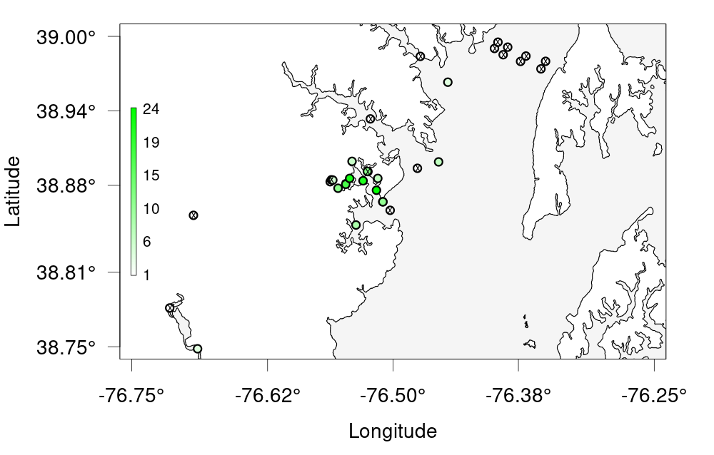
FACT Node
Now that we’ve cleaned and processed our data, we can use glatos’ built-in plotting tools to make quick and effective visualizations out of it. One of the simplest visualizations is an abacus plot to display animal detections against the appropriate stations. To this end, glatos supplies a built-in, customizable abacus_plot function.
# Visualizing Data - Abacus Plots ####
# ?glatos::abacus_plot
# customizable version of the standard VUE-derived abacus plots
abacus_plot(detections_w_events,
location_col='station',
main='TQCS Detections by Station') # can use plot() variables here, they get passed thru to plot()
This is good, but you can see that the plot is cluttered. Rather than plotting our entire dataset, let’s try filtering out a single animal ID and only plotting that. We can do this right in our call to abacus_plot with the filtering syntax we’ve previously covered.
# pick a single fish to plot
abacus_plot(detections_filtered[detections_filtered$animal_id=="TQCS-1049273-2008-02-28",],
location_col='station',
main="TQCS-1049273-2008-02-28 Detections By Station")
Other plots are available in glatos and can show different facets of our data. If we want to see the physical distribution of our stations, for example, a bubble plot will serve us better.
# Bubble Plots for Spatial Distribution of Fish ####
# bubble variable gets the summary data that was created to make the plot
detections_filtered
?detection_bubble_plot
# We'll use raster to get a polygon to plot on
library(geodata)
USA <- geodata::gadm("USA", level=1, path=".")
FL <- USA[USA$NAME_1=="Florida",]
#Alternative method of getting the polygon.
f <- 'http://biogeo.ucdavis.edu/data/gadm3.6/Rsp/gadm36_USA_1_sp.rds'
b <- basename(f)
download.file(f, b, mode="wb", method="curl")
USA <- readRDS('gadm36_USA_1_sp.rds')
FL <- USA[USA$NAME_1=="Florida",]
bubble_station <- detection_bubble_plot(detections_filtered,
out_file = 'tqcs_bubble.png',
location_col = 'station',
map = FL,
col_grad=c('white', 'green'),
background_xlim = c(-81, -80),
background_ylim = c(26, 28))
bubble_station
These examples provide just a brief introduction to some of the plotting available in glatos.
Glatos FACT Challenge
Challenge 1 —- Create a bubble plot of that bay we zoomed in earlier. Set the bounding box using the provided nw + se cordinates, change the colour scale and resize the points to be smaller. As a bonus, add points for the other receivers that don’t have any detections. Hint: ?detection_bubble_plot will help a lot Here’s some code to get you started
nw <- c(26, -80) # given se <- c(28, -81) # givenSolution
nw <- c(26, -80) # given se <- c(28, -81) # given bubble_challenge <- detection_bubble_plot(detections_filtered, background_ylim = c(nw[1], se[1]), background_xlim = c(nw[2], se[2]), map = FL, symbol_radius = 0.75, location_col = 'station', col_grad = c('white', 'green'), receiver_locs = receivers, # For bonus out_file = 'fact_bubbles_challenge.png')
GLATOS Network
Now that we’ve cleaned and processed our data, we can use glatos’ built-in plotting tools to make quick and effective visualizations out of it. One of the simplest visualizations is an abacus plot to display animal detections against the appropriate stations. To this end, glatos supplies a built-in, customizable abacus_plot function.
# Visualizing Data - Abacus Plots ####
# ?glatos::abacus_plot
# customizable version of the standard VUE-derived abacus plots
abacus_plot(detections_w_events,
location_col='station',
main='Walleye detections by station') # can use plot() variables here, they get passed thru to plot()
This is good, but you can see that the plot is cluttered. Rather than plotting our entire dataset, let’s try filtering out a single animal ID and only plotting that. We can do this right in our call to abacus_plot with the filtering syntax we’ve previously covered.
# pick a single fish to plot
abacus_plot(detections_filtered[detections_filtered$animal_id=="22",],
location_col='station',
main="Animal 22 Detections By Station")
Other plots are available in glatos and can show different facets of our data. If we want to see the physical distribution of our stations, for example, a bubble plot will serve us better.
# Bubble Plots for Spatial Distribution of Fish ####
# bubble variable gets the summary data that was created to make the plot
?detection_bubble_plot
bubble_station <- detection_bubble_plot(detections_filtered,
location_col = 'station',
out_file = 'walleye_bubbles_by_stations.png')
bubble_station
bubble_array <- detection_bubble_plot(detections_filtered,
out_file = 'walleye_bubbles_by_array.png')
bubble_array
These examples provide just a brief introduction to some of the plotting available in glatos.
Glatos Challenge
Challenge 1 —- Create a bubble plot of the station in Lake Erie only. Set the bounding box using the provided nw + se cordinates and resize the points. As a bonus, add points for the other receivers in Lake Erie. Hint: ?detection_bubble_plot will help a lot Here’s some code to get you started
erie_arrays <-c("DRF", "DRL", "DRU", "MAU", "RAR", "SCL", "SCM", "TSR") #given nw <- c(43, -83.75) #given se <- c(41.25, -82) #givenSolution
erie_arrays <-c("DRF", "DRL", "DRU", "MAU", "RAR", "SCL", "SCM", "TSR") #given nw <- c(43, -83.75) #given se <- c(41.25, -82) #given bubble_challenge <- detection_bubble_plot(detections_filtered, background_ylim = c(nw[1], se[1]), background_xlim = c(nw[2], se[2]), symbol_radius = 0.75, location_col = 'station', col_grad = c('white', 'green'), out_file = 'glatos_bubbles_challenge.png')
MIGRAMAR Node
Now that we’ve cleaned and processed our data, we can use glatos’ built-in plotting tools to make quick and effective visualizations out of it. One of the simplest visualizations is an abacus plot to display animal detections against the appropriate stations. To this end, glatos supplies a built-in, customizable abacus_plot function.
# Visualizing Data - Abacus Plots ####
# ?glatos::abacus_plot
# customizable version of the standard VUE-derived abacus plots
abacus_plot(detections_w_events,
location_col='station',
main='MIGRAMAR Detections by Station') # can use plot() variables here, they get passed thru to plot()
This is good, but you can see that the plot is cluttered. Rather than plotting our entire dataset, let’s try filtering out a single animal ID and only plotting that. We can do this right in our call to abacus_plot with the filtering syntax we’ve previously covered.
# pick a single fish to plot
abacus_plot(detections_filtered[detections_filtered$animal_id== "GMR-25724-2014-01-22",],
location_col='station',
main="GMR-25724-2014-01-22 Detections By Station"))
Other plots are available in glatos and can show different facets of our data. If we want to see the physical distribution of our stations, for example, a bubble plot will serve us better.
# Bubble Plots for Spatial Distribution of Fish ####
# bubble variable gets the summary data that was created to make the plot
detections_filtered
?detection_bubble_plot
# We'll use raster to get a polygon to plot against
library(raster)
library(geodata)
ECU <- geodata::gadm("Ecuador", level=1, path=".")
GAL <- ECU[ECU$NAME_1=="Galápagos",]
bubble_station <- detection_bubble_plot(detections_filtered,
background_ylim = c(-2, 2),
background_xlim = c(-93.5, -89),
map = GAL,
location_col = 'station',
out_file = 'migramar_bubbles_by_stations.png')
bubble_station
These examples provide just a brief introduction to some of the plotting available in glatos.
Glatos MIGRAMAR Challenge
Challenge 1 —- Create a bubble plot of the islands we zoomed in earlier. Set the bounding box using the provided nw + se cordinates, change the colour scale and resize the points to be smaller. Hint: ?detection_bubble_plot will help a lot Here’s some code to get you started
nw <- c(-2, -89) # given se <- c(2, -93.5) # givenSolution
nw <- c(-2, -89) # given se <- c(2, -93.5) # given bubble_challenge <- detection_bubble_plot(detections_filtered, background_ylim = c(nw[1], se[1]), background_xlim = c(nw[2], se[2]), map = GAL, symbol_radius = 0.75, location_col = 'station', col_grad = c('white', 'green'), out_file = 'migramar_bubbles_challenge.png')
Key Points
Introduction to actel
Overview
Teaching: 45 min
Exercises: 0 minQuestions
What does the actel package do?
When should I consider using Actel to analyze my acoustic telemetry data?
Objectives
actel is designed for studies where animals tagged with acoustic tags are expected to move through receiver arrays. actel combines the advantages of automatic sorting and checking of animal movements with the possibility for user intervention on tags that deviate from expected behaviour. The three analysis functions: explore, migration and residency, allow the users to analyse their data in a systematic way, making it easy to compare results from different studies.
Author: Dr. Hugo Flavio, ( hflavio@wlu.ca )
Supplemental Links and Related Materials:
Actel - a package for the analysis of acoustic telemetry data
The R package actel seeks to be a one-stop package that guides the user through the compilation and cleaning of their telemetry data, the description of their study system, and the production of many reports and analyses that are generally applicable to closed-system telemetry projects. actel tracks receiver deployments, tag releases, and detection data, as well as an additional concept of receiver groups and a network of the interconnectivity between them within our study area, and uses all of this information to raise warnings and potential oddities in the detection data to the user.
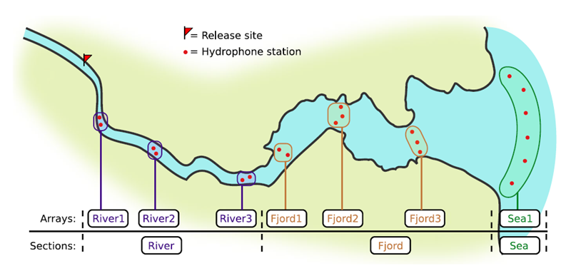

If you’re working in river systems, you’ve probably got a sense of which receivers form arrays. There is a larger-order grouping you can make called ‘sections’, and this will be something we can inter-compare our results with.
Preparing to use actel
With our receiver, tag, and detection data mapped to actel’s formats, and after creating our receiver groups and graphing out how detected animals may move between them, we can leverage actel’s analyses for our own datasets. Thanks to some efforts on the part of Hugo and of the glatos development team, we can move fairly easily with our glatos data into actel.
actel’s standard suite of analyses are grouped into three main functions - explore(), migration(), and residency(). As we will see in this and the next modules, these functions specialize in terms of their outputs but accept the same input data and arguments.
The first thing we will do is use actel’s built-in dataset to ensure we’ve got a working environment, and also to see what sorts of default analysis output Actel can give us.
Exploring
library("actel")
# The first thing you want to do when you try out a package is...
# explore the documentation!
# See the package level documentation:
?actel
# See the manual:
browseVignettes("actel")
# Get the citation for actel, and access the paper:
citation("actel")
# Finally, every function in actel contains detailed documentation
# of the function's purpose and parameters. You can access this
# documentation by typing a question mark before the function name.
# e.g.: ?explore
Working with actel’s example dataset
# Start by checking where your working directory is (it is always good to know this)
getwd()
# We will then deploy actel's example files into a new folder, called "actel_example".
# exampleWorkspace() will provide you with some information about how to run the example analysis.
exampleWorkspace("actel_example")
# Side note: When preparing your own data, you can create the initial template files
# with the function createWorkspace("directory_name")
# Take a minute to explore this folder's contents.
# -----------------------
These are the files the Actel package depends on to create its output plots and result summary files.
biometrics.csv contains the detailed information on your tagged animals, where they were released and when, what the tag code is for that animal, and a grouping variable for you to set. Additional columns can be part of biometrics.csv but these are the minimum requirements. The names of our release sites must match up to a place in our spatial.csv file, where you release the animal has a bearing on how it will begin to interact with your study area.
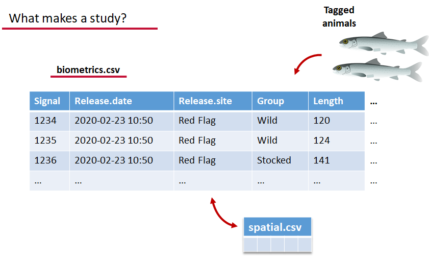
deployments.csv concerns your receiver deployments, when and where each receiver by serial number was deployed. Here again you can have more than the required columns but you have to have a column that corresponds to the station’s ‘name’, which will have a paired entry in the spatial.csv file as well, and a start and end time for the deployment.
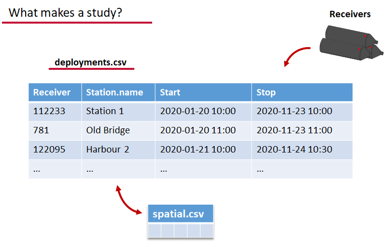
Finally, we have to have some number of detection files. This is helpfully a folder to make it easier on folks who don’t have aggregators like GLATOS and OTN to pull together all the detection information for their tags. While we could drop our detection data in here, when the time comes to use GLATOS data with actel we’ll see how we can create these data structures straight from the glatos data objects. Here also Hugo likes to warn people about opening their detection data files in Excel directly… Excel’s eaten a few date fields on all of us, I’m sure. We don’t have a hate-on for Excel or anything, like our beloved household pet, we’ve just had to learn there are certain places we just can’t bring it with us.
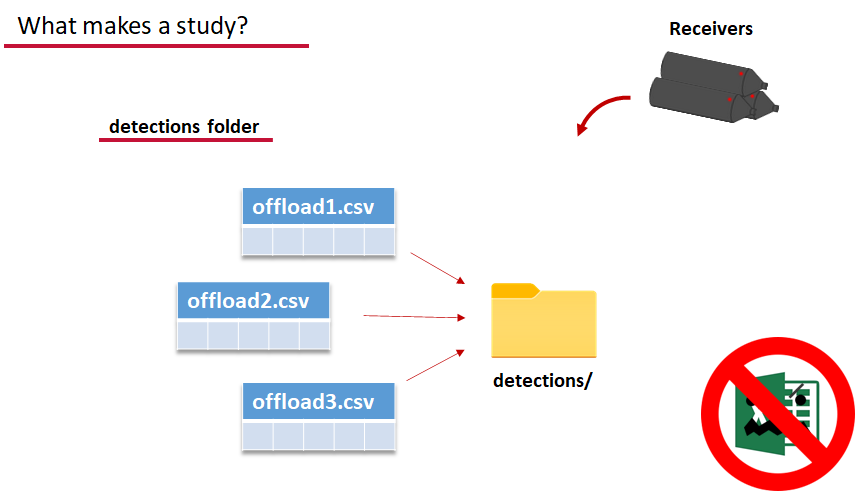
OK, now we have a biometrics file of our tag releases with names for each place we released our tags in spatial.csv, we have a deployments file of all our receiver deployments and the matching names in spatial.csv, and we’ve got our detections. These are the minimum components necessary for actel to go to work.
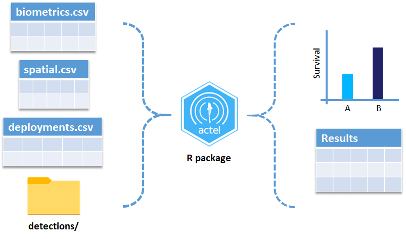
# move into the newly created folder
setwd('actel_example')
# Run analysis. Note: This will open an analysis report on your web browser.
exp.results <- explore(tz = 'Europe/Copenhagen', report = TRUE)
# Because this is an example dataset, this analysis will run very smoothly.
# Real data is not always this nice to us!
# ----------
# If your analysis failed while compiling the report, you can load
# the saved results back in using the dataToList() function:
exp.results <- dataToList("actel_explore_results.RData")
# If your analysis failed before you had a chance to save the results,
# load the pre-compiled results, so you can keep up with the workshop.
# Remember to change the path so R can find the RData file.
exp.results <- dataToList("pre-compiled_results.RData")
This example dataset is a salmon project working in a river-and-estuary system in northeastern Denmark. There are lots of clear logical separations in the array design and the general geography here that we will want to compare and deal with separately.
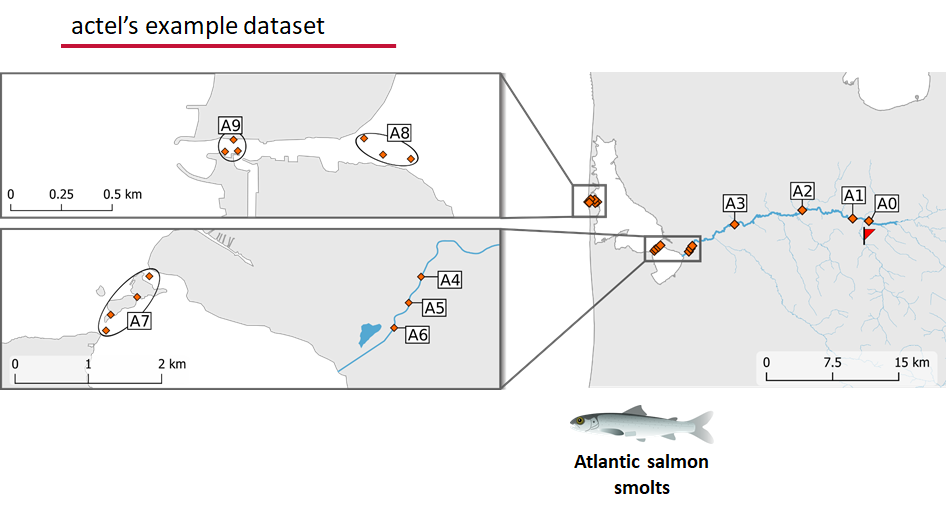
Exploring the output of explore()
# What is inside the output?
names(exp.results)
# What is inside the valid movements?
names(exp.results$valid.movements)
# let's have a look at the first one:
exp.results$valid.movements[["R64K-4451"]]
# and here are the respective valid detections:
exp.results$valid.detections[["R64K-4451"]]
# We can use these results to obtain our own plots (We will go into that later)
These files are the minimum requirements for the main analyses, but there are more files we can create that will give us more control over how actel sees our study area.
A good deal of checking occurs when you first run any analysis function against your data files, and actel is designed to step through any problems interactively with you and prompt you for the preferred resolutions. These interactions can be saved as plaintext in your R script if you want to remember your choices, or you can optionally clean up the input files directly and re-run the analysis function.
Checks that actel runs:
Actel will calculate the movement path for each individual animal, and determine whether that animal has met a threshhold for minimum detections and detection events, whether it snuck across arrays that should have detected it but didn’t, whether it reached unlikely speeds or crossed impassable areas
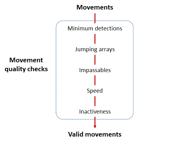
Minimum detections:
Controlled by the minimum.detections and max.interval arguments, if a tag has only 1 movement with less than n detections, discard the tag. Note that animals with movement events > 1 will pass this filter regardless of n.
Jumping arrays:
In cases where you have gates of arrays designed to capture all movement up and down a linear system, you may want to verify that your tags have not ‘jumped’ past one or more arrays before being re-detected. You can use the jump.warning and jump.error arguments to explore() to set the number of acceptable jumps across your array system are permissible.
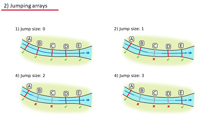
Impassables:
When we define how our areas are connected in the spatial.txt file, it tells actel which movements are -not- permitted explicitly, and can tell us about when those movements occur. This way, we can account for manmade obstacles or make other assumptions about one-way movement and verify our data against them.
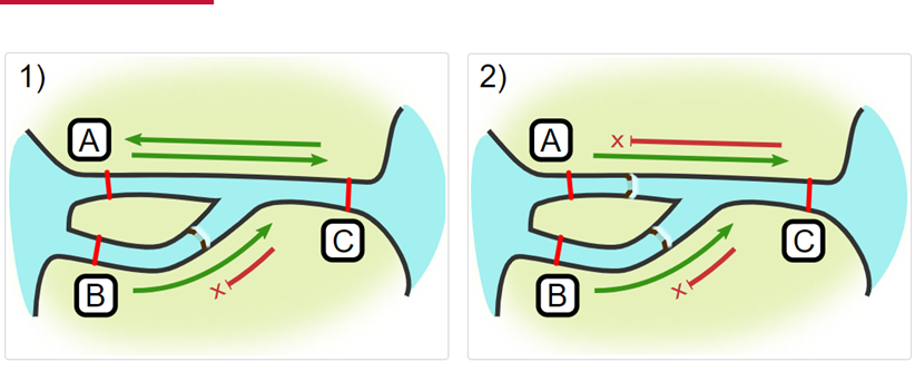
Speed:
actel can calculate the minimum speed of an animal between (and optionally within) detection events using the distances calculated from spatial.csv into a new distance matrix file, distances.csv, and we can supply speed.warning, speed.error, and speed.method to tailor our report to the speed and calculation method we want to submit our data to.
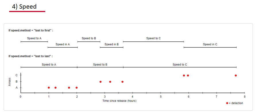
Inactivity:
With the inactive.warning and inactive.error arguments, we can flag entries that have spent a longer time than expected not transiting between locations.
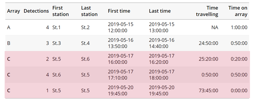
Creating a spatial.txt file
Your study area might be simple and linear, may be complicated and open, completely interconnected. It is more likely a combination of the two! We can use DOT notation (commonly used in graphing applications like GraphViz and Gephi) to create a graph of our areas and how they are allowed to inter-mingle. actel can read this information as DOT notation using readDOT() or you can provide a spatial.txt with the DOT information already inline.
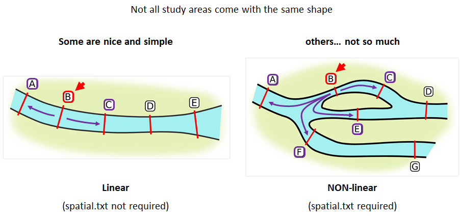
The question you must ask when creating spatial.txt files is: for each location, where could my animal move to and be detected next?
The DOT for the simple system on the left is:
A -- B -- C -- D -- E
And for the more complicated system on the right it’s
A -- B -- C -- D
A -- E -- D
A -- F -- G
B -- E -- F
B -- F
C -- E
Challenge : DOT notation
Using the DOT notation tutorial linked here, discover the notation for a one-way connection and write the DOT notations for the systems shown here:
Solution:
Left-hand diagram:
A -- B A -- C B -> CRight-hand diagram:
A -- B A -> C B -> C
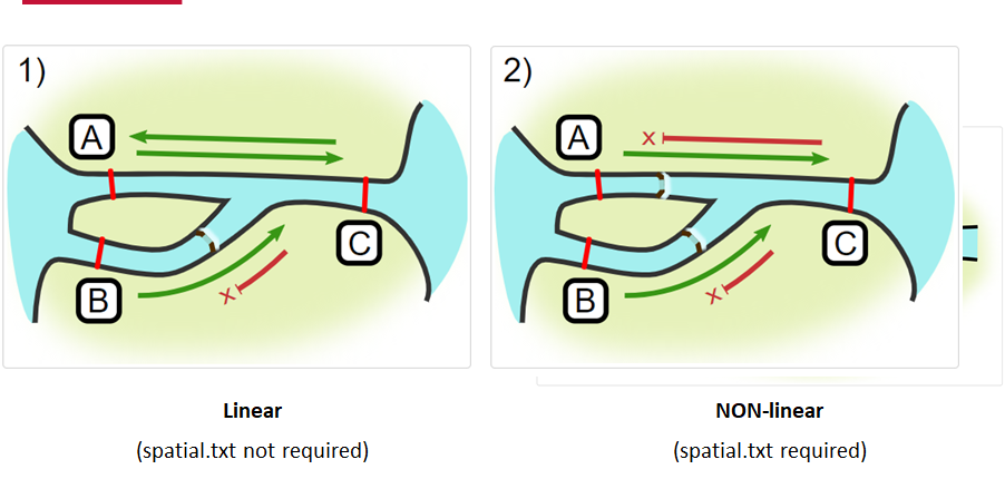
Generating an initial distance matrix file
A distance matrix tracks the distance between each pair of spatial data points in a dataframe. In actel, our dataframe is spatial.csv, and we can use this datafile as well as a shapefile describing our body or bodies of water, with the functions loadShape(), transitionLayer() and distancesMatrix() to generate a distance matrix for our study area.
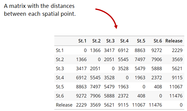
Let’s use actel’s built-in functions to create a distance matrix file. The process generally will be:
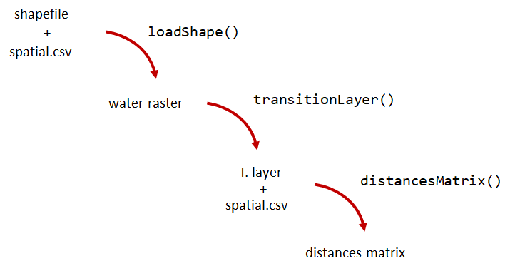
# Let's load the spatial file individually, so we can have a look at it.
spatial <- loadSpatial()
head(spatial)
# When doing the following steps, it is imperative that the coordinate reference
# system (CRS) of the shapefile and of the points in the spatial file are the same.
# In this case, the values in columns "x" and "y" are already in the right CRS.
# loadShape will rasterize the input shape, using the "size" argument as a reference
# for the pixel size. Note: The units of the "size" will be the same as the units
# of the shapefile projection (i.e. metres for metric projections, and degrees for latlong systems)
#
# In this case, we are using a metric system, so we are saying that we want the pixel
# size to be 10 metres.
#
# NOTE: Change the 'path' to the folder where you have the shape file.
# ^^^^^^^^^^^^^^^^^^^^^^^^^^^^^^^^^^^^^^^^^^^^^^^^^^^^^^^^^^^^^^^^^^^^
water <- loadShape(path = "replace/with/path/to/shapefile",
shape = "stora_shape_epsg32632.shp", size = 10,
coord.x = "x", coord.y = "y")
# The function above can run without the coord.x and coord.y arguments. However, by including them,
# you are allowing actel to load the spatial.csv file on the fly and check if the spatial points
# (i.e. hydrophone stations and release sites) are positioned in water. This is very important,
# as any point position on land will be cut off during distance calculations.
# Now we need to create a transition layer, which R will use to estimate the distances
tl <- transitionLayer(water)
# We are ready to try it out! distancesMatrix will automatically search for a "spatial.csv"
# file in the current directory, so remember to keep that file up to date!
dist.mat <- distancesMatrix(tl, coord.x = "x", coord.y = "y")
# have a look at it:
dist.mat
migration and residency
The migration() function runs the same checks as explore() and can be advantageous in cases where your animals can be assumed to be moving predictably.
The built-in vignettes (remember: browseVignettes("actel") for the interactive vignette) are the most comprehensive description of all that migration() offers over and above explore() but one good way might be to examine its output. For simple datasets and study areas like our example dataset, the arguments and extra spatial.txt and distances.csv aren’t necessary. Our mileage may vary.
# Let's go ahead and try running migration() on this dataset.
mig.results <- migration(tz = 'Europe/Copenhagen', report = TRUE)
the migration() function will ask us to invalidate some flagged data or leave it in the analysis, and then it will ask us to save a copy of the source data once we’ve cleared all the flags. Then we get to see the report. It will show us things like our study locations and their graph relationship:

… a breakdown of the biometrics variables it finds in biometrics.csv
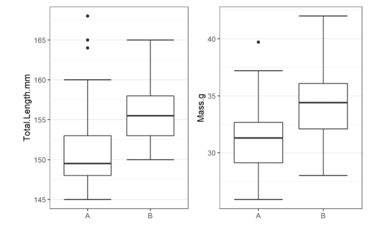
… and a temporal analysis of when animals arrived at each of the array sections of the study area.
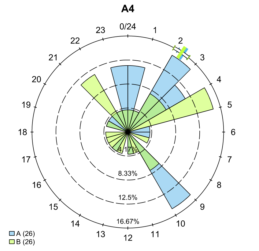
To save our choices in actel’s interactives, let’s include them as raw text in our R block. We’ll test this by calling residency() with a few pre-recorded choices, as below:
# Try copy-pasting the next five lines as a block and run it all at once.
res.results <- residency(tz = 'Europe/Copenhagen', report = TRUE)
comment
This is a lovely fish
n
y
# R will know to answer each of the questions that pop up during the analysis
# with the lines you copy-pasted together with your code!
# explore the reports to see what's new!
# Note: There is a known bug in residency() as of actel 1.2.0, which for some datasets
# will cause a crash with the following error message:
#
# Error in tableInteraction(moves = secmoves, tag = tag, trigger = the.warning, :
# argument "save.tables.locally" is missing, with no default
#
# This has already been corrected and a fix has been released in actel 1.2.1.
Further exploration of actel: Transforming the results
# Review more available features of Actel in the manual pages!
vignette("f-0_post_functions", "actel")
Key Points
Preparing ACT/OTN/GLATOS Data for actel
Overview
Teaching: 30 min
Exercises: 0 minQuestions
How do I take my ACT detection extracts and metadata and format them for use in
actel?Objectives
Note to instructors: please choose the relevant Network below when teaching
ACT Node
Preparing our data to use in Actel
So now, as the last piece of stock curriculum for this workshop, let’s quickly look at how we can take the data reports we get from the ACT-MATOS (or any other OTN-compatible data partner, like FACT, or OTN proper) and make it ready for Actel.
# Using ACT-style data in Actel ####
library(actel)
library(stringr)
library(glatos)
library(tidyverse)
library(readxl)
Within actel there is a preload() function for folks who are holding their deployment, tagging, and detection data in R variables already instead of the files and folders we saw in the actel intro. This function expects 4 input objects, plus the ‘spatial’ data object that will help us describe the locations of our receivers and how the animals are allowed to move between them.
To achieve the minimum required data for actel’s ingestion, we’ll want deployment and recovery datetimes, instrument models, etc. We can transform our metadata’s standard format into the standard format and naming schemes expected by actel::preload() with a bit of dplyr magic:
# Load the ACT metadata and detection extracts -------------
# set working directory to the data folder for this workshop
setwd("YOUR/PATH/TO/data/act")
# Our project's detections file - I'll use readr to read everything from proj59 in at once:
proj_dets <- list.files(pattern="proj59_matched_detections*") %>%
map_df(~readr::read_csv(.))
# note: readr::read_csv will read in csvs inside zip files no problem.
# read in the tag metadata:
tag_metadata <- readxl::read_excel('Tag_Metadata/Proj59_Metadata_bluecatfish.xls',
sheet='Tag Metadata', # use the Tag Metadata sheet from this excel file
skip=4) # skip the first 4 lines as they're 'preamble'
# And we can import first a subset of the deployments in MATOS that were deemed OK to publish
deploy_metadata <- read_csv('act_matos_moorings_receivers_202104130939.csv') %>%
# Add a very quick and dirty receiver group column.
mutate(rcvrgroup = ifelse(collectioncode %in% c('PROJ60', 'PROJ61'), # if we're talking PROJ61
paste0(collectioncode,station_name), #let my receiver group be the station name
collectioncode)) # for other project receivers just make it their whole project code.
# Also tried to figure out if there was a pattern to station naming that we could take advantage of
# but nothing obvious materialized.
# mutate(rcvrgroup = paste(collectioncode, stringr::str_replace_all(station_name, "[:digit:]", ""), sep='_'))
# Let's review the groups quickly to see if we under or over-shot what our receiver groups should be.
# nb. hiding the legend because there are too many categories.
deploy_metadata %>% ggplot(aes(deploy_lat, deploy_long, colour=rcvrgroup)) +
geom_point() +
theme(legend.position="none")
# Maybe this is a bit of an overshoot, but it should work out. proj61 has receivers all over the place,
# so our spatial analysis is not going to be very accurate.
# And let's look at what the other projects were that detected us.
proj_dets %>% count(detectedby)
# And how many of our tags are getting detections back:
proj_dets %>% filter(receiver != 'release') %>% count(tagname)
# OK most of those who have more than an isolated detection are in our deploy metadata.
# just one OTN project to add.
# For OTN projects, we would be able to add in any deployments of OTN receivers from the OTN GeoServer:
# if we wanted to grab and add V2LGMXSNAP receivers to our deployment metadata
# using OTN's public station history records on GeoServer:
# otn_geoserver_stations_url = 'https://members.oceantrack.org/geoserver/otn/ows?service=WFS&version=1.0.0&request=GetFeature&typeName=otn:stations_receivers&outputFormat=csv&cql_filter=collectioncode=%27V2LGMXSNAP%27'
## TODO: Actel needs serial numbers for receivers, so OTN
# will add serial numbers to this layer, and then we can just
# urlencode the CQL-query for which projects you want,
# so you can write your list in 'plaintext' and embed it in the url
# For today, we've made an extract for V2LGMXSNAP and included it in the data folder:
otn_deploy_metadata <- readr::read_csv('otn_moorings_receivers_202104130938.csv') %>%
mutate(rcvrgroup = collectioncode)
# Tack OTN stations to the end of the MATOS extract.
# These are in the exact same format because OTN and MATOS's databases are the
# same format, so we can easily coordinate our output formats.
all_stations <- bind_rows(deploy_metadata, otn_deploy_metadata)
# For ACT/FACT projects - we could use GeoServer to share this information, and could even add
# an authentication layer to let ACT members do this same trick to fetch deploy histories!
# So now this is our animal tagging metadata
# tag_metadata %>% View
# these are our detections:
# proj_dets %>% View
# These are our deployments:
# all_stations %>% View
# Mutate metadata into Actel format ----
# Create a station entry from the projectcode and station number.
# --- add station to receiver metadata ----
full_receiver_meta <- all_stations %>%
dplyr::mutate(
station = paste(collectioncode, station_name, sep = '-')
) %>%
filter(is.na(rcvrstatus)|rcvrstatus != 'lost')
We’ve now imported our data, and renamed a few columns from the receiver metadata sheet so that they are in a nicer format. We also create a few helper columns, like a ‘station’ column that is of the form collectioncode + station_name, guaranteed unique for any project across the entire Network.
Formatting - Tagging and Deployment Data
As we saw earlier, tagging metadata is entered into Actel as biometrics, and deployment metadata as deployments. These data structures also require a few specially named columns, and a properly formatted date.
# All dates will be supplied to Actel in this format:
actel_datefmt = '%Y-%m-%d %H:%M:%S'
# biometrics is the tag metadata. If you have a tag metadata sheet, it looks like this:
actel_biometrics <- tag_metadata %>% dplyr::mutate(Release.date = format(UTC_RELEASE_DATE_TIME, actel_datefmt),
Signal=as.integer(TAG_ID_CODE),
Release.site = RELEASE_LOCATION,
# Group=RELEASE_LOCATION # can supply group to subdivide tagging groups
)
# deployments is based in the receiver deployment metadata sheet
actel_deployments <- full_receiver_meta %>% dplyr::filter(!is.na(recovery_date)) %>%
mutate(Station.name = station,
Start = format(deploy_date, actel_datefmt), # no time data for these deployments
Stop = format(recovery_date, actel_datefmt), # not uncommon for this region
Receiver = rcvrserial) %>%
arrange(Receiver, Start)
Detections
For detections, a few columns need to exist: Transmitter holds the full transmitter ID. Receiver holds the receiver serial number, Timestamp has the detection times, and we use a couple of Actel functions to split CodeSpace and Signal from the full transmitter_id.
# Renaming some columns in the Detection extract files
actel_dets <- proj_dets %>% dplyr::filter(receiver != 'release') %>%
dplyr::mutate(Transmitter = tagname,
Receiver = as.integer(receiver),
Timestamp = format(datecollected, actel_datefmt),
CodeSpace = extractCodeSpaces(tagname),
Signal = extractSignals(tagname),
Sensor.Value = sensorvalue,
Sensor.Unit = sensorunit)
Note: we don’t have any environmental data in our detection extract here, but Actel will also find and plot temperature or other sensor values if you have those kinds of tags.
Creating the Spatial dataframe
The spatial dataframe must have entries for all release locations and all receiver deployment locations. Basically, it must have an entry for every distinct location we can say we know an animal has been.
# Prepare and style entries for receivers
actel_receivers <- full_receiver_meta %>% dplyr::mutate( Station.name = station,
Latitude = deploy_lat,
Longitude = deploy_long,
Type='Hydrophone') %>%
dplyr::mutate(Array=rcvrgroup) %>% # Having too many distinct arrays breaks things.
dplyr::select(Station.name, Latitude, Longitude, Array, Type) %>%
distinct(Station.name, Latitude, Longitude, Array, Type)
# Actel Tag Releases ---------------
# Prepare and style entries for tag releases
actel_tag_releases <- tag_metadata %>% mutate(Station.name = RELEASE_LOCATION,
Latitude = RELEASE_LATITUDE,
Longitude = RELEASE_LONGITUDE,
Type='Release') %>%
# It's helpful to associate release locations with their nearest Array.
# Could set all release locations to the same Array:
# mutate(Array = 'PROJ61JUGNO_2A') %>% # Set this to the closest array to your release locations
# if this is different for multiple release groups, can do things like this to subset case-by-case:
# here Station.name is the release location 'station' name, and the value after ~ will be assigned to all.
mutate(Array = case_when(Station.name %in% c('Red Banks', 'Eldorado', 'Williamsburg') ~ 'PROJ61UTEAST',
Station.name == 'Woodrow Wilson Bridge' ~ 'PROJ56',
Station.name == 'Adjacent to Lyons Creek' ~ 'PROJ61JUGNO_5',
Station.name == 'Merkle Wildlife Sanctuary' ~ 'PROJ61JUGNO_2A',
Station.name == 'Nottingham' ~ 'PROJ61NOTTIN',
Station.name == 'Sneaking Point' ~ 'PROJ61MAGRUD',
Station.name == 'Jug Bay Dock' ~ 'PROJ61JUGDCK')) %>% # This value needs to be the nearest array to the release site
distinct(Station.name, Latitude, Longitude, Array, Type)
# Combine Releases and Receivers ------
# Bind the releases and the deployments together for the unique set of spatial locations
actel_spatial <- actel_receivers %>% bind_rows(actel_tag_releases)
Now, for longer data series, we may have similar stations that were deployed and redeployed at very slightly different locations. One way to deal with this issue is that for stations that are named the same, we assign an average location in spatial.
Another way we might overcome this issue could be to increment station_names that are repeated and provide their distinct locations.
# group by station name and take the mean lat and lon of each station deployment history.
actel_spatial_sum <- actel_spatial %>% dplyr::group_by(Station.name, Type) %>%
dplyr::summarize(Latitude = mean(Latitude),
Longitude = mean(Longitude),
Array = first(Array))
Creating the Actel data object w/ preload()
Now you have everything you need to call preload().
# Specify the timezone that your timestamps are in.
# OTN provides them in UTC/GMT.
# FACT has both UTC/GMT and Eastern
# GLATOS provides them in UTC/GMT
# If you got the detections from someone else,
# they will have to tell you what TZ they're in!
# and you will have to convert them before importing to Actel!
tz <- "GMT0"
# You've collected every piece of data and metadata and formatted it properly.
# Now you can create the Actel project object.
actel_project <- preload(biometrics = actel_biometrics,
spatial = actel_spatial_sum,
deployments = actel_deployments,
detections = actel_dets,
tz = tz)
# Alas, we're going to have to discard a bunch of detections here,
# as our subsetted demo data doesn't have deployment metadat for certain
# receivers / time periods and is missing some station deployments
e # discard all detections at unknown receivers - this is almost never
# what you want to do in practice. Ask for missing metadata before
# resorting to this one
There will very likely be some issues with the data that the Actel checkers find and warn us about. Detections outside the deployment time bounds, receivers that aren’t in your metadata. For the purposes of today, we will drop those rows from the final copy of the data, but you can take these prompts as cues to verify your input metadata is accurate and complete. It is up to you in the end to determine whether there is a problem with the data, or an overzealous check that you can safely ignore. Here our demo is using a very deeply subsetted version of one project’s data, and it’s not surprising to be missing some deployments.
Once you have an Actel object, you can run explore() to generate your project’s summary reports:
# actel::explore()
actel_explore_output <- explore(datapack=actel_project,
report=TRUE, GUI='never',
print.releases=FALSE)
n # don't render any movements invalid - repeat for each tag, because:
# we haven't told Actel anything about which arrays connect to which
# so it's not able to properly determine which movements are valid/invalid
n # don't save a copy of the results to a RData object... this time.
# Review the output .html file that has popped up in a browser.
# Our analysis might not make a lot of sense, since...
# actel assumed our study area was linear, we didn't tell it otherwise!
Review the file that Actel pops up in our browser. It presumed our Arrays were arranged linearly and alphabetically, which is of course not correct!
Custom spatial.txt files for Actel
We’ll have to tell Actel how our arrays are inter-connected. To do this, we’ll need to design a spatial.txt file for our detection data.
To help with this, we can go back and visualize our study area interactively, and start to see how the Arrays are connected.
# Designing a spatial.txt file -----
library(mapview)
library(spdplyr)
library(leaflet)
library(leafpop)
## Exploration - Let's use mapview, since we're going to want to move around,
# drill in and look at our stations
# Get a list of spatial objects to plot from actel_spatial_sum:
our_receivers <- as.data.frame(actel_spatial_sum) %>%
dplyr::filter(Array %in% (actel_spatial_sum %>% # only look at the arrays already in our spatial file
distinct(Array))$Array)
rcvr_spatial <- our_receivers %>%
dplyr::select(Longitude, Latitude) %>% # and get a SpatialPoints object to pass to mapview
sp::SpatialPoints(CRS('+proj=longlat'))
# and plot it using mapview. The popupTable() function lets us customize our tooltip
mapview(rcvr_spatial, popup = popupTable(our_receivers,
zcol = c("Array",
"Station.name"))) # and make a tooltip we can explore
Can we design a graph and write it into spatial.txt that fits all these Arrays together? The station value we put in Array for our PROJ61 and PROJ60 projects looks to be a bit too granular for our purposes. Maybe we can combine many arrays that are co-located in open water into a singular ‘zone’, preserving the complexity of the river systems but creating a large basin to which we can connect the furthest downstream of those river arrays.
To do this, we only need to update the arrays in our spatial.csv file or actel_spatial dataframe. We don’t need to edit our source metadata! We will have to define a spatial.txt file and how these newly defined Arrays interconnect. While there won’t be time to do that for this example dataset and its large and very complicated region, this approach is definitely suitable for small river systems and even perhaps for multiple river systems feeding a bay and onward to the open water.
Custom Spatial Networks
Let’s get started designing a spatial.txt file for our detection data!
First we will visualize our study area, with a popup that tells us what project each deployment belongs to.
library(ggplot2)
library(ggmap)
library(plotly)
# Subset our study area so we're not dealing with too much stuff.
# Where were we detected, excluding Canada and the GoM:
actel_dets <- actel_dets %>% filter(!detectedby %in% c('OTN.V2LGMXSNAP', 'OTN.V2LSTANI', 'OTN.V2LSTADC'))
bbox.minlat <- min(actel_dets$latitude) - 0.5
bbox.maxlat <- max(actel_dets$latitude) + 0.5
bbox.minlong <- min(actel_dets$longitude) - 0.5
bbox.maxlong <- max(actel_dets$longitude) + 1.5
actel_deployments <- actel_deployments %>% filter(between(deploy_lat, bbox.minlat, bbox.maxlat) &
between(deploy_long, bbox.minlong, bbox.maxlong))
actel_receivers <- actel_receivers %>% filter(Station.name %in% actel_deployments$Station.name)
# biometrics? maybe don't have to?
actel_spatial_sum <- actel_spatial_sum %>% filter(Station.name %in% actel_deployments$Station.name)
base <- get_stadiamap(
bbox = c(left = min(actel_deployments$deploy_long),
bottom = min(actel_deployments$deploy_lat),
right = max(actel_deployments$deploy_long),
top = max(actel_deployments$deploy_lat)),
maptype = "stamen_toner",
crop = FALSE,
zoom = 12)
proj59_zoomed_map <- ggmap(base, extent='panel') +
ylab("Latitude") +
xlab("Longitude") +
geom_point(data = actel_spatial_sum,
aes(x = Longitude,y = Latitude, colour = Station.name),
shape = 19, size = 2)
ggplotly(proj59_zoomed_map)
Now we can see all the arrays in our region, and can begin to imagine how they are all connected. Can we design a spatial.txt file that fits our study area using ‘collectioncode’ as our Array?
Not really, no. Too complicated, too many interconnected arrays! Let’s define most of our projects as “outside”, that is, outside our estuary/river system, not really subject to being interconnected.
# projects in relatively 'open' water:
outside_arrays <- c('PROJ56',
'PROJ61CORNHB', 'PROJ61POCOMO',
'PROJ61LTEAST', 'PROJ61LTWEST')
# Within the Chesapeake area:
# Piney Point's a gate array
piney_point <-c('PROJ60PINEY POINT A', 'PROJ60PINEY POINT B',
'PROJ60PINEY POINT C', 'PROJ60PINEY POINT D')
# the RTE 301 receivers are a group.
rte_301 <- c('PROJ60RT 301 A', 'PROJ60RT 301 B')
cedar_point <- c('PROJ60CEDAR POINT A', 'PROJ60CEDAR POINT B',
'PROJ60CEDAR POINT C', 'PROJ60CEDAR POINT D',
'PROJ60CEDAR POINT E')
ccb_kent <- c('PROJ60CCB1', 'PROJ60CCB2', 'PROJ60CCB3', 'PROJ60CCB4',
'PROJ60KENT ISLAND A', 'PROJ60KENT ISLAND B',
'PROJ60KENT ISLAND C', 'PROJ60KENT ISLAND D')
bear_cr <- c('PROJ61BEARCR', 'PROJ61BEARCR2')
# Single receivers inside the Chesapeake:
ches_rcvrs <- c('PROJ61COOKPT','PROJ61NELSON','PROJ61CASHAV',
'PROJ61TPTSH','PROJ61SAUNDR', 'PROJ61DAVETR')
rhode_r <- c('PROJ61WESTM', 'PROJ61RHODEM', 'PROJ61RMOUTH')
Now we can update actel_spatial_sum to reflect the inter-connectivity of the Chesapeake arrays.
actel_spatial <- actel_receivers %>% bind_rows(actel_tag_releases)
To improve our plots we can summarize and take mean locations for stations
# group by station name and take the mean lat and lon of each station deployment history.
actel_spatial_sum <- actel_spatial %>% dplyr::group_by(Station.name, Type) %>%
dplyr::summarize(Latitude = mean(Latitude),
Longitude = mean(Longitude),
Array = first(Array))
actel_spatial_sum_grouped <- actel_spatial_sum %>%
dplyr::mutate(Array = if_else(Array %in% outside_arrays, 'Outside', #if any of the above, make it 'Huron'
Array)) %>% # else leave it as its current value
# dplyr::mutate(Array = if_else(Array %in% wilmington, 'Wilmington', Array)) %>%
dplyr::mutate(Array = if_else(Array %in% ches_rcvrs, 'InnerChesapeake', Array)) %>%
dplyr::mutate(Array = if_else(Array %in% piney_point, 'PROJ60PineyPoint', Array)) %>%
dplyr::mutate(Array = if_else(Array %in% rte_301, 'PROJ60RTE301', Array)) %>%
dplyr::mutate(Array = if_else(Array %in% rhode_r, 'PROJ61RHODER', Array)) %>%
dplyr::mutate(Array = if_else(Array %in% cedar_point, 'PROJ60CEDARPOINT', Array)) %>%
dplyr::mutate(Array = if_else(Array %in% ccb_kent, 'CCBKENT', Array)) %>%
dplyr::mutate(Array = if_else(Array %in% bear_cr, 'PROJ60BEARCR', Array)) %>%
dplyr::mutate(Array = if_else(Station.name %in% c('PROJ56-UP', 'Woodrow Wilson Bridge'),'PROJ56-UP', Array)) %>% # one tricky receiver?
dplyr::mutate(Array = if_else(Station.name == 'PROJ56-SN', 'PROJ56-SN', Array)) %>%
dplyr::mutate(Array = if_else(Station.name == 'PROJ56-GR', 'PROJ56-GR', Array)) %>%
# dplyr::mutate(Array = if_else(Array == 'PROJ60CD WEST LL 9200', 'PROJ60CDWESTLL9200', Array)) %>%
dplyr::mutate(Array = if_else(Array == 'PROJ60CBL PIER', 'PROJ60CBLPIER', Array))# two tricky receivers?
# Notice we haven't changed any of our data or metadata, just the spatial table
Now let’s remake our map, see if the connectivity is better denoted.
# Head back into the map, and denote the connectivity between our receiver groups:
proj59_arrays_map <- ggmap(base, extent='panel') +
ylab("Latitude") +
xlab("Longitude") +
geom_point(data = actel_spatial_sum_grouped,
aes(x = Longitude,y = Latitude, colour = Array),
shape = 19, size = 2) +
geom_point(data = actel_tag_releases, aes(x=Longitude, y=Latitude, colour=Station.name),
shape = 10, size = 5)
ggplotly(proj59_arrays_map)
At this stage you would create and curate your spatial.txt file. This example shows how complicated they can get in large systems where all receivers arrays interact!
spatial_txt_dot = 'act_spatial.txt'
# How many unique spatial Arrays do we still have, now that we've combined
# so many?
actel_spatial_sum_grouped %>% dplyr::group_by(Array) %>% dplyr::select(Array) %>% unique()
For a grand finale, let’s try analyzing this dataset with our reduced spatial complexity compared to previous runs.
# actel::preload() with custom spatial.txt ----
actel_project <- preload(biometrics = actel_biometrics,
spatial = actel_spatial_sum_grouped,
deployments = actel_deployments,
detections = actel_dets,
dot = readLines(spatial_txt_dot),
tz = tz)
# Now actel understands the connectivity between our arrays better!
# actel::explore() with custom spatial.txt
actel_explore_output_chesapeake <- explore(datapack=actel_project, report=TRUE, print.releases=FALSE)
# We no longer get the error about detections jumping across arrays!
# and we don't need to save the report
n
If you haven’t been able to follow along, this report is included in the data/act/ folder you have cloned from the workshop repository (called actel_explore_report_chesapeake.html) so you can check it out!
MIGRAMAR Node
Preparing our data to use in Actel
So now, as the last piece of stock curriculum for this workshop, let’s quickly look at how we can take the data reports we get from the MigraMar (or any other OTN-compatible data partner, like FACT, or OTN proper) and make it ready for Actel.
# Using MigraMar-style data in Actel ####
library(actel)
library(stringr)
library(glatos)
library(tidyverse)
library(readxl)
Within actel there is a preload() function for folks who are holding their deployment, tagging, and detection data in R variables already instead of the files and folders we saw in the actel intro. This function expects 4 input objects, plus the ‘spatial’ data object that will help us describe the locations of our receivers and how the animals are allowed to move between them.
To achieve the minimum required data for actel’s ingestion, we’ll want deployment and recovery datetimes, instrument models, etc. We can transform our metadata’s standard format into the standard format and naming schemes expected by actel::preload() with a bit of dplyr magic:
# Load the MigraMar metadata and detection extracts -------------
# set working directory to the data folder for this workshop
setwd("YOUR/PATH/TO/data/migramar")
# Our project's detections file - I'll use readr to read everything from gmr in at once:
proj_dets <- list.files(pattern="gmr_matched_detections*") %>%
map_df(~readr::read_csv(.))
# note: readr::read_csv will read in csvs inside zip files no problem.
# read in the tag metadata:
tag_metadata <- readxl::read_excel('gmr_tagging_metadata.xls',
sheet='Tag Metadata'# use the Tag Metadata sheet from this excel file
) # skip the first 4 lines as they're 'preamble'
# And we can import our gmr deployment metadata
deploy_metadata <- readxl::read_excel('gmr-deployment-short-form.xls', sheet='Deployment') %>%
# Add a very quick and dirty receiver group column.
mutate(rcvrgroup = ifelse(OTN_ARRAY %in% c('GMR'), # if we're talking GMR
paste0(OTN_ARRAY,STATION_NO), #let my receiver group be the station name
OTN_ARRAY)) # for other project receivers just make it their whole project code.
# Also tried to figure out if there was a pattern to station naming that we could take advantage of
# but nothing obvious materialized.
# mutate(rcvrgroup = paste(collectioncode, stringr::str_replace_all(station_name, "[:digit:]", ""), sep='_'))
# Let's review the groups quickly to see if we under or over-shot what our receiver groups should be.
# nb. hiding the legend because there are too many categories.
deploy_metadata %>% ggplot(aes(DEPLOY_LAT, DEPLOY_LONG, colour=rcvrgroup)) +
geom_point() +
theme(legend.position="none")
# And let's look at what the other projects were that detected us.
proj_dets %>% count(detectedby)
# And how many of our tags are getting detections back:
proj_dets %>% filter(receiver != 'release') %>% count(tagname)
# Mutate metadata into Actel format ----
# Create a station entry from the projectcode and station number.
# --- add station to receiver metadata ----
full_receiver_meta <- deploy_metadata %>%
dplyr::mutate(
station = paste(OTN_ARRAY, STATION_NO, sep = '-')
) %>%
filter(is.na(`RECOVERED (y/n/l)`)|`RECOVERED (y/n/l)` != 'lost')
We’ve now imported our data, and renamed a few columns from the receiver metadata sheet so that they are in a nicer format. We also create a few helper columns, like a ‘station’ column that is of the form collectioncode + station_name, guaranteed unique for any project across the entire Network.
Formatting - Tagging and Deployment Data
As we saw earlier, tagging metadata is entered into Actel as biometrics, and deployment metadata as deployments. These data structures also require a few specially named columns, and a properly formatted date.
# All dates will be supplied to Actel in this format:
actel_datefmt = '%Y-%m-%d %H:%M:%S'
# biometrics is the tag metadata. If you have a tag metadata sheet, it looks like this:
ctel_biometrics <- tag_metadata %>% dplyr::mutate(Release.date = format(as.POSIXct(UTC_RELEASE_DATE_TIME), actel_datefmt),
Signal=as.integer(TAG_ID_CODE),
Release.site = `RELEASE_LOCATION (SITIO DE MARCAJE)`,
# Group=RELEASE_LOCATION # can supply group to subdivide tagging groups
)
# deployments is based in the receiver deployment metadata sheet
actel_deployments <- full_receiver_meta %>% dplyr::filter(!is.na(`RECOVER_DATE_TIME (yyyy-mm-ddThh:mm:ss)`)) %>%
mutate(Station.name = station,
Start = format(as.POSIXct(`DEPLOY_DATE_TIME (yyyy-mm-ddThh:mm:ss)`), actel_datefmt), # no time data for these deployments
Stop = format(as.POSIXct(`RECOVER_DATE_TIME (yyyy-mm-ddThh:mm:ss)`), actel_datefmt), # not uncommon for this region
Receiver = INS_SERIAL_NO) %>%
arrange(Receiver, Start)
Detections
For detections, a few columns need to exist: Transmitter holds the full transmitter ID. Receiver holds the receiver serial number, Timestamp has the detection times, and we use a couple of Actel functions to split CodeSpace and Signal from the full transmitter_id.
# Renaming some columns in the Detection extract files
actel_dets <- proj_dets %>% dplyr::filter(receiver != 'release') %>%
dplyr::mutate(Transmitter = tagname,
Receiver = as.integer(receiver),
Timestamp = format(datecollected, actel_datefmt),
CodeSpace = extractCodeSpaces(tagname),
Signal = extractSignals(tagname),
Sensor.Value = sensorvalue,
Sensor.Unit = sensorunit)
Note: we don’t have any environmental data in our detection extract here, but Actel will also find and plot temperature or other sensor values if you have those kinds of tags.
Creating the Spatial dataframe
The spatial dataframe must have entries for all release locations and all receiver deployment locations. Basically, it must have an entry for every distinct location we can say we know an animal has been.
# Prepare and style entries for receivers
actel_receivers <- full_receiver_meta %>% dplyr::mutate( Station.name = station,
Latitude = DEPLOY_LAT,
Longitude = DEPLOY_LONG,
Type='Hydrophone') %>%
dplyr::mutate(Array=rcvrgroup) %>% # Having too many distinct arrays breaks things.
dplyr::select(Station.name, Latitude, Longitude, Array, Type) %>%
distinct(Station.name, Latitude, Longitude, Array, Type)
# Actel Tag Releases ---------------
# Prepare and style entries for tag releases
actel_tag_releases <- tag_metadata %>% mutate(Station.name = `RELEASE_LOCATION (SITIO DE MARCAJE)`,
Latitude = RELEASE_LATITUDE,
Longitude = RELEASE_LONGITUDE,
Type='Release') %>%
# It's helpful to associate release locations with their nearest Array.
# Could set all release locations to the same Array:
# mutate(Array = 'PROJ61JUGNO_2A') %>% # Set this to the closest array to your release locations
# if this is different for multiple release groups, can do things like this to subset case-by-case:
# here Station.name is the release location 'station' name, and the value after ~ will be assigned to all.
mutate(Array = case_when(Station.name %in% c('Derrumbe Wolf',
'Darwin Anchorage',
'Mosquera inside',
'Puerto Baltra',
'Bachas',
'Playa Millonarios Baltra',
'La Seca',
'Punta Vicente Roca') ~ 'GMRWolf_Derrumbe',
Station.name %in% c('Wolf Anchorage',
'Wolf Fondeadero') ~ 'GMRWolf_Shark Point',
Station.name %in% c('Arco Darwin',
'Darwin, Galapagos') ~ 'GMRDarwin_Cleaning Station',
Station.name %in% c('Manuelita, Cocos',
'West Cocos Seamount') ~ 'GMRDarwin_Bus stop'
)) %>% # This value needs to be the nearest array to the release site
distinct(Station.name, Latitude, Longitude, Array, Type)
# Combine Releases and Receivers ------
# Bind the releases and the deployments together for the unique set of spatial locations
actel_spatial <- actel_receivers %>% bind_rows(actel_tag_releases)
Now, for longer data series, we may have similar stations that were deployed and redeployed at very slightly different locations. One way to deal with this issue is that for stations that are named the same, we assign an average location in spatial.
Another way we might overcome this issue could be to increment station_names that are repeated and provide their distinct locations.
# group by station name and take the mean lat and lon of each station deployment history.
actel_spatial_sum <- actel_spatial %>% dplyr::group_by(Station.name, Type) %>%
dplyr::summarize(Latitude = mean(Latitude),
Longitude = mean(Longitude),
Array = first(Array))
Creating the Actel data object w/ preload()
Now you have everything you need to call preload().
# Specify the timezone that your timestamps are in.
# OTN provides them in UTC/GMT.
# FACT has both UTC/GMT and Eastern
# GLATOS provides them in UTC/GMT
# If you got the detections from someone else,
# they will have to tell you what TZ they're in!
# and you will have to convert them before importing to Actel!
tz <- "GMT0"
# You've collected every piece of data and metadata and formatted it properly.
# Now you can create the Actel project object.
actel_project <- preload(biometrics = actel_biometrics,
spatial = actel_spatial_sum,
deployments = actel_deployments,
detections = actel_dets,
tz = tz)
# Alas, we're going to have to discard a bunch of detections here,
# as our subsetted demo data doesn't have deployment metadat for certain
# receivers / time periods and is missing some station deployments
e # discard all detections at unknown receivers - this is almost never
# what you want to do in practice. Ask for missing metadata before
# resorting to this one
There will very likely be some issues with the data that the Actel checkers find and warn us about. Detections outside the deployment time bounds, receivers that aren’t in your metadata. For the purposes of today, we will drop those rows from the final copy of the data, but you can take these prompts as cues to verify your input metadata is accurate and complete. It is up to you in the end to determine whether there is a problem with the data, or an overzealous check that you can safely ignore. Here our demo is using a very deeply subsetted version of one project’s data, and it’s not surprising to be missing some deployments.
Once you have an Actel object, you can run explore() to generate your project’s summary reports:
# actel::explore()
actel_explore_output <- explore(datapack=actel_project,
report=TRUE, GUI='never',
print.releases=FALSE)
n # don't render any movements invalid - repeat for each tag, because:
# we haven't told Actel anything about which arrays connect to which
# so it's not able to properly determine which movements are valid/invalid
n # don't save a copy of the results to a RData object... this time.
# Review the output .html file that has popped up in a browser.
# Our analysis might not make a lot of sense, since...
# actel assumed our study area was linear, we didn't tell it otherwise!
Review the file that Actel pops up in our browser. It presumed our Arrays were arranged linearly and alphabetically, which is of course not correct!
Custom spatial.txt files for Actel
We’ll have to tell Actel how our arrays are inter-connected. To do this, we’ll need to design a spatial.txt file for our detection data.
To help with this, we can go back and visualize our study area interactively, and start to see how the Arrays are connected.
# Designing a spatial.txt file -----
library(mapview)
library(spdplyr)
library(leaflet)
library(leafpop)
## Exploration - Let's use mapview, since we're going to want to move around,
# drill in and look at our stations
# Get a list of spatial objects to plot from actel_spatial_sum:
our_receivers <- as.data.frame(actel_spatial_sum) %>%
dplyr::filter(Array %in% (actel_spatial_sum %>% # only look at the arrays already in our spatial file
distinct(Array))$Array)
rcvr_spatial <- our_receivers %>%
dplyr::select(Longitude, Latitude) %>% # and get a SpatialPoints object to pass to mapview
sp::SpatialPoints(CRS('+proj=longlat'))
# and plot it using mapview. The popupTable() function lets us customize our tooltip
mapview(rcvr_spatial, popup = popupTable(our_receivers,
zcol = c("Array",
"Station.name"))) # and make a tooltip we can explore
Can we design a graph and write it into spatial.txt that fits all these Arrays together? The station value we put in Array for our PROJ61 and PROJ60 projects looks to be a bit too granular for our purposes. Maybe we can combine many arrays that are co-located in open water into a singular ‘zone’, preserving the complexity of the river systems but creating a large basin to which we can connect the furthest downstream of those river arrays.
To do this, we only need to update the arrays in our spatial.csv file or actel_spatial dataframe. We don’t need to edit our source metadata! We will have to define a spatial.txt file and how these newly defined Arrays interconnect. While there won’t be time to do that for this example dataset and its large and very complicated region, this approach is definitely suitable for small river systems and even perhaps for multiple river systems feeding a bay and onward to the open water. If you’d like to apply Actel to your data and want to define a custom spatial.txt file we can help you get started.
Key Points
Basic Animation
Overview
Teaching: 20 min
Exercises: 0 minQuestions
How do I set up my data extract for animation?
How do I animate my animal movements?
Objectives
OTN Node
Static plots are excellent tools and are appropriate a lot of the time, but there are instances where something extra is needed to demonstrate your interesting fish movements. This is where plotting animated tracks can be a useful tool. In this lesson we will explore how to take data from your OTN-style detection extract documents and animate the journey of one fish between stations.
Getting our Packages
If not done already, we will first need to ensure we have all the required packages activated in our R session.
library(glatos)
library(sf)
library(mapview)
library(plotly)
library(gganimate)
library(ggmap)
library(tidyverse)
Preparing our Dataset
Before we can animate, we need to do some preprocessing on our dataset. For this animation we will be using detection events (a format we learned about in the glatos lessons) so we will need to first create that variable. To do this, we will read in our data using the read_otn_detections function from glatos and check for false detections with the false_detections function.
For the purposes of this lesson we will assume that any detection that did not pass the filter is a false detection, and will filter them out using filter(passed_filter != FALSE). It is important to note that for real data you will need to look over these detections to be sure they are truly false.
Finally, we use the detection_events function with station as the location_col argument to get our detection events.
unzip('nsbs_matched_detections_2022.zip', overwrite = TRUE)
detection_events <- #create detections event variable
read_otn_detections('nsbs_matched_detections_2022/nsbs_matched_detections_2022.csv') %>%
false_detections(tf = 3600) %>% #find false detections
dplyr::filter(passed_filter != FALSE) %>%
detection_events(location_col = 'station', time_sep=3600)
There is extra information in detection_events (such as the number of detections per event and the residence time in seconds) that can make some interesting plots, but for our visualization we only need the animal_id, mean_longitude, mean_latitude, and first_detection columns. So we will use the dplyr select function to create a dataframe with just those columns.
plot_data <- detection_events %>%
dplyr::select(animal_id, mean_longitude,mean_latitude, first_detection)
Additionally, animating many animal tracks can be computationally intensive as well as create a potentially confusing plot, so for this lesson we will only be plotting one fish. We well subset our data by filtering where the animal_id is equal to NSBS-1393342-2021-08-10.
one_fish <- plot_data[plot_data$animal_id == "NSBS-1393342-2021-08-10",]
Preparing a Static Plot
Now that we have our data we can begin to create our plot. We will start with creating a static plot and then once happy with that, we will animate it.
The first thing we will do for our plot is download the basemap. This will provide the background for our plot. To do this we will use the get_stadiamap function from ggmap. This function gets a Stamen Map based off a bounding box that we provide. “Stamen” is the name of the service that provides the map tiles, but it was recently bought by Stadia, so the name of the function has changed. To create the bounding box we will pass a vector of four values to the argument bbox ; those four values represent the left, bottom, right, and top boundaries of the map.
To determine which values are needed we will use the min and max function on the mean_longitude and mean_latitude columns of our one_fish variable. min(one_fish$mean_longitude) will be our left-most bound, min(one_fish$mean_latitude) will be our bottom bound, max(one_fish$mean_longitude) will be our right-most bound, and max(one_fish$mean_latitude) will be our top bound. This gives most of what we need for our basemap but we can further customize our plot with maptype which will change what type of map we use, crop which will crop raw map tiles to the specified bounding box, and zoom which will adjust the zoom level of the map.
A note on maptype
The different values you can put for maptype: “terrain”, “terrain-background”, “terrain-labels”, “terrain-lines”, “toner”, “toner-2010”, “toner-2011”, “toner-background”, “toner-hybrid”, “toner-labels”, “toner-lines”, “toner-lite”, “watercolor”
basemap <-
get_stadiamap(
bbox = c(left = min(one_fish$mean_longitude),
bottom = min(one_fish$mean_latitude),
right = max(one_fish$mean_longitude),
top = max(one_fish$mean_latitude)),
maptype = "stamen_toner_lite",
crop = FALSE,
zoom = 7)
ggmap(basemap)
Now that we have our basemap ready we can create our static plot. We will store our plot in a variable called otn.plot so we can access it later on.
To start our plot we will call the ggmap function and pass it our basemap as an argument. To make our detection locations we will then call geom_point, supplying one_fish as the data argument. For the aesthetic we will make the x argument equal to mean_longitude and the y argument will be mean_latitude. This will orient our map and data properly.
We will then call geom_path to connect those detections supplying one_fish as the data argument. For the aesthetic x will again be mean_longitude and y will be mean_latitude.
Lastly, we will use the labs function to add context to our plot including a title, a label for the x axis, and a label for the y axis. We are then ready to view our graph by calling ggplotly with otn.plot as the argument!
otn.plot <-
ggmap(basemap) +
geom_point(data = one_fish, aes(x = mean_longitude, y = mean_latitude), size = 2) +
geom_path(data = one_fish, aes(x = mean_longitude, y = mean_latitude)) +
labs(title = "NSBS Animation",
x = "Longitude", y = "Latitude", color = "Tag ID")
ggplotly(otn.plot)
Animating our Static Plot
Once we have a static plot we are happy with, we are ready for the final step of animating it! We will use the gganimate package for this, since it integrates nicely with ggmap.
To animate our plot we update our otn.plot variable by using it as our base, then add a label for the dates to go along with the animation. We then call transition_reveal, which is a function from gganimate that determines how to create the transitions for the animations. There are many transitions you can use for animations with gganimate but transition_reveal will calculate intermediary values between time observations. For our plot we will pass transition_reveal the first_detection information. We will finally use the functions shadow_mark with the arguments of past equal to TRUE and future equal to FALSE. This makes the animation continually show the previous data (a track) but not the future data yet to be seen (allowing it to be revealed as the animation progresses).
Finally, to see our new animation we call the animate function with otn.plot as the argument.
otn.plot <-
otn.plot +
labs(subtitle = 'Date: {format(frame_along, "%d %b %Y")}') +
transition_reveal(first_detection) +
shadow_mark(past = TRUE, future = FALSE)
animate(otn.plot)
ACT Node
Static plots are excellent tools and are appropriate a lot of the time, but there are instances where something extra is needed to demonstrate your interesting fish movements. This is where plotting animated tracks can be a useful tool. In this lesson we will explore how to take data from your OTN-style detection extract documents and animate the journey of one fish between stations.
Getting our Packages
If not done already, we will first need to ensure we have all the required packages activated in our R session.
library(glatos)
library(sf)
library(mapview)
library(plotly)
library(gganimate)
library(ggmap)
library(tidyverse)
Preparing our Dataset
Before we can animate, we need to do some preprocessing on our dataset. For this animation we will be using detection events (a format we learned about in the glatos lessons) so we will need to first create that variable. To do this, we will read in our data using the read_otn_detections function from glatos and check for false detections with the false_detections function.
For the purposes of this lesson we will assume that any detection that did not pass the filter is a false detection, and will filter them out using filter(passed_filter != FALSE). It is important to note that for real data you will need to look over these detections to be sure they are truly false.
Finally, we use the detection_events function with station as the location_col argument to get our detection events.
detection_events <- #create detections event variable
read_otn_detections('cbcnr_matched_detections_2016.csv') %>% # reading detections
false_detections(tf = 3600) %>% #find false detections
filter(passed_filter != FALSE) %>%
detection_events(location_col = 'station', time_sep=3600)
There is extra information in detection_events (such as the number of detections per event and the residence time in seconds) that can make some interesting plots, but for our visualization we only need the animal_id, mean_longitude, mean_latitude, and first_detection columns. So we will use the dplyr select function to create a dataframe with just those columns.
plot_data <- detection_events %>%
dplyr::select(animal_id, mean_longitude,mean_latitude, first_detection)
Additionally, animating many animal tracks can be computationally intensive as well as create a potentially confusing plot, so for this lesson we will only be plotting one fish. We well subset our data by filtering where the animal_id is equal to PROJ58-1218508-2015-10-13.
one_fish <- plot_data[plot_data$animal_id == "CBCNR-1218508-2015-10-13",]
Preparing a Static Plot
Now that we have our data we can begin to create our plot. We will start with creating a static plot and then once happy with that, we will animate it.
The first thing we will do for our plot is download the basemap. This will provide the background for our plot. To do this we will use the get_stadiamap function from ggmap. This function gets a Stamen Map based off a bounding box that we provide. “Stamen” is the name of the service that provides the map tiles, but it was recently bought by Stadia, so the name of the function has changed. To create the bounding box we will pass a vector of four values to the argument bbox ; those four values represent the left, bottom, right, and top boundaries of the map.
To determine which values are needed we will use the min and max function on the mean_longitude and mean_latitude columns of our one_fish variable. min(one_fish$mean_longitude) will be our left-most bound, min(one_fish$mean_latitude) will be our bottom bound, max(one_fish$mean_longitude) will be our right-most bound, and max(one_fish$mean_latitude) will be our top bound. This gives most of what we need for our basemap but we can further customize our plot with maptype which will change what type of map we use, crop which will crop raw map tiles to the specified bounding box, and zoom which will adjust the zoom level of the map.
basemap <-
get_stadiamap(
bbox = c(left = min(one_fish$mean_longitude),
bottom = min(one_fish$mean_latitude),
right = max(one_fish$mean_longitude),
top = max(one_fish$mean_latitude)),
maptype = "stamen_toner_lite",
crop = FALSE,
zoom = 8)
ggmap(basemap)
Now that we have our basemap ready we can create our static plot. We will store our plot in a variable called act.plot so we can access it later on.
To start our plot we will call the ggmap function and pass it our basemap as an argument. To make our detection locations we will then call geom_point, supplying one_fish as the data argument. For the aesthetic we will make the x argument equal to mean_longitude and the y argument will be mean_latitude. This will orient our data properly.
We will then call geom_path to connect those detections supplying one_fish as the data argument. For the aesthetic x will again be mean_longitude and y will be mean_latitude.
Lastly, we will use the labs function to add context to our plot including a title, a label for the x axis, and a label for the y axis. We are then ready to view our graph by calling ggplotly with act.plot as the argument!
act.plot <-
ggmap(base) +
geom_point(data = one_fish, aes(x = mean_longitude, y = mean_latitude, group = animal_id, color = animal_id), size = 2) +
geom_path(data = one_fish, aes(x = mean_longitude, y = mean_latitude, group = animal_id, color = animal_id)) +
labs(title = "ACT animation",
x = "Longitude", y = "Latitude", color = "Tag ID")
ggplotly(act.plot)
Animating our Static Plot
Once we have a static plot we are happy with, we are ready for the final step of animating it! We will use the gganimate package for this, since it integrates nicely with ggmap.
To animate our plot we update our act.plot variable by using it as our base, then add a label for the dates to go along with the animation. We then call transition_reveal, which is a function from gganimate that determines how to create the transitions for the animations. There are many transitions you can use for animations with gganimate but transition_reveal will calculate intermediary values between time observations. For our plot we will pass transition_reveal the first_detection information. We will finally use the functions shadow_mark with the arguments of past equal to TRUE and future equal to FALSE. This makes the animation continually show the previous data (a track) but not the future data yet to be seen (allowing it to be revealed as the animation progresses).
Finally, to see our new animation we call the animate function with act.plot as the argument.
act.plot <-
act.plot +
labs(subtitle = 'Date: {format(frame_along, "%d %b %Y")}') +
transition_reveal(first_detection) +
shadow_mark(past = TRUE, future = FALSE)
animate(act.plot)
Key Points
Animation with pathroutr
Overview
Teaching: 20 min
Exercises: 0 minQuestions
How can I create animal movement plots that avoid land?
Objectives
OTN Node
Basic animations using gganimate are great for many purposes but you will soon run into issues where your fish tracks are moving across land barriers, especially in more complex environments. This is because the geom used in the previous lesson choose the most direct path between two detection points. To avoid this we need to use a specific land avoidance tool. For our next animation we will use the pathroutr package which you can find out more about here.
We will begin in much the same way we did for our basic animation lesson with getting our data ready, but things will differ when we start to use pathroutr since there are specific data formats expected.
Preparing our Data
Just as in the basic animations lesson, we will only look at one fish. We will also filter down the data and only look at one animal as an example subset due to the computational intensity of pathroutr and its calculations.
library(glatos)
library(sf)
library(gganimate)
library(tidyverse)
library(pathroutr)
library(ggspatial)
library(sp)
library(raster)
library(geodata)
detection_events <- #create detections event variable
read_otn_detections('nsbs_matched_detections_2022.csv') %>% # reading detections
false_detections(tf = 3600) %>% #find false detections
dplyr::filter(passed_filter != FALSE) %>%
detection_events(location_col = 'station', time_sep=3600)
plot_data <- detection_events %>%
dplyr::select(animal_id, mean_longitude,mean_latitude, first_detection)
one_fish <- plot_data[plot_data$animal_id == "NSBS-1393342-2021-08-10",]
There is one small tweak we are going to make that is not immediately intuitive, and which we’re only doing for the sake of this lesson. The blue sharks in our dataset have not given us many opportunities to demonstrate pathroutr’s awareness of coastlines. In order to give you a fuller demonstration of the package, we are going to cheat and shift the data 0.5 degrees to the west, which brings it more into contact with the Nova Scotian coastline and lets us show off pathroutr more completely. You do not need to do this with your real data.
one_fish_shifted <- one_fish %>% mutate(mean_longitude_shifted = mean_longitude-0.5)
Getting our Shapefile
The first big difference between our basic animation lesson and this lesson is that we will need a shapefile of the study area, so pathroutr can determine where the landmasses are located. To do this we will use the gadm function from the geodata library which gets administrative boundaries (i.e, borders) for anywhere in the world. The first argument we will pass to gadm is the name of the country we wish to get, in this case, Canada. We will specify level as 1, meaning we want our data to be subdivided at the first level after ‘country’ (in this case, provinces). 0 would get us a single shapefile of the entire country; 1 will get us individual shapefiles of each province. We must also provide a path for the downloaded shapes to be stored (./geodata here), and optionally a resolution. gadm only has two possible values for resolution: 1 for ‘high’ and 2 for ‘low’. We’ll use low resolution here because as we will see, for this plot it is good enough and will reduce the size of the data objects we download.
This is only one way to get a shapefile for our coastlines- you may find you prefer a different method. Regardless, this is the one we’ll use for now.
CAN<-geodata::gadm('CANADA', level=1, path=".")
We only need one province, which we can select using the filtering methods common to R.
shape_file <- CAN[CAN$NAME_1 == 'Nova Scotia',]
This shapefile is a great start, but we need the format to be an sf multipolygon. To do that we will run the st_as_sf function on our shapefile. We also want to change the coordinate reference system (CRS) of the file to a projected coordinate system since we will be mapping this plot flat. To do that we will run st_transform and provide it the value 5070.
ns_polygon <- st_as_sf(single_poly) %>% st_transform(5070)
Formatting our Dataset
We will also need to make some changes to our detection data as well, in order to work with pathroutr. To start we will need to turn the path of our fish movements into a SpatialPoints format. To do that we will get the deploy_long and deploy_lat with dplyr::select and add them to a variable called path.
Using the SpatialPoints function we will pass our new path variable and CRS("+proj=longlat +datum=WGS84 +no_defs") for the proj4string argument. Just like for our shapefile we will need to turn our path into an sf object by using the st_as_sf function and change the CRS to a projected coordinate system because we will be mapping it flat.
path <- one_fish_shifted %>% dplyr::select(mean_longitude_shifted,mean_latitude)
path <- SpatialPoints(path, proj4string = CRS("+proj=longlat +datum=WGS84 +no_defs"))
path <- st_as_sf(path) %>% st_transform(5070)
We can do a quick plot to just check how things look at this stage and see if they are as expected.
ggplot() +
ggspatial::annotation_spatial(ns_polygon, fill = "cornsilk3", size = 0) +
geom_point(data = path, aes(x=unlist(map(geometry,1)), y=unlist(map(geometry,2)))) +
geom_path(data = path, aes(x=unlist(map(geometry,1)), y=unlist(map(geometry,2)))) +
theme_void()
Using pathroutr
Now that we have everything we need we can begin to use pathroutr. First, we will turn our path points into a linestring - this way we can use st_sample to sample points on our path.
plot_path <- path %>% summarise(do_union = FALSE) %>% st_cast('LINESTRING')
track_pts <- st_sample(plot_path, size = 10000, type = "regular")
The first pathroutr function we will use is prt_visgraph. This creates a visibility graph that connects all of the vertices for our shapefile with a Delaunay triangle mesh and removes any edges that cross land. You could think of this part as creating the viable routes an animal could swim through (marking the “water” as viable).
vis_graph <- prt_visgraph(ns_polygon, buffer = 100)
To reroute our paths around the landmasses we will call the prt_reroute function. Passing track_pts, md_polygon, and vis_graph as arguments. To have a fully updated path we can run the prt_update_points function, passing our new path track_pts_fix with our old path track_pts.
track_pts_fix <- prt_reroute(track_pts, ns_polygon, vis_graph, blend = TRUE)
track_pts_fix <- prt_update_points(track_pts_fix, track_pts)
Now with our newly fixed path we can visualize it and see how it looks. We can also use this plot as the base plot for our animation.
For geom_point and geom_path we will pass in track_pts_fix for the data argument, but we will need to get a little creative for the x and y arguments in the aesthetic. track_pts_fix is a list of points so we will need a way to subset just the x and y values in order to supply them to the aesthetic. We will do this using map(geometry,1) to get a list of the values, and then unlist to turn that into a vector.
pathroutrplot <- ggplot() +
ggspatial::annotation_spatial(ns_polygon, fill = "cornsilk3", size = 0) +
geom_point(data = track_pts_fix, aes(x=unlist(map(geometry,1)), y=unlist(map(geometry,2)))) +
geom_path(data = track_pts_fix, aes(x=unlist(map(geometry,1)), y=unlist(map(geometry,2)))) +
theme_void()
pathroutrplot
Animating our New Path
With our plot in good order we are now able to animate! We will follow what we did in the basic animation lesson with updating our pathroutrplot variable by using it as the basemap, then adding extra information. Using the function transition_reveal and then shadow_mark, we will use the arguments of past equal to TRUE and future equal to FALSE. Then we are good to call the gganimate::animate function and watch our creation!
pathroutrplot.animation <-
pathroutrplot +
transition_reveal(fid) +
shadow_mark(past = TRUE, future = FALSE)
gganimate::animate(pathroutrplot.animation, nframes=100, detail=2)
A Note on Detail
You’ll note that the animation we’ve generated still crosses the landmass at certain points. This is a combination of several factors: our coastline polygon is not very high-res, our animation does not have many frames, and what frames it does have are not rendered in great detail. We can increase all of these and get a more accurate plot. For example:
- We can specify
resolution=1when downloading our shapefile from GADM.- We can increase the
nframesvariable in our call togganimate::animate.- We can pass
detail = 2or higher to the call togganimate::animate.All of these will give us an animation that more scrupulously respects the landmass, however, they will all bloat the runtime of the code significantly. This may not be a consideration when you create your own animations, but they do make it impractical for this workshop. Embedded below is an animation created with high-resolution polygons and animation parameters to show an example of the kind of animation we could create with more time and processing power.
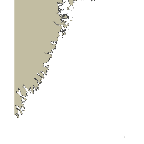
ACT Node
Basic animations using gganimate are great for many purposes but you will soon run into issues where your fish tracks are moving across land barriers, especially in more complex environments. This is because the geom used in the previous lesson choose the most direct path between two detection points. To avoid this we need to use a specific land avoidance tool. For our next animation we will use the pathroutr package which you can find out more about here.
We will begin in much the same way we did for our basic animation lesson with getting our data ready, but things will differ when we start to use pathroutr since there are specific data formats expected.
Preparing our Data
Just as in the basic animations lesson, we will only look at one fish. We will also filter down the data and only look at 5 detection events as an example subset due to the computational intensity of pathroutr and its calculations.
library(glatos)
library(sf)
library(gganimate)
library(tidyverse)
library(pathroutr)
library(ggspatial)
library(sp)
library(raster)
library(geodata)
detection_events <- #create detections event variable
read_otn_detections('cbcnr_matched_detections_2016.csv') %>% # reading detections
false_detections(tf = 3600) %>% #find false detections
filter(passed_filter != FALSE) %>%
detection_events(location_col = 'station', time_sep=3600)
plot_data <- detection_events %>%
dplyr::select(animal_id, mean_longitude,mean_latitude, first_detection)
one_fish <- plot_data[plot_data$animal_id == "CBCNR-1218518-2015-09-16",]
one_fish <- one_fish %>% filter(mean_latitude < 38.90 & mean_latitude > 38.87) %>%
slice(155:160)
Getting our Shapefile
The first big difference between our basic animation lesson and this lesson is that we will need a shapefile of the study area, so pathroutr can determine where the landmasses are located. To do this we will use the gadm function from the geodata library which gets administrative boundaries (i.e, borders) for anywhere in the world. The first argument we will pass to gadm is the name of the country we wish to get, in this case, the United States. We will specify level as 1, meaning we want our data to be subdivided at the first level after ‘country’ (in this case, provinces). 0 would get us a single shapefile of the entire country; 1 will get us individual shapefiles of each province. We must also provide a path for the downloaded shapes to be stored (./geodata here), and optionally a resolution. gadm only has two possible values for resolution: 1 for ‘high’ and 2 for ‘low’. We’ll use low resolution here because as we will see, for this plot it is good enough and will reduce the size of the data objects we download.
This is only one way to get a shapefile for our coastlines- you may find you prefer a different method. Regardless, this is the one we’ll use for now.
USA<-geodata::gadm("USA", level=1, path=".")
Since we only need one state we will have to filter out the states we don’t need. We can do this by filtering the data frame using the same filtering methods we have explored in previous lessons.
shape_file <- USA[USA$NAME_1 == 'Maryland',]
This shapefile is a great start, but we need the format to be an sf multipolygon. To do that we will run the st_as_sf function on our shapefile. We also want to change the coordinate reference system (CRS) of the file to a projected coordinate system since we will be mapping this plot flat. To do that we will run st_transform and provide it the value 5070.
md_polygon <- st_as_sf(single_poly) %>% st_transform(5070)
Formatting our Dataset
We will also need to make some changes to our detection data as well, in order to work with pathroutr. To start we will need to turn the path of our fish movements into a SpatialPoints format. To do that we will get the deploy_long and deploy_lat with dplyr::select and add them to a variable called path.
Using the SpatialPoints function we will pass our new path variable and CRS("+proj=longlat +datum=WGS84 +no_defs") for the proj4string argument. Just like for our shapefile we will need to turn our path into an sf object by using the st_as_sf function and change the CRS to a projected coordinate system because we will be mapping it flat.
path <- one_fish %>% dplyr::select(mean_longitude,mean_latitude)
path <- SpatialPoints(path, proj4string = CRS("+proj=longlat +datum=WGS84 +no_defs"))
path <- st_as_sf(path) %>% st_transform(5070)
We can do a quick plot to just check how things look at this stage and see if they are as expected.
ggplot() +
ggspatial::annotation_spatial(md_polygon, fill = "cornsilk3", size = 0) +
geom_point(data = path, aes(x=unlist(map(geometry,1)), y=unlist(map(geometry,2)))) +
geom_path(data = path, aes(x=unlist(map(geometry,1)), y=unlist(map(geometry,2)))) +
theme_void()
Using pathroutr
Now that we have everything we need we can begin to use pathroutr. First, we will turn our path points into a linestring - this way we can use st_sample to sample points on our path.
plot_path <- path %>% summarise(do_union = FALSE) %>% st_cast('LINESTRING')
track_pts <- st_sample(plot_path, size = 10000, type = "regular")
The first pathroutr function we will use is prt_visgraph. This creates a visibility graph that connects all of the vertices for our shapefile with a Delaunay triangle mesh and removes any edges that cross land. You could think of this part as creating the viable routes an animal could swim through (marking the “water” as viable).
vis_graph <- prt_visgraph(md_polygon, buffer = 150)
To reroute our paths around the landmasses we will call the prt_reroute function. Passing track_pts, md_polygon, and vis_graph as arguments. To have a fully updated path we can run the prt_update_points function, passing our new path track_pts_fix with our old path track_pts.
track_pts_fix <- prt_reroute(track_pts, land_barrier, vis_graph, blend = TRUE)
track_pts_fix <- prt_update_points(track_pts_fix, track_pts)
Now with our newly fixed path we can visualize it and see how it looks. We can also use this plot as the base plot for our animation.
For geom_point and geom_path we will pass in track_pts_fix for the data argument, but we will need to get a little creative for the x and y arguments in the aesthetic. track_pts_fix is a list of points so we will need a way to subset just the x and y values in order to supply them to the aesthetic. We will do this using map(geometry,1) to get a list of the values, and then unlist to turn that into a vector.
pathroutrplot <- ggplot() +
ggspatial::annotation_spatial(md_polygon, fill = "cornsilk3", size = 0) +
geom_point(data = track_pts_fix, aes(x=unlist(map(geometry,1)), y=unlist(map(geometry,2)))) +
geom_path(data = track_pts_fix, aes(x=unlist(map(geometry,1)), y=unlist(map(geometry,2)))) +
theme_void()
pathroutrplot
Animating our New Path
With our plot in good order we are now able to animate! We will follow what we did in the basic animation lesson with updating our pathroutrplot variable by using it as the basemap, then adding extra information. Using the function transition_reveal and then shadow_mark, we will use the arguments of past equal to TRUE and future equal to FALSE. Then we are good to call the gganimate::animate function and watch our creation!
pathroutrplot.animation <-
pathroutrplot +
transition_reveal(fid) +
shadow_mark(past = TRUE, future = FALSE)
gganimate::animate(pathroutrplot.animation)
A Note on Detail
You’ll note that the animation we’ve generated still crosses the landmass at certain points. This is a combination of several factors: our coastline polygon is not very high-res, our animation does not have many frames, and what frames it does have are not rendered in great detail. We can increase all of these and get a more accurate plot. For example:
- We can specify
resolution=1when downloading our shapefile from GADM.- We can increase the
nframesvariable in our call togganimate::animate.- We can pass
detail = 2or higher to the call togganimate::animate.All of these will give us an animation that more scrupulously respects the landmass, however, they will all bloat the runtime of the code significantly. This may not be a consideration when you create your own animations, but they do make it impractical for this workshop. Embedded below is an animation created with high-resolution polygons and animation parameters to show an example of the kind of animation we could create with more time and processing power.
Key Points
Quality Control Checks with Remora
Overview
Teaching: 15 min
Exercises: 0 minQuestions
How do I use Remora to quality check my data?
Objectives
remora (Rapid Extraction of Marine Observations for Roving Animals) is a program developed by researchers with IMOS to perform two critical functions. The first is to provide quality control checks for acoustic telemetry detection data. The second is to match detections with environmental
conditions at the time of detection. This lesson will cover the former functionality.
remora’s original design only allowed for quality control on data collected by IMOS, in the area surrounding Australia. OTN has taken it on to globalize the code, allowing for detections from any location or institution to be processed. As such, some functions are not available in base remora, and must be taken from the OTN fork and the appropriate branch.
To install the appropriate branch, run the following code:
install.packages('devtools')
library(devtools)
devtools::install_github("ocean-tracking-network/surimi", force=TRUE)
devtools::install_github("ocean-tracking-network/remora", force=TRUE)
library(remora)
library(surimi)
There are other packages that need to be installed and activated but these will have been covered in the workshop setup file.
We also need to download some test data. The data files are too big to store in the repo, so we’ve placed them on the OTN website. Run the following code to download and unzip the file to your working directory.
download.file("https://members.oceantrack.org/data/share/testdataotn.zip/@@download/file/testDataOTN.zip", "./testDataOTN.zip")
unzip("testDataOTN.zip")
The test data folder contains test data from UGACCI and FSUGG that we can test against, and a tif map of the world. We need the latter for certain QC tests. You can replace it with a file of your own if you so desire after this workshop.
Now that we have some test data, we can start to run remora.
Through this lesson we may refer to “IMOS-format” or “OTN-format” data. This may be confusing, since all the files have a ‘.csv’ extension. What we’re referring to are the names and presence of certain columns. Remora, having originally been written to handle IMOS’ data, expects to receive a file with certain column names. OTN does not use the same column names, even though the data is often analogous. For example, in IMOS detection data, the column containing the species’ common name is called species_common_name. In OTN detection data, the column is called commonname. The data in the two columns is analogous, but remora expects to see the former and will not accept the latter.
To get around this limitation, we’re in the process of writing a second package, surimi, that will allow users to translate data between institutional formats. At present, Surimi can only translate data from the OTN format to the IMOS format and from the IMOS format to the OTN format. However, we aim to expand this across more institutions to allow better transit of data products between analysis packages.
For the purposes of this code, you do not need to do any additional manipulation of the test data- Remora invokes the appropriate surimi functions to make the data ingestible.
Let’s begin by making sure we have our raster of world landmasses. We can load this with the raster library as such:
world_raster <- raster::raster("./testDataOTN/NE2_50M_SR.tif")
We can now pass world_raster through to the QC process. Some of the tests to do with measuring distances require this raster.
We’ll also set up what we call our ‘test vector’. This is a vector containing the names of all the tests you want to run. For the purposes of this workshop, we’re going to run all of our tests, but you can comment out tests that you don’t want to run.
tests_vector <- c("FDA_QC",
"Velocity_QC",
"Distance_QC",
"DetectionDistribution_QC",
"DistanceRelease_QC",
"ReleaseDate_QC",
"ReleaseLocation_QC",
"Detection_QC")
The tests are as follows:
- False Detection Algorithm: Is the detection likely to be false? Remora has an algorithm for determining whether or not a detection is false, but for OTN data, we invoke the Pincock filter as implemented in the
glatoslibrary. - Velocity Check: Would the fish have had to travel at an unreasonable speed to get from its last detection to this one?
- Distance Check: Was the fish detected an unreasonable distance from the last detection?
- Detection Distribution: Was the fish detected within its species home range?
- Distance from Release: Was the fish detected a reasonable distance from the tag release?
- Release Date: Was the detection from before the release date?
- Release Location: Was the release within the species home range or 500km of the detection?
- Detection Quality Control: An aggregation of the 7 previous tests to provide a final score as to the detection’s likely legitimacy. Scores range from 1 (Valid) to 4 (Invalid).
An important note: if you’re taking your data from an OTN node, the Release Date and Release Location QC will have already been done on the data during ingestion into OTN’s database. You can still run them, and some other Remora functionality still depends on them, but they will not be counted towards the aggregation step, so as not to bias the results.
Now, we can begin to operate on our files. First, create a vector containing the name of the detection file.
otn_files_ugacci <- list(det = "./testDataOTN/ugaaci_matched_detections_2017.csv")
This format is necessary because if you have receiver and tag metadata, you can pass those in as well by supplying ‘rec’ and ‘tag’ entries in the vector. However, if all you have is a detection extract, Remora will use that to infer Receiver and Tag metadata. This is not a perfect system, but for most analyses you can do with Remora, it is good enough.
You will note that some of the tests above reference a species home range. To determine that, we are going to use occurrence data from OBIS and GBIF to create a polygon that we can pass through to the QC functions. The code is contained within a function called getOccurrence, which invokes code written by Steve Formel to get occurrence data from both OBIS and GBIF and combine it into a single dataframe.
#Add the scientific name of the species in question...
scientific_name <- "Acipenser oxyrinchus"
#And pass it through to getOccurrence.
sturgeonOccurrence <- getOccurrence(scientific_name)
The next step is to take the occurrence data and pass that to createPolygon, which will return a spatial object representing the species’ home range. This function invokes code written by Jessica Castellanos, as well as the voluModel library, to create an alpha hull out of the occurrence data points. Most of the parameters we can pass to createPolygon are passed directly through to voluModel’s marineBackground function.
sturgeonPolygon <- createPolygon(sturgeonOccurrence, fraction=1, partsCount=1, buff=100000, clipToCoast = "aquatic")
Note that while here we are passing it the dataframe variable, if you have your own occurrence file you can pass the filename and createPolygon will read that in.
With all of that in hand, we can run the QC function, like so:
otn_test_tag_qc <- runQC(otn_files_ugacci,
data_format = "otn",
tests_vector = tests_vector,
shapefile = sturgeonPolygon,
col_spec = NULL,
fda_type = "pincock",
rollup = TRUE,
world_raster = world_raster,
.parallel = FALSE, .progress = TRUE)
Most of these parameters are self explanatory. Of note, though, is ‘rollup’, which- when set to TRUE, will return not only the normal Remora output (a nested tibble containing per-animal QC information), but a CSV file containing your original detection extract with the appropriate QC information attached.
To get a quick visualization of our data, we can pass it to plotQC, a Remora function with some alterations for OTN data, and see an interactive Leaflet map of our data.
plotQC(otn_test_tag_qc, distribution_shp = sturgeonPolygon, data_format = "otn")
This concludes the workshop material for Remora. For additional information about the package’s original intentions, details can be found in the original Hoenner et al paper that describes Remora’s QC process.
Key Points
Spatial and Temporal Modelling with GAMs
Overview
Teaching: min
Exercises: 0 minQuestions
What are GAMs?
How can I use GAMs to visualise my data?
Objectives
GAM is short for ‘Generalized Additive Model’, a type of statistical model. In this lesson, we will be using GAMs to visualise our data.
While we are still developing this lesson as templated text like our other lessons, we can provide the Powerpoint slides for the GAMs talk given by Dr. Lennox at the CANSSI Early Career Researcher workshop. You can access the slides here.
The following code is meant to be run alongside this presentation.
require(BTN) # remotes::install_github("robertlennox/BTN")
require(tidyverse)
require(mgcv)
require(lubridate)
require(Thermimage)
require(lunar)
library(sf)
library(gratia)
theme_set<-theme_classic()+
theme(text=element_text(size=20), axis.text=element_text(colour="black"))+
theme(legend.position="top") # set a theme for ourselves
aur<-BTN::aurland %>%
st_transform(32633) %>%
slice(2) %>%
ggplot()+
geom_sf()
#Load RData
load("YOUR/PATH/TO/data/otn/troutdata.RDS")
# first plot of the data
troutdata %>%
ggplot(aes(dt, Data, colour=Data))+
geom_point()+
theme_classic()+
scale_colour_gradientn(colours=Thermimage::flirpal)
# mapping out the data
aur+
geom_point(data=troutdata %>%
group_by(lon, lat) %>%
dplyr::summarise(m=mean(Data)),
aes(lon, lat, colour=m))+
scale_colour_gradientn(colours=Thermimage::flirpal)+
theme(legend.position="top", legend.key.width=unit(3, "cm"))+
theme_bw()
# 4. going for smooth
a<-troutdata %>%
mutate(h=hour(dt)) %>%
bam(Data ~ s(h, bs="cc", k=5), data=., method="fREML", discrete=T)
b<-troutdata %>%
mutate(h=hour(dt)) %>%
bam(Data ~ s(h, bs="tp", k=5), data=., , method="fREML", discrete=T)
c<-troutdata %>%
mutate(h=hour(dt)) %>%
bam(Data ~ h, data=., , method="fREML", discrete=T)
tibble(h=c(0:23)) %>%
mutate(circular=predict.gam(a, newdata=.)) %>%
mutate(thin_plate=predict.gam(b, newdata=.)) %>%
# mutate(v3=predict.gam(c, newdata=.)) %>%
gather(key, value, -h) %>%
ggplot(aes(h, value, colour=key))+
geom_line(size=2)+
theme_set+
labs(x="Hour", y="Predicted Depth", colour="Model")+
scale_y_reverse(limits=c(20, 0))+
geom_hline(yintercept=0)+
coord_polar()
#6. model fitting vehicle
m1<-troutdata %>%
mutate(h=hour(dt)) %>%
mutate(foid=factor(oid)) %>%
gam(Data ~ s(h, k=5)+s(foid, bs="re"), data=., method="REML")
m2<-troutdata %>%
mutate(h=hour(dt)) %>%
mutate(foid=factor(oid)) %>%
bam(Data ~ s(h, k=5)+s(foid, bs="re"), data=., method="fREML", discrete=T)
tibble(h=c(0:23)) %>%
mutate(foid=1) %>%
mutate(gam=predict.gam(m1, newdata=., type="response", exclude=c("s(foid)"))) %>%
mutate(bam=predict.gam(m2, newdata=., type="response", exclude=c("s(foid)"))) %>%
mutate(i=gam-bam) %>%
gather(key, value, -h, -foid, -i) %>%
ggplot(aes(h, value, colour=i))+
geom_line(size=2)+
theme_set+
facet_wrap(~key)+
labs(x="Hour", y="Predicted temperature", colour="Difference between predictions")+
theme(legend.key.width=unit(3, "cm"))+
scale_colour_gradientn(colours=Thermimage::flirpal)
#8. check your knots
k1<-troutdata %>%
mutate(h=hour(dt)) %>%
bam(Data ~ s(h, bs="cc", k=5), data=., method="fREML", discrete=T)
k2<-troutdata %>%
mutate(h=hour(dt)) %>%
bam(Data ~ s(h, bs="cc", k=15), data=., , method="fREML", discrete=T)
tibble(h=c(0:23)) %>%
mutate("k=5"=predict.gam(k1, newdata=., type="response")) %>%
mutate("k=15"=predict.gam(k2, newdata=., type="response")) %>%
gather(key, value, -h) %>%
ggplot(aes(h, value/10, colour=key))+
geom_line(size=2)+
theme_set+
labs(y="Temperature", x="Hour", colour="model")
#9. temporal dependency
t1<-troutdata %>%
mutate(h=hour(dt), yd=yday(dt), foid=factor(oid)) %>%
group_by(foid, dti=round_date(dt, "1 hour")) %>%
dplyr::filter(dt==min(dt)) %>%
bam(Data ~ s(h, k=5, bs="cc")+s(yd, k=10)+s(foid, bs="re"), data=., method="fREML", discrete=T)
t2<-troutdata %>%
mutate(h=hour(dt), yd=yday(dt), foid=factor(oid)) %>%
group_by(foid, dti=round_date(dt, "1 hour")) %>%
bam(Data ~ s(h, k=5, bs="cc")+s(yd, k=10)+s(foid, bs="re"), data=., method="fREML", discrete=T)
expand_grid(h=c(12),
yd=c(32:60),
foid=1) %>%
mutate(partial_series=predict.gam(t1, newdata=., type="response", exclude=c("s(foid)"))) %>%
mutate(full_series=predict.gam(t2, newdata=., type="response", exclude=c("s(foid)"))) %>%
gather(key, value, -h, -foid, -yd) %>%
ggplot(aes(yd, value, colour=key))+
geom_point(data=troutdata %>%
mutate(h=hour(dt), yd=yday(dt), foid=factor(oid)),
aes(yday(dt), Data), inherit.aes=F)+
geom_path(size=2)+
theme_set+
labs(x="Date", y="Temperature", colour="Model")
# 10. spatial dependency
aur+
geom_point(data=troutdata %>%
group_by(lon, lat) %>%
dplyr::summarise(m=mean(Data)),
aes(lon, lat, colour=m))+
scale_colour_gradientn(colours=Thermimage::flirpal)+
theme(legend.position="top", legend.key.width=unit(3, "cm"))+
theme_bw()+
theme_set+
theme(legend.position="top", legend.key.width=unit(3, "cm"))+
labs(colour="mean temperature")
#11. interactions
mi<-troutdata %>%
mutate(h=hour(dt), yd=yday(dt), foid=factor(oid)) %>%
bam(Data ~ te(h, yd, bs=c("cc", "tp"), k=c(5, 10))+
s(foid, bs="re"), data=., family=Gamma(link="log"), method="fREML", discrete=T)
ms<-troutdata %>%
mutate(h=hour(dt), yd=yday(dt), foid=factor(oid)) %>%
bam(Data ~ s(h, bs="cc", k=5)+
s(yd, bs="tp", k=10)+
s(foid, bs="re"), data=., family=Gamma(link="log"), method="fREML", discrete=T)
p1<-expand_grid(h=c(0:23), yd=c(182:212)) %>%
mutate(foid=1) %>%
mutate(value=predict.gam(ms, newdata=., type="response", exclude=c("s(foid)"))) %>%
mutate(i="Simple model, AIC=426 801") %>%
ggplot(aes(yd, h, fill=value))+
geom_raster()+
scale_fill_viridis_c()+theme_set+
theme(legend.key.width=unit(3, "cm"))+
labs(x="Date", y="Hour", fill="Predicted temperature")+
facet_wrap(~i)
p2<-expand_grid(h=c(0:23), yd=c(182:212)) %>%
mutate(foid=1) %>%
mutate(value=predict.gam(mi, newdata=., type="response", exclude=c("s(foid)"))) %>%
mutate(i="Interaction model, AIC=425 805") %>%
ggplot(aes(yd, h, fill=value))+
geom_raster()+
scale_fill_viridis_c()+theme_set+
theme(legend.key.width=unit(3, "cm"))+
labs(x="Date", y="Hour", fill="Predicted temperature")+
facet_wrap(~i)
AIC(mi, ms)
gridExtra::grid.arrange(p1, p2)
# is it the moon?
a<-expand_grid(h=c(0:23), yd=c(182:212)) %>%
mutate(foid=1) %>%
mutate(value=predict.gam(ms, newdata=., type="response", exclude=c("s(foid)"))) %>%
mutate(i="Simple model, AIC= -262 975") %>%
mutate(dt=ymd("2022-12-31")+days(yd)) %>%
mutate(l=lunar::lunar.illumination(dt)) %>%
ggplot(aes(yd, h, fill=value))+
geom_raster()+
scale_fill_viridis_c()+theme_set+
theme(legend.key.width=unit(3, "cm"))+
labs(x="Date", y="Hour", fill="Predicted temperature")+
facet_wrap(~i)+
geom_point(data=expand_grid(h=c(0:23), yd=c(182:212)) %>%
mutate(foid=1) %>%
mutate(value=predict.gam(ms, newdata=., type="response", exclude=c("s(foid)"))) %>%
mutate(i="Simple model, AIC= -262 975") %>%
mutate(dt=ymd("2022-12-31")+days(yd)) %>%
mutate(l=lunar::lunar.illumination(dt)) %>%
distinct(dt, yd, l),
aes(yd, 10, size=l), inherit.aes=F, colour="white")
b<-expand_grid(h=c(0:23), yd=c(182:212)) %>%
mutate(foid=1) %>%
mutate(value=predict.gam(mi, newdata=., type="response", exclude=c("s(foid)"))) %>%
mutate(i="Interaction model, AIC=425 805") %>%
ggplot(aes(yd, h, fill=value))+
geom_raster()+
scale_fill_viridis_c()+theme_set+
theme(legend.key.width=unit(3, "cm"))+
labs(x="Date", y="Hour", fill="Predicted temperature")+
facet_wrap(~i)+
geom_point(data=expand_grid(h=c(0:23), yd=c(182:212)) %>%
mutate(foid=1) %>%
mutate(value=predict.gam(ms, newdata=., type="response", exclude=c("s(foid)"))) %>%
mutate(i="Simple model, AIC=426 801") %>%
mutate(dt=ymd("2022-12-31")+days(yd)) %>%
mutate(l=lunar::lunar.illumination(dt)) %>%
distinct(dt, yd, l),
aes(yd, 10, size=l), inherit.aes=F, colour="white")
gridExtra::grid.arrange(a, b)
########### the worked example
troutdata %>%
mutate(lun=lunar::lunar.illumination(dt)) %>%
ggplot(aes(lun, Data))+
geom_point()+
theme_set+
labs(x="Lunar illumination", y="Temperature")
troa<-troutdata %>%
mutate(foid=factor(oid)) %>%
mutate(lun=lunar::lunar.illumination(dt))
m0<-troa %>%
bam(Data ~ lun, data=., family=Gamma(link="log"))
tibble(lun=seq(0,1, by=0.1)) %>%
mutate(p=predict.gam(m0, newdata=., type="response")) %>%
ggplot(aes(lun, p))+
geom_point(data=troa, aes(lun, Data))+
geom_line(colour="red")+
theme_set+
labs(x="Moonlight", y="Temperature")
m0<-troa %>%
bam(Data ~ lun+s(foid, bs="re"), data=., family=Gamma(link="log"))
tibble(lun=seq(0,1, by=0.1)) %>%
mutate(foid=1) %>%
mutate(p=predict.gam(m0, newdata=., type="response", exclude=c("s(foid)"))) %>%
ggplot(aes(lun, p))+
geom_point(data=troa, aes(lun, Data, colour=factor(foid)))+
geom_line(colour="red")+
theme_set+
guides(colour=F)+
labs(x="Moonlight", y="Temperature")
m0<-troa %>%
bam(Data ~ s(lun, k=7)+s(foid, bs="re"), data=., family=Gamma(link="log"))
tibble(lun=seq(0,1, by=0.1)) %>%
mutate(foid=1) %>%
mutate(p=predict.gam(m0, newdata=., type="response", exclude=c("s(foid)"))) %>%
ggplot(aes(lun, p))+
geom_point(data=troa, aes(lun, Data, colour=factor(foid)))+
geom_line(colour="red")+
theme_set+
guides(colour=F)+
labs(x="Moonlight", y="Temperature")
m01<-troa %>%
mutate(yd=yday(dt), h=hour(dt)) %>%
bam(Data ~ s(lun, k=7)+s(foid, bs="re")+
s(h, bs="cc", k=5)+
s(lon, lat, k=15), data=., family=Gamma(link="log"))
BTN::aurland %>%
st_transform(32633) %>%
slice(2)
tibble(x=c(7.26, 7.32),
y=c(60.85, 60.87)) %>%
st_as_sf(., coords=c("x", "y")) %>%
st_set_crs(4326) %>%
st_transform(32633)
sp<-expand_grid(lon=seq(80077, 83583, by=10),
lat=seq(6770907, 6772740, by=10)) %>%
st_as_sf(., coords=c("lon", "lat")) %>%
st_set_crs(32633) %>%
st_intersection(BTN::aurland %>%
slice(1) %>%
st_transform(32633)) %>%
as(., "Spatial") %>%
as_tibble %>%
dplyr::rename(lon=coords.x1, lat=coords.x2) %>%
dplyr::select(lon, lat)
sp %>%
slice(1) %>%
expand_grid(., lun=seq(0, 1, by=0.1), h=c(0:23)) %>%
mutate(foid=1) %>%
mutate(value=predict.gam(m01, newdata=., exclude=c("s(foid)"))) %>%
ggplot(aes(h, lun, fill=value))+
geom_raster()+
scale_fill_gradientn(colours=Thermimage::flirpal)+
theme_classic()+
theme_set+
theme(legend.key.width=unit(3, "cm"))+
labs(x="Hour", y="Moonlight", fill="Predicted Temperature")
expand_grid(sp, lun=seq(0, 1, by=0.1), h=c(0, 12), yd=200) %>%
mutate(foid=1) %>%
mutate(p=predict.gam(m01, newdata=., type="response", exclude=c("s(foid)", "s(lon,lat)", "s(h)"))) %>%
ggplot(aes(lun, p))+
geom_point(data=troa, aes(lun, Data, colour=factor(foid)))+
geom_line()+
theme_set+
guides(colour=F)+
labs(x="Moonlight", y="Temperature")
sp %>%
expand_grid(., lun=seq(0, 1, by=0.3)) %>%
mutate(foid=1, h=1) %>%
mutate(value=predict.gam(m01, newdata=., type="response", exclude=c("s(foid)"))) %>%
ggplot(aes(lon, lat, fill=value))+
geom_raster()+
scale_fill_gradientn(colours=Thermimage::flirpal)+
theme_set+
theme(legend.key.width=unit(3, "cm"))+
labs(x="UTM (x)", y="UTM (y)", fill="Predicted Temperature")+
coord_fixed(ratio=1)+
facet_wrap(~lun)
gratia::draw(m01)
sp %>%
expand_grid(., lun=seq(0, 1, by=0.05), h=c(0:23)) %>%
mutate(foid=1) %>%
mutate(value=predict.gam(m01, newdata=., type="response", exclude=c("s(foid)", "s(lon,lat)"))) %>%
ggplot(aes(lun, value, colour=h))+
geom_point()+
theme_set+
theme(legend.key.width=unit(3, "cm"))+
scale_fill_gradientn(colours=Thermimage::flirpal)
coef(m01) %>%
data.frame %>%
rownames_to_column() %>%
as_tibble %>%
dplyr::filter(grepl("foid", rowname)) %>%
bind_cols(troa %>% distinct(foid)) %>%
left_join(troutdata %>%
group_by(oid) %>%
dplyr::summarise(m=mean(Data)) %>%
dplyr::rename(foid=oid) %>%
mutate(foid=factor(foid))) %>%
dplyr::rename(value=2) %>%
ggplot(aes(reorder(foid, value), value, colour=m))+
geom_point()+
coord_flip()+
theme_set+
labs(x="ID", y="Random intercept of temperature", size="Length (mm)", colour="True mean temperature")+
scale_colour_viridis_c()
Key Points
Introduction to the miscYAPS package
Overview
Teaching: 0 min
Exercises: 0 minQuestions
What is YAPS?
For what applications is YAPS well-suited?
How can I use the miscYAPS package to make working with YAPS easier?
Objectives
YAPS (short for ‘Yet Another Position Solver’) is a package originally presented in a 2017 paper by Baktoft, Gjelland, Økland & Thygesen. YAPS represents a way of positioning aquatic animals using statistical analysis (specifically, maximum likelihood analysis) in conjunction with time of arrival data, movement models, and state-space models. Likewise, miscYaps() is a package developed by Dr. Robert Lennox to provide more intuitive wrappers for YAPS functions, to ease the analysis process.
While we are still developing this lesson as templated text, as with the other lessons, we can provide the Powerpoint slides for the miscYaps talk given by Dr. Lennox at the CANSSI Early Career Researcher workshop. You can access the slides here.
The following code is meant to be run alongside this powerpoint.
remotes::install_github("robertlennox/miscYAPS")
require(yaps)
require(miscYAPS)
remotes::install_github("robertlennox/BTN")
require(BTN)
require(tidyverse)
require(lubridate)
require(data.table)
data(boats)
dets<-boats %>% pluck(1)
hydros<-dets %>%
dplyr::distinct(serial, x, y, sync_tag=sync) %>%
mutate(idx=c(1:nrow(.)), z=1)
detections<-dets %>%
dplyr::filter(Spp=="Sync") %>%
dplyr::select(ts, epo, frac, serial, tag)
ss_data<-boats %>% pluck(2) %>%
dplyr::rename(ts=dt) %>%
setDT
############
require(miscYAPS)
sync_model<-sync(hydros,
detections,
ss_data,
keep_rate=0.5,
HOW_THIN=100,
ss_data_what="data",
exclude_self_detections=T,
fixed=NULL)
plotSyncModelResids(sync_model)
sync_model<-sync(hydros,
detections,
ss_data,
keep_rate=0.5,
HOW_THIN=100,
ss_data_what="data",
exclude_self_detections=T,
fixed=c(1:9, 11:20))
fish_detections<-dets %>%
dplyr::filter(Spp!="Sync") %>%
mutate(tag=factor(tag)) %>%
dplyr::select(ts, epo, frac, tag, serial)
tr<-swim_yaps(fish_detections, runs=3, rbi_min=60, rbi_max=120)
data(aur)
btnstorel <- BTN::storel
raster::plot(btnstorel)
points(tr$x, tr$y, pch=1)
Key Points
Introduction to Git for Code
Overview
Teaching: 45 min
Exercises: 0 minQuestions
What is Git and why should I use it?
How can you use Git for code management?
What is the difference between GitHub and GitLab?
Why does OTN use both GitHub and GitLab for project management?
Objectives
Introduction to Git
Git is a common command-line interface software used by developers worldwide to share their work with colleagues and keep their code organized. Teams are not the only ones to benefit from version control: lone researchers can benefit immensely. Keeping a record of what was changed, when, and why is extremely useful for all researchers if they ever need to come back to the project later on (e.g., a year later, when memory has faded).
Version control is the lab notebook of the digital world: it’s what professionals use to keep track of what they’ve done and to collaborate with other people. Every large software development project relies on it, and most programmers use it for their small jobs as well. And it isn’t just for software: books, papers, small data sets, and anything that changes over time or needs to be shared can and should be stored in a version control system.
Git is the version control software and tool, while GitHub is the website where Git folders/code can be shared and edited by collaborators.
This lesson is accompanied by this Powerpoint presentation.

What can Git do for you?
- Archive all your code changes, for safekeeping and posterity
- Share and build code within your group and across the globe
Why Git is valuable
Think about Google Docs or similar… but for code and data!
- Version Control
- Collaboration
- One True Codebase – authoritative copy shared among colleagues
- Documentation of any changes
- Mark and retrieve the exact version you ran from any point in time, even if it’s been “overwritten”
- Resolve conflicts when editors change the same piece of content
- Supporting open science, open code, and open data. A requirement for a lot of publications!

Basic commands
Turn my code folder into a Git Repository
git initgit add .adds ALL files to Git’s tracking indexgit commit -m 'add your initial commit message here, describing what this repo will be for'saves everything that has been “added” to the tracking index.
You will always need to ADD then COMMIT each new file.
Link your Git Repository to the GitHub website, for storage and collaboration
git remote add origin [url]telling git the web-location with which to linkgit push -u origin masterpushes your work up to the website, in the “master” master!
To add the latest changes to the web-version while you’re working you will always have to ADD, then COMMIT, then PUSH the changes.
Clone a Git Repository to your computer to work on it
git clone [paste the url]git pullto get the newest changes from the web-version at any time!
In summary, you should PULL any new changes to keep your repository synced with the website where other people are working, then ADD/COMMIT/PUSH your changes back to the website for other people to see!

As an alternative - you can use an app like TortoiseGit (Windows) or SourceTree (MAC) to stay away from command line. GitHub also has an app! The commands will be the same (ADD, PUSH, etc.) but you will be able to do them by pushing buttons instead of writing them into a command line terminal.
Resources
- An excellent introductory lesson is available from the Carpentries
- Oh shit, git is a website that helps you troubleshoot Git with plain-language search terms
- NYU has a curriculum for sharing within labs - available here
- This article explains why data scientists (us!) should be using Git
GitHub
GitHub is the website where Git folders/code can be shared and edited by collaborators. This is the “cloud” space for your local code folders, allowing you to share with collaborators easily.
GitLab
At OTN, we use both GitHub and GitLab to manage our repositories. Both services implement Git, the version-control software, but GitHub repositories are publicly viewable, while GitLab gives the option to control access to project information and repository contents. This allows us to maintain privacy on projects that are not ready for public release, or that may have sensitive data or information included in their code. GitLab also (at time of writing) has a more robust set of continuous integration/testing tools, which are useful for ensuring the continued integrity of some of OTN’s core projects and data pipelines.
GitLab provides a broad range of versioning control functionality through its web interface; however, technical explanations of how to use them are beyond the scope of this document. This lesson is more about why we at OTN use GitLab and where it fits in our processes. GitLab maintains its own comprehensive documentation, however. If you have used any Git-derived service before, many of the concepts will be familiar to you. Here are a few links to relevant documentation:
Why use both GitHub and GitLab? There are several reasons, chief among them that GitLab provides more robust access control for private repositories. In the course of OTN’s work, it is not uncommon to have code that we need to work on or even distribute, but not make entirely public. A good example are the iPython Utilities notebooks that we and our node managers use to upload data into our database. Node Managers outside of OTN need to be able to use and potentially modify these notebooks, but we don’t wish for them to be publicly available, since they may contain code that we don’t want anyone oustide of the node network to run. We therefore want to keep the repository private in macro, but allow specific users to pull the repository and use it. GitHub only allows private repositories for free users to have a maximum of three collaborators, whereas GitLab imposes no such limits. This makes GitLab the preferred option for code that needs to remain private. We do sometimes migrate code from GitLab to our GitHub page when we are ready for the code to be more public, as with resonATe. In other words, we use GitHub and GitLab at different stages of the software development process depending on who needs access.
At the time of writing, GitLab also has a different approach to automated CI/CD and testing than GitHub. GitHub’s recent feature, GitHub Actions, allows for a range of automated processes that can influence both the code base and a project’s online GitHub portal. GitLab’s CI/CD automation focuses more on testing and deploying code, and is currently more robust and established than Actions. This situation may change with time.
In a more general sense, we use both GitHub and GitLab because having familiarity with both platforms allows us to future-proof ourselves against one or the other changing with short notice. Absent any consideration of features and appropriateness for a given project, the nature of GitHub and its corporate ownership means that it can change very quickly, possibly in ways that make it unsustainable for our needs. Likewise, GitLab is open-core, and may introduce new features from community developers that are not desirable for certain projects. Using both at this stage and developing familiarity along both axes means that we can migrate projects to and from each as appropriate. It also ensures that the dev team is used to working in multiple environments, in case we need to introduce or adopt different version-control services in the future.
Key Points
Other OTN Telemetry Curriculums
Overview
Teaching: 0 min
Exercises: 0 minQuestions
How can I expand my learning?
Objectives
NOTE: this workshop has been update to align with OTN’s 2025 Detection Extract Format. For older detection extracts, please see the this lesson: Archived OTN Workshop.
OTN has hosted other workshops in the past which contain different code sets that may be useful to explore after this workshop. Please note the date each workshop was last edited! Newer workshops will be more relevant and may contain fewer bugs. Older workshops will be built for older detection extract formats
-
IdeasOTN Telemetry Workshop Series 2020: code available here and videos available on our YouTube here
Many of our Intro to R workshops are based upon this curriculum from The Carpentries.
Key Points
Public Data Endpoints
Overview
Teaching: 10 min
Exercises: 0 minQuestions
What public endpoints does OTN provide, and when should I use each?
Objectives
Identify the Discovery Portal, GeoServer, OBIS, and ERDDAP.
Understand the purpose of each endpoint.
Select the right endpoint for mapping, biodiversity records, or tabular analysis.
The Big Picture
The Ocean Tracking Network (OTN) makes much of its data publicly available. There isn’t just one access point — instead, OTN provides several endpoints, each designed for a different type of use.
- Discovery Portal → the searchable catalogue of OTN datasets.
- GeoServer → spatial data services for maps and GIS (stations, receivers, moorings).
- OBIS → biodiversity/occurrence datasets (species records).
- ERDDAP → analysis-ready tabular datasets with filtering and download options.
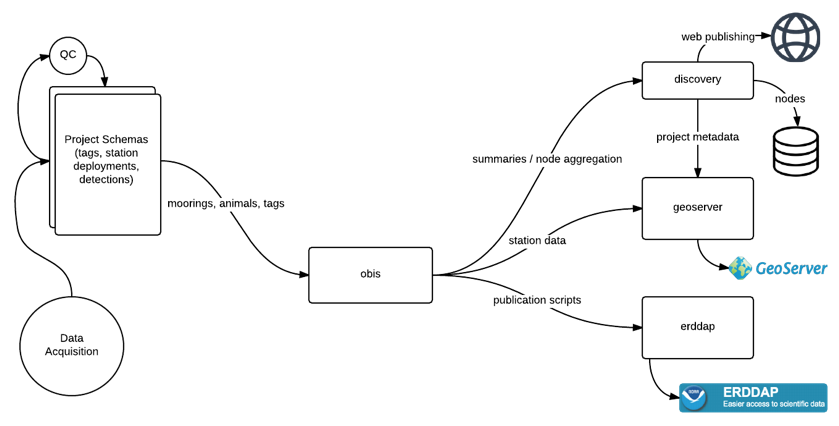
Public Endpoints
-
Discovery Portal (catalogue): https://members.oceantrack.org/data/discovery/bypublic.htm
- Human-friendly entry point.
- Provides search and links to datasets across OTN systems.
-
GeoServer (spatial layers): http://geoserver.oceantrack.org/geoserver/web/?1
- Serves GIS-ready data via WFS/WMS (e.g., CSV, GeoJSON).
- Best for mapping stations, receivers, and moorings.
- Example: integrating OTN station layers in QGIS.
- → See: GeoServer episode.
-
OBIS (biodiversity occurrences): https://obis.org/node/68f83ea7-69a7-44fd-be77-3c3afd6f3cf8
- Global standard for species occurrence data.
- OTN contributes datasets with UUID identifiers.
- Ideal for querying animal presence/absence or species distribution.
- → See: OBIS episode.
-
ERDDAP (tabular/time-series): https://erddap.oceantrack.org/erddap/index.html
- Provides time-series and detection datasets in formats like CSV, JSON, NetCDF.
- Supports subsetting and reproducible queries.
- Suitable for analysis pipelines and scripting.
- → See: ERDDAP episode.
Which Endpoint Should I Use?
- Need spatial layers or GIS integration? → GeoServer
- Need species occurrence data for biodiversity studies? → OBIS
- Need tabular or time-series data for analysis? → ERDDAP
- Not sure where to start? → Discovery Portal
Private Data (OTN Collaborators)
For OTN-affiliated projects, additional Detection Extracts are available in secure project repositories under Detection Extracts. See documentation: https://members.oceantrack.org/OTN/data/otn-detection-extract-documentation-matched-to-animals
Key Points
Discovery Portal = searchable catalogue
GeoServer = spatial layers (WFS/WMS)
OBIS = biodiversity occurrence datasets (UUID-based)
ERDDAP = analysis-ready tables with filtering
Accessing OTN GeoServer Data
Overview
Teaching: 15 min
Exercises: 15 minQuestions
What is GeoServer and what does it serve?
How do I download OTN layers like stations or receivers?
How can I bring these layers into R or Python for mapping?
Objectives
Know what kinds of spatial layers OTN publishes via GeoServer.
Construct a WFS
GetFeaturerequest for a specific layer.Load GeoServer data directly into R or Python for analysis and mapping.
What is GeoServer?
GeoServer is an open-source server that implements OGC standards for sharing spatial data. It can deliver vector features via WFS, map images via WMS, and raster coverages via WCS.
At OTN, GeoServer is used to publish infrastructure layers such as station and receiver deployments, mooring sites, and project footprints. These layers support tasks like plotting receiver locations, filtering detections by location, and integrating OTN data into GIS workflows.
For reproducible analysis, this lesson focuses on WFS because it returns tabular and spatial formats that R and Python can read directly.
GeoServer Layer Definitions
OTN publishes multiple spatial layers through its GeoServer service. These layers describe network infrastructure, metadata, and partner data products. Descriptions below are summarized from the OTN Publication Information page.
otn:animals: A history of deployed tags and which species to which they were attached.
otn:contacts: Contact information and project associations for all affiliated OTN partners.
otn:glatos_project_averaged: Average location coordinates for GLATOS projects, showing one representative point per project.
otn:gs_species: Species listed by project, with scientific/common names, collaboration type, record totals, and AphiaID.
otnnewprod:gs_species: Species listed by project, with scientific/common names, collaboration type, record totals, and AphiaID.
otn:imosatf_project_averaged: Average coordinates for IMOS ATF projects, giving one centroid point per project.
otn:mstr_contacts: Contact records for project contributors, including names, roles, affiliation, email, ORCID, and project association.
otn:mysterytags: Unidentified tag detections by region and year, listing tag IDs and associated detection counts.
otn:otn_resources_metadata: Project-level metadata with project names, descriptions, status, locality, collaboration type, citation, website, and project footprint polygons.
otn:otn_resources_metadata_points: Project metadata represented as point features, including project names, status, collaboration type, total records, and project footprint polygons.
otn:project_metadata: A listing of each OTN and partner-affiliated project.
otn:receiver_fishery_interactions: Records of receiver deployment outcomes where gear was lost, failed, or moved, including station details, dates, instrument type, and notes on recovery or failure.
otn:stations: A list of all the locations at which there have been receivers deployed.
otn:stations_history: A list of all receiver deployments, along with any user-submitted ‘proposed’ instrument deployments, with future-dated deployments and status of ‘proposed’.
otn:stations_receivers: Receiver deployment records with station name, location, model, deployment and recovery dates, depth, offset, download history, and receiver status.
otn:stations_series: A list of all the receiver deployments OTN is aware of, with locations, instrument serial number, start and end dates, and project affiliation.
otn:vr4_mooring_history: Deployment and recovery history for VR4 moorings, including coordinates, dates, last downloads, and principal investigator details.
Anatomy of a WFS GetFeature request
A WFS GetFeature request is a URL composed of key–value parameters.
https://members.oceantrack.org/geoserver/otn/ows?
service=WFS&
version=1.0.0&
request=GetFeature&
typeName=otn:stations_receivers&
outputFormat=csv
Parameters
| Parameter | Example | Purpose |
|---|---|---|
| Base endpoint | https://members.oceantrack.org/geoserver/otn/ows? |
GeoServer OWS endpoint |
service |
WFS |
Service type |
version |
1.0.0 |
WFS version |
request |
GetFeature |
Operation to fetch vector features |
typeName |
otn:stations_receivers |
Layer name (workspace:name) |
outputFormat |
csv |
Output format (e.g., csv, application/json, SHAPE-ZIP) |
Optional filters
&bbox=-70,40,-40,60,EPSG:4326
Restricts results to a bounding box (minLon, minLat, maxLon, maxLat, CRS).
&cql_filter=collectioncode='MAST'
Filters by attribute values using CQL.
Filtering by Bounds (Spatial and Temporal)
For many projects, you’ll want to narrow your results to a specific study area and time window. This can be done directly in the WFS request using a bbox= parameter, or after downloading the layer in R or Python. The simplest WFS form is:
&bbox=minLon,minLat,maxLon,maxLat,EPSG:4326
For example:
&bbox=-70,40,-40,60,EPSG:4326
In some workflows, especially when combining receiver deployments with detections or project timelines, it’s useful to filter data after download instead. Naomi Tress provides an example of this approach: she defines project latitude/longitude limits, sets start and end dates, then filters the full stations_receivers layer by deployment and recovery dates. Receivers with no reported recovery date can also be kept if they are likely still active, using expected lifespans for different receiver models (e.g., VR2W, VR3, VR4). After the temporal filtering, latitude and longitude are used to keep only receivers inside the study bounds.
This method offers precise control over which receivers were active in your region during the period of interest, and complements the simpler server-side bbox= filter.
The GeoServer catalog at geoserver.oceantrack.org lets you browse layers (e.g., stations, receivers, animals, project footprints) and download data in formats such as CSV, GeoJSON, or Shapefile. By default, downloads are limited to 50 features; increase the limit by adding a parameter such as &maxFeatures=50000. For reproducible workflows, build a WFS request URL and load the data programmatically in R or Python.
Accessing OTN GeoServer Data
Example: Receivers Layer in R
Before we can use spatial layers in analysis, we first need to build the WFS request and then read the results into R. Here’s how:
# If needed, first install:
# install.packages("readr")
library(readr)
# 1) Define WFS URL (CSV output)
# This is the "request URL" that tells GeoServer what we want.
# Here: the `otn:stations_receivers` layer in CSV format.
wfs_csv <- "https://members.oceantrack.org/geoserver/otn/ows?
service=WFS&version=1.0.0&request=GetFeature&
typeName=otn:stations_receivers&outputFormat=csv"
# 2) Download directly into a data frame
# R will fetch the URL and treat the result as a CSV.
receivers <- read_csv(wfs_csv, guess_max = 50000, show_col_types = FALSE)
# 3) Preview first rows
print(head(receivers, 5))
Example: Receivers Layer in Python
The same workflow works in Python: construct the URL, download it, read into a DataFrame.
# If needed, first install:
# pip install pandas
import pandas as pd
# 1) Define WFS URL (CSV output)
# Same request as above, but written in Python.
wfs_csv = (
"https://members.oceantrack.org/geoserver/otn/ows?"
"service=WFS&version=1.0.0&request=GetFeature&"
"typeName=otn:stations_receivers&outputFormat=csv"
)
# 2) Read CSV into DataFrame
receivers = pd.read_csv(wfs_csv)
# 3) Preview first rows
print(receivers.head())
Follow Along: Filtering OTN Receivers in R
Sometimes you only need receivers that were active during a certain time window and inside your study region. Here’s a short example showing how to define those bounds, download the layer once, and filter it.
Define study window and region
library(tidyverse)
library(lubridate)
study_start <- ymd("2019-01-01")
study_end <- ymd("2020-01-01")
lon_lo <- -70; lon_hi <- -40
lat_lo <- 40; lat_hi <- 60
Download receivers layer
receivers <- readr::read_csv(
"https://members.oceantrack.org/geoserver/otn/ows?
service=WFS&version=1.0.0&request=GetFeature&
typeName=otn:stations_receivers&outputFormat=csv",
guess_max = 20000
)
Filter by time and space
filtered <- receivers %>%
filter(!is.na(deploy_date)) %>%
filter(
deploy_date <= study_end &
(is.na(recovery_date) | recovery_date >= study_start)
) %>%
filter(
stn_long >= lon_lo & stn_long <= lon_hi,
stn_lat >= lat_lo & stn_lat <= lat_hi
)
head(filtered)
(Optional) Save your filtered receivers to CSV
write_csv(filtered, "otn_receivers_filtered.csv")
Follow Along: Mapping OTN Data in Python
Now let’s go one step further: visualizing animal detections and station deployments on an interactive map. We’ll use folium to create a Leaflet web map.
1. Imports & Setup
Here we load the libraries and prepare some helpers.
pandas→ tablesrequests→ download datafolium→ mapping
# If needed, first install:
# pip install pandas folium requests
import pandas as pd
import requests
from io import StringIO
import folium
from folium.plugins import MarkerCluster, HeatMap
2. Define Region & Layers
Every request can be limited by a bounding box (min/max longitude/latitude). We also specify which layers we want (animals, stations) and a maximum number of features.
lon_lo, lat_lo, lon_hi, lat_hi = -70.0, 40.0, -40.0, 60.0
srs = "EPSG:4326"
animals_layer = "otn:animals"
stations_layer = "otn:stations"
max_features_animals = 200_000
max_features_stations = 50_000
3. Build WFS Requests
The base WFS endpoint stays the same, we just plug in:
typeName=for the layeroutputFormat=for the format (CSV)bbox=for geographic limits
BASE = "https://members.oceantrack.org/geoserver/otn/ows"
animals_url = (
f"{BASE}?service=WFS&version=1.0.0&request=GetFeature"
f"&typeName={animals_layer}&outputFormat=csv&maxFeatures={max_features_animals}"
f"&bbox={lon_lo},{lat_lo},{lon_hi},{lat_hi},{srs}"
)
stations_url = (
f"{BASE}?service=WFS&version=1.0.0&request=GetFeature"
f"&typeName={stations_layer}&outputFormat=csv&maxFeatures={max_features_stations}"
f"&bbox={lon_lo},{lat_lo},{lon_hi},{lat_hi},{srs}"
)
print("Animals URL:\n", animals_url)
print("\nStations URL:\n", stations_url)
4. Download CSV Data
We send the request, grab the CSV text, and load it into pandas. Lowercasing the column names makes later handling easier.
animals_csv = requests.get(animals_url, timeout=180).text
stations_csv = requests.get(stations_url, timeout=180).text
animals = pd.read_csv(StringIO(animals_csv)).rename(columns=str.lower)
stations = pd.read_csv(StringIO(stations_csv)).rename(columns=str.lower)
print("animals shape:", animals.shape)
print("stations shape:", stations.shape)
animals.head(3)
5. Clean Up Data
Geospatial data often needs cleanup. Here we:
- Convert date strings to datetime
- Remove rows without coordinates
if "datecollected" in animals.columns:
animals["datecollected"] = pd.to_datetime(animals["datecollected"], errors="coerce")
animals = animals.dropna(subset=["latitude","longitude"]).copy()
stations = stations.dropna(subset=["latitude","longitude"]).copy()
print("after cleanup:", animals.shape, stations.shape)
6. Create Interactive Map
Finally, we build a Leaflet map:
- Animal detections as clustered markers + heatmap
- Stations as circle markers
- A layer switcher so you can toggle overlays
# Center map
if len(animals):
center = [animals["latitude"].median(), animals["longitude"].median()]
else:
center = [(lat_lo + lat_hi)/2, (lon_lo + lon_hi)/2]
m = folium.Map(location=center, zoom_start=5, tiles="OpenStreetMap")
# ---- Animals markers ----
mc = MarkerCluster(name="Detections").add_to(m)
sample = animals.sample(min(3000, len(animals)), random_state=42) if len(animals) else animals
vern = "vernacularname" if "vernacularname" in animals.columns else None
sci = "scientificname" if "scientificname" in animals.columns else None
date = "datecollected" if "datecollected" in animals.columns else None
for _, r in sample.iterrows():
sp = (vern and r.get(vern)) or (sci and r.get(sci)) or "Unknown"
when = (pd.to_datetime(r.get(date)).strftime("%Y-%m-%d %H:%M") if date and pd.notna(r.get(date)) else "")
popup = f"<b>{sp}</b>" + (f"<br>{when}" if when else "")
folium.Marker([r["latitude"], r["longitude"]], popup=popup).add_to(mc)
# ---- Heatmap ----
if len(animals):
HeatMap(animals[["latitude","longitude"]].values.tolist(),
name="Density heatmap", radius=15, blur=20, min_opacity=0.2).add_to(m)
# ---- Stations ----
fg = folium.FeatureGroup(name="Stations").add_to(m)
name_col = "station_name" if "station_name" in stations.columns else None
for _, r in stations.iterrows():
tip = r.get(name_col) if name_col and pd.notna(r.get(name_col)) else "(station)"
folium.CircleMarker([r["latitude"], r["longitude"]], radius=4, tooltip=tip).add_to(fg)
folium.LayerControl().add_to(m)
m.save("ocean_map.html")
print("Saved → ocean_map.html")
Outputs
Figure 1. Animal detections only.
Figure 2. Detections with density heatmap.
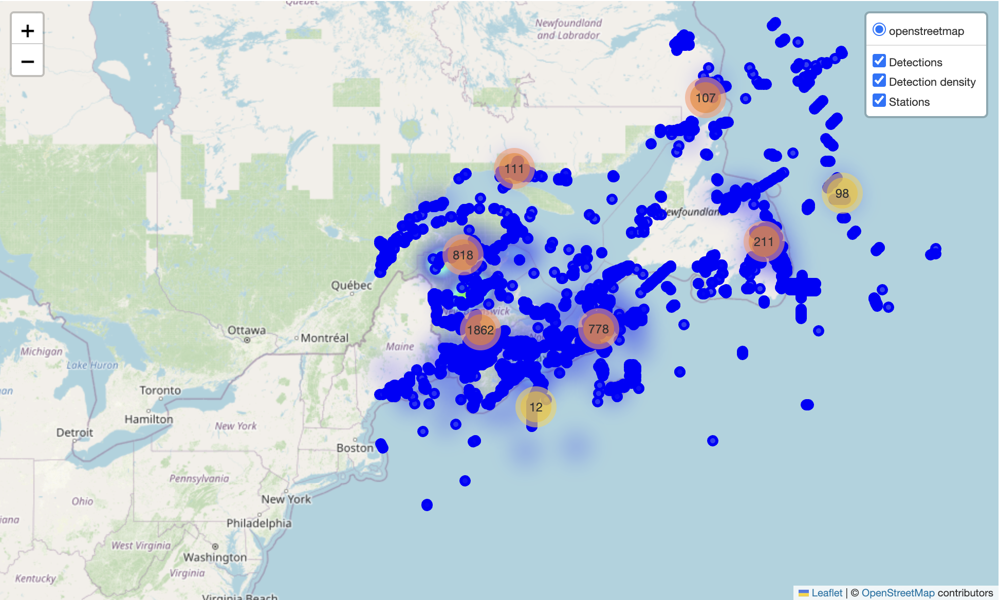
Figure 3. All layers combined: detections, density heatmap, and stations.
Advanced WFS Request Tips
WFS requests can do more than just typeName + outputFormat.
Here are a few useful extras:
- Limit columns →
&propertyName=station_name,latitude,longitude - Filter by attributes →
&cql_filter=collectioncode='MAST' - Filter by space →
&bbox=-70,40,-60,50,EPSG:4326 - Sort results →
&sortBy=datecollected D(D = descending) - Reproject on the fly →
&srsName=EPSG:3857 - Page through large results →
&count=5000&startIndex=0
Things to avoid
- Requesting everything at once (can be very slow).
→ Always add abbox,cql_filter, orcount. - Huge Shapefile downloads (
outputFormat=SHAPE-ZIP) for big datasets.
→ Use CSV or GeoJSON instead. - Ignoring CRS in
bbox.
→ Always include the EPSG code at the end.
These options make requests faster, lighter, and more reproducible.
Assessment
Check your understanding
You’ve been asked to map receiver stations for a regional study area between longitudes −70 and −40 and latitudes 40 to 60.
Which of the following WFS URLs would return the right subset as CSV?
...?service=WFS&request=GetFeature&typeName=otn:stations_receivers&bbox=40,-70,60,-40&outputFormat=csv...?service=WFS&request=GetFeature&typeName=otn:stations_receivers&bbox=-70,40,-40,60,EPSG:4326&outputFormat=csv...?service=WMS&layers=otn:stations_receivers&bbox=-70,40,-40,60&format=image/pngSolution
Option 2.
It uses the correct coordinate order (minLon,minLat,maxLon,maxLat), includes the CRS, and requestsWFSdata as CSV.
Option 1 swaps lat/lon; Option 3 is WMS, which only returns an image.
Spot the issue
A user reports that this request only returns 50 features, even though the dataset is much larger:
https://members.oceantrack.org/geoserver/otn/ows?service=WFS&version=1.0.0& request=GetFeature&typeName=otn:stations_receivers&outputFormat=csvWhat could you add to return more data?
Solution
Add a limit parameter, e.g.
&maxFeatures=50000.
GeoServer defaults to 50 results per query unless you raise that limit.
Construct a filtered query
You only want receivers from the
MASTproject in your region of interest.
Write the filter part of a WFS request that would do this.Solution
Use a CQL filter:
&cql_filter=collectioncode='MAST'&bbox=-70,40,-40,60,EPSG:4326
You can combine multiple filters usingANDorORif needed.
Short answer
Why might someone prefer
outputFormat=application/jsonoveroutputFormat=csv?Solution
JSON (or GeoJSON) keeps geometry in a structured spatial format that GIS software and libraries like
leaflet,folium, andgeopandascan read directly for mapping, while CSV flattens coordinates into columns.
Exercise
- Try swapping in a different
typeName=layer - Limit results with
bbox=to a smaller area - Switch
outputFormat=application/jsonand load withsf::st_read()(R) orgeopandas.read_file()(Python)
Key Points
GeoServer shares OTN’s spatial data via open standards (WFS/WMS).
WFS requests are just URLs: specify the layer, format, and optional filters.
You can load these URLs directly into R or Python for analysis.
Keep requests efficient with filters, bounding boxes, and paging.
For mapping,
folium(Python) orleaflet(R) can turn data into interactive maps.
Accessing OTN Data via OBIS
Overview
Teaching: 15 min
Exercises: 15 minQuestions
What does OBIS hold for the Ocean Tracking Network?
How do I query OTN records by node, dataset, or species?
How can I bring OTN occurrence data into R or Python for mapping?
Objectives
Recognize what OTN contributes to OBIS (occurrence-focused).
Filter OBIS by OTN node, dataset, taxon, region, and time.
Load OTN records into R or Python and make a quick map.
What is OBIS and how does OTN fit in?
- OBIS (Ocean Biodiversity Information System) is the global hub for marine species occurrence data.
- The Ocean Tracking Network (OTN) is one of OBIS’s regional nodes. OTN contributes tagging and tracking metadata summarized as occurrence records (for example, tag releases and detection events).
- To focus only on OTN-contributed data, use the OTN node UUID:
68f83ea7-69a7-44fd-be77-3c3afd6f3cf8
Bulk or offline access (optional)
While this lesson focuses on using the OBIS API and the robis / pyobis packages for
programmatic queries, OBIS also provides complete data exports for large-scale or offline use.
- OBIS publishes its full occurrence data archive on the AWS Open Data Registry: https://registry.opendata.aws/obis/
- Technical details and examples are maintained in the OBIS Open Data GitHub repository: https://github.com/iobis/obis-open-data
These exports contain the same occurrence records available through the API, formatted as CSV and GeoParquet files for analysis in cloud or high-performance environments. For most OTN-focused analyses, the API-based approach taught here is sufficient, but bulk exports are ideal if you need full OBIS datasets or offline workflows.
Anatomy of an OBIS query (OTN-focused)
An OBIS request is a URL with filters. The example below retrieves blue shark records contributed by OTN.
https://api.obis.org/v3/occurrence?
nodeid=68f83ea7-69a7-44fd-be77-3c3afd6f3cf8&
scientificname=Prionace%20glauca&
startdate=2000-01-01&
size=100
What each part means
nodeid — restricts results to the OTN node scientificname — filters by species (for example, Prionace glauca) startdate / enddate — sets a time window geometry — filters by region (polygon or bounding box in WKT) datasetid — limits the search to a specific OTN dataset size / from — controls paging through large results fields — specifies which columns to return for smaller, faster responses
Your first OBIS query
The simplest OBIS query includes only two filters: a species name and the OTN node UUID. The example below retrieves blue shark (Prionace glauca) records contributed by OTN.
R (using robis)
# install.packages("robis") # run once
library(robis)
OTN <- "68f83ea7-69a7-44fd-be77-3c3afd6f3cf8"
blue <- occurrence("Prionace glauca", nodeid = OTN, size = 500)
head(blue)
Python (using pyobis)
# pip install pyobis pandas # run once
from pyobis import occurrences
OTN = "68f83ea7-69a7-44fd-be77-3c3afd6f3cf8"
blue = occurrences.search(
scientificname="Prionace glauca",
nodeid=OTN,
size=500
).execute()
print(blue.head())
Adding filters
You can add filters to make OBIS queries more specific. The most common options are:
- Time window (
startdate,enddate) - Place (
geometry=using a WKT polygon or bounding box in longitude/latitude) - Dataset (
datasetid=) - Fields (
fields=to return only selected columns)
R
# Time filter (since 2000)
blue_time <- occurrence("Prionace glauca", nodeid = OTN, startdate = "2000-01-01")
# Place filter (box in Gulf of St. Lawrence)
wkt <- "POLYGON((-70 40, -70 50, -55 50, -55 40, -70 40))"
blue_space <- occurrence("Prionace glauca", nodeid = OTN, geometry = wkt)
# Dataset filter (replace with an actual dataset UUID)
# blue_ds <- occurrence("Prionace glauca", nodeid = OTN, datasetid = "DATASET-UUID")
# Return selected fields only
blue_lean <- occurrence("Prionace glauca", nodeid = OTN,
fields = c("scientificName", "eventDate", "decimalLatitude",
"decimalLongitude", "datasetName"))
Python
# Time filter (since 2000)
blue_time = occurrences.search(
scientificname="Prionace glauca", nodeid=OTN, startdate="2000-01-01"
).execute()
# Place filter (box in Gulf of St. Lawrence)
wkt = "POLYGON((-70 40, -70 50, -55 50, -55 40, -70 40))"
blue_space = occurrences.search(
scientificname="Prionace glauca", nodeid=OTN, geometry=wkt
).execute()
# Dataset filter (replace with an actual dataset UUID)
# blue_ds = occurrences.search(
# scientificname="Prionace glauca", nodeid=OTN, datasetid="DATASET-UUID"
# ).execute()
# Return selected fields only
blue_lean = occurrences.search(
scientificname="Prionace glauca", nodeid=OTN,
fields="scientificName,eventDate,decimalLatitude,decimalLongitude,datasetName"
).execute()
Tips
- Always drop NAs in latitude/longitude before mapping.
- Dates come back as text — convert to
Date(R) ordatetime(Python) if you need time plots. - For large datasets, paginate with
size+from(Python) or repeat calls withfrom(R).
Follow-Along: “Where are the Blue Sharks?”
We’ll walk through a full workflow:
- pull blue shark (Prionace glauca) records contributed by OTN,
- focus on the NW Atlantic,
- make an interactive map and a couple of time-series views.
Install once
pip install pyobis pandas folium matplotlib
1) Imports & Setup
Load the libraries, set the OTN node UUID, species, and a bounding box (WKT polygon) for the NW Atlantic.
from pyobis import occurrences, dataset
import pandas as pd
import folium
from folium.plugins import HeatMap, MarkerCluster
import matplotlib.pyplot as plt
OTN = "68f83ea7-69a7-44fd-be77-3c3afd6f3cf8"
SPECIES = "Prionace glauca" # blue shark
WKT = "POLYGON((-80 30, -80 52, -35 52, -35 30, -80 30))"
2) Peek at OTN datasets
This shows which datasets under OTN actually contain blue shark records.
ds = dataset.search(nodeid=OTN, limit=100, offset=0).execute()
pd.DataFrame(ds["results"])[["id","title"]].head(10)
3) Query OBIS for Blue Shark
We add filters: species + node + region + time window.
df = occurrences.search(
scientificname=SPECIES,
nodeid=OTN,
geometry=WKT,
startdate="2000-01-01",
size=5000,
fields="id,scientificName,eventDate,decimalLatitude,decimalLongitude,datasetName"
).execute()
4) Clean the results
Drop rows without coordinates, parse event dates, and check the shape.
df = df.dropna(subset=["decimalLatitude","decimalLongitude"]).copy()
df["eventDate"] = pd.to_datetime(df["eventDate"], errors="coerce")
df = df.dropna(subset=["eventDate"])
print(df.shape)
df.head()
5) Quick sanity checks
See which datasets dominate and what the date range looks like.
print("Top datasets:\n", df["datasetName"].value_counts().head(10))
print("Date range:", df["eventDate"].min(), "→", df["eventDate"].max())
6) Interactive Map
Plot both individual points (sampled so the map stays fast) and a density heatmap.
center = [df["decimalLatitude"].median(), df["decimalLongitude"].median()]
m = folium.Map(location=center, zoom_start=4, tiles="OpenStreetMap")
# Markers
sample = df.sample(min(len(df), 2000), random_state=42)
mc = MarkerCluster(name="Blue shark points").add_to(m)
for _, r in sample.iterrows():
tip = f"{r['scientificName']} • {str(r['eventDate'])[:10]}"
folium.CircleMarker([r["decimalLatitude"], r["decimalLongitude"]],
radius=3, tooltip=tip).add_to(mc)
# Heatmap
HeatMap(df[["decimalLatitude","decimalLongitude"]].values.tolist(),
name="Density", radius=14, blur=22, min_opacity=0.25).add_to(m)
folium.LayerControl().add_to(m)
m.save("otn_blue_shark_map.html")
print("Saved → otn_blue_shark_map.html")
7) Yearly & Monthly Patterns
Summarize how records are distributed in time.
# Records per year
df["eventDate"].dt.year.value_counts().sort_index().plot(kind="bar", title="Records per year")
plt.xlabel("Year"); plt.ylabel("Records"); plt.show()
# Records by month
df["eventDate"].dt.month.value_counts().sort_index().plot(kind="bar", title="Records by month")
plt.xlabel("Month"); plt.ylabel("Records"); plt.show()
Common pitfalls & quick fixes
- Empty results? Loosen filters (remove
geometry, broaden dates, dropdatasetid). - Slow/large queries? Use
fields=..., smaller regions, and paginate withsize+from. - Missing coordinates? Drop NA lat/lon before mapping.
- CRS confusion? OBIS returns WGS84 (EPSG:4326); mapping expects lon/lat.
Exercises
- Query a different species (e.g.,
"Gadus morhua") restricted to OTN. - Find a specific OTN dataset and filter occurrences by
datasetid. - Compare recent vs historical records with
startdate/enddate. - Change the
geometryto your own study region and map results. -
Save results:
- Python:
df.to_csv("export.csv", index=False) - R:
write.csv(salmon, "export.csv", row.names = FALSE)
- Python:
Assessment
Check your understanding
You want blue shark (Prionace glauca) records from OTN only, since 2000-01-01, via the OBIS API. Which URL is correct?
https://api.obis.org/v3/occurrence?scientificname=Prionace glauca&node=OTN&startdate=2000-01-01
https://api.obis.org/v3/occurrence?scientificname=Prionace%20glauca&nodeid=68f83ea7-69a7-44fd-be77-3c3afd6f3cf8&startdate=2000-01-01&size=500
https://api.obis.org/v3/occurrence?scientificName=Prionace%20glauca&nodeid=OTN&since=2000-01-01Solution
Option 2. Uses the correct parameter names (
scientificname,nodeid,startdate), correctly URL-encodes the space in the species name, includes the OTN node UUID, and addssizeto control paging. Option 1 uses the wrong param for the node and doesn’t encode the space; Option 3 uses incorrect parameter names.
Spot the paging issue
Your query returns only 500 records, even though you expect more:
https://api.obis.org/v3/occurrence?scientificname=Prionace%20glauca&nodeid=68f83ea7-69a7-44fd-be77-3c3afd6f3cf8What would you add to retrieve additional pages?
Solution
Use paging parameters: increase a page size (e.g.,
&size=5000) and iterate withfrom(offset), e.g.&from=0,&from=5000,&from=10000, … until a page comes back empty. Example:...&size=5000&from=0
Construct a filtered query
Restrict to the NW Atlantic box and return only a slim set of fields. Use blue shark, the OTN UUID, a time window since 2000-01-01, and this WKT polygon:
POLYGON((-80 30, -80 52, -35 52, -35 30, -80 30))Solution
https://api.obis.org/v3/occurrence? scientificname=Prionace%20glauca& nodeid=68f83ea7-69a7-44fd-be77-3c3afd6f3cf8& geometry=POLYGON((-80%2030,%20-80%2052,%20-35%2052,%20-35%2030,%20-80%2030))& startdate=2000-01-01& size=5000& fields=id,scientificName,eventDate,decimalLatitude,decimalLongitude,datasetNameNotes: URL-encode spaces in WKT;
fields=keeps the response small and faster to parse.
Diagnose empty results
This query returns zero rows. Which two fixes are most likely to help?
https://api.obis.org/v3/occurrence?scientificname=Prionace%20glauca&nodeid=68f83ea7-69a7-44fd-be77-3c3afd6f3cf8&geometry=POLYGON((-70%2060,%20-70%2062,%20-55%2062,%20-55%2060,%20-70%2060))&startdate=2024-01-01&enddate=2024-01-31A) Swap lat/lon to
POLYGON((60 -70, 62 -70, 62 -55, 60 -55, 60 -70))B) Broaden the time window or region C) Removenodeidso non-OTN records are included D) UsescientificName=instead ofscientificname=Solution
B and C are plausible, depending on your aim. If you must stay with OTN, try B first (expand dates/area). If any OBIS records are acceptable, C will increase results. A is incorrect (OBIS expects lon,lat in WKT already); D is just a casing variant—
scientificnameis correct.
Short answer
Why use
fields=when querying OBIS for mapping?Solution
It reduces payload (faster, cheaper) and returns only what mapping needs (e.g.,
scientificName,eventDate,decimalLatitude,decimalLongitude), avoiding dozens of unused columns.
True or False
OBIS coordinates are returned in WGS84 (EPSG:4326) and the WKT
geometryfilter expects coordinates in lon,lat order.Solution
True. OBIS uses WGS84; WKT polygons and bboxes are specified in longitude, latitude order.
Code reading (R)
What two lines would you add to this
robiscall to drop missing coordinates and parse dates for plotting?library(robis); library(dplyr) OTN <- "68f83ea7-69a7-44fd-be77-3c3afd6f3cf8" df <- occurrence("Prionace glauca", nodeid = OTN, size = 5000) # add lines hereSolution
df <- df %>% filter(!is.na(decimalLatitude), !is.na(decimalLongitude)) df$eventDate <- as.POSIXct(df$eventDate, tz = "UTC", tryFormats = c("%Y-%m-%d","%Y-%m-%dT%H:%M:%S","%Y-%m-%dT%H:%M:%SZ"))
Code reading (Python)
Fill in the missing paging to gather up to 20,000 records (4 pages of 5,000).
from pyobis import occurrences OTN = "68f83ea7-69a7-44fd-be77-3c3afd6f3cf8" pages = [] for offset in [____]: page = occurrences.search( scientificname="Prionace glauca", nodeid=OTN, size=5000, from_=offset, fields="id,scientificName,eventDate,decimalLatitude,decimalLongitude" ).execute() pages.append(page)Solution
for offset in [0, 5000, 10000, 15000]: ...
Key Points
OBIS hosts species occurrence records.
OTN is an OBIS node; UUID: 68f83ea7-69a7-44fd-be77-3c3afd6f3cf8.
Use robis (R) or pyobis (Python) for programmatic queries.
Keep queries lean with fields, geometry, time window, and paging.
Accessing OTN ERDDAP Data
Overview
Teaching: 15 min
Exercises: 15 minQuestions
What is ERDDAP and what kind of data does it serve?
How can I query OTN datasets and download subsets for analysis?
How can I bring ERDDAP data into R or Python for exploration?
Objectives
Understand what kinds of OTN data are published via ERDDAP.
Construct a simple TableDAP request to retrieve a custom data subset.
Load ERDDAP data directly into R or Python for analysis.
What is ERDDAP?
ERDDAP (Environmental Research Division’s Data Access Program) is an open-source data server that provides a consistent and flexible way to search, subset, and download scientific data, particularly time-series and tabular datasets. It functions as both a database and a web API, allowing users to define variables, filters, and output formats in their data requests. ERDDAP then delivers the requested data in formats such as CSV, JSON, or NetCDF, which can be directly integrated into analytical tools like R or Python.
Within the Ocean Tracking Network (OTN), ERDDAP is used to publish public time-series and detection datasets, including acoustic animal detections, glider mission data (e.g., temperature and salinity), and mooring or sensor-based time-series. Each dataset has a unique dataset ID (for example, otn_aat_detections) and a list of variables such as time, latitude, longitude, depth, or transmitter_id.
Researchers can use ERDDAP to select specific variables, filter data by time or location, specify the desired output format, and integrate the retrieved data into analytical workflows. ERDDAP serves as OTN’s central data access platform, providing clear and efficient access to information about what happened, where, and when.
Anatomy of an ERDDAP TableDAP Request
ERDDAP provides table-based access to OTN data through a simple, reproducible URL pattern.
Basic structure
https://members.oceantrack.org/erddap/tabledap/<dataset_id>.<file_type>?<variables>[&<filters>]
An ERDDAP URL consists of four components:
| Component | Description | Example |
|---|---|---|
| Base endpoint | Always begins with /erddap/tabledap/ |
https://members.oceantrack.org/erddap/tabledap/ |
| Dataset ID | The specific dataset to query | otn_aat_detections |
| File type | Desired output format | .csv, .json, .nc |
| Query | Variables and filters joined by ? and & |
?time,latitude,longitude&time>=2016-11-01T00:00:00Z&time<=2016-11-16T23:59:59Z |
Example request:
https://members.oceantrack.org/erddap/tabledap/otn_aat_detections.csv?time,latitude,longitude&time>=2016-11-01T00:00:00Z&time<=2016-11-16T23:59:59Z
This query instructs ERDDAP to:
- Use the
otn_aat_detectionsdataset - Return results in CSV format
- Include only the columns
time,latitude, andlongitude - Restrict rows to detections between 1–16 November 2016
Choosing variables, filters, and formats
Each ERDDAP dataset lists its available variables and supported filters in the web interface. Users can select only the variables required and apply constraints such as time ranges, spatial bounds, or numeric thresholds to limit the results. These filters are applied server-side, ensuring only the requested subset is downloaded.
Multiple output formats are supported. CSV is commonly used for R or Python workflows,
but JSON, NetCDF (.nc), and Parquet are also available for large-scale or cloud-based analyses.
The full list of output options appears at the bottom of the Data Access Form.
Example query
A live query can be opened directly in a browser:
Users can modify .csv to .json or adjust the time range to explore different results.
Accessing OTN ERDDAP Data in R and Python
Reading ERDDAP data in R
# If needed, install:
# install.packages("readr")
library(readr)
# Define the ERDDAP URL
erddap_url <- "https://members.oceantrack.org/erddap/tabledap/otn_aat_detections.csv?time,latitude,longitude&time>=2016-11-01T00:00:00Z&time<=2016-11-16T23:59:59Z"
# Read directly into R as a data frame
detections <- read_csv(erddap_url, show_col_types = FALSE)
# Preview the first few rows
head(detections)
Explanation
read_csv()downloads the filtered dataset directly from ERDDAP.- The server returns only the specified columns and time range.
- The resulting data frame can be used immediately for analysis or visualization.
Reading ERDDAP data in Python
# If needed, install:
# pip install pandas
import pandas as pd
# Define the ERDDAP URL
erddap_url = (
"https://members.oceantrack.org/erddap/tabledap/otn_aat_detections.csv?"
"time,latitude,longitude&"
"time>=2016-11-01T00:00:00Z&"
"time<=2016-11-16T23:59:59Z"
)
# Load the data into a pandas DataFrame
detections = pd.read_csv(erddap_url)
# Preview the first few rows
print(detections.head())
Explanation
pd.read_csv()retrieves the filtered CSV directly from ERDDAP.- Variable selection, filtering, and formatting occur on the server side.
- The resulting DataFrame is immediately ready for exploration or analysis.
Exploring ERDDAP’s Built-in Tools
ERDDAP is not only a data API but also a complete browser-based interface for exploring, filtering, plotting, and exporting datasets. Each dataset page includes a set of built-in tools designed for data access, discovery, and quick validation.
The ERDDAP Dataset Catalog
When you open the Ocean Tracking Network’s ERDDAP server, the first page you see is the dataset catalog. This catalog lists every dataset that is publicly available through the system.
Each row in this table represents a dataset. Some are small, such as metadata summaries, while others—like animal detections or glider missions—contain millions of records collected over many years of fieldwork.
Each dataset row includes several links that provide different ways to explore the same data.
- The TableDAP link opens the Data Access Form, where you can select variables, apply filters (for example, a date range or location), and download a filtered subset.
- The Make A Graph link opens a lightweight plotting interface directly on the server. It allows you to preview data patterns, such as plotting a glider’s depth through time or visualizing detection locations by latitude and longitude.
- The Files link, if available, provides access to raw data files, typically in NetCDF or CSV format.
- The Metadata and Background Info links lead to documentation describing the dataset, including variable definitions, units, collection methods, licensing, and citation details.
Each dataset also has a short Dataset ID, such as otn_aat_detections
or otn200_20220912_116_realtime.
This identifier is used in R, Python, or programmatic queries to specify which dataset
to access.
The catalog is the primary entry point for exploring OTN data. You can identify the dataset you need, review its metadata, and either download data directly or copy the generated URL for use in code.
The Data Access Form
Selecting a dataset’s data link opens the Data Access Form, an interactive interface for exploring variables, applying filters, and building precise queries before downloading.
Each row in the form corresponds to a variable, such as time, latitude,
longitude, or depth.
You can check boxes to include variables or enter constraints to limit results
(for example, a specific time window or latitude range).
At the bottom of the form, the File type menu controls the format
in which ERDDAP returns data.
CSV (.csv) is a common choice for quick analysis,
but JSON (.json) or NetCDF (.nc) formats work equally well.
When ready, you can either:
- Click Submit to run the query and preview results directly in the browser, or
- Choose Just generate the URL to create a reusable link encoding all selected variables, filters, and output format.
This link can be copied into a browser, R script, or Python notebook to reproduce the same query at any time.
The “Make A Graph” Tool
The Make A Graph option allows you to visualize data on the ERDDAP server before downloading.
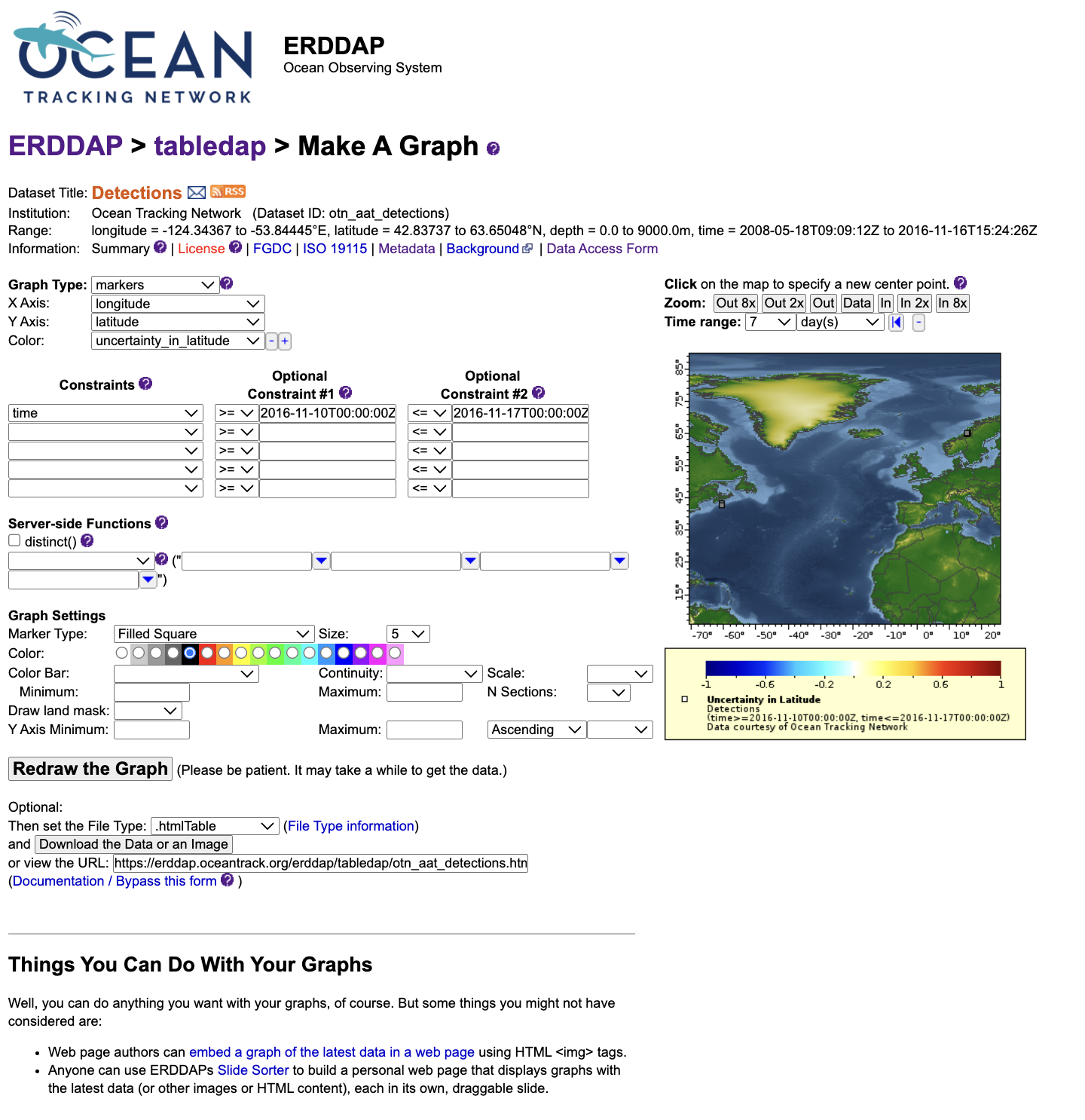
This tool functions similarly to the Data Access Form but adds a plotting interface. You can select X and Y variables, apply filters, and preview data as line, scatter, or depth profile plots. It is intended for quick data exploration—useful for checking coverage, identifying trends, or confirming that filters are working as expected.
When you click Redraw the graph, ERDDAP generates the plot immediately. A caption and a direct URL appear below the graph; this URL reproduces the same visualization and can be shared or reused later.
Other Features in ERDDAP
In addition to the data and graph tools, ERDDAP provides several supporting views that help users understand datasets in detail.
- The Metadata page lists all variables, their units, ranges, and data types, as well as global attributes such as license, citation, and time coverage.
- The Background Info page provides contextual details— for example, project origin, instrument type, or links to related documentation.
- The Files view (when available) offers complete data archives, often in NetCDF, CSV, or Parquet format, for users who prefer to download full datasets rather than filtered subsets.
Together, these tools make ERDDAP a comprehensive environment for data discovery and access. They allow you to inspect, filter, visualize, and document datasets directly within the web interface, and then replicate those workflows programmatically in R or Python.
Key Points
ERDDAP shares OTN’s tabular and time-series data through open web services.
Every dataset has a stable ID and variables you can select freely.
Requests are just URLs: pick variables, add filters, and choose an output format.
You can load ERDDAP results directly into R or Python using CSV or JSON.
Start small, then build up filters for time, space, and attributes.
Intro to Geospatial Data in R
Overview
Teaching: 45 min
Exercises: 30 minQuestions
What is spatial data in R?
What is a coordinate reference system (CRS)?
How do I check and change a CRS?
How does CRS choice affect distance and area?
Objectives
Introduction
This lesson introduces the basic concepts and practical workflow for working with geospatial data in R, using telemetry-style data as the running example. The intent is to cover both the definitions (what spatial data is, what a CRS is) and the minimum set of operations you need to correctly map and analyze locations.
The lesson uses two core R packages:
sffor vector spatial data (points, lines, and polygons). In telemetry workflows, detections and receiver locations are typically treated as points; movement paths can be represented as lines; and analysis regions (for example, receiver coverage areas) are often represented as polygons.terrafor raster spatial data (grids of cells). Rasters are commonly used for environmental layers (for example, depth or temperature surfaces) and are often combined with telemetry points by extracting raster values at point locations.
A large portion of geospatial analysis is deciding how coordinates should be interpreted. For that reason, this lesson emphasizes coordinate reference systems (CRS) and how they affect results. Specifically, the lesson covers:
- what spatial data is, and how vector and raster data differ
- how CRSs work (geographic vs projected coordinates, units, and what the CRS metadata represents)
- how to check CRS information in R and how to fix common issues (missing or incorrect CRS)
- how to convert data between CRSs (assigning a CRS when it is known vs transforming to a new CRS)
- an example of when CRS choice matters for analysis (distance/buffering or area calculations), including why you may choose a distance-preserving, area-preserving, or angle-preserving CRS depending on the method
By the end of the lesson, participants will have taken telemetry-style detection and receiver tables, converted them into sf objects, transformed them into an appropriate projected CRS for measurement-based analysis, and then used terra to work with a raster layer and combine it with the telemetry points through CRS alignment and value extraction.
Setup
This lesson uses R. Open RStudio and work from an R script (File → New File → R Script) so your code is saved.
We will use:
sffor vector spatial data (points, lines, polygons)terrafor raster spatial data (grids)glatosfor telemetry-oriented workflows and example data structures
Install packages
Install sf and terra from CRAN:
install.packages(c("sf", "terra"))
Install glatos from the OTN R-universe repository:
options(repos = c(
otn = "https://ocean-tracking-network.r-universe.dev",
CRAN = "https://cloud.r-project.org"
))
install.packages("glatos")
If you have trouble installing glatos, you can refer the instructions here: https://github.com/ocean-tracking-network/glatos
Load packages
library(sf)
library(terra)
library(glatos)
Verify the setup
These commands should return version numbers without errors:
packageVersion("sf")
packageVersion("terra")
packageVersion("glatos")
The detections and receiver datasets used in the exercises will be introduced after the spatial data concepts section.
Spatial data concepts
Spatial data (also called geospatial data) is data that includes information about location on the Earth. In practice, spatial datasets usually combine location information (for example, coordinates or boundaries) with attribute data that describes what was observed (for example, a tag ID, receiver ID, detection time, species, or deployment details).
What makes spatial data different from a regular table is that location can be used directly in analysis. Instead of only asking “how many detections happened,” you can ask questions such as “which detections occurred near a receiver,” “which detections fall inside a study area,” or “how far apart were consecutive detections.” These questions depend on how location is represented and measured.
Spatial data is commonly represented in two formats: vector and raster.
Vector data represents discrete features as geometries. The main geometry types are points, lines, and polygons. A point represents a single location, such as a receiver station or a detection location. A line can represent a path or track, such as connecting detections in time order for a single tag. A polygon represents an area, such as a study boundary or a buffer region around a receiver. Vector data is most useful when you care about individual features and their relationships (for example, distance to the nearest receiver, whether a point falls inside a polygon, or overlap between areas).
Raster data represents a surface as a grid of cells. Each cell stores a value, such as temperature, depth, chlorophyll, or elevation. Raster data is often used for continuous variables that change across space. Key raster properties are the extent (the area covered), resolution (cell size), and the coordinate reference system used to locate the grid on the Earth. Higher resolution (smaller cells) increases spatial detail but also increases data size and computation time.
In an ocean monitoring context, a typical workflow uses both types. Detections and receivers are naturally represented as vector points, while environmental context (for example, depth or sea surface temperature) is often represented as a raster. A common task is to attach raster values to detection points (for example, “what was the raster value at each detection location?”), which requires that both datasets use compatible coordinate reference systems.
Vector vs raster Challenge
For each item below, decide whether it is vector or raster. If vector, specify point, line, or polygon.
Receiver station locations (one coordinate pair per receiver)
Detection locations (one coordinate pair per detection record)
A path connecting detections in time order for one tag
A buffer zone drawn around each receiver
A gridded depth or temperature layer
Solution
- Vector (point)
- Vector (point)
- Vector (line)
- Vector (polygon)
- Raster
Example data (detections and deployments)
For this lesson, we will use the example detections and deployments CSV files that ship with glatos. system.file() is used to locate files that are included inside an installed package.
det_csv <- system.file("extdata", "blue_shark_detections.csv", package = "glatos")
dep_csv <- system.file("extdata", "hfx_deployments.csv", package = "glatos")
detections <- read.csv(det_csv)
deployments <- read.csv(dep_csv)
What these datasets represent
detections contains detection records. Each row represents one detection event and includes both identifying information (for example, the tag name and receiver/station fields) and metadata such as detection time.
deployments contains receiver station deployment information. Each row represents a receiver station record and includes station identifiers and location fields.
These example datasets include many columns that are not required for the geospatial parts of this lesson. For the next sections, the only fields we must have are:
- detection coordinates (longitude and latitude)
- receiver/station coordinates (longitude and latitude)
- a tag identifier (to allow filtering to one animal/tag for plotting)
Other columns (for example, depth fields, receiver model fields, notes) are retained because they are often useful in real projects, but they are not required for creating spatial objects.
Identify key columns
Check the column names:
names(detections)
names(deployments)
For these example datasets, the coordinate columns are:
- In
detections:decimalLongitudeanddecimalLatitude - In
deployments:stn_longandstn_lat
A useful identifier column in detections is tagName (this will be used later to subset detections for one tag).
detections also contains a column called geometry. For this lesson, we will create spatial objects using the longitude/latitude columns so the workflow is explicit and consistent.
In the next section, we will convert these tables into sf objects so R understands the coordinates as spatial geometries and we can use spatial operations (plotting, CRS checks, distance/buffer operations).
Vector spatial data with sf (creating point objects)
The sf package is the standard way to represent vector spatial data in R. An sf object is a regular table (data frame) with an additional geometry column that stores spatial features (points, lines, or polygons). Once data is stored as an sf object, R can treat it as spatial: you can plot it as a map layer, check and assign coordinate reference systems (CRS), transform between CRSs, and use spatial operations such as distance, buffering, and spatial joins.
At the moment, detections and deployments are regular tables. Even though they contain coordinate columns (and detections has a column named geometry), R does not automatically treat the rows as spatial features. In this section, we will explicitly create point geometries from longitude and latitude and store them as sf objects.
Create sf point objects
# Detections as sf points ####
detections_sf <- st_as_sf(
detections,
coords = c("decimalLongitude", "decimalLatitude"),
remove = FALSE
)
# Deployments (receiver stations) as sf points ####
deployments_sf <- st_as_sf(
deployments,
coords = c("stn_long", "stn_lat"),
remove = FALSE
)
# Check the result ####
class(detections_sf)
class(deployments_sf)
st_geometry(detections_sf)[1:3]
st_geometry(deployments_sf)[1:3]
At this point, both objects have a geometry column, but they do not yet have a CRS assigned. The CRS step is covered in the next section.
Quick plot
plot(st_geometry(deployments_sf),
pch = 16, cex = 0.8, asp = 1,
main = "Receiver deployments and detections")
plot(st_geometry(detections_sf),
pch = 16, cex = 0.5,
add = TRUE)
The plot shows the receiver deployment locations (first layer) with detections overlaid on top (second layer). Both layers are being drawn using only their point geometries. At this stage, the objects do not have a coordinate reference system (CRS) assigned (CRS: NA), but the numeric values indicate these are longitude/latitude coordinates (negative longitudes and latitudes around ~44°). In the next section, a CRS will be assigned so the coordinates are formally defined and can be transformed when needed.
Because there can be many detections at the same receiver station, multiple points may overlap exactly. When many points overlap, they can appear as darker or thicker marks. The overall footprint of points should still fall in the same general region for deployments and detections; if they do not overlap geographically, that is often the first sign that coordinates or CRS metadata are incorrect.
Creating sf points Challenge
Run the code above to create
detections_sfanddeployments_sf.Use
names(detections_sf)to confirm the coordinate columns are still present (becauseremove = FALSE).Plot the two layers and confirm they appear in the same general area.
Solution
A correct result is that both objects print as
sfobjects,names()still lists the longitude/latitude columns, and the plot shows detections and deployments in overlapping geographic space.
Coordinate reference systems (CRS)
A coordinate reference system (CRS) is a GIS definition that specifies how coordinate values correspond to locations on Earth. CRS information is required to place spatial data correctly on a map and to align multiple spatial layers.
A CRS definition typically includes:
- a datum (the reference surface used to model the Earth)
- a coordinate system (how positions are expressed, such as longitude/latitude or a planar grid)
- units (for example, degrees or meters)
- if projected, a map projection (the mathematical transformation from the Earth to a flat map)
CRS choice affects measurement. Geographic coordinates in degrees are convenient for storing and sharing locations, but distance and area calculations generally require a projected CRS with linear units. Map projections introduce distortion, so different projections preserve different properties (for example, area, angles, or distance) more effectively over a given region. For telemetry workflows, it is common to keep raw locations in longitude/latitude and transform to a meter-based projected CRS before distance-based operations (buffers, nearest receiver, movement distances) and many area-based calculations.
Geographic vs projected CRS
- Geographic CRS (longitude/latitude): coordinates are angles in degrees (e.g., WGS84 / EPSG:4326).
- Projected CRS: coordinates are in linear units (commonly meters) defined by a projection (e.g., UTM zones).
For the Halifax-area example data in this lesson, we will use WGS84 / UTM zone 20N (EPSG:32620) as a practical projected CRS for distance calculations.
Assigning vs transforming CRS in sf
Two different CRS operations are used in practice:
- Assign a CRS when the CRS is known but missing from the object. This adds CRS metadata and does not change coordinate values.
- Transform to a new CRS to represent the same locations in a different coordinate system. This changes coordinate values while keeping locations the same.
In sf:
st_set_crs()assigns CRS metadatast_transform()transforms (reprojects) to a new CRS
Check CRS metadata
We created point geometries earlier; check whether CRS metadata is present:
st_crs(detections_sf)
st_crs(deployments_sf)
If CRS is missing, st_crs() will return NA.
Assign WGS84 (EPSG:4326)
The example glatos coordinates are longitude/latitude in degrees, so assign WGS84 (EPSG:4326):
detections_sf <- st_set_crs(detections_sf, 4326)
deployments_sf <- st_set_crs(deployments_sf, 4326)
st_crs(detections_sf)
st_crs(deployments_sf)
Transform to a projected CRS (meters)
Transform to a projected CRS for distance-based work. Here we use UTM zone 20N (EPSG:32620):
detections_utm <- st_transform(detections_sf, 32620)
deployments_utm <- st_transform(deployments_sf, 32620)
st_crs(detections_utm)
st_crs(deployments_utm)
CRS workflow Challenge
- Use
st_crs()to confirmdetections_sfanddeployments_sfhave missing CRS metadata (NA) before assignment.- Assign EPSG:4326 to both objects with
st_set_crs().- Transform both objects to EPSG:32620 with
st_transform().- Plot the projected layers and confirm they still overlap.
plot(st_geometry(deployments_utm), pch = 16, cex = 0.8, asp = 1, main = "Deployments and detections (UTM, meters)") plot(st_geometry(detections_utm), pch = 16, cex = 0.5, add = TRUE)Solution
A correct result is:
- EPSG:4326 is assigned to
detections_sfanddeployments_sf.- EPSG:32620 is shown for
detections_utmanddeployments_utm.- The projected plot shows the same spatial pattern as the geographic plot.
If you want a deeper overview of coordinate reference systems and projections, you can refer the following links: https://earthdatascience.org/courses/earth-analytics/spatial-data-r/intro-to-coordinate-reference-systems/ and https://www.esri.com/arcgis-blog/products/arcgis-pro/mapping/gcs_vs_pcs
When CRS choice matters (distance vs area vs angles)
Projection choice matters when your method depends on measuring something (distance, area, direction), not just drawing a map. A projected CRS converts locations from a longitude/latitude description on a globe into a flat coordinate system where measurements behave in specific ways. Because flattening the Earth introduces distortion, different projections are designed to preserve different properties (and no single projection preserves everything equally well everywhere).
What to preserve depends on the analysis
- Distance-based methods (buffers, nearest-receiver distance, step lengths) require a CRS with linear units (typically meters) and reasonable distance behavior over your study region (often a local UTM zone).
- Area-based methods (polygon area, habitat area summaries, home-range area outputs) should use an equal-area projection so computed areas are comparable.
- Angle/bearing methods (movement direction, headings, angle-based comparisons) are best supported by an angle-preserving (conformal) projection, which preserves local angles.
In this lesson, we demonstrate the distance case with a 5 km receiver buffer. This provides a concrete example of why we transformed from longitude/latitude (degrees) to a projected CRS (meters) in the previous section.
Distance example: detections within 5 km of a receiver
This example answers:
“For one tag, how many detections occurred within 5 km of at least one receiver station?”
This requires meter units, so it uses deployments_utm and detections_utm.
Create 5 km buffers around receiver stations
# 5 km = 5000 meters (requires projected CRS with meter units)
receiver_buf_5km <- st_buffer(deployments_utm, dist = 5000)
Subset detections to one tag
# Use one tag to keep results and plots manageable
tag_id <- detections_utm$tagName[1]
one_tag <- detections_utm[detections_utm$tagName == tag_id, ]
Count detections inside any buffer
st_intersects() returns which buffers each detection intersects. If a detection intersects at least one buffer, it is within 5 km of a receiver.
inside_any <- lengths(st_intersects(one_tag, receiver_buf_5km)) > 0
sum(inside_any) # detections within 5 km of >= 1 receiver
nrow(one_tag) # total detections for this tag
Plot buffers and detections
plot(st_geometry(receiver_buf_5km), col = NA, border = "grey40",
main = "Detections within 5 km of receivers (UTM, one tag)")
plot(st_geometry(one_tag), pch = 16, cex = 0.6, add = TRUE)
Distance and projection choice Challenge
Create 5 km buffers around receivers using
deployments_utm.Subset
detections_utmto a singletagName.Use
st_intersects()to count how many detections are within 5 km of at least one receiver.Make the plot showing buffers and detections.
Solution
A correct result is:
sum(inside_any)returns a count between 0 andnrow(one_tag).- The plot shows detection points overlaid on the receiver buffers.
- This workflow uses the projected
*_utmobjects so the buffer distance is interpreted in meters.
Notes
This section demonstrates a common reason to transform CRS in telemetry workflows: distance thresholds (for example, “within 5 km”) require a projected CRS with linear units. The same decision rule applies to other methods: use an equal-area CRS when area is the target metric, and use an angle-preserving CRS when bearings or angle relationships are central to the analysis.
Raster spatial data with terra
A raster is spatial data stored as a grid. The study area is divided into equal-sized cells, and each cell stores a value. That value can represent a continuous variable (for example, depth or temperature) or a category (for example, habitat class). Rasters are widely used for environmental and remote-sensing products because they represent conditions across an entire area, not just at a set of sampled locations.
In contrast, vector data (what we used with sf) represents discrete features as points, lines, and polygons. In this lesson’s telemetry context:
- Vector (
sf): detections and receiver stations as points, and derived features like buffers as polygons. - Raster (
terra): environmental layers such as bathymetry (seafloor depth), sea surface temperature, or chlorophyll.
What a raster “means” in practice
A raster value is tied to a specific cell location and cell size. When you use a raster in analysis, you are working at the raster’s resolution: values represent conditions at the scale of the cell. Many rasters also include NoData cells (missing values), for example where a dataset has no coverage or where land/water masks remove values.
Some rasters have one layer (one value per cell). Others have multiple layers (often called bands). For example:
- satellite imagery commonly has multiple bands (different wavelengths)
- environmental datasets may have multiple layers for different variables or time steps
Core raster properties
Three properties determine how a raster lines up with other spatial data and how detailed it is:
- Extent: the area covered by the raster.
- Resolution (cell size): the size of each cell. Smaller cells give more spatial detail but increase file size and computation time.
- CRS: how the raster grid is positioned on Earth.
If you want a deeper overview of raster concepts and raster properties (extent, resolution, CRS, bands, NoData), see the ArcGIS Pro documentation: https://pro.arcgis.com/en/pro-app/latest/help/data/imagery/introduction-to-raster-data.htm and https://pro.arcgis.com/en/pro-app/latest/help/data/imagery/raster-dataset-properties.htm
The key raster–point operation: extraction
A common workflow is to attach raster values to point locations:
For each detection point, return the raster value at that location.
This is called extraction. After extraction, your detection points gain a new column (for example depth_m), which you can summarize, plot, or use in later analysis.
Example raster layer for this lesson: bathymetry
We will use a bathymetry raster (seafloor depth) because it is a common ocean layer and it pairs naturally with detection locations. The same terra workflow applies to other rasters (for example temperature): load the raster, ensure CRS compatibility, then extract values at point locations.
Extract depth values at detection points
This example uses a depth (bathymetry) GeoTIFF. Download the bathymetry_raster.tiff from the workshop GitHub repository:
Load the raster and check its spatial information
depth_raster <- rast("data/bathymetry_raster.tiff")
ext(depth_raster) # area covered
res(depth_raster) # cell size
crs(depth_raster) # CRS
Subset detections to one tag
tag_id <- detections_sf$tagName[1]
one_tag <- detections_sf[detections_sf$tagName == tag_id, ]
Match CRS (if needed) and extract values
if (st_crs(one_tag)$wkt != crs(depth_raster)) {
one_tag <- st_transform(one_tag, crs(depth_raster))
}
one_tag$depth_m <- extract(depth_raster, vect(one_tag))[, 2]
head(one_tag[, c("tagName", "depth_m")])
Quick plot (optional)
plot(depth_raster, main = "Depth raster + detections (one tag)")
plot(st_geometry(one_tag), pch = 16, cex = 0.6, add = TRUE)
Raster extraction Challenge
Load
data/bathymetry_raster.tiffas a raster usingrast().Subset
detections_sfto onetagName.If needed, transform the points to match the raster CRS.
Use
extract()to create adepth_mcolumn.Solution
A correct result is that
one_tag$depth_mcontains numeric values (not allNA) andhead(one_tag[, c("tagName","depth_m")])prints depth values for the first few detections.
Next steps
This lesson introduced the core workflow for working with geospatial data in R. You converted telemetry tables into spatial objects with sf, used CRS metadata to correctly align layers and support measurement-based operations, and ran a simple distance-based example using buffers. You also introduced raster data with terra by loading a gridded depth layer and extracting values at detection locations.
From here, the same steps can be applied to common tasks such as nearest-receiver summaries, points-in-polygons queries, creating simple tracks from time-ordered detections, and extracting additional environmental layers (for example, temperature or chlorophyll) once an appropriate raster product and time slice are selected.
Key Points